基礎html5-css3 -...
TRANSCRIPT

RITA TEACHING
基礎html5-css3
老田講座
ENTER
講師:田甜甜
http://tutorial.jumpdesign.tw/
Ema
il: rita.d
esig
n@
gm
ail.c
om
v3.0

RitaTeaching

Javascript
HTML5是包含了:
HTML、CSS和JavaScript三個部分。
不單單只是HTML部分增加新標籤,
CSS3和JavaScript也有許多的創新,
讓整個網頁程式功能更加繽紛。
RitaTeaching
HTML
超文件標示語言
(文件內容架構)
CSS3
層疊樣式表
(外觀呈現)
行為腳本
(動態效果)

是最新版本的HTML語言
HTML5標準,於2014年才正式完成
大多數瀏覽器早已開始支援HTML5標準
結合html+css3+javascript三種語言
設定JavaScript與CSS為預設技術(可不另外宣告)
統一許多標準,讓跨瀏覽器的支援度提升
精簡舊版標籤,已取消支援許多舊版元素
新的語義,並加強元件控制
加入新的媒體元件與繪圖功能,建立網站架構有更多元件可選擇
許多新功能需依靠JavaScript才能使用
可建立網路應用程式API
RitaTeaching
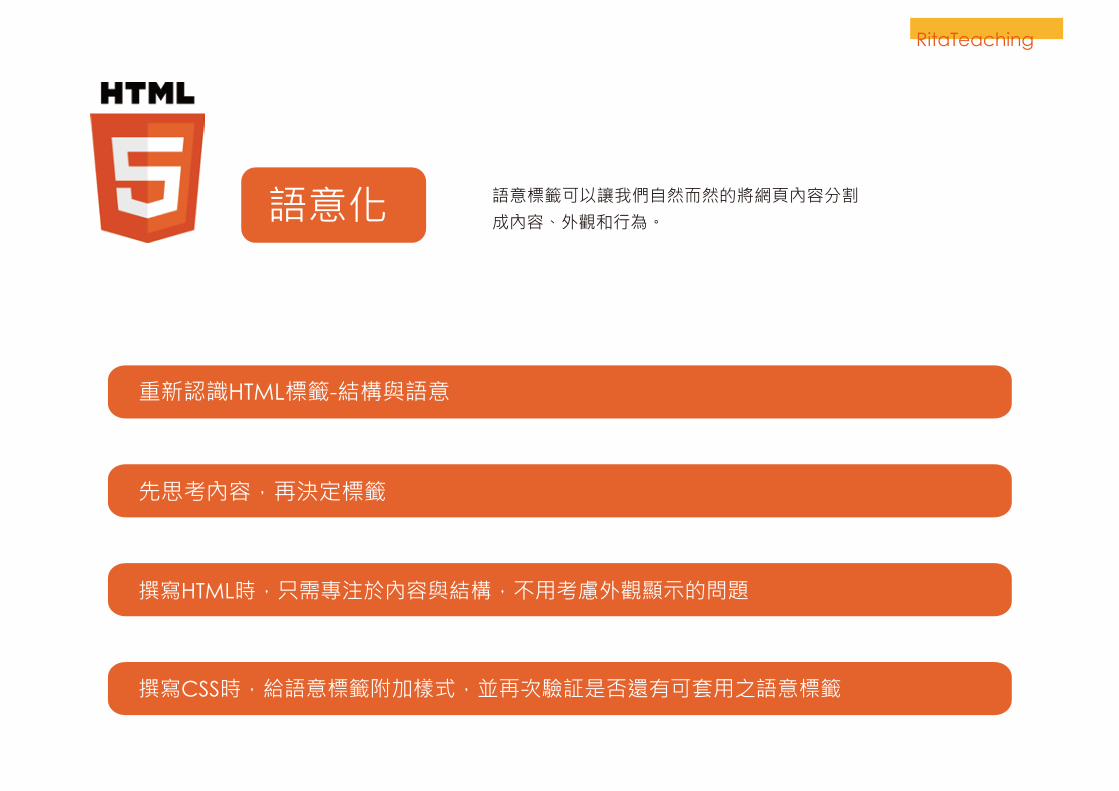
語意化 語意標籤可以讓我們自然而然的將網頁內容分割成內容、外觀和行為。
RitaTeaching
重新認識HTML標籤-結構與語意
先思考內容,再決定標籤
撰寫HTML時,只需專注於內容與結構,不用考慮外觀顯示的問題
撰寫CSS時,給語意標籤附加樣式,並再次驗証是否還有可套用之語意標籤

<link rel="stylesheet" type="text/css" href="">
<script type="text/javascript"></script>
<link rel="stylesheet" href="">
<script></script>
<div class=”header”>
<div class=”footer”>
<div class=”nav”>
<div class=”article”>
<div class=”section”>
<div class=”section”>
<header>
<footer>
<nav>
<div class=”aside”> <aside>
<article>
<section>
<section>
HTML4&HTML5內容結構
RitaTeaching
<!DOCTYPE html PUBLIC "-//W3C//DTD XHTML 1.0 Transitional//EN" "http://www.w3.org/TR/xhtml1/DTD/xhtml1-transitional.dtd"> <!DOCTYPE html>

檔頭標籤<header>
RitaTeaching
檔頭標籤<header><header>元素表示用於介紹內容或一組導航鏈接的容器。一
個<header>元素通常包含:
一個或多個標題元素(<h1> - <h6>)標誌、圖標、作者信息。
*<header>標籤不能放置在<footer>,<address>或另一個
<header>元素中。
<header> <h1>田老大工作室</h1></header><section> <header> <h2>關於田老大工作室</h2> </header></section> <footer>
<nav>
<section>
<section> <header> 關於田老大工作室 </header></section>
<article>
<header> <h1>田老大工作室</h1>
</header>

RitaTeaching
導覽標籤<nav>
導覽標籤<nav>
建立網頁的導覽區段,連結其他網頁的超連結集合,通常只有主要導覽區段會建立在<nav>中。是以Navigation縮寫定義。
<header> <h1>田老大工作室</h1> <nav> <ul> <li><a href=”/news/”>最新消息</a></li> <li><a href=”/services/”>關於我們</a></li> <li><a href=”/about/”>服務項目</a></li> </ul> </nav></header>
<header>
<footer>
<nav> <ul> <li><a href=”/news/”>最新消息</a></li>
<li><a href=”/services/”>公司服務</a></li>
<li><a href=”/about/”>關於網站</a></li>
</ul></nav>
<article>
<section>
<section>
<nav>

RitaTeaching
影像群組標籤<figure>
<header>
<nav>
影像群組標籤<figure>用來將多個影像封裝成一個群組。
<article> <figure> <img src=”photo1.jpg”> <figcaption>相片名稱標題</figcaption> </figure> <p>林書豪(英語:Jeremy Shu-How Lin,1988年8月23日-),生於美國加州托倫斯,美國職業籃球隊球員,現屬NBA夏洛特黃蜂,場上位置為得分後衛與控球後衛,擅長擋切戰術以及跑轟戰術。</p></article>
<footer>
<article>
<p>
<figure> <img src=”1.jpg”>
<img src=”2.jpg”>
<figcaption>
相片名稱標題
</figcaption>
</figure>
<nav>

【div】
無任何語義,僅僅用作樣式化或者腳本化的容器
【main】
文檔的主要內容
【article】
這段內容可以脫離上下文,作為完整的獨立存在的一段內容
【section】
一段相關主題性的內容區段
原則上來說,能使用article的時候,也是可以使用section的,假如
使用article更合適,那麼就不要使用section。
section包含的內容也能算作獨立的一塊,但是它只能算是組成整體
的一部分,article才是一個完整的整體。
區塊元素說明
RitaTeaching

主要標籤<main>
RitaTeaching
主要標籤<main>文檔的主要內容。元素中的內容應該是唯一的文檔。
它不應該包含跨檔案的文件,如側邊欄,導航列,版權
宣告,網站標誌(logo)和搜索表單的內容。
一個文件中只能有一個<main>元素,不能在<article>,
<aside>, <footer>, <header>, <nav>裡面。
<header>
<footer>
<nav>
<main> <section> <h1>公司歷史</h1> <p>公司歷史內容</p> </section> <section> <h1>經營理念</h1> <p>經營理念內容</p> </section></main>
<main>
</main>
<article>
<h1>關於我們</h1>
<p>關於我們內容</p>
</article>
<article>
<h1>產品介紹</h1>
<p>產品介紹內容</p>
</article>

文章標籤<article>
RitaTeaching
文章標籤<article>
包含自我完整內容成份的區域,能獨立發送重覆使用的資料。它比section具有更明確的語義,它代表一段脫離了整體還能作為一個完整的、獨立的相關內容。
<header>
<footer>
<nav>
<article> <section> <h1>公司歷史</h1> <p>公司歷史內容</p> </section> <section> <h1>經營理念</h1> <p>經營理念內容</p> </section></article>
<article>
</article>
<section>
<h1>公司歷史</h1>
<p>公司歷史內容</p>
</section>
<section>
<h1>經營理念</h1>
<p>經營理念內容</p>
</section>

區段標籤<section>
RitaTeaching
區段標籤<section>用來群組一般用途的文件或應用程式,區段相關的網頁內容
,絕不可包含不相關的內容,常用於文章的章節、標籤對話
框中的標籤頁、或者論文中有編號的部分。例如:一個網站
的首頁可以分成簡介、最新消息和聯絡方式等多個區段。
<article> <section> <h1>公司簡介</h1> <p>公司簡介內容</p> </section> <section> <h1>經營理念</h1> <p>經營理念內容</p> </section></article>
<header>
<footer>
<article>
</article>
<nav>
<section> <h1>公司歷史</h1>
<p>公司歷史內容</p>
</section>
<section> <h1>經營理念</h1>
<p>經營理念內容</p>
</section>

額外資訊標籤<aside>
額外資訊標籤<aside>與article相關的內容片斷,可提供額外資訊進一步補強主要內容,非指向網站其他內頁之超連結,如:說明、提示、引用、附加註解等。
<header>
<footer>
<nav>
<section>
<section>
<aside>
<article>
<article> <section> <h1>林書豪簡介</h1> <p>林書豪(英語:Jeremy Shu-How Lin,1988年8月23日-),生於美國加州托倫斯,美國職業籃球隊球員,現屬NBA夏洛特黃蜂,場上位置為得分後衛與控球後衛,擅長擋切戰術以及跑轟戰術。</p> </section> <aside> ^ 2.0 2.1 kevin Ding. Lin is the NBA's Asian-American inspiration [在NBA成為美籍亞裔榜樣的林書豪]. </aside></article>
RitaTeaching

頁腳標籤<footer>
RitaTeaching
<header>
<nav>
頁腳標籤<footer>
作為區段內容的結束,同一網頁中可以有多個。不可用於<header>及<footer>本身。
<footer>
<small>
老田設計 版權所有 © 2015 . All Rights Reserved.
</small>
</footer><footer> <small>
老田設計 版權所有 © 2015 . All Rights Reserved.
</small>
</footer><small>標籤:在HTML5中為輔助說明之意。
<section>
<article>
<article>
<aside>

多媒體Audio
音樂的原生播放支援
<!DOCTYPE html><html><body><audio controls="controls"> <source src="horse.ogg" type="audio/ogg"> <!--部分版本的Firefox,Opera,不支援mp3或mp4檔案格式的播放, 所以可設定改用ogg檔--> <source src="horse.mp3" type="audio/mpeg"> 您的瀏覽器不支援audio,請升級您的瀏覽器</audio></body></html>
HTML5定義了Audio標籤,可以用來撥放音樂,這表示以後的瀏覽器便不需要外掛一些軟體就可以達到這樣的目地,Audio標籤可以和CSS與JavaScript整合,讓我們更容易進行操控音樂的撥放。
RitaTeaching
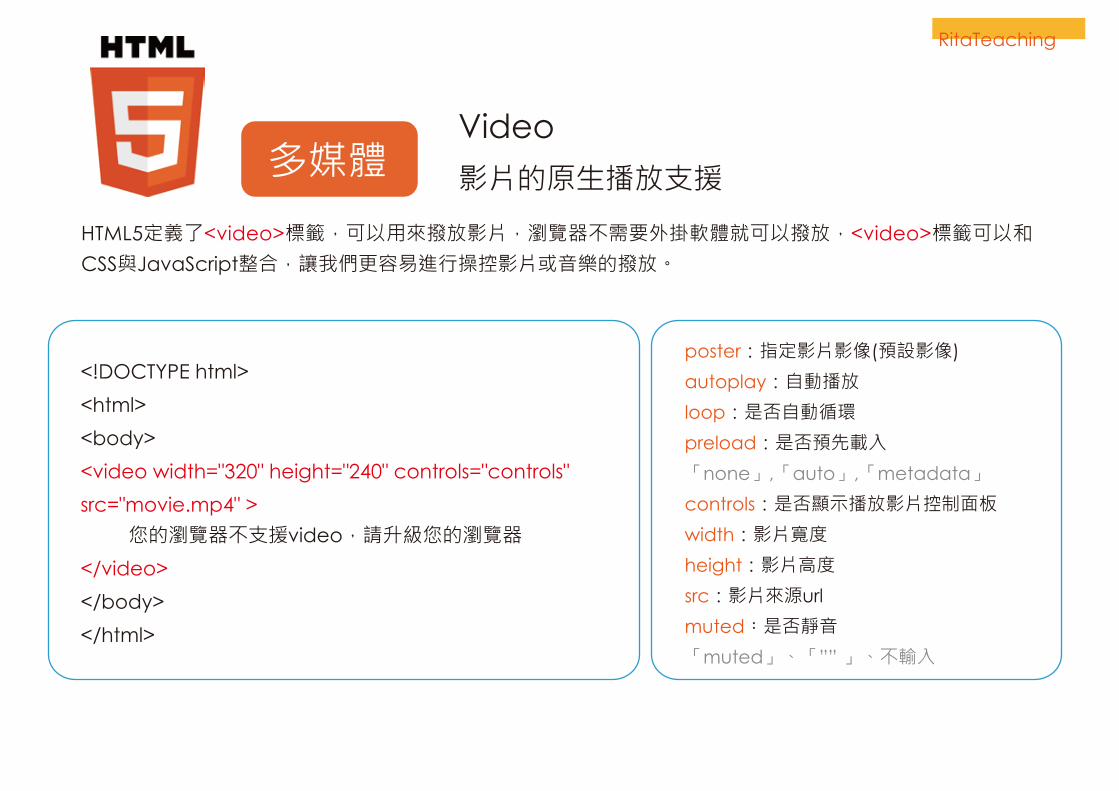
多媒體Video
影片的原生播放支援
<!DOCTYPE html>
<html>
<body>
<video width="320" height="240" controls="controls"
src="movie.mp4" >
您的瀏覽器不支援video,請升級您的瀏覽器
</video>
</body>
</html>
HTML5定義了<video>標籤,可以用來撥放影片,瀏覽器不需要外掛軟體就可以撥放,<video>標籤可以和CSS與JavaScript整合,讓我們更容易進行操控影片或音樂的撥放。
RitaTeaching
poster:指定影片影像(預設影像)
autoplay:自動播放
loop:是否自動循環
preload:是否預先載入
「none」,「auto」,「metadata」
controls:是否顯示播放影片控制面板
width:影片寬度
height:影片高度
src:影片來源url
muted:是否靜音
「muted」、「”” 」、不輸入

Canvas
2D的繪圖功能支援 多媒體
<!DOCTYPE html>
<html>
<body>
<canvas id="myCanvas" width="200" height="100" > 您的瀏覽器不支援canvas,請升級您的瀏覽器
</canvas>
</body>
</html>
RitaTeaching
<canvas>元素能建立一個直接從瀏覽器中執行繪圖平台,類似一個畫布。本身沒有樣式,必須使用腳本語言來繪製圖形(通常是JavaScript)。預設的畫布大小是 300px * 150px (寬 * 高)。
畫布<canvas>
<style> canvas { border:1px solid #000000; }</style>

SVG
向量圖支援
<svg xmlns="http://www.w3.org/2000/svg" width="50" height="50" viewBox="0 10 25 25" fill="#30745E"> <path d="M0 16.67l2.829 2.83 9.175-9.339 9.167 9.339 2.829-2.83-11.996-12.17z"/></svg>
*viewBox="0 10 25 25" | (min x, min y, width, height)
SVG是什麼?
可伸縮的向量圖形SVG代表
SVG是用來定義用於Web的向量圖形
SVG圖形利用XML格式定義
SVG圖形縮放或調整,不會失真
在SVG文件中,每一個元素或屬性都可以是動畫,
SVG是W3C推薦使用
SVG的優點
SVG比其他圖像格式(如JPEG和GIF)的優勢:
可以用任何文本編輯器創建和編輯SVG圖像
SVG圖像可以被搜索,索引,腳本,和壓縮
SVG圖像具有可擴展性
SVG圖像可以在任何平台上提供高品質的印刷
SVG圖像是可縮放(圖像可以進行放大,縮小,而不會降低)
RitaTeaching
多媒體

RitaTeaching

【圓角border-radius】邊框
<!DOCTYPE html><html><head><style> div{border:2px solid #a1a1a1;padding:10px 40px; background:#dddddd;width:300px;border-radius:25px;-moz-border-radius:25px; /* Firefox 3.6 and earlier */}</style></head><body>
<div>The border-radius</div>
</body></html>
RitaTeaching
在CSS2中要建立圓角是很困
難的。需要建立背景圖片、切
片或Javascript,才能做到。
但在CSS3中輕易就可以做到
。它可能是目前使用最多的
CSS3屬性。
CSS3 border-radius屬性可以
被用來創建圓角:

【陰影box-shadow】
<!DOCTYPE html><html><head><style> div{width:300px;height:100px;background-color:yellow;-moz-box-shadow: 10px 10px 5px #888888; /* Firefox 3.6 and earlier */box-shadow: 10px 10px 5px #888888;}</style></head><body>
<div></div>
</body></html>
CSS3box-shadow:x y 模糊 顏色;
屬性可以被用來製造陰影效果:
邊框RitaTeaching

【伸展背景圖:background-size 】
背景
<!DOCTYPE html><html><head><style> div{background:url(img_flwr.gif);background-size:100% 100%;-moz-background-size:100% 100%; /* Firefox 3.6 */background-repeat:no-repeat;}</style></head><body><div></div></body></html>
CSS3background-size屬性可以被用來製造背景圖片效果
RitaTeaching

<!DOCTYPE html><html><head><style> div{border:1px solid black;padding:35px;background-image:url('icon.png');background-repeat:no-repeat;background-position:left;}#div1{background-origin:border-box;<!--背景來源:邊框區域 -->}#div2{background-origin:content-box;<!--背景來源:內容區域 -->}</style></head><body><p>background-origin:border-box:</p><div id="div1"></div><p>background-origin:content-box:</p><div id="div2"></div></body></html>
CSS3background-origin屬性可以被用來指定背景圖片顯示的區域位置。border-box可指定圖片在邊框區域。content-box可指定圖片在內容區域。
RitaTeaching
【指定背景圖區域:background-origin 】
背景

<!DOCTYPE html><html><head><style> div{ border:1px solid black; padding:35px; background-image:url('icon.png'); background-repeat:no-repeat; background-position:left;}#div1{ background: linear-gradient(#fff,#000); <!-- 背景:線性漸層 -->}#div2{ background: radial-gradient(#fff,#000); <!-- 背景:放射性漸層 -->}</style></head><body> <p>background-origin:border-box:</p> <div id="div1"></div> <p>background-origin:content-box:</p> <div id="div2"></div></body></html>
CSS3線性漸層:background: linear-gradient(#fff,#000);放射性漸層:
RitaTeaching
【漸層背景色:background:gradient 】
背景

<!DOCTYPE html><html><head><style>h1{text-shadow: 5px 5px 5px #FF0000;}</style></head><body>
<h1>Text-shadow effect!</h1>
</body></html>
CSS3text-shadow屬性可以被用來製造文字陰影效果:
text-shadow: x y 模糊 顏色;
【陰影Text Shadow 】
文字RitaTeaching

【字體樣式@font-face】
<!DOCTYPE html><html><head><style> @font-face{font-family: myFirstFont;src: url('http://randsco.com//fonts/lexogragh.eot') ,url('http://randsco.com/fonts/lexograph.ttf'); /* IE9+ */}div{font-family:myFirstFont;font-size:2em;}</style></head><body><div>With CSS3, websites can finally use fonts other than the pre-selected "web-safe" fonts.</div></body></html>
RitaTeaching
CSS3@font-face屬性可以用來指字字體樣式效果:有了CSS3,網站終於可以使用預先選定的“網路安全”字體。注意:Internet Explorer8之前的版本是不支援新的 @font-face規則
文字

【opacity】
半透明<html><head><style>div.background { width:500px; height:250px; background:url(klematis.jpg) repeat; border:2px solid black; }div.transbox { width:400px; height:180px; margin:30px 50px; background-color:#ffffff; border:1px solid black; opacity:0.6; filter:alpha(opacity=60); /* For IE8 and earlier */ }div.transbox p { margin:30px 40px; font-weight:bold; color:#000000; }</style></head>
<body>
<div class="background"><div class="transbox"><p>This is some text that is placed in the transparent box.</p></div></div></body></html>
CSS3opacity屬性可以被用來製造出半透明效果:
RitaTeaching

【column-count】【column-gap】
多欄 <!DOCTYPE html>
<html>
<head>
<style>
.newspaper
{
-moz-column-count:3; /* Firefox */
-webkit-column-count:3; /* Safari and Chrome */
column-count:3;
-moz-column-gap:40px; /* Firefox */
-webkit-column-gap:40px; /* Safari and Chrome */
column-gap:40px;
}
</style>
</head>
<body>
<div class="newspaper"></div>
</body>
</html>
CSS3column-count /*多欄*/column-gap /*欄距*/屬性可以被用來製作出多欄 排版效果:
RitaTeaching

【rotate()】
旋轉 <!DOCTYPE html><html><head><style> div{width:100px;height:75px;background-color:red;border:1px solid black;}div#div2{transform:rotate(30deg);-ms-transform:rotate(30deg); /* IE 9 */-moz-transform:rotate(30deg); /* Firefox */-webkit-transform:rotate(30deg); /* Safari and Chrome */-o-transform:rotate(30deg); /* Opera */}</style></head><body>
<div>Hello. This is a DIV element.</div>
<div id="div2">Hello. This is a DIV element.</div>
</body></html>
RitaTeaching
CSS3transform:rotate (角度deg)屬性可以被用來轉換製造出旋轉效果:

【3D rotateX】【3D rotateY】
鏡射 <!DOCTYPE html>
<html>
<head>
<style>
div
{
width:100px;
height:75px;
background-color:red;
border:1px solid black;
}
div#div2
{
transform:rotateX(120deg);
-webkit-transform:rotateX(120deg);
-moz-transform:rotateX(120deg);
}
</style>
</head>
<body>
<div>Hello. This is a DIV element.</div>
<div id="div2">Hello. This is a DIV element.</div>
</body>
</html>
CSS3transform:rotateX(角度deg)transform:rotateY(角度deg)屬性可以被用來轉換製造出鏡射效果:
RitaTeaching

【skew()】
傾斜 <!DOCTYPE html><html><head><style> div{width:100px;height:75px;background-color:red;border:1px solid black;}div#div2{transform:skew(30deg,20deg);-ms-transform:skew(30deg,20deg); /* IE 9 */-moz-transform:skew30deg,20deg); /* Firefox */-webkit-transform:skew(30deg,20deg); /* Safari and Chrome */-o-transform:skew(30deg,20deg); /* Opera */}</style></head><body>
<div>Hello. This is a DIV element.</div>
<div id="div2">Hello. This is a DIV element.</div>
</body></html>
CSS3transform:skew(x,y)屬性可以被用來轉換製造出傾斜效果:
RitaTeaching

【transition】
轉換 <!DOCTYPE html><html><head><style> div{width:115px;height:115px;background:red;transition:width 2s;-moz-transition:width 2s; -webkit-transition:width 2s;-o-transition:width 2s;}div:hover /*滑入*/{width:300px;}</style></head><body><div>可將滑鼠移到上面的div元素,瀏覽轉換效果。IE瀏覽器不支援這個功能。</div></body></html>
RitaTeaching
CSS3可 以 添 加 動 畫 效 果 , 而 無 需 使 用Flash動畫或JavaScript。CSS3轉換效果,讓元素逐漸改變。你必須指定兩件事情:1,指定CSS屬性效果。2,指定持續時間效果。

【Animations】
動畫 <!DOCTYPE html><html><head><style> div{width:100px;height:100px;background:red;animation:myfirst 5s;-moz-animation:myfirst 5s; -webkit-animation:myfirst 5s;-o-animation:myfirst 5s;}@keyframes myfirst{from {background:red;}to {background:yellow;}}@-moz-keyframes myfirst {from {background:red;}to {background:yellow;}}@-webkit-keyframes myfirst{from {background:red;}to {background:yellow;}}
@-o-keyframes myfirst {from {background:red;}to {background:yellow;}}</style></head><body><div></div></body></html>
CSS3@keyframes Rule要建立CSS3動畫,你必須了解@keyframes Rule(@關鍵框架規則)。@keyframes Rule 指定CSS樣式和動畫逐步從目前的樣式改變為新的樣式。當創建在動畫@keyframes Rule時,一定要指定一個選項,否則動畫不會有任何效果。你必須指定兩件事情:1,指定CSS屬性效果。2,指定持續時間效果。
RitaTeaching
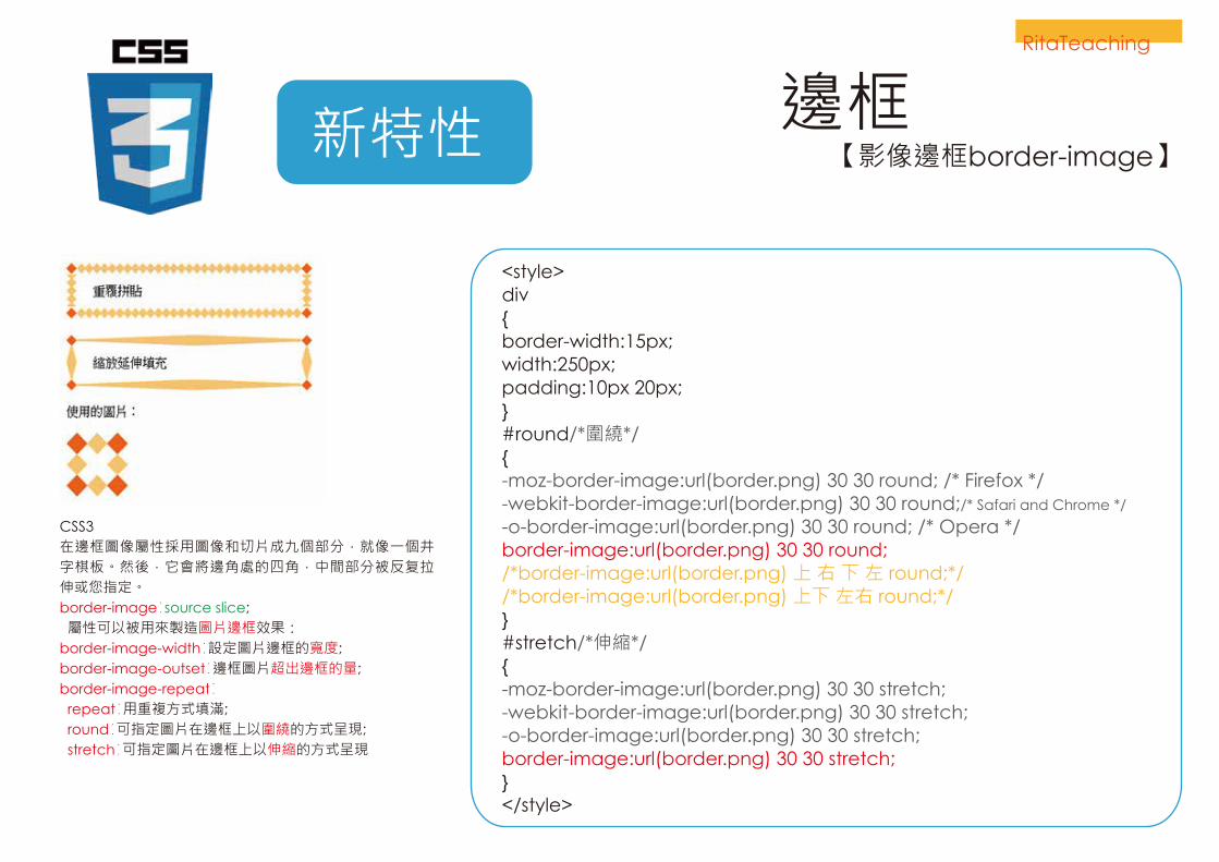
新特性 【影像邊框border-image】
<style> div{border-width:15px;width:250px;padding:10px 20px;}#round/*圍繞*/{-moz-border-image:url(border.png) 30 30 round; /* Firefox */-webkit-border-image:url(border.png) 30 30 round;/* Safari and Chrome */
-o-border-image:url(border.png) 30 30 round; /* Opera */border-image:url(border.png) 30 30 round;/*border-image:url(border.png) 上 右 下 左 round;*//*border-image:url(border.png) 上下 左右 round;*/}#stretch/*伸縮*/{-moz-border-image:url(border.png) 30 30 stretch;-webkit-border-image:url(border.png) 30 30 stretch; -o-border-image:url(border.png) 30 30 stretch; border-image:url(border.png) 30 30 stretch;}</style>
CSS3在邊框圖像屬性採用圖像和切片成九個部分,就像一個井字棋板。然後,它會將邊角處的四角,中間部分被反复拉伸或您指定。border-image∶source slice; 屬性可以被用來製造圖片邊框效果:border-image-width∶設定圖片邊框的寬度;border-image-outset∶邊框圖片超出邊框的量;border-image-repeat∶ repeat∶用重複方式填滿; round∶可指定圖片在邊框上以圍繞的方式呈現; stretch∶可指定圖片在邊框上以伸縮的方式呈現
RitaTeaching
邊框

END.