practical css3: develop and design -...
TRANSCRIPT
Chris Mills
PracticalCSS3
DEVELOPAND DESIGN

Practical CSS3DEVELOP AND DESIGN
Chris Mills

Practical CSS3: Develop and Design
Chris Mills
Peachpit Press
1249 Eighth StreetBerkeley, CA 94710510/524-2178510/524-2221 (fax)
Find us on the Web at: www.peachpit.comTo report errors, please send a note to: [email protected] Press is a division of Pearson Education.Copyright © 2013 by Chris Mills
Acquisitions Editor: Rebecca GulickDevelopment and Copy Editor: Anne Marie WalkerTechnical Reviewers: Peter Gasston, Bruce LawsonProduction Coordinator: Myrna VladicCompositor: David Van NessProofreader: Patricia PaneIndexer: Valerie Haynes-PerryCover Design: Aren Howell StraigerInterior Design: Mimi Heft
Notice of Rights
All rights reserved. No part of this book may be reproduced or transmitted in any form by any means, elec-tronic, mechanical, photocopying, recording, or otherwise, without the prior written permission of the pub-lisher. For information on getting permission for reprints and excerpts, contact [email protected].
Notice of Liability
The information in this book is distributed on an “As Is” basis, without warranty. While every precaution has been taken in the preparation of the book, neither the author nor Peachpit Press shall have any liability to any person or entity with respect to any loss or damage caused or alleged to be caused directly or indirectly by the instructions contained in this book or by the computer software and hardware products described in it.
Trademarks
Many of the designations used by manufacturers and sellers to distinguish their products are claimed as trademarks. Where those designations appear in this book, and Peachpit was aware of a trademark claim, the designations appear as requested by the owner of the trademark. All other product names and services identi-fied throughout this book are used in editorial fashion only and for the benefit of such companies with no intention of infringement of the trademark. No such use, or the use of any trade name, is intended to convey endorsement or other affiliation with this book.
ISBN-13: 978-0-321-82372-4ISBN-10: 0-321-82372-9
9 8 7 6 5 4 3 2 1
Printed and bound in the United States of America
ACKNOWLEDGMENTS III
ACKNOWLEDGMENTS
I’d like to give a shout out to all the spiffing chaps and chapesses of awesomeness and beauty that have helped and inspired me during this time, and driven me to get this book written!
My colleagues and friends at Opera for being almost like a second family, for teaching me so much, for helping me fix my code, and for making web standards fun. ODevRel2012: Andreas, Bruce, Daniel-san, Karl, Luz, Mike, Patrick, Shwetank, Tiffany, Vadim, and Zi Bin. And thanks to all the other talented people who make Opera a great place to work.
My allies in the wider web dev community for giving me much inspiration and smiles, mainly on Twitter: Jake74, Dan Donald, Phil Sherry, Shaun/Leslie Jensen-Inman, Doug Schepers, Jon Hicks, Chris Murphy, and the rest of the Irish posse, Remy Sharp, Anna Debenham, Mark and Emma Boulton, and the rest of the FSS crew, Henny Swan, and the W3C Web Education Community Group—phew. If I forgot your name on this list, please abuse me on Twitter: @chrisdavidmills.
Peter Gasston for an awesome tech review job on this book. I owe you mate.Anne Marie Walker, Rebecca Gulick, and the rest of the Peachpit crew for kick-
ing my ass into delivering this thing and helping to shape it.Conquest of Steel (Vic/DD/Dan/Claymore) for being almost like a third family,
or maybe more like having four whinging girlfriends. Cheers guys for the 15 years and counting of heavy metal. \m/
My friends in other far-flung places for always giving me love and support, even if they didn’t understand this interweb thing.
My parents for “bringing me up proper.” I love you both very dearly.And most of all I’d like to give thanks and love to Kirsty, Gabriel, Elva, and Freida
for putting up with me for four months while ignoring them to write this book, and for being the main reason I get out of bed in the morning.
IV PRACTICAL CSS3
Online Resources . . . . . . . . . . . . . . . . . . . . . . . . . . . . . . . . . . . . . . . . . . . . . . . . . . . . . vii
Welcome to CSS3 . . . . . . . . . . . . . . . . . . . . . . . . . . . . . . . . . . . . . . . . . . . . . . . . . . . . viii
CHAPTER 1 INTRODUCTION TO CSS3 AND MODERN WEB DESIGN . . . . . . . . 2
Why CSS3? . . . . . . . . . . . . . . . . . . . . . . . . . . . . . . . . . . . . . . . . . . . . . . . . . . . . . . . . . . . . 4
Modern Web Design Philosophy . . . . . . . . . . . . . . . . . . . . . . . . . . . . . . . . . . . . . . 6
Thought Process for Content . . . . . . . . . . . . . . . . . . . . . . . . . . . . . . . . . . . . . . . . 10
CSS3 Modules in This Book . . . . . . . . . . . . . . . . . . . . . . . . . . . . . . . . . . . . . . . . . . 12
General CSS3 Features . . . . . . . . . . . . . . . . . . . . . . . . . . . . . . . . . . . . . . . . . . . . . . . 14
Wrapping Up . . . . . . . . . . . . . . . . . . . . . . . . . . . . . . . . . . . . . . . . . . . . . . . . . . . . . . . . . 35
CHAPTER 2 BUILDING A SOLID CROSS-BROWSER TEMPLATE
WITH HTML5 AND JAVASCRIPT . . . . . . . . . . . . . . . . . . . . . . . . . . . . . . . 36
Starting with Semantic HTML5 . . . . . . . . . . . . . . . . . . . . . . . . . . . . . . . . . . . . . . 38
Building a Template . . . . . . . . . . . . . . . . . . . . . . . . . . . . . . . . . . . . . . . . . . . . . . . . . . 41
Validating HTML5 . . . . . . . . . . . . . . . . . . . . . . . . . . . . . . . . . . . . . . . . . . . . . . . . . . . . 47
Exploring HTML5 Elements . . . . . . . . . . . . . . . . . . . . . . . . . . . . . . . . . . . . . . . . . 48
CSS Resets and normalize.css . . . . . . . . . . . . . . . . . . . . . . . . . . . . . . . . . . . . . . . 64
JavaScript Library Roundup . . . . . . . . . . . . . . . . . . . . . . . . . . . . . . . . . . . . . . . . . . 65
IE Conditional Comments . . . . . . . . . . . . . . . . . . . . . . . . . . . . . . . . . . . . . . . . . . . 68
Wrapping Up . . . . . . . . . . . . . . . . . . . . . . . . . . . . . . . . . . . . . . . . . . . . . . . . . . . . . . . . . 69
CHAPTER 3 SPICING UP YOUR FONTS AND TEXT . . . . . . . . . . . . . . . . . . . . . . . . . 70
Up the Pythons! . . . . . . . . . . . . . . . . . . . . . . . . . . . . . . . . . . . . . . . . . . . . . . . . . . . . . . 72
Using Web Fonts . . . . . . . . . . . . . . . . . . . . . . . . . . . . . . . . . . . . . . . . . . . . . . . . . . . . . 73
CSS3 Text Wrangling . . . . . . . . . . . . . . . . . . . . . . . . . . . . . . . . . . . . . . . . . . . . . . . . . 87
CSS3 Typography . . . . . . . . . . . . . . . . . . . . . . . . . . . . . . . . . . . . . . . . . . . . . . . . . . . . 94
Wrapping Up . . . . . . . . . . . . . . . . . . . . . . . . . . . . . . . . . . . . . . . . . . . . . . . . . . . . . . . . 105
CONTENTS
CONTENTS V
CHAPTER 4 ENHANCING BOXES WITH CSS3 BLING . . . . . . . . . . . . . . . . . . . . . . 106
A Bright Future with CSS3 Bling . . . . . . . . . . . . . . . . . . . . . . . . . . . . . . . . . . . . 108
border-radius: God Bless Those Rounded Corners . . . . . . . . . . . . . . . . . 110
Adding Depth with box-shadow . . . . . . . . . . . . . . . . . . . . . . . . . . . . . . . . . . . . 114
Bring the Bling with CSS Gradients . . . . . . . . . . . . . . . . . . . . . . . . . . . . . . . . . 118
Multiple Backgrounds . . . . . . . . . . . . . . . . . . . . . . . . . . . . . . . . . . . . . . . . . . . . . . . 132
Box Clever: border-image . . . . . . . . . . . . . . . . . . . . . . . . . . . . . . . . . . . . . . . . . . . 136
box-decoration-break . . . . . . . . . . . . . . . . . . . . . . . . . . . . . . . . . . . . . . . . . . . . . . . 141
Adding Bling to a Banner Ad . . . . . . . . . . . . . . . . . . . . . . . . . . . . . . . . . . . . . . . . 142
Wrapping Up . . . . . . . . . . . . . . . . . . . . . . . . . . . . . . . . . . . . . . . . . . . . . . . . . . . . . . . . 147
CHAPTER 5 ANIMATED EFFECTS USING CSS3 . . . . . . . . . . . . . . . . . . . . . . . . . . . . 148
Bringing Animation to CSS . . . . . . . . . . . . . . . . . . . . . . . . . . . . . . . . . . . . . . . . . 150
Transforms . . . . . . . . . . . . . . . . . . . . . . . . . . . . . . . . . . . . . . . . . . . . . . . . . . . . . . . . . . 151
Transitions . . . . . . . . . . . . . . . . . . . . . . . . . . . . . . . . . . . . . . . . . . . . . . . . . . . . . . . . . . 179
Animations . . . . . . . . . . . . . . . . . . . . . . . . . . . . . . . . . . . . . . . . . . . . . . . . . . . . . . . . . . 189
Enhancing a Banner Ad with Animations . . . . . . . . . . . . . . . . . . . . . . . . . . 199
Providing Alternatives with Modernizr . . . . . . . . . . . . . . . . . . . . . . . . . . . . 204
Wrapping Up . . . . . . . . . . . . . . . . . . . . . . . . . . . . . . . . . . . . . . . . . . . . . . . . . . . . . . . . 217
CHAPTER 6 USING CSS TO IMPLEMENT ICONS . . . . . . . . . . . . . . . . . . . . . . . . . . 218
Icons Rock! . . . . . . . . . . . . . . . . . . . . . . . . . . . . . . . . . . . . . . . . . . . . . . . . . . . . . . . . . . 220
Using Icons on Websites . . . . . . . . . . . . . . . . . . . . . . . . . . . . . . . . . . . . . . . . . . . . 221
When to Use Icons . . . . . . . . . . . . . . . . . . . . . . . . . . . . . . . . . . . . . . . . . . . . . . . . . . 222
The Basics of Icon Implementation . . . . . . . . . . . . . . . . . . . . . . . . . . . . . . . . 224
Web Fonts as Icons . . . . . . . . . . . . . . . . . . . . . . . . . . . . . . . . . . . . . . . . . . . . . . . . . . 231
Pure CSS Icons: Peculiar? . . . . . . . . . . . . . . . . . . . . . . . . . . . . . . . . . . . . . . . . . . . 235
Wrapping Up . . . . . . . . . . . . . . . . . . . . . . . . . . . . . . . . . . . . . . . . . . . . . . . . . . . . . . . . 239
VI PRACTICAL CSS3
CHAPTER 7 CSS3 LAYOUT CHOPS . . . . . . . . . . . . . . . . . . . . . . . . . . . . . . . . . . . . . . . . 240
CSS3 Layout Modules in Brief . . . . . . . . . . . . . . . . . . . . . . . . . . . . . . . . . . . . . . 242
Multi-col Layouts . . . . . . . . . . . . . . . . . . . . . . . . . . . . . . . . . . . . . . . . . . . . . . . . . . . 244
Using Flexbox . . . . . . . . . . . . . . . . . . . . . . . . . . . . . . . . . . . . . . . . . . . . . . . . . . . . . . . 255
Exploring Grids . . . . . . . . . . . . . . . . . . . . . . . . . . . . . . . . . . . . . . . . . . . . . . . . . . . . . 269
Other Layout Modules Worthy of Mention . . . . . . . . . . . . . . . . . . . . . . . . . 275
Wrapping Up . . . . . . . . . . . . . . . . . . . . . . . . . . . . . . . . . . . . . . . . . . . . . . . . . . . . . . . . 281
CHAPTER 8 RESPONSIVE AND ADAPTIVE DESIGN . . . . . . . . . . . . . . . . . . . . . . . 282
A Brief History of Web Browsers . . . . . . . . . . . . . . . . . . . . . . . . . . . . . . . . . . . 284
Responsive Design Strategies . . . . . . . . . . . . . . . . . . . . . . . . . . . . . . . . . . . . . . . 286
Flexible Layout Techniques . . . . . . . . . . . . . . . . . . . . . . . . . . . . . . . . . . . . . . . . . 292
Media Queries . . . . . . . . . . . . . . . . . . . . . . . . . . . . . . . . . . . . . . . . . . . . . . . . . . . . . . . 297
Media Query Polyfills . . . . . . . . . . . . . . . . . . . . . . . . . . . . . . . . . . . . . . . . . . . . . . . 307
Serving Images Responsively . . . . . . . . . . . . . . . . . . . . . . . . . . . . . . . . . . . . . . . 308
Mobile Browsers Lie! . . . . . . . . . . . . . . . . . . . . . . . . . . . . . . . . . . . . . . . . . . . . . . . . . 311
High-fidelity Devices . . . . . . . . . . . . . . . . . . . . . . . . . . . . . . . . . . . . . . . . . . . . . . . 316
A Responsive Heavy Metal Banner Ad! . . . . . . . . . . . . . . . . . . . . . . . . . . . . . 318
Wrapping Up . . . . . . . . . . . . . . . . . . . . . . . . . . . . . . . . . . . . . . . . . . . . . . . . . . . . . . . . 320
Index . . . . . . . . . . . . . . . . . . . . . . . . . . . . . . . . . . . . . . . . . . . . . . . . . . . . . . . . . . . . . . . . 321
BONUS CHAPTER
CHAPTER 9 STYLING HTML5 MEDIA AND FORMS . . . . . . . . . . . . . . . . . . . . . . . . A-2
Customizing <video> and <audio> . . . . . . . . . . . . . . . . . . . . . . . . . . . . . . . . . A-4
Form Improvements . . . . . . . . . . . . . . . . . . . . . . . . . . . . . . . . . . . . . . . . . . . . . . . A-12
Wrapping Up . . . . . . . . . . . . . . . . . . . . . . . . . . . . . . . . . . . . . . . . . . . . . . . . . . . . . . . A-15
ONLINE RESOURCES VII
Throughout this book I use several third-party, online resources that include scripts and stylesheets, and I present and reference many examples that I wrote to illustrate the concepts in this book. The third-party resources are referenced where appro-priate, so you’ll be able to find them when needed. To find my examples is even easier: You can download them all at http://peachpit.com/practicalcss3.
But that’s not all! Also available at http://peachpit.com/practicalcss3 are the following:
� A bonus chapter. In Chapter 9, “Styling HTML5 Media and Forms,” I discuss building custom-styled controls for your HTML5 <video> and <audio> ele-ments, and styling form elements using the form-related pseudo-classes in CSS3.
� A cheat sheet. This reference document details the syntax of all the new CSS3 features I use in this book and how they are supported in browsers. Print it out and hang it on your wall as an at-a-glance guide! I’ll update this reference as the data changes.
Both are courtesy of your very generous author.
ONLINE RESOURCES
VIII PRACTICAL CSS3
WELCOME TO CSS3
CSS3 provides you with exciting new tools for your web development toolbox, allowing
you to accomplish many styling tasks in a much easier, more flexible, and less hackish
manner than you’ve been used to when working with CSS2. The following chapters will
introduce you to the most useful, new CSS3 features and show you how to use them in real
HTML AND CSS
BASIC KNOWLEDGE
This book assumes you
are well versed in basic
HTML(4) and CSS(2)
features and techniques.
But just in case you need
to look up any of the
basics, keep some decent
reference material to
hand. A wealth of excel-
lent tutorials is available
on the W3C Web Educa-
tion Community Wiki at
www.w3.org/community/
webed/wiki/Main_Page.
THE LATEST,
GREATEST BROWSERS
Be sure to install the
latest versions of desktop
Opera, Firefox, Chrome,
Safari, and Internet
Explorer (IE). Ideally, you
should have a testing
environment available
for all modern browsers;
have as many to hand as
you can.
OLDER, LESS-CAPABLE
BROWSERS
Have older, less-capable
browsers available for
testing fallbacks, polyfills,
and graceful degrada-
tion. Run older versions
of IE on multiple virtual
machines (VirtualBox is
an acceptable, free option
at www.virtualbox.org).
Camino is a good option
for a test Mac-based
browser that doesn’t
support most of the new
CSS3/HTML5 features.

ALTERNATIVE
BROWSING DEVICES
To test sites on different
screen sizes, resolutions,
and control mechanisms,
have at least one or two
alternative browsing
devices. Mobile phones
and tablets are essential
fodder. A web-enabled TV
would also be fun!
DEBUGGING
ENVIRONMENTS
When it comes to choos-
ing debugging environ-
ments, you have so many
choices! Dragonfly on
Opera, Firebug on Firefox;
hell, every browser tends
to come with a respect-
able debugging environ-
ment these days. Be sure
to become familiar with
as many as possible
so you’ll have the best
chance at tracking down
irksome bugs.
A DECENT TEXT
EDITOR
A good text editor is
all you need to write
CSS and HTML. Coda on
the Mac is awesome
(http://panic.com/coda),
but it’s not free. Good
free alternatives are
Notepad++ for Windows,
Text Wrangler for Mac,
and Bluefish for Linux.
WYSIWYG environments
are not recommended,
especially for learning. I’m
a big fan of Jared Spool’s
quip about them being
more like “WYSI . . . WTF”!
projects today, as well as provide alternatives and fallbacks for less-capable
browsers. Before you start this book, make sure you have the following pre-
requisites. Now that you have all of the tools you need laid out in front of you,
you’re ready to go and make beautiful CSS3 music. Let’s get going.

4
ENHANCING BOXESWITH CSS3 BLING
107
One of the overriding general prob-
lems that CSS3 works toward solving
is reducing the number of images (and the inflexibility of
those images) you are called upon to use to prettify your
websites. This chapter groups together all such CSS3 features
(like box shadows, gradients, and border images) that have strong
browser support under the moniker “bling boxes.”
In this chapter you’ll learn new ways to (tastefully) add graphical
effects to your sites programmatically without having to use mil-
lions of background images. You’ll start by looking at some basic
isolated examples and then advance to more involved implementa-
tions. So put on your sequined disco clothes, jangle your change,
and prepare to strut your funky stuff.

108 CHAPTER 4 ENHANCING BOXES WITH CSS3 BLING
A BRIGHT FUTURE
WITH CSS3 BLING
Most of you will have a good idea of the kinds of CSS3 features I’m referring to by bling boxes: Drop shadows, rounded corners, linear and radial gradients, and alpha transparency are exemplary examples. Also, a number of properties still require the use of images but allow you to use them in a more flexible way!
The advantages of such features should be obvious, but just in case, let’s briefly review them before moving on:
� Less downloading. Programmatically creating bling effects allows you to decrease the number of images you need for your designs and therefore the number of HTTP requests and download sizes involved.
� Easier maintenance of graphical effects. You can now vary colors, dimen-sions, and so on by just changing some CSS syntax rather than having to open Photoshop and manually alter image files.
� Less spaghetti code. Back in the day, so-called “bulletproof CSS” solutions typically involved multiple images and multiple nested <div>s—a double disappointment of extra complexity of design time and unsemantic cruft code. If you wanted to create bulletproof rounded corners on a content box to allow it to flex horizontally and vertically, you’d need three extra nested <div>s for holding all the necessary images. If you had only one container available, you’d have to settle for an inflexible, one-size box, which was usually rendered useless when content changed. CSS3 features, such as rounded corners and multiple background images, change all this.
� Fewer Photoshop ninja skills required. Creating such bling effects in code is a lot easier and more intuitive for non-Photoshop experts.
Of course, the main disadvantages at this time are that some of these CSS3 fea-tures are not supported in older browsers (usually meaning Internet Explorer 6–8), and they are often used with vendor prefixes. Table 4.1 gives you an at-a-glance reference of browser support for the properties covered in this chapter.

A B
RIG
HT
FU
TU
RE
WIT
HC
SS
3 B
LING
109
TABLE 4.1 Browser Support Matrix for CSS3 “Bling Box” Features
BROWSERRGBA/HSLA
Border-radius
Box-shadow
Multiplebackgrounds Gradients
Background-size
Border-image
Background-clip
Box-decoration-break
Opera version 10.5 version 10.5 version 10.5 version 10.5 11.6 with -o- version 10.5 11 with -o- version 10.5 version 10.5
Firefox version 3 3 with -moz-, 4
prefixless
3.5 with -moz-,
4 prefixless
version 3.6 3.6 with
-moz-
version 4 3.5 with
-moz-
version 4 Exact details
unknown
Safari version 3.1 3.1 with -webkit-,
5 prefixless
3.1 with -web-
kit-, 5 prefixless
version 3.1 5.1 with
-webkit-
version 5 3.1 with
-webkit-
version 5 Exact details
unknown
Chrome version 4 4 with -webkit-,
5 prefixless
4 with -webkit-,
10 prefixless
version 4 10 with
-webkit-
version 4 15 with
-webkit-
version 4 Exact details
unknown
Internet
Explorer
version 9 version 9 version 9 version 9 10 with
-ms- *
version 9 10 with
-ms-
version 9 Exact details
unknown
iOS version 3.2 version 4 3.2 with -web-
kit-, 5 prefixless
version 3.2 5.0 with
-webkit-
version 5 3.2 with
-webkit-
version 5 Exact details
unknown
Android version 2.1 2.1 with -webkit-,
2.2 prefixless
2.1 with
-webkit-
version 2.1 4 with
-webkit-
version 2.1 2.3 with
-webkit-
version 2.1 Exact details
unknown
Opera
Mobile
version 10 version 11 version 11 version 10 11.5 with -o- version 10 11 with -o- version 10 Exact details
unknown
Opera Mini version 5 no no version 5 no version 5.0 no version 5 Exact details
unknown
*IE10 platform preview 6 saw support without the prefix

110 CHAPTER 4 ENHANCING BOXES WITH CSS3 BLING
Rounded corners are vital for street cred, critical for keeping with the Web 2.0 cool school, and essential if you want to impress your significant other.
These elements are such a commonly requested design feature that the spec writers added the border-radius property to the Borders and Backgrounds module (www.w3.org/TR/css3-background). The syntax is very simple to use (see border-radius-examples.html in the code download for many examples). You can specify a single value for the radius size of all the rounded corners. For example:
border-radius: 10px;
You can use pixels or any other CSS unit that makes sense. The preceding line of code results in corners like those in Figure 4.1.
FIGURE 4.1 A simple container
with equally rounded corners.
BORDER-RADIUS: GOD BLESS
THOSE ROUNDED CORNERS

BORDER-RADIUS: GOD BLESS THOSE ROUNDED CORNERS 111
As you’d logically expect, you can also specify two, three, or four values. For example:
� border-radius: 0px 0px 20px 20px; These relate to top-left, top-right, bottom-right, and bottom-left values, respectively.
� border-radius: 0px 10px 20px; These relate to the top-left value, top-right and bottom-left, and bottom-right values, respectively.
� border-radius: 10px 20px; These relate to the top-left and bottom-right, and top-right and bottom-left values, respectively.
� A couple of examples are shown in Figure 4.2.
Using border-radius, you can also specify two sets of values separated by a forward slash to indicate separate horizontal and vertical corner radii. For example, the following line sets every horizontal radius to 10px and every vertical radius to 20px (Figure 4.3):
border-radius: 10px/20px;
FIGURE 4.2 The container on the left has four values set; the one on the
right has two values set. I’ve not included a three-value example, because
I find it a bit pointless.
FIGURE 4.3 Setting different
horizontal and vertical radii on
a container.

112 CHAPTER 4 ENHANCING BOXES WITH CSS3 BLING
The x and y values can follow the same rules as the single set of values you saw in the first couple of examples. You can set a different value for each radius, like this:
border-radius: 5px 10px 15px 30px/30px 15px 10px 5px;
Or, you can set separate values for the horizontal radii and one value for all four vertical radii:
border-radius: 10px 20px 30px 40px/30px;
These examples produce the results shown in Figure 4.4.
ADDING SUPPORT FOR OLDER BROWSERS: CSS3PIE!
All modern browsers support rounded corners, but older versions of IE, of course, don’t. So what can you do here? The simple answer in this case is to use CSS3PIE, which you first looked at in Chapter 2. You can download CSS3PIE from http://css3pie.com. Unzip the file and save PIE.htc to your working directory.
Next, you need to apply the following property line to all elements in your CSS that use properties you want to add support for:
behavior: url(path/to/PIE.htc);
FIGURE 4.4 Specifying the
horizontal and vertical radii
separately.

BORDER-RADIUS: GOD BLESS THOSE ROUNDED CORNERS 113
The easiest way to do this for the border-radius-examples.html file was to just apply this line to all <div>s, which works well even though the actual border-radius properties are applied via different classes on the different <div>s:
div {
...
behavior: url(PIE.htc);
}
The path you specify to the PIE.htc file must be relative to the HTML file the CSS is applied to, not the CSS, if you are using an external CSS file. This sounds very odd, but it is due to the way HTC file works: It alters the behavior of the CSS after it is applied to the HTML!
The other major part of using the CSS3PIE technique comes when you use it to add support for gradients. To do so, you need to add a special -pie- prefixed version of the property. For example:
-pie-background: linear-gradient(rgba(0,0,0,0), rgba(0,0,0,0.2));
You’ll notice that when using the -pie- prefix on a gradient, the prefix is put on background, not linear-gradient, which is where the vendor prefixes would go.
There is an added complication: the limitation of CSS3PIE’s RGBA support. You see, CSS3PIE will add support, but it won’t render the alpha bit. Instead, it will drop the alpha channel and render the equivalent RGB color. This is certainly better than nothing and is probably not disastrous in many situations, but it could also cause content to be rendered unreadable or just look shocking, especially if you’re relying on a color with a low alpha value to just add a faint shadow or tint to a container on your page. To remedy this problem, it is a good idea to change the -pie- prefixed version of the property to a sensible fallback color or even remove
it in some situations:
-pie-background: linear-gradient(#ff0000,#A60000);
NOTE: I tried applying the PIE behavior property to all elements on a
complex site using * { behavior: url(PIE.htc); }, but it resulted
in some very weird behavior, so it’s best not to try this strategy.
The * selector is expensive to render anyway, at the best of times.
114 CHAPTER 4 ENHANCING BOXES WITH CSS3 BLING
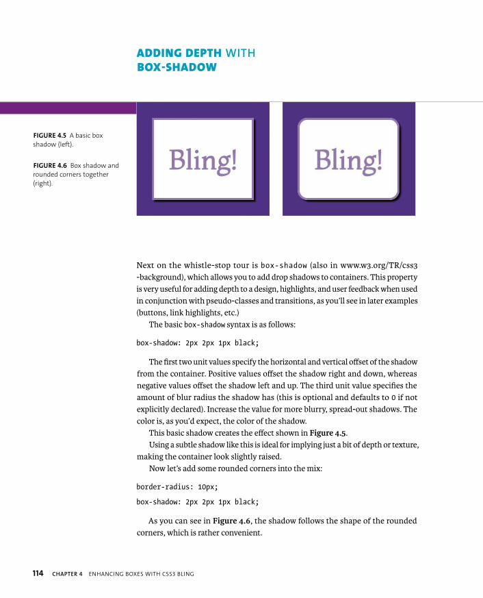
Next on the whistle-stop tour is box-shadow (also in www.w3.org/TR/css3-background), which allows you to add drop shadows to containers. This property is very useful for adding depth to a design, highlights, and user feedback when used in conjunction with pseudo-classes and transitions, as you’ll see in later examples (buttons, link highlights, etc.)
The basic box-shadow syntax is as follows:
box-shadow: 2px 2px 1px black;
The first two unit values specify the horizontal and vertical offset of the shadow from the container. Positive values offset the shadow right and down, whereas negative values offset the shadow left and up. The third unit value specifies the amount of blur radius the shadow has (this is optional and defaults to 0 if not explicitly declared). Increase the value for more blurry, spread-out shadows. The color is, as you’d expect, the color of the shadow.
This basic shadow creates the effect shown in Figure 4.5.Using a subtle shadow like this is ideal for implying just a bit of depth or texture,
making the container look slightly raised.Now let’s add some rounded corners into the mix:
border-radius: 10px;
box-shadow: 2px 2px 1px black;
As you can see in Figure 4.6, the shadow follows the shape of the rounded corners, which is rather convenient.
ADDING DEPTH WITH BOX-SHADOW
FIGURE 4.5 A basic box
shadow (left).
FIGURE 4.6 Box shadow and
rounded corners together
(right).
ADDING DEPTH WITH BOX-SHADOW 115
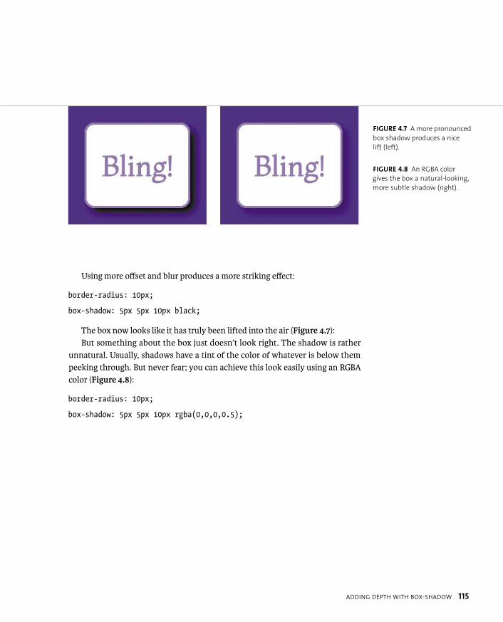
Using more offset and blur produces a more striking effect:
border-radius: 10px;
box-shadow: 5px 5px 10px black;
The box now looks like it has truly been lifted into the air (Figure 4.7):But something about the box just doesn’t look right. The shadow is rather
unnatural. Usually, shadows have a tint of the color of whatever is below them peeking through. But never fear; you can achieve this look easily using an RGBA color (Figure 4.8):
border-radius: 10px;
box-shadow: 5px 5px 10px rgba(0,0,0,0.5);
FIGURE 4.7 A more pronounced
box shadow produces a nice
lift (left).
FIGURE 4.8 An RGBA color
gives the box a natural-looking,
more subtle shadow (right).

116 CHAPTER 4 ENHANCING BOXES WITH CSS3 BLING
You next need to know that you can include multiple box shadows on a single container. You just write the different shadows you want one after another, delim-ited by commas:
border-radius: 10px;
box-shadow: 2px 2px 5px rgba(0,0,0,0.5),
10px 10px 15px rgba(0,0,0,0.5),
-1px -1px 30px rgba(0,0,0,0.2);
This trio creates some immediate depth, plus the suggestion of multiple light sources (the very faint shadow is offset left and up using negative values) (Figure 4.9).
Now let’s look at inner box shadows. You can make any box shadow an inner box shadow by adding the inset keyword at the start. For example:
border-radius: 10px;
box-shadow: 2px 2px 5px rgba(0,0,0,0.5),
inset 5px 5px 8px rgba(0,0,0,0.5);
Figure 4.10 shows the result. This technique is useful for creating nice “button being pushed in” type thingamajigs (technical term).
FIGURE 4.9 Multiple box
shadows in action. (left)
FIGURE 4.10 An inner, or inset,
box shadow. (right)

ADDING DEPTH WITH BOX-SHADOW 117
Finally, let’s look at one more possible unit value you could include: spread. I’m not talking about middle-aged spread or marmalade but the fact that you can add a fourth unit value to specify an amount that the shadow size will increase by in all directions. It’s like “padding” for shadows. For example:
border-radius: 10px;
box-shadow: 5px 5px 10px 10px rgba(0,0,0,0.5);
See the effect in Figure 4.11. I’ve never found a use for adding a spread value, but you probably will.
ADDING BOX SHADOW SUPPORT TO OL’ IE
Adding CSS3PIE into the mix, as you did earlier, also adds box-shadow support for older versions of IE. But remember CSS3PIE’s limited support for RGBA: It is often better to provide an alternative style with a nontransparent color that might be more effective. You could provide this in a conditional-commented stylesheet.
NOTE: Use box shadows responsibly! Used subtly they can produce a great effect
and lift a design. However, if you use them a lot on the same site and on large
containers, they can make the site look cluttered and horrible. They can also
cause a significant performance impact, especially if you combine them with
animations. They are expensive to render in terms of processing power required.
FIGURE 4.11 A box shadow
with a spread value.
118 CHAPTER 4 ENHANCING BOXES WITH CSS3 BLING
Gradients are one of the most hotly anticipated features to become native to CSS. Gradients are vital for design in general to reproduce the effects of light falling on curved/shiny surfaces and create interesting patterns. The number of developers who use them in web design is staggering, if not unsurprising. What is a surprise is that until CSS3 came along, web developers never had the ability to create gra-dients programmatically in any sane way that would work across browsers. SVG had gradients for a long time before that, but IE never supported SVG until IE9.
All this time you’ve been stuck with either faking SVG in IE using a Polyfill solution like SVGWeb or using repeated background images for those gradients or repeating patterns you desired. This last technique works OK-ish but is an inflex-ible pain and can become cumbersome very quickly, especially if your boss keeps changing his mind about the gradient colors (more playing with Photoshop; oh goody) or if you are trying to create any kind of complicated layered effect.
Again, CSS3 comes to the rescue with linear and radial gradients, which are defined in the CSS Image Values and Replaced Content module (http://dev.w3.org/csswg/css3-images). To see how flexible CSS gradients are, just have a good play with the examples in this section.
Let’s review the two different gradient types separately.
LINEAR GRADIENTS
Linear gradients are the simpler of the two types; these are smooth color progres-sions that start at one side or corner of an area and cycle smoothly between two or more color stops, ending at the other side or corner.
In CSS they work the same. CSS gradients are basically a special kind of back-ground image. You can set them in place of an image in most places that it would make sense to do so; for example, background-image and border-image (see the
“Box Clever: border-image” section later in this chapter for more on border images).
BRING THE BLING WITH CSS GRADIENTS
BRING THE BLING WITH CSS GRADIENTS 119
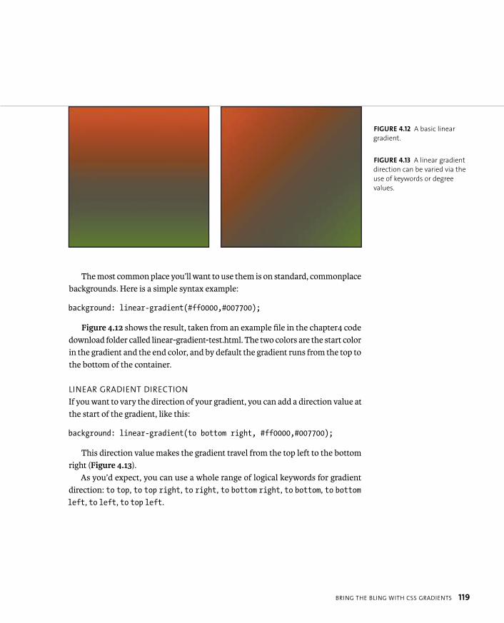
The most common place you’ll want to use them is on standard, commonplace backgrounds. Here is a simple syntax example:
background: linear-gradient(#ff0000,#007700);
Figure 4.12 shows the result, taken from an example file in the chapter4 code download folder called linear-gradient-test.html. The two colors are the start color in the gradient and the end color, and by default the gradient runs from the top to the bottom of the container.
LINEAR GRADIENT DIRECTION
If you want to vary the direction of your gradient, you can add a direction value at the start of the gradient, like this:
background: linear-gradient(to bottom right, #ff0000,#007700);
This direction value makes the gradient travel from the top left to the bottom right (Figure 4.13).
As you’d expect, you can use a whole range of logical keywords for gradient direction: to top, to top right, to right, to bottom right, to bottom, to bottomleft, to left, to top left.
FIGURE 4.12 A basic linear
gradient.
FIGURE 4.13 A linear gradient
direction can be varied via the
use of keywords or degree
values.
120 CHAPTER 4 ENHANCING BOXES WITH CSS3 BLING
You can also specify the direction you want the gradient to travel in using an angle. Zero degrees (0deg) is the equivalent of to right; as you increase the angle, it travels around counterclockwise. So the subsequent equivalents would be 90deg
= to top, 180deg = to left, 270deg = to bottom. Bear in mind that 135deg will not be the equivalent of to top left (as you might expect) unless the container is a perfect square: The diagonal keywords will change the angle so the gradient will always run from one corner to the other. As a result, you can choose keywords or angles, depending on the effect you want to create.
Note: The spec states that 0deg is the equivalent of the keywords to top, but browsers don’t follow this currently. This could change in the future.
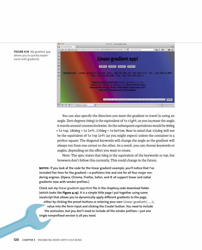
FIGURE 4.14 My gradient app
allows you to quickly experi-
ment with gradients.
NOTES: If you look at the code for the linear gradient example, you’ll notice that I’ve
included five lines for the gradient—a prefixless line and one for all four major ren-
dering engines. (Opera, Chrome, Firefox, Safari, and IE all support linear and radial
gradients now with vendor prefixes.)
Check out my linear-gradient-app.html file in the chapter4 code download folder
(which looks like Figure 4.14). It is a simple little page I put together using some
JavaScript that allows you to dynamically apply different gradients to the page,
either by clicking the preset buttons or entering your own linear-gradient(...);
value into the form input and clicking the Create! button. You need to include
the semicolon, but you don’t need to include all the vendor prefixes—just one
single nonprefixed version is all you need.

BRING THE BLING WITH CSS GRADIENTS 121
LINEAR GRADIENT COLOR STOPS
You can also add multiple color stops between the start and the end point by put-ting them between the start and end color stops, like this:
background: linear-gradient(to right,#ff0000,#0000ff 40%, p #000000 70%,#007700);
The result is shown in Figure 4.15.The unit values specify the distance away from the start of the gradient. Note
that the percentage values are optional: If you don’t specify them, the color stops will be evenly spaced along the gradient.
Instead of percentages, you can use any units you like that would make sense in the circumstances. By default, the first and last values are at 0% and 100%, but you can alter their positions too. For example:
background: linear-gradient(#ff0000 66px, #ffffff 67px, p #ffffff 133px, #00ff00 134px);
This effect creates three solid color bands from left to right (Figure 4.16). The green color stop is set at 66px down from the top, and everything before it adopts the same color. The red color stop is set at 134px, and everything after it adopts the same color. I also inserted two white color stops in the middle to force the middle band to be completely white. This technique is very useful, especially if you want to start creating more intricate and interesting repeating background patterns, as you’ll read about later in the “Multiple Backgrounds” section.
FIGURE 4.15 A gradient with
multiple color stops.
FIGURE 4.16 Italiano, pasta,
meatballs, Roma Roma (well,
not quite).

122 CHAPTER 4 ENHANCING BOXES WITH CSS3 BLING
You can even use negative unit values if for some reason you want the linear gradient to start or end outside the container. (You might want to change the gradi-ent on hover. Unfortunately, you can’t smoothly animate a gradient, at least not at the time of this writing. Believe me, I’ve tried.)
Again, I’ll extol the awesomeness of transparent colors by providing a very simple gradient with a vital difference (Figure 4.17):
background: linear-gradient(to top right, p rgba(0,0,0,0.6),rgba(0,0,0,0));
background-color: #ff0000;
Here the gradient is a transparency gradient overlaid onto a solid background color to create the different gradient colors. This is a very powerful technique because it means you can control the look of an entire site section just by varying the background color. It’s perfect if you want to vary the look of different pages on a site with minimum effort. Try it!
FIGURE 4.17 RGBA colors
provide great control over
gradients while blending them
into their surroundings.
TIP: It’s a good idea to always include a suitable background color in
a separate property alongside your gradient, even if the gradient is not
transparent. It acts as a good fallback mechanism for a browser that doesn’t
support CSS gradients, ensuring that content is still readable.
BRING THE BLING WITH CSS GRADIENTS 123
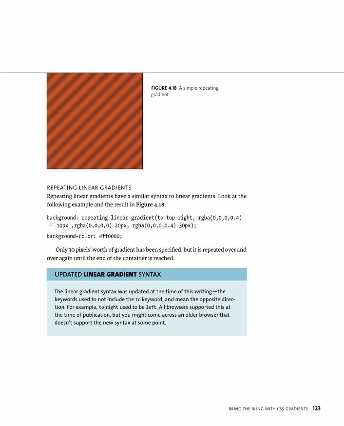
REPEATING LINEAR GRADIENTS
Repeating linear gradients have a similar syntax to linear gradients. Look at the following example and the result in Figure 4.18:
background: repeating-linear-gradient(to top right, rgba(0,0,0,0.4) p 10px ,rgba(0,0,0,0) 20px, rgba(0,0,0,0.4) 30px);
background-color: #ff0000;
Only 30 pixels’ worth of gradient has been specified, but it is repeated over and over again until the end of the container is reached.
UPDATED LINEAR GRADIENT SYNTAX
The linear gradient syntax was updated at the time of this writing—the
keywords used to not include the to keyword, and mean the opposite direc-
tion. For example, to right used to be left. All browsers supported this at
the time of publication, but you might come across an older browser that
doesn’t support the new syntax at some point.
FIGURE 4.18 A simple repeating
gradient.
124 CHAPTER 4 ENHANCING BOXES WITH CSS3 BLING
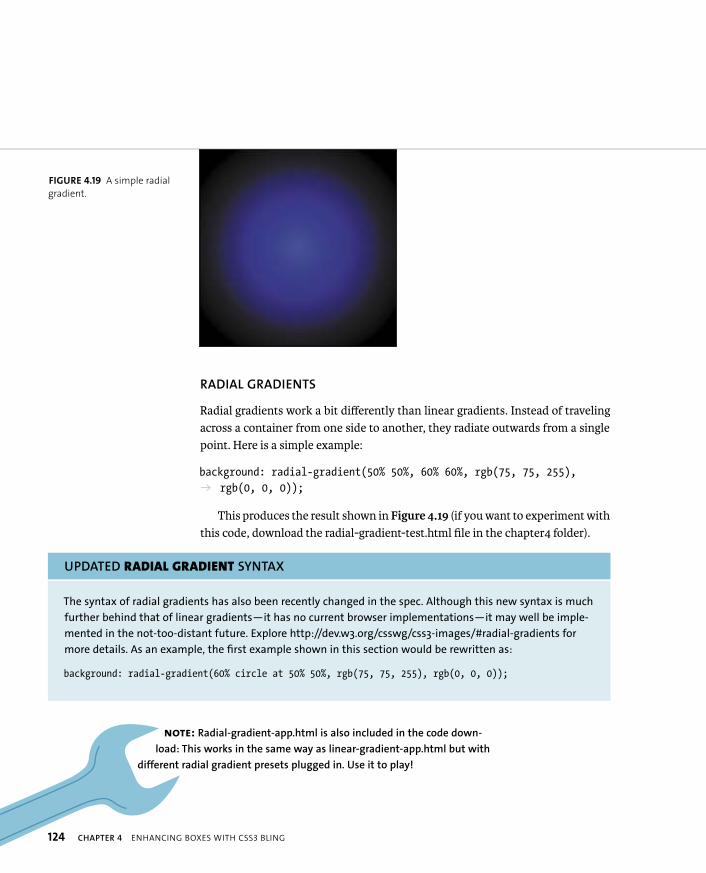
RADIAL GRADIENTS
Radial gradients work a bit differently than linear gradients. Instead of traveling across a container from one side to another, they radiate outwards from a single point. Here is a simple example:
background: radial-gradient(50% 50%, 60% 60%, rgb(75, 75, 255), p rgb(0, 0, 0));
This produces the result shown in Figure 4.19 (if you want to experiment with this code, download the radial-gradient-test.html file in the chapter4 folder).
UPDATED RADIAL GRADIENT SYNTAX
The syntax of radial gradients has also been recently changed in the spec. Although this new syntax is much
further behind that of linear gradients—it has no current browser implementations—it may well be imple-
mented in the not-too-distant future. Explore http://dev.w3.org/csswg/css3-images/#radial-gradients for
more details. As an example, the first example shown in this section would be rewritten as:
background: radial-gradient(60% circle at 50% 50%, rgb(75, 75, 255), rgb(0, 0, 0));
FIGURE 4.19 A simple radial
gradient.
NOTE: Radial-gradient-app.html is also included in the code down-
load: This works in the same way as linear-gradient-app.html but with
different radial gradient presets plugged in. Use it to play!
BRING THE BLING WITH CSS GRADIENTS 125
The syntax is a little different than that of linear gradients, so let’s go through the radial gradient syntax step by step.
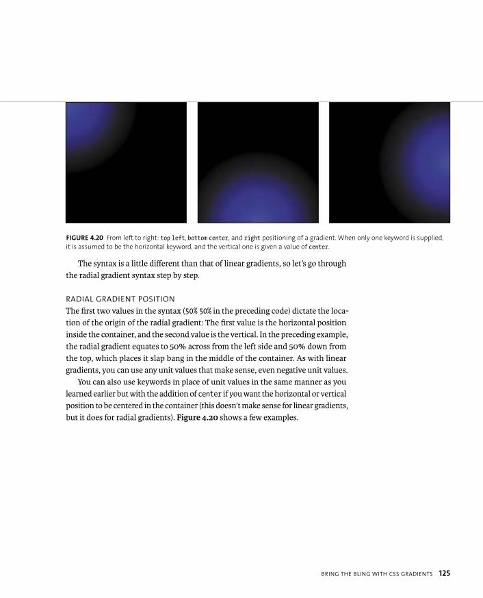
RADIAL GRADIENT POSITION
The first two values in the syntax (50% 50% in the preceding code) dictate the loca-tion of the origin of the radial gradient: The first value is the horizontal position inside the container, and the second value is the vertical. In the preceding example, the radial gradient equates to 50% across from the left side and 50% down from the top, which places it slap bang in the middle of the container. As with linear gradients, you can use any unit values that make sense, even negative unit values.
You can also use keywords in place of unit values in the same manner as you learned earlier but with the addition of center if you want the horizontal or vertical position to be centered in the container (this doesn’t make sense for linear gradients, but it does for radial gradients). Figure 4.20 shows a few examples.
FIGURE 4.20 From left to right: top left, bottom center, and right positioning of a gradient. When only one keyword is supplied,
it is assumed to be the horizontal keyword, and the vertical one is given a value of center.
126 CHAPTER 4 ENHANCING BOXES WITH CSS3 BLING
RADIAL GRADIENT SIZE AND SHAPE
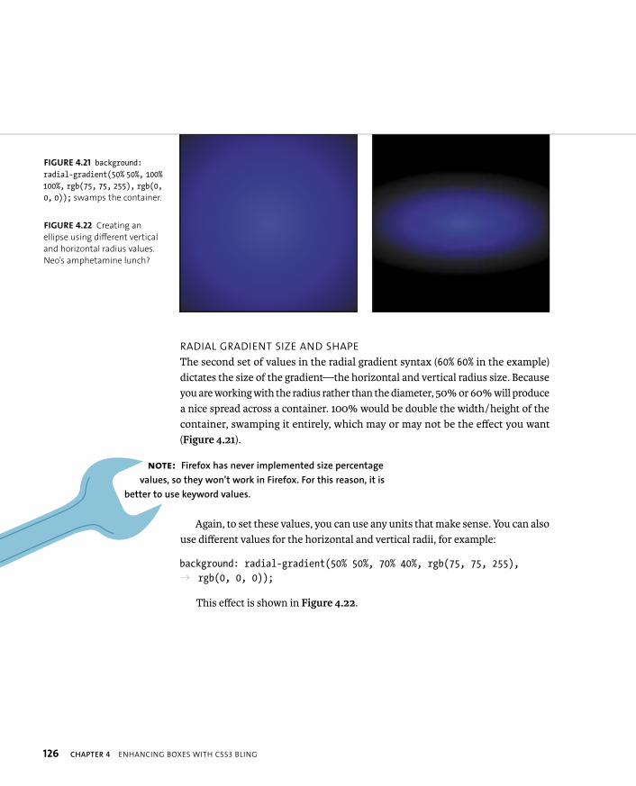
The second set of values in the radial gradient syntax (60% 60% in the example) dictates the size of the gradient—the horizontal and vertical radius size. Because you are working with the radius rather than the diameter, 50% or 60% will produce a nice spread across a container. 100% would be double the width/height of the container, swamping it entirely, which may or may not be the effect you want (Figure 4.21).
Again, to set these values, you can use any units that make sense. You can also use different values for the horizontal and vertical radii, for example:
background: radial-gradient(50% 50%, 70% 40%, rgb(75, 75, 255), p rgb(0, 0, 0));
This effect is shown in Figure 4.22.
FIGURE 4.21 background:radial-gradient(50% 50%, 100%100%, rgb(75, 75, 255), rgb(0,0, 0)); swamps the container.
FIGURE 4.22 Creating an
ellipse using different vertical
and horizontal radius values.
Neo’s amphetamine lunch?
NOTE: Firefox has never implemented size percentage
values, so they won’t work in Firefox. For this reason, it is
better to use keyword values.

BRING THE BLING WITH CSS GRADIENTS 127
But as usual, there are more ways to set the radii: CSS3 supplies several key-words for setting the radii, which need explaining because they are a bit confusing. Consider the following examples (Figure 4.23):
background: -o-radial-gradient(30% 50%, circle closest-side, p rgb(75, 75, 255), rgb(0, 0, 0));
background: -o-radial-gradient(30% 50%, ellipse closest-side, p rgb(75, 75, 255), rgb(0, 0, 0));
So, what’s going on here? By using circle and ellipse, you specify that you want your gradient to be a circle or an ellipse, respectively. closest-side means that the shape will expand so that it just touches the container side closest to the point of origin of the radius in the case of a circle and the horizontal and vertical container sides closest to the point of origin of the radius in the case of an ellipse.
FIGURE 4.23 The effects of
circle closest-side and
ellipse closest-side.
TIP: You can use the keyword contain
in place of closest-side.
128 CHAPTER 4 ENHANCING BOXES WITH CSS3 BLING
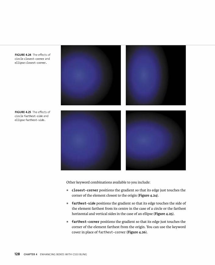
Other keyword combinations available to you include:
� closest-corner positions the gradient so that its edge just touches the corner of the element closest to the origin (Figure 4.24).
� farthest-side positions the gradient so that its edge touches the side of the element farthest from its centre in the case of a circle or the farthest horizontal and vertical sides in the case of an ellipse (Figure 4.25).
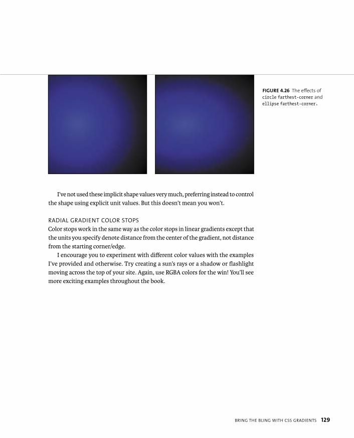
� farthest-corner positions the gradient so that its edge just touches the corner of the element farthest from the origin. You can use the keyword cover in place of farthest-corner (Figure 4.26).
FIGURE 4.24 The effects of
circle closest-corner and
ellipse closest-corner.
FIGURE 4.25 The effects of
circle farthest-side and
ellipse farthest-side.
BRING THE BLING WITH CSS GRADIENTS 129
I’ve not used these implicit shape values very much, preferring instead to control the shape using explicit unit values. But this doesn’t mean you won’t.
RADIAL GRADIENT COLOR STOPS
Color stops work in the same way as the color stops in linear gradients except that the units you specify denote distance from the center of the gradient, not distance from the starting corner/edge.
I encourage you to experiment with different color values with the examples I’ve provided and otherwise. Try creating a sun’s rays or a shadow or flashlight moving across the top of your site. Again, use RGBA colors for the win! You’ll see more exciting examples throughout the book.
FIGURE 4.26 The effects of
circle farthest-corner and
ellipse farthest-corner.

130 CHAPTER 4 ENHANCING BOXES WITH CSS3 BLING
REPEATING-RADIAL-GRADIENT
As with linear gradients, you can also create repeating radial gradients by adding repeating values into the syntax (Figure 4.27):
background: -o-repeating-radial-gradient(50% 50%, 60% 60%, p rgba(75, 75, 255,0.5) 10px, rgba(0, 0, 0,0.5) 20px);
background-color: #ff0000;
PROVIDING GRADIENT SUPPORT FOR OLD VERSIONS OF IE
CSS3PIE also adds support for CSS gradients. But again, you need to be careful of its limited RGBA support. To use CSS3PIE, target a separate, nontransparent color gradient to IE using a special -pie- prefixed background property (bear in mind that CSS3PIE doesn’t add support for background-image, just the shorthand). Look at the following example from the Monty Python blog (I’ve removed all the less interesting and prefixed properties for brevity):
FIGURE 4.27 A simple
repeating radial gradient.

BRING THE BLING WITH CSS GRADIENTS 131
aside article {
...
background: repeating-linear-gradient(45deg, rgba(0,0,0,0.1) 1px, p rgba(0,0,0,0.05) 2px, rgba(0,0,0,0.1) 3px, rgba(0,0,0,0) 4px, p rgba(0,0,0,0) 5px);
background-color: rgba(255,255,255,0.4);
border-radius: 4px;
box-shadow: 2px 2px 10px black;
}
The result is a rather nice container with a shadow, rounded corners, and a textured repeating gradient pattern (Figure 4.28).
To add IE support after you’ve placed the PIE.htc file, you can add the following two lines, which include a far simpler gradient without an alpha channel that is still in keeping with the color scheme (Figure 4.29):
-pie-background: linear-gradient(45deg, #6988af, #a6b9cf);
behavior: url(/cmills/arthur/script/PIE.htc);
FIGURE 4.29 A pleasing alter-
native set of styling provided
for older versions of IE.
FIGURE 4.28 An attractive bling box.
132 CHAPTER 4 ENHANCING BOXES WITH CSS3 BLING
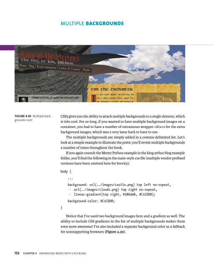
CSS3 gives you the ability to attach multiple backgrounds to a single element, which is très cool. For so long, if you wanted to have multiple background images on a container, you had to have a number of extraneous wrapper <div>s for the extra background images, which was a very lame hack to have to use.
The multiple backgrounds are simply added in a comma-delimited list. Let’s look at a simple example to illustrate the point; you’ll revisit multiple backgrounds a number of times throughout the book.
If you again consult the Monty Python example in the king arthur blog example folder, you’ll find the following in the main-style.css file (multiple vendor prefixed versions have been omitted here for brevity):
body {
...
background: url(../images/castle.png) top left no-repeat, p url(../images/clouds.png) top right no-repeat, p linear-gradient(top right, #3B6498, #C1CDDB);
background-color: #C1CDDB;
}
Notice that I’ve used two background images here and a gradient as well. The ability to include CSS gradients in the list of multiple backgrounds makes them even more awesome! I’ve also included a separate background color as a fallback for nonsupporting browsers (Figure 4.30).
FIGURE 4.30 Multiple back-
grounds rock!
MULTIPLE BACKGROUNDS
MULTIPLE BACKGROUNDS 133
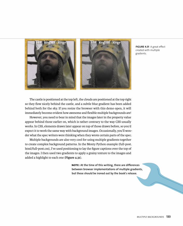
The castle is positioned at the top left, the clouds are positioned at the top right so they flow nicely behind the castle, and a subtle blue gradient has been added behind both for the sky. If you resize the browser with this demo open, it will immediately become evident how awesome and flexible multiple backgrounds are!
However, you need to bear in mind that the images later in the property value appear behind those earlier on, which is rather contrary to the way CSS usually works. In CSS, elements drawn later appear on top of those drawn before, so you’d expect it to work the same way with background images. Occasionally, you’ll won-der what the spec writers were thinking when they wrote certain parts of the spec.
Multiple backgrounds are also very cool for using multiple gradients together to create complex background patterns. In the Monty Python example (full-post.html/full-post.css), I’ve used positioning to lay the figure captions over the top of the images. I then used two gradients to apply a grainy texture to the images and added a highlight to each one (Figure 4.31).
NOTE: At the time of this writing, there are differences
between browser implementations of multiple gradients,
but these should be ironed out by the book’s release.
FIGURE 4.31 A great effect
created with multiple
gradients.
134 CHAPTER 4 ENHANCING BOXES WITH CSS3 BLING
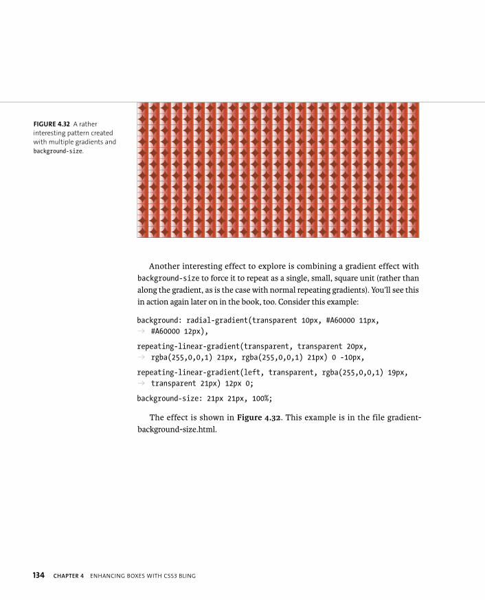
Another interesting effect to explore is combining a gradient effect with background-size to force it to repeat as a single, small, square unit (rather than along the gradient, as is the case with normal repeating gradients). You’ll see this in action again later on in the book, too. Consider this example:
background: radial-gradient(transparent 10px, #A60000 11px, p #A60000 12px),
repeating-linear-gradient(transparent, transparent 20px, p rgba(255,0,0,1) 21px, rgba(255,0,0,1) 21px) 0 -10px,
repeating-linear-gradient(left, transparent, rgba(255,0,0,1) 19px, p transparent 21px) 12px 0;
background-size: 21px 21px, 100%;
The effect is shown in Figure 4.32. This example is in the file gradient-background-size.html.
FIGURE 4.32 A rather
interesting pattern created
with multiple gradients and
background-size.

MULTIPLE BACKGROUNDS 135
The radial gradient creates a simple, small, transparent circle with red on the outside. The background-size property was used to force this circle into a 22-pixel square, which then repeats. A couple of simple line patterns are then placed over the top and spaced so they perfectly bisect the circles, horizontally and vertically. This is a rather complex bit of code to write for a simple repeating pattern, but it does show what is possible. You can find more aesthetically pleasing examples at Lea Verou’s fantastic CSS3 patterns gallery at http://lea.verou.me/css3patterns.
MULTIPLE BACKGROUNDS IN IE?
Unfortunately, CSS3PIE’s supremacy collapses when you consider multiple back-ground support in past versions of IE. There isn’t a decent way to add support for multiple backgrounds to older IE versions without resorting to those nasty old nested <div>s. And you don’t want to go down that road!
So, the only way around this limitation is to provide alternative styling, either via a conditional comment or via Modernizr, which you’ll explore in Chapter 5.
TIP: Providing multiple background image fallbacks is difficult
if you need the flexibility the multiple backgrounds provide in a
liquid layout, as in the Monty Python example. To make IE fallback styling
easier to work out, it’s best to make the layout fixed in IE by serving a style
in your IE-targeted CSS, such as: body { width: 1024px; }.
136 CHAPTER 4 ENHANCING BOXES WITH CSS3 BLING
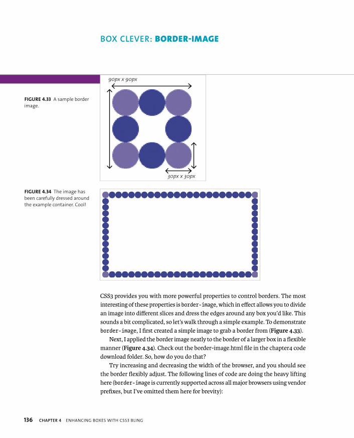
CSS3 provides you with more powerful properties to control borders. The most interesting of these properties is border-image, which in effect allows you to divide an image into different slices and dress the edges around any box you’d like. This sounds a bit complicated, so let’s walk through a simple example. To demonstrate border-image, I first created a simple image to grab a border from (Figure 4.33).
Next, I applied the border image neatly to the border of a larger box in a flexible manner (Figure 4.34). Check out the border-image.html file in the chapter4 code download folder. So, how do you do that?
Try increasing and decreasing the width of the browser, and you should see the border flexibly adjust. The following lines of code are doing the heavy lifting here (border-image is currently supported across all major browsers using vendor prefixes, but I’ve omitted them here for brevity):
BOX CLEVER: BORDER-IMAGE
90px x 90px
30px x 30px
FIGURE 4.33 A sample border
image.
FIGURE 4.34 The image has
been carefully dressed around
the example container. Cool!
BOX CLEVER: BORDER-IMAGE 137
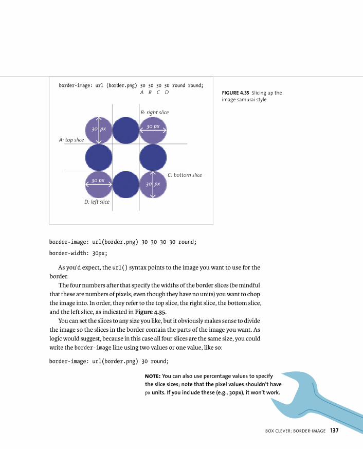
border-image: url(border.png) 30 30 30 30 round;
border-width: 30px;
As you’d expect, the url() syntax points to the image you want to use for the border.
The four numbers after that specify the widths of the border slices (be mindful that these are numbers of pixels, even though they have no units) you want to chop the image into. In order, they refer to the top slice, the right slice, the bottom slice, and the left slice, as indicated in Figure 4.35.
You can set the slices to any size you like, but it obviously makes sense to divide the image so the slices in the border contain the parts of the image you want. As logic would suggest, because in this case all four slices are the same size, you could write the border-image line using two values or one value, like so:
border-image: url(border.png) 30 round;
NOTE: You can also use percentage values to specify
the slice sizes; note that the pixel values shouldn’t have
px units. If you include these (e.g., 30px), it won’t work.
FIGURE 4.35 Slicing up the
image samurai style.
border-image: url (border.png) 30 30 30 30 round round;
30 px
30 px
30 px
30 px
A B C D
A: top slice
B: right slice
C: bottom slice
D: left slice
138 CHAPTER 4 ENHANCING BOXES WITH CSS3 BLING
After slicing the image, it is applied to the borders of your container: The four corners remain the same. The four sides all tile in one dimension to fill up the borders, however long they are (although see the end of this section for browser differences). The center of the image tiles in both directions to fill up the remain-ing background space.
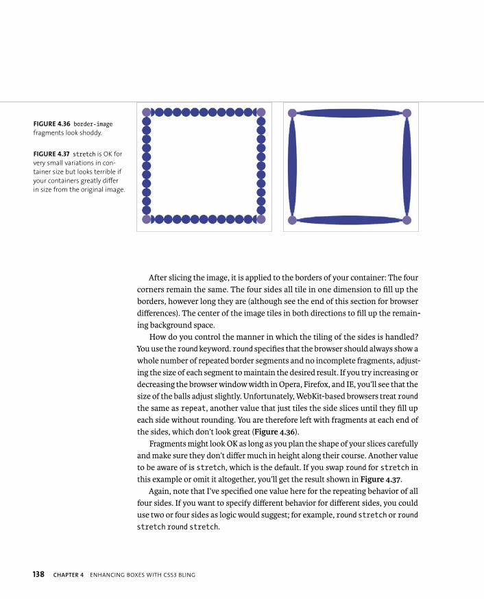
How do you control the manner in which the tiling of the sides is handled? You use the round keyword. round specifies that the browser should always show a whole number of repeated border segments and no incomplete fragments, adjust-ing the size of each segment to maintain the desired result. If you try increasing or decreasing the browser window width in Opera, Firefox, and IE, you’ll see that the size of the balls adjust slightly. Unfortunately, WebKit-based browsers treat roundthe same as repeat, another value that just tiles the side slices until they fill up each side without rounding. You are therefore left with fragments at each end of the sides, which don’t look great (Figure 4.36).
Fragments might look OK as long as you plan the shape of your slices carefully and make sure they don’t differ much in height along their course. Another value to be aware of is stretch, which is the default. If you swap round for stretch in this example or omit it altogether, you’ll get the result shown in Figure 4.37.
Again, note that I’ve specified one value here for the repeating behavior of all four sides. If you want to specify different behavior for different sides, you could use two or four sides as logic would suggest; for example, round stretch or roundstretch round stretch.
FIGURE 4.36 border-imagefragments look shoddy.
FIGURE 4.37 stretch is OK for
very small variations in con-
tainer size but looks terrible if
your containers greatly differ
in size from the original image.

BOX CLEVER: BORDER-IMAGE 139
And there’s one more detail you should know about the basic syntax. To actually provide space for your border image, you need to specify a border width, which is why border-width: 30px; was included in the code example. If you don’t do this, you won’t see anything. The border-width property offers additional interesting possibilities: If you make the border width bigger or smaller than the slices within the border-image property, the slice size will scale up or down to suit. So, if you make the border half as big, like so:
border-width: 15px;
the border image slices will be displayed in half dimensions, as shown in Figure 4.38!
BORDER-IMAGE PROBLEMS
Using border-image is not all plain sailing, of course, as with most things in web design. Aside from the fact that WebKit-based browsers currently don’t use the round value properly, there are a couple of other issues to keep in mind.
First, you need to determine if you want your central slice to be discarded or not. You might want the central slice to act as the background for your con-tainer content, or you might just want to put the border image only in the border. Unfortunately, the default behavior according to the spec is to discard it, but most browsers do the opposite, except for Chrome (try comparing border-image-2.html in Chrome and Opera). You are supposed to be able to control this behavior with border-image-slice, but this property is currently not supported in any browser,
FIGURE 4.38 Border images at
half the size—very funkalistic.
140 CHAPTER 4 ENHANCING BOXES WITH CSS3 BLING
so your only option is to fill in your background explicitly with a background-coloror repeated background-image, and try to make it match the border-image.
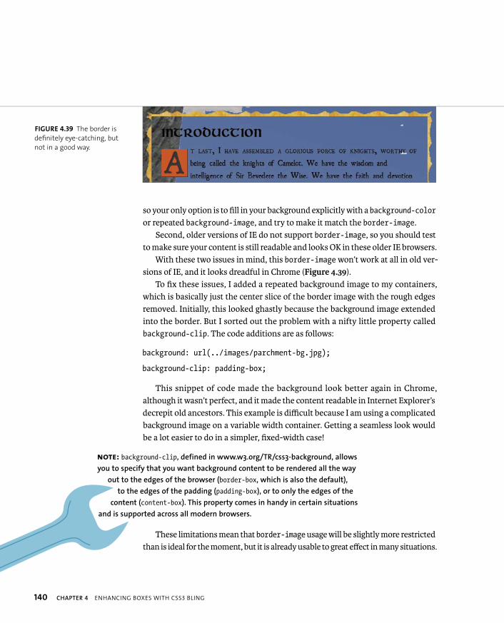
Second, older versions of IE do not support border-image, so you should test to make sure your content is still readable and looks OK in these older IE browsers.
With these two issues in mind, this border-image won’t work at all in old ver-sions of IE, and it looks dreadful in Chrome (Figure 4.39).
To fix these issues, I added a repeated background image to my containers, which is basically just the center slice of the border image with the rough edges removed. Initially, this looked ghastly because the background image extended into the border. But I sorted out the problem with a nifty little property called background-clip. The code additions are as follows:
background: url(../images/parchment-bg.jpg);
background-clip: padding-box;
This snippet of code made the background look better again in Chrome, although it wasn’t perfect, and it made the content readable in Internet Explorer’s decrepit old ancestors. This example is difficult because I am using a complicated background image on a variable width container. Getting a seamless look would be a lot easier to do in a simpler, fixed-width case!
These limitations mean that border-image usage will be slightly more restricted than is ideal for the moment, but it is already usable to great effect in many situations.
NOTE: background-clip, defined in www.w3.org/TR/css3-background, allows
you to specify that you want background content to be rendered all the way
out to the edges of the browser (border-box, which is also the default),
to the edges of the padding (padding-box), or to only the edges of the
content (content-box). This property comes in handy in certain situations
and is supported across all modern browsers.
FIGURE 4.39 The border is
definitely eye-catching, but
not in a good way.

BOX-DECORATION-BREAK 141
Let’s finish the CSS bling tour with a simple little fix for those ugly breaks you get when a nicely styled element wraps across lines (or columns or pages). Figure 4.40shows a styled link as an example.
This break is easily remedied by a new CSS property called box-decoration-break (in www.w3.org/TR/css3-background). If you add the following to the link properties:
box-decoration-break: clone;
you’ll produce a better-looking result (well, in Opera anyway; other browsers should catch up soon) (Figure 4.41).
BOX-DECORATION-BREAK
FIGURE 4.40 An ugly box break across lines.
FIGURE 4.41 The broken ends of the box are now filled in and are cloned from the start and
end of the box. This looks a lot better!
142 CHAPTER 4 ENHANCING BOXES WITH CSS3 BLING
To round off the chapter, let’s build an ad example using some of the cool proper-ties you learned about earlier. You’ll make it look good, albeit different across older browsers, and make it sing with a minimum of images (and a video). Later in the book you’ll explore how to make the ad responsive and add some cool animated effects.
The ad will be for a fictional metal band called Dead Hamster. The band is making a comeback, and its management wants to move forward with an online advertising campaign that is going get the band noticed! And what better way to get people to notice than by using thrills, spills, moving pictures, and raw exciting content? OK, so they don’t have Bieber or Jedward, but they would only serve to draw the wrong kind of attention.
To make a big splash, the ad will work on mobile devices, so the poster needs to work at different sizes and on different devices. And the band also has a huge following in developing countries due to their freedom anthems. Therefore, the ad needs to work across less-capable browsers.
Let’s rock!
BASIC SETUP
The basic idea is to create a set ad size: the Internet Advertising Bureau (IAB) has semistandardized sizes for web ads, as you’ll see at http://en.wikipedia.org/wiki/Web_banner. Let’s start off this example by creating a 730 x 300 pixel “pop-under ad.”
But let’s take it even further and make an eye-catching ad to show that many of the tasks you used to do with Flash are now possible using only CSS3. In this chapter you’ll just build up the basic ad. (Animation will come in Chapter 5, and responsiveness in Chapter 8.) You’ll also learn how to provide a reasonable alter-native in older browsers and what improvements you can and should make if you were to do something similar in a production environment.
NOTE: I got the idea for creating a responsive advertising example
from Mark Boulton’s rather interesting “Responsive advertising” article
at www.markboulton.co.uk/journal/comments/responsive-advertising.
ADDING BLING TO A BANNER AD
ADDING BLING TO A BANNER AD 143
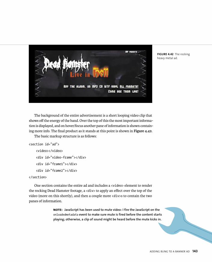
The background of the entire advertisement is a short looping video clip that shows off the energy of the band. Over the top of this the most important informa-tion is displayed, and on hover/focus another pane of information is shown contain-ing more info. The final product as it stands at this point is shown in Figure 4.42.
The basic markup structure is as follows:
<section id=”ad”>
<video></video>
<div id=”video-frame”></div>
<div id=”frame1”></div>
<div id=”frame2”></div>
</section>
One section contains the entire ad and includes a <video> element to render the rocking Dead Hamster footage, a <div> to apply an effect over the top of the video (more on this shortly), and then a couple more <div>s to contain the two panes of information.
FIGURE 4.42 The rocking
heavy metal ad.
NOTE: JavaScript has been used to mute video: I fire the JavaScript on the
onloadedmetadata event to make sure mute is fired before the content starts
playing; otherwise, a clip of sound might be heard before the mute kicks in.

144 CHAPTER 4 ENHANCING BOXES WITH CSS3 BLING
Most of the content is absolutely positioned so the layers stack on top of one another, and most of the containers are set to 720 x 300 px, the same dimensions as the outer container, to keep everything inside the ad working well. Most of the code should be pretty simple to understand for anyone with previous CSS experi-ence, so I’ll just explain the CSS3 code. You can find my code in the poster folder in the code download.
ADDING THE CSS3 SPARKLE
Let’s walk through the different layers of this example in turn so it’ll make more sense. You first have the video, and the video-frame div is positioned on top of it. This “superfluous” div is annoying to have to include, but it is necessary at the moment because currently border-image doesn’t work correctly across all brows-ers. Recall that in all browsers except Chrome the middle slice is wrongly included, and you can’t get rid of it. If you could, then you could add the ripped edges using border-image,but at present you can’t. So instead you’ll add the ripped edges on this div using multiple background images:
#video-frame {
width: 720px;
height: 300px;
background: url(left-edge.png) top left repeat-y, p url(right-edge.png) top right repeat-y;
}
This is a rather useful technique in many ways: Imagine if you had lots of ele-ments, such as headers or articles, and you wanted them to have a background image at either end and have a flexible width and height. This code is all you’d need.
Next, you’ll set a uniform black text shadow on all text, apart from the interest-ing flaming effect I’ve put on the word “hell”: This is suitable for increasing the latent cheese factor to be appropriate for the average heavy metal band. This can be done like so—add this now to your text:

ADDING BLING TO A BANNER AD 145
#ad #hell {
font-size: 150%;
text-shadow: 0 0 4px white,
0 -5px 4px #FFFF33,
2px -10px 6px #FFDD33,
-2px -15px 11px #FF8800,
2px -25px 18px #FF2200;
}
Also, you’ll include a repeating radial gradient using various transparent blacks for a bit of background texture, plus a background color to provide a faint blue tint:
#ad #frame1 {
background-image: repeating-radial-gradient(top left,
rgba(0,0,0,0) 9px,
rgba(0,0,0,0.05) 10px,
rgba(0,0,0,0.05) 15px,
rgba(0,0,0,0.1) 16px,
rgba(0,0,0,0.1) 20px);
background-color: rgba(16,8,115,0.2);
}
And finally, you’ll use cool, very metal web fonts! These all result in a great set of components that blend well into one another.
SUPPORTING OLDER BROWSERS
To support older browsers, instead of using clever Polyfilling of content, you’ll include a simple image fallback for non-<video> supporting browsers:
<img src=”poster.jpg” alt=””>

146 CHAPTER 4 ENHANCING BOXES WITH CSS3 BLING
You’ll do this because Flash content tends to dominate the area of the page it is put on, so rollovers on top of the video content won’t work on a Flash fallback.
In the end, let’s opt for the coward’s option of not displaying the hover effect in the second frame because IE6, 7, and 8 tend to prove troublesome when you are trying to get hover effects to work on positioned content. You’ll use text-indentto push the text far off the screen, so it will still be available to screen readers.
In addition, you’ll include some quick box model and positioning fixes for IE6 and 7. The box shadows, text shadows, gradients, and RGBA colors all degrade well.
ADDING AD IMPROVEMENTS
I think you’ve created a fairly effective basic ad in this example. The ad is all con-tained within a single container, so it is fairly easy to transplant in whichever page you want it in, and then position it where you want it.
But why not just create the ad in Flash? It would potentially be simpler to deal with, but the point is that you are trying to create components with open standards, which includes all the advantages they bring to the project, plus the text would not be accessible if you put it in a Flash video. The advantages open standards have over Flash in this context will be even more obvious when you start to add animated effects in Chapter 5.
Of course, before you really use this ad, you might want to make a few improvements:
� Optimize video files. The video files as they stand are a fairly heavy addition to a page, so you should optimize them.
� Pare down fonts. The fonts are also quite heavy. In a real production envi-ronment, you could use Fontforge (as mentioned in Chapter 3) to reduce the size of the font files and just include the glyphs you need.
� Add a link. You should also wrap the final version in a link (HTML5 allows block-level linking) to click through to wherever you want the ad to lead to.
WRAPPING UP 147
Hopefully, you’ve come away from this chapter with an understanding of the great new tools CSS3 offers for making your visuals less image-dependent and therefore more flexible and lightweight. Although having the ability to programmatically cre-ate web graphics does make web design a lot easier for non-Photoshop ninjas (like me), I hope you’re committed to using those features in a responsible way rather than just spamming all the relevant properties onto every container on your site!
And, you also now know how to get these CSS3 features working in a reasonable manner across older, less-capable browsers.
WRAPPING UP
INDEX 321
NUMBERS2D transforms
applying, 159matrix, 160rotate, 155–156scale, scaleX, scaleY, 157–158skew, skewX, skewY, 158–159translate, translateX, translateY,
153–154X, Y, and Z axes, 154
3D animations, hardware acceleration, 177. See also CSS Animations
3D transforms. See also CSS Transforms
backface-visibility, 174–177matrix3D, 165perspective, 165–170rotate3D, 163–164rotateX, rotateY, rotateZ, 162scale3D and scaleZ, 165transform-style, 171–174translate3D, translateZ, 160–161trouble with, 178
SYMBOL:: (double-colon) syntax, 33
Aaccessibility, prioritizing, 7–8adaptive design, versus responsive
design, 289Adaptive Images technique, 309adjacent sibling CSS3 selector, 23Android
animations, 189bling boxes, 109CSS3 Color Units, 16font formats, 74layout features, 243rem units, 20responsive design features, 291text features, 87, 94transforms, 152transitions, 179
animating flaming text, 202–203animation rate, altering, 194–195
animation-direction property, using, 195–196
animation-duration property, using, 193, 198
animation-fill-mode property, 196–197animation-name property, using,
192, 198animations. See also 3D animations;
CSS Animationsadding delays, 195applying to elements, 192button-glow, 196card flip behavior, 208, 210enhancing banner ad with, 199–203:hover/:focus rule, 208menu-move, 193moving <h1>, 210–212multiple, 197–198overflow: hidden, 201running number of times, 193shorthand, 197–198sliding form, 211triggering via JavaScript, 208–216whoosh, 198
animation-timing-function, 194–195anti-aliasing, 81<article> element, 51–53<aside> element, 54–55Ates, Faruk, 67, 204attr() function, using, 33attribute CSS3 selector, 22, 27<audio> element, 48, 50
control buttons, A-4–A-5media styling, A-10–A-11resources, A-11SVG and <canvas>, A-10–A-11wiring buttons with JavaScript,
A-5–A-9
Bbackface-visibility 3D transform,
174–177background content, rendering, 140background images
serving to small devices, 308using in banner ads, 144
background-clip property, using, 140background:radial-gradient, 126
backgroundsattaching to elements, 132gradients, 133in IE versions, 135using linear gradients on, 119
background-size, using gradients with, 134–135
banner ad. See also bling boxesadding bling to, 142–146animating flaming text, 202–203background images, 144enhancing with animations,
199–203heavy metal example, 318–320improving, 146recommended size, 142repeating radial gradient, 145support for older browsers, 145–146
Bézier curves, cubic, 182bling boxes. See also banner ad; CSS3
featuresadding depth, 114–117adding to banner ad, 142–146advantages, 108border-image property, 136–140box-decoration break property, 141box-shadow property, 114–117browser support for, 109disadvantages, 108examples, 108
border-image propertyapplying, 136–138central slice, 139fragments, 138problems, 139–140providing space, 139tiling sides, 138url() syntax, 137
border-radius property, 110–113Boulton, Mark, 142box-decoration break property,
using, 141boxes. See bling boxesbox-shadow property, 114–117browser support. See also mobile
browsers; Modernizranimations, 189“bling box” features, 109color units, 16CSS selectors, 22–26
INDEX
322 INDEX
browser support (continued)font formats, 74indicating, 205layout features, 243rem units, 20, 206responsive design features, 291text features, 87, 94transforms, 152transitions, 179
browsers, history of, 284Bulletproof CSS, 4, 77, 231button, styling, 180button-glow animation, specifying, 196
CCaballero, Luz, 63Calzadilla, Anthony, 204<canvas> element, 62–63capitalization, controlling, 100captions, creating, 56–57Cederholm, Dan, 9character set, defining, 42–43child CSS3 selector, 23, 25Chrome
animations, 189bling boxes, 109CSS3 Color Units, 16font formats, 74layout features, 243rem units, 20responsive design features, 291text features, 87, 94transforms, 152transitions, 179
Chrome Mobilefont formats, 74text features, 87, 94
Clark, Keith, 34, 67ClearType, use by Windows, 81Collison, Simon, 86column layouts, 5. See also CSS Multi-
column layout modulecontent
generating, 26thought process for, 10–11
corners, rounded, 110–113CSS, Bulletproof, 4CSS Animations. See also 3D
animations; animationsat-rule block, 191
background-color, 191browser support for, 189keyframe blocks, 190–192setting up, 190–192website, 150
CSS Exclusions and Shapes layout module, 242, 277–279
CSS Flexible box layout module, 242CSS Grids
layout module, 242problems with, 274
CSS Multi-column layout module, 242. See also column layouts; layout modules
adjusting columns, 253column breaks, 251column gutters, 247column-count property, 245column-fill property, 248–249column-gap property, 247column-rule property, 247column-span property, 249–250column-width property, 246, 252features, 244lack of browser support, 254limited scope, 254parody Disney movie, 252–253problems, 254setting number of columns, 245
CSS Regions Module, 242, 275–277CSS resets, using, 64CSS sprites, using with icons, 227–228CSS tables, applying, 305CSS Transforms. See also 3D
transforms2D, 153–160browser support for, 152:focus effect, 163:hover effect, 163skew, 151two- and three-dimensional, 152website, 150
CSS Transitions. See also transitionsspec, 180website, 150
CSS3column layouts, 5creation of, 4–5dynamic UIs, 5font embedding, 4modules in, 4–5
CSS3 Color units, browser support for, 16–18
CSS3 features. See also bling boxesCSS3 Color units, 16–18sizing text using rems, 19–21vendor prefixes, 14–16
CSS3 modules, 12–13CSS3 selectors
adjacent sibling, 23attribute, 22, 27child, 23descendant, 23general sibling, 23language, 24negation, 24negation pseudo-class, 28pseudo-classes, 28–31pseudo-elements, 26, 32–33resource, 21structural pseudo-classes, 25–26target, 24UI element pseudo-classes, 23–24universal, 22using with older browsers, 34
CSS3-man website, 204css3-mediaqueries-js library, 65CSS3PIE, 66–67
downloading, 112–113gradients, 113.htc file, 66RGBA support, 113support for IE versions, 130using with box shadows, 117
CSS4 selectors module, 26cubic Bézier curves, 182, 185
Ddate and time, marking up, 57–58datetime attribute, using, 57–58Dead Hamster banner ad,
142–146, 199descendant CSS3 selector, 23design philosophies. See web design
philosophyDevlin, Ian, A-11DHTML (dynamic HTML), 39DOCTYPE, using, 41, 43double-colon (::) syntax, 33dynamic UIs, 5
INDEX 323
Eelements. See also HTML5 elements
repeating patterns of, 29selecting, 23, 26, 28styling, 23–25
ellipsis;, using with text-overflowproperty, 90–91, 93
embedded video, implementing with HTML, 40
error messages, examples of, 61–62Eye of Sauron, 167–168
Ffeature detection library. See
Modernizr<figcaption> element, 56–57<figure> element, 56–57Firefox
animations, 189bling boxes, 109CSS3 Color Units, 16font formats, 74rem units, 20responsive design features, 291text features, 87, 94transforms, 152transitions, 179
Flexbox. See also layout modulesaligning children, 261–262align-items property, 262align-self property, 262<articles> and <section>, 256box-flex property, 268browser support, 255Cast container, 265child <articles>, 264–265child flow direction, 256–257cross axis, 258cross-browser with Modernizr,
267–268display order of child elements,
259–260display property, 255Facts container, 265flex property, 263–264flex-flow property, 257–258flexibility of, 263–267flex-order property, 259<header> content, 261
main axis, 258syntax changes, 255wrapping elements, 257
:focus effect, using with transforms, 163
font embedding, 4font files
creating, 80reducing, 233
font formats, browser support for, 74font services, 85–86font size, considering, 80Font Squirrel
customizing fonts, 75–76downloading fonts from, 75@font-face generator, 75–76@font-face kit, 82
Fontdeck service, 85–86@font-face block, 73, 83–84font-family declaration, including, 73font-feature usage, 103–104font-feature-settings property, 97–99Fontforge, downloading, 80fonts. See also text; typography;
web fontsadding to Holy Grail tribute site,
75–77anti-aliasing, 81browser bugs, 83–84bulletproof syntax, 77downloading, 73glyphs in, 82heading sizes, 82OpenType, 74overuse of, 82–83quality of, 82–83troubleshooting, 84TrueType, 74websites, 75
Fonts module, 73Fonts service website, 79font-style declaration, including, 74font-weight declaration, including,
73–74<footer> element, 54form improvements. See also HTML5
form elementsconsistency, A-12pseudo-classes, A-12selectors, A-12–A-15
form inputs, styling, 24
FOUT (flash of unstyled text), 78–84fractions, declaring, 99
GGallagher, Nicolas, 64Gasston, Peter, 267GCPM (Generate Content for Paged
Media), 243, 280general sibling CSS3 selector, 23Google
Fonts service, 79webfont loader, 78
Google Code, HTML5 shiv, 45–46graceful degradation, 8–9gradients
features, 118linear, 118–123radial, 124–130using with backgrounds, 133
grid layout examples, 272–274grid structure. See also layout modules
defining, 269–270grid-columns property, 270grid-rows property, 270
gridselements, 271fitting content onto, 271–273
Gunther, Lars, 43
H<header> element, 54headings
determining levels of, 56grouping, 56
heavy metal banner ad, 318–320<hgroup> element, 56Hicks, Jon, 216high-fidelity devices, 316–317highlighting words, 59Holy Grail tribute site, 72, 75–77Home icon
CSS applied to, 235–236markup for, 235
:hover effect, using with transforms, 163
HSL, browser support for CSS 3 Color Units, 16–18
HSLA, browser support for CSS 3 Color Units, 16–18
324 INDEX
HTML, trouble with 3D CSS, 178HTML content, creating base of, 10HTML Lint website, 47HTML5. See also semantic HTML5;
templatebenefits, 39browser support for, 40DOCTYPE, 41embedded video, 40error handling, 40features, 39outlines, 56sectioning, 56shiv, 45–46validating, 47
HTML5 elements. See also elements<article>, 51–53<aside>, 54–55<audio>, 48–50<canvas>, 62–63<figcaption>, 56–57<figure>, 56–57<footer>, 54<header>, 54<hgroup>, 56<mark>, 59<nav>, 55<section>, 51–53<time>, 57–58<video>, 48–50
HTML5 form elements, 60–62. See alsoform improvements
hyphenation, controlling, 92–93
IIAB (Internet Advertising Bureau), 142icons
arbitrary, 221background images, 229–230background-position property, 227background-size property, 228–229comparison, 222–223CSS sprites, 227–228emotion, 222–223functionality, 222generated content for, 226guidelines for use of, 222–223ideograms, 221implementing, 224–230, 235–238
making bulletproof, 228–229Media Queries, 228–229min-width property, 228–229navigation, 222Peculiar set, 235–238pictograms, 221setting gradient on list item, 225status, 222user feedback, 222–223web fonts as, 231–234
IE conditional comments, 68–69IE Print Protector script, 46IE versions
backgrounds in, 135CSS3PIE, 130gradient support for, 130–131
images, serving responsively, 308–310Internet Explorer
animations, 189bling boxes, 109CSS3 Color Units, 16font formats, 74layout features, 243rem units, 20–21responsive design features, 291text features, 87, 94transforms, 152transitions, 179
iOSanimations, 189bling boxes, 109CSS3 Color Units, 16font formats, 74layout features, 243rem units, 20responsive design features, 291text features, 87, 94transforms, 152transitions, 179
Irish, Paul, 11, 204“Bulletproof @font-face syntax,” 77Modernizr library, 67
JJavaScript, triggering animations with,
208–216JavaScript libraries
css3-mediaqueries-js, 65CSS3PIE, 66–67
Modernizr, 67respond.js, 65Selectivizr, 67
Jehl, Scott, 65
Kkerning text, 101King Arthur example, adding fonts to,
75–77Krug, Steve, 8
Llanguage CSS3 selector, 24Lauke, Patrick, 62Lawson, Bruce
HTML5 semantics, 53HTML5 video player, 50IE conditional comments, 69
layout modules. See also CSS Multi-column layout module; Flexbox; grid structure
CSS Exclusions and Shapes, 242, 277–279
CSS Flexible box, 242CSS GCPM (Generate Content for
Paged Media), 280CSS Grids, 242CSS Multi-column, 242CSS Regions Level 3, 275–277GCPM, 243Regions, 242
layout techniquescontainers, 292–293max-width, 295–296responsive media layouts,
293–296layout width, setting upper bound
on, 296letters in elements, selecting, 26ligatures
dealing with, 95–96discretionary, 98
linear gradientscolor stops, 121–122negative unit values, 122repeating, 123RGBA colors, 122syntax, 123

INDEX 325
transparent colors, 122using on backgrounds, 119varying direction of, 118–120
links, styling, 23list items, selecting, 30
MMakeev, Vadim, 50Manian, Divya, 11Marin, Lucian, 235<mark> element, 59matrix 2D transform, 160matrix3D transform, 165Media Blitz site, 292, 297, 299, 306–307media layouts, responsive, 293–296media queries
applying, 299–301, 303–304applying styles, 297–298content breakpoints, 302device breakpoints, 302Mobile First technique, 306not keyword, 298orientation-based, 302polyfills, 307spec, 297table-related properties, 305testing features, 298–299using, 302viewport meta tag, 312–315width-based, 302
menu-move animation, running, 193<meta name=“viewport”>, 312–315mime-types, described, 43Miro Video Converter, 49mobile browsers. See also browser
supportbrowser width, 311<meta name=“viewport”>, 312–315optimizing content for, 311–312rendering sites, 311–312width/height media queries, 312
Mobile Chromeanimations, 189CSS3 Color Units, 16layout features, 243rem units, 20responsive design features, 291transforms, 152transitions, 179
Mobile First techniqueadvantage of, 308using with media queries, 306
“mobile web,” explained, 289Modernizr, 67. See also browser
supportanimating states, 215animations and JavaScript, 208applying to pages, 205descendant selector, 206downloading, 204event listeners, 212fallbacks, 216if test, 214providing alternative styles,
206–207test, 213–214transitions, 215
Monty Python example, 72, 186muting video, 142
N<nav> element, 55Neal, Jonathan, 46negation CSS3 selector, 24negation pseudo-class, 28normalize.css, using, 63numerals
fractions, 99ordinal, 99tabular, 99
Oopacity, browser support for CSS3
Color Units, 16, 18open standards, 6OpenType fonts
numbers, 98–99support for, 74
Operaanimations, 189bling boxes, 109CSS3 Color Units, 16font formats, 74layout features, 243rem units, 20text features, 87, 94transforms, 152
transitions, 179Opera Mini
animations, 189bling boxes, 109CSS3 Color Units, 16disadvantages, 285features, 285layout features, 243OBML (Opera Binary Markup
Language) page, 285rem units, 20responsive design features, 291simulator, 286text features, 87, 94transforms, 152transitions, 179
Opera Mobileanimations, 189bling boxes, 109CSS3 Color Units, 16Emulator, 287font formats, 74layout features, 243rem units, 20responsive design features, 291text features, 87, 94transforms, 152transitions, 179
ordinal numerals, declaring, 99
PPeculiar icon set, using, 235–238perspective 3D transforms, 165–170petite caps, using, 100philosophy of web design, 6–9polyfills, using with media
queries, 307prefixed properties, 15progressive enhancement, 8–9pseudo-classes, 28–31pseudo-elements, 26, 32–33Python, Monty, 72
Rradial gradients
circle closest-corner, 128circle closest-side, 127circle farthest-corner, 129
326 INDEX
radial gradients (continued)circle farthest-side, 128closest-corner, 128color stops, 129contain keyword, 127ellipse closest-corner, 128ellipse closest-side, 127ellipse farthest-corner, 129ellipse farthest-side, 128farthest-corner, 128farthest-side, 128keyword combinations, 128keywords versus unit values, 125position, 125repeating, 130, 145setting radii, 127size and shape, 126–129syntax, 124–125using, 135
Regions Module, 242, 275–277rems
dealing with, 206using to size text, 19–21
rendering text, 95–96respond.js library, 65responsive design, 286–291responsive media layouts, 293–296RGBA, browser support for CSS 3 Color
Units, 16–17Robinson, Mike, 59rotate
2D transform, 155–1563D transforms, 162
rotate3D transform, 163–164rounded corners, 110–114
SSafari
animations, 189bling boxes, 109CSS3 Color Units, 16font formats, 74layout features, 243rem units, 20responsive design features, 291text features, 87, 94transforms, 152transitions, 179
scale 2D transforms, 157–158
scale3D and scaleZ transforms, 165<section> element, 51–55Selectivizr library, 34, 67selectors. See CSS3 selectorsSelectors Level 3 CSS3 module, 12semantic HTML5. See also HTML5
cross-browser support, 44–46versus HTML4, 38
Sexton, Alex, 67, 204shadows, adding depth with, 114–117Sharp, Remy, 45–46, 48sites. See websitesSivonen, Henri, 47size units, 19skew 2D transforms, 158–159skew transform, example of, 151small caps, using, 100sprites, using with icons, 227structural pseudo-classes CSS3
selector, 25–26stylistic sets, 102–103
Ttables, applying, 305tabular numerals, declaring, 99Tan, Jon, 81target CSS3 selector, 24:target pseudo-class, 28–29template. See also HTML5
browser support for, 44–46building, 41–46character set, 42–43document outline, 41–42HTML5 DOCTYPE, 41language, 41–42mime-types, 43XHTML5 and coding styles, 43
text. See also fonts; typographyaligning, 92capitalizing, 100controlling hyphenation, 92–93justifying, 92ligatures, 95–96sizing using rems, 19–21using word-wrap with, 91
text effects, browser support for, 87text overflow, controlling, 90–91text rendering, optimizing, 95–96text-shadow property, 88–90
<time> element, 57–58transform-origin property, 156transforms. See 3D transforms; CSS
Transformstransform-style property, using,
171–173transition shorthand property,
15–16transition-property: all, 188transitions. See also CSS Transitions
altering rate of, 181–186“bounce effect,” 185browser support for, 179cubic Bézier curves, 182, 185cubic-bezier() value, 183delaying, 181ease values, 182linear value, 182multiple, 187–188nested <div>s, 184–185selecting items for, 180selecting length of, 181shorthand property, 187–188steps() value, 183
transition-timing-function property, 181–183
translate 2D transforms, 153–154translate3D transform, 160–161TrueType fonts, support for, 74Typekit font service, 85typography. See also fonts; text; web
fontsfont-feature usage, 103–104font-feature-settings property,
97–99kerning, 101ligatures, 95–96petite caps, 100small caps, 100stylistic sets, 102–103text rendering, 95–96
UUI element pseudo-classes CSS3
selector, 23–24universal CSS3 selector, 22usability, prioritizing, 8

INDEX 327
Vvalidating HTML5, 47vendor prefixes, 14–16video
muting, 142responsive, 310
video formats, converting between, 49<video> element, 48–50
control buttons, A-4–A-5controls attribute, 49height attribute, 49media styling, A-10–A-11poster attribute, 49resources, A-11<source> attributes, 49SVG and <canvas>, A-10–A-11using in banner ad, 142width attribute, 49wiring buttons with JavaScript,
A-5–A-9@viewport rule spec, accessing, 314
WW3C
Current Work page, 12WOFF standard, 74
web browsers. See browser supportweb design philosophy, 6–9web fonts. See also fonts; text;
typographyadded bandwidth, 80creating text characters, 232FOUT (flash of unstyled text), 78–84HTML5 data- attribute, 233as icons, 231–234problems, 78–84storing text characters, 233using, 73Windows rendering problems,
81–82webfont loader, 78–79
WebGL, article about, 63-webkit- prefixes properties, 15websites
Adaptive Images technique, 309Backgrounds and Borders Level 3
module, 13<canvas> tutorials, 63CSS Animations, 13, 150CSS Color module, 12CSS Exclusions and Shapes layout
module, 242, 277CSS Flexible box layout module,
13, 242CSS Fonts Level 3 module, 12CSS Grids layout module, 242CSS Image Values and Replaced
Content Level 3 module, 13CSS Multi-column layout module,
13, 242CSS Regions Level 3 module, 275CSS Text Level 3 module, 12CSS Transitions, 13, 150CSS3 and HTML5 features, 11CSS3 Color units, 16–18CSS3 modules, 12CSS3-man, 204css3-mediaqueries-js library, 65CSS3PIE, 112–113CSS4 selectors module, 26“Display type and the raster
wars,” 81font services, 85Font Squirrel, 75Fontdeck, 85Fontforge, 80fonts, 75Fonts module, 73Fonts service, 79GCPM (Generate Content for Paged
Media), 280GCPM layout module, 243Google Fonts service, 79HTML Lint, 47
HTML5 and CSS3 features, 11HTML5 elements, 48HTML5 form elements, 62HTML5 sectioning and outlines, 56IAB (Internet Advertising
Bureau), 142IE conditional comments, 69<mark> element, 59Media Queries module, 12, 297Miro Video Converter, 49Modernizr library, 67normalize.css, 64Regions layout module, 242respond.js library, 65Selectivizr, 34Selectors Level 3 module, 12size units, 19Typekit, 85“Use the whole font” showcase, 97video players, A-11@viewport rule spec, 314W3C Current Work page, 12W3C WOFF standard, 74webfont loader from Google, 78WebGL, 63WebType font service, 85
whoosh animation, duration of, 198Wilcox, Matt, 309Windows ClearType, 81words, highlighting, 59word-wrap, using, 91Wroblewski, Luke, 306
XX, Y, and Z axes, 154XHTML5 and coding styles, 43
Zzebra stripes, creating, 25, 30zooming feature, including, 314