r & bioinformatics toolsamborella.net/2019-hybseq-jeonhyungrin/sungsin-univ.3rd... ·...
TRANSCRIPT

R & bioinformatics tools
생물정보팀 전형린
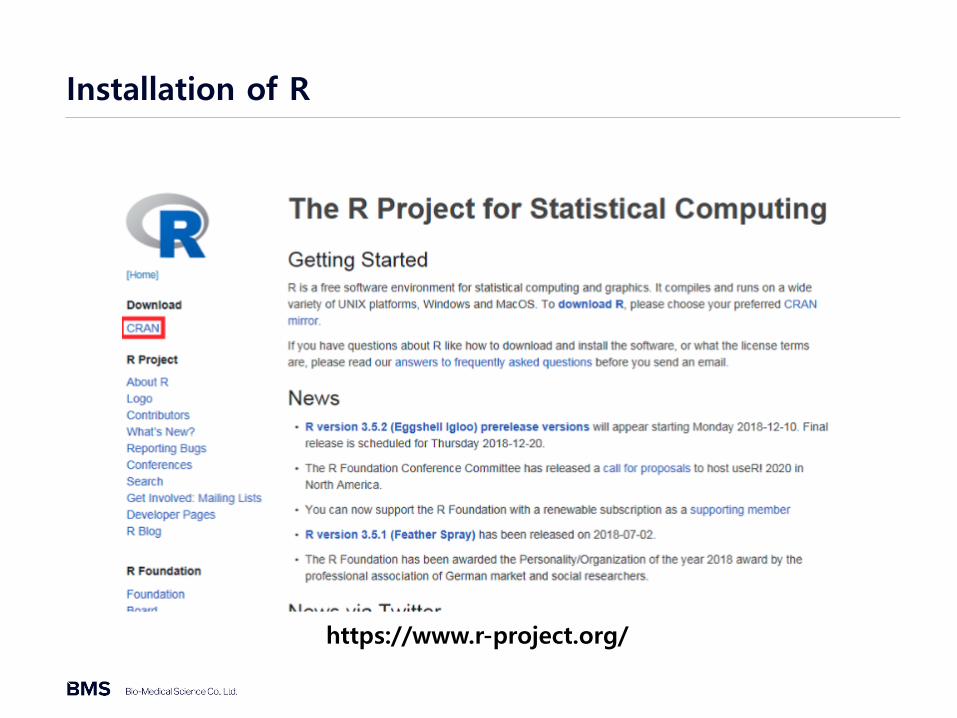
Installation of R
https://www.r-project.org/

Installation of R

Installation of R

Installation of R

Installation of R

Installation of R

Installation of RStudio
https://www.rstudio.com/

Installation of RStudio

Installation of RStudio

Definition of Bioinformatics
https://github.com/rstudio/cheatsheets/blob/master/data-visualization-2.1.pdf

Definition of Bioinformatics
https://github.com/rstudio/cheatsheets/blob/master/data-visualization-2.1.pdf

Grammar of Graphics
https://github.com/rstudio/cheatsheets/blob/master/data-visualization-2.1.pdf

Grammar Defines Components of Graphics

Load package and mpg data
library(ggplot2)
head(mpg)

Change path
1.클릭

Change path
2. 경로지정

Change path
3.클릭4.클릭(경로 설정)

mpg data
write.table(mpg,"mpg.txt",sep="\t")

Data information
summary(mpg)
model - 모델displ - 배기량year - 생산연도cyl - 실린더 개수trans - 변속기 종류
drv - 구동 방식cty - 도시 연비hwy - 고속도로 연비fl - 연료 종류class - 자동차 종류

Basic setting – ggplot2
ggplot(dataset, aes(x = x_data, y= y_data, color = color_gruop))
ggplot(mtcars, aes(x = wt))
ggplot(mtcars, aes(x = wt, y = mpg))
ggplot(mtcars, aes(x = wt, y = mpg))
• aes(aesthetics) = 미학요소
• ggplot2에서는 색상, 크기, 모양, 채우기 등과 함께 플롯의 X 축과 Y 축을미학으로 간주

Layer – ggplot2
• Layer = '기하 구조(geoms)
• 기본 설정 후 기하 구조를 다른 구성 위에 추가 할 수 있으며, 이러한 추가는 ‘+’ 기호를 사용함. 해당 링크에는 사용 가능한 모든 기하 구조의 목록이 있습니다. (Layers: geoms 참조)
• display the data – allows viewer to see patterns, overall structure, local structure, outliers, ...
• display statistical summaries of the data – allows viewer to see counts, means, medians, IQRs, model predictions, ...

geom_xxx() – ggplot2
https://opr.princeton.edu/workshops/Downloads/2015Jan_ggplot2Koffman.pdf

Individual geoms – ggplot2
https://opr.princeton.edu/workshops/Downloads/2015Jan_ggplot2Koffman.pdf

Individual geoms – ggplot2
p <- ggplot(mpg, aes(displ, cty, label = model)) + labs(x = NULL, y = NULL) + theme(plot.title = element_text(size = 12))
p + geom_point() + ggtitle("point")
p + geom_text() + ggtitle("text")
p + geom_tile() + ggtitle("raster")
p + geom_tile() + ggtitle("raster")
p + geom_line() + ggtitle("line")
p + geom_area() + ggtitle("area")
p + geom_path() + ggtitle("path")
p + geom_polygon() + ggtitle("polygon")

Collective geoms – ggplot2
ggplot(data, aes(x, y)) + geom_point() + geom_line()
ggplot(data, aes(x, y)) + geom_boxplot() + geom_line( aes(group = group), colour = "#3366FF", alpha = 0.5)
ggplot(data, aes(x, fill = fill_group)) +
geom_bar()

Collective geoms – ggplot2
ggplot(mpg, aes(cty, displ, group = manufacturer)) + geom_point() + geom_line()
ggplot(mpg, aes(class, cty))+ geom_boxplot() + geom_line( aes(group = cty), colour = "#3366FF", alpha = 0.5)
ggplot(mpg, aes(class, fill = drv)) + geom_bar()

stat_xxx() – ggplot2
https://opr.princeton.edu/workshops/Downloads/2015Jan_ggplot2Koffman.pdf

Statistical Transformation – ggplot2
p <- ggplot(mpg, aes(x=cty))
p + stat_bin()
p + stat_bin(geom="tile")

Change Default Geometric Object – ggplot2
p <- ggplot(mpg, aes(x=cty))
#figure1
p + stat_bin()
#figure2
p + stat_bin(geom="point", binwidth=1)
#figure3
p + stat_bin(geom="line", binwidth=1)
#figure4
p + stat_bin(geom="line",binwidth=1) + stat_bin(geom="point",binwidth=1)

Use Variables Created by stat_xxx() – ggplot2
p <- ggplot(mpg, aes(x=cty))
p + stat_bin(aes(fill=..count..))

Add or Remove Aesthetic Mapping– ggplot2
• Describe visual characteristics that represent data• for example, x position, y position, size, color (outside), fill (inside), point shape, line type,
transparency
• Each layer inherits default aesthetics from plot object• within each layer, aesthetics may added, overwritten, or removed
p <- ggplot(mpg, aes(x=displ, y=cty, color=manufacturer))
p + geom_point() + geom_smooth(method="lm", se=FALSE) #fig1
p + geom_point(aes(shape=manufacturer)) + geom_smooth(method="lm",se=FALSE) #fig2
p + geom_point(aes(color=NULL)) + geom_smooth(method="lm",se=FALSE) #fig3

Aesthetic Mapping vs. Parameter Setting – ggplot2
• aesthetic mapping• data value determines visual characteristic
use aes()
• Setting• constant value determines visual characteristic
use layer parameter
p <- ggplot(mpg, aes(x=displ, y=cty))
p + geom_point(aes(color=manufacturer))
p + geom_point(color="red")

Position – ggplot2
p <- ggplot(mpg, aes(x=manufacturer, fill=class))
p + geom_bar() #figure1
p + geom_bar(position="stack") #figure2
p + geom_bar(position="dodge") #figure3
p + geom_bar(position="fill") #figure4

Bar Width – ggplot2
p <- ggplot(mpg, aes(x=manufacturer))
p + geom_bar()
p + geom_bar(width=.5)
p + geom_bar(width=.3)

Coordinate System – ggplot2
p <- ggplot(mpg, aes(x=factor(1), fill=manufacturer))
#figure1
p + geom_bar()
#figure2
p + geom_bar() + coord_flip()
#figure3
p + geom_bar() + coord_polar(theta="y")
#figure4
p + geom_bar() + coord_polar(theta="y", direction=-1)

Fill Scales – ggplot2
p <- ggplot(mpg, aes(x=manufacturer, fill=class))
p + geom_bar(color="black") #figure1
p + geom_bar(color="black") + scale_fill_grey() #figure2
p + geom_bar(color="black") + scale_fill_brewer() #figure3
library(RColorBrewer)
p + geom_bar(color="black") + scale_fill_brewer(palette="Set1") #figure4

Theme – ggplot2
https://opr.princeton.edu/workshops/Downloads/2015Jan_ggplot2Koffman.pdf
• Theme is non-data elements and
• Theme does not affect how data is displayed by geom_xxx() or stat_xxx() functions
• addition/modification/deletion of titles, axis labels, tick marks, axis tick labels and legends

Theme: Titles, Tick Marks, and Tick Labels – ggplot2
https://opr.princeton.edu/workshops/Downloads/2015Jan_ggplot2Koffman.pdf

Theme: Legends – ggplot2
https://opr.princeton.edu/workshops/Downloads/2015Jan_ggplot2Koffman.pdf

Theme: Overall Look– ggplot2
https://opr.princeton.edu/workshops/Downloads/2015Jan_ggplot2Koffman.pdf

Theme: Overall Look– ggplot2
https://opr.princeton.edu/workshops/Downloads/2015Jan_ggplot2Koffman.pdf

Genome browser
https://opr.princeton.edu/workshops/Downloads/2015Jan_ggplot2Koffman.pdf

Genome browser
https://opr.princeton.edu/workshops/Downloads/2015Jan_ggplot2Koffman.pdf
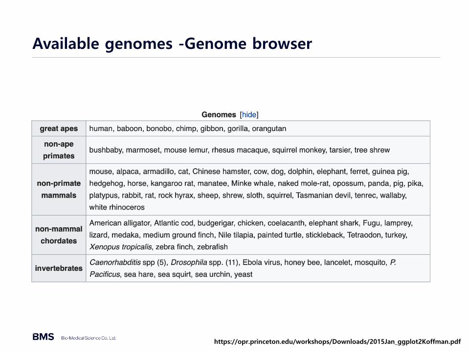
Available genomes -Genome browser
https://opr.princeton.edu/workshops/Downloads/2015Jan_ggplot2Koffman.pdf

Available information - Genome browser
https://opr.princeton.edu/workshops/Downloads/2015Jan_ggplot2Koffman.pdf

Add custom tracks - Genome browser
https://opr.princeton.edu/workshops/Downloads/2015Jan_ggplot2Koffman.pdf

In–Slico PCR - Genome browser
https://opr.princeton.edu/workshops/Downloads/2015Jan_ggplot2Koffman.pdf

IGV
https://opr.princeton.edu/workshops/Downloads/2015Jan_ggplot2Koffman.pdf

IGV
https://opr.princeton.edu/workshops/Downloads/2015Jan_ggplot2Koffman.pdf

Practice - IGV
https://opr.princeton.edu/workshops/Downloads/2015Jan_ggplot2Koffman.pdf
• Path - /var2/users/Practice/IGV
• Files• H1.Myc.bed• H1.Nanog.bed• GSM438363_UCSD.IMR90.mRNA-Seq.mRNA-seq_imr90_r1.wig

DAVID
https://opr.princeton.edu/workshops/Downloads/2015Jan_ggplot2Koffman.pdf
DAVID is a tool for Gene ontology analysis to understand biological meaning behind interest gene list

Insert gene list - DAVID
https://opr.princeton.edu/workshops/Downloads/2015Jan_ggplot2Koffman.pdf
1.유전자 리스트 삽입
2.유전자 ID 형식 선택
3.유전자 List type 선택

Gene ontology - DAVID
https://opr.princeton.edu/workshops/Downloads/2015Jan_ggplot2Koffman.pdf

Biological process - DAVID
https://opr.princeton.edu/workshops/Downloads/2015Jan_ggplot2Koffman.pdf

Structure of gene ontology - DAVID
https://opr.princeton.edu/workshops/Downloads/2015Jan_ggplot2Koffman.pdf

KEGG pathway - DAVID
https://opr.princeton.edu/workshops/Downloads/2015Jan_ggplot2Koffman.pdf

KEGG pathway - DAVID
https://opr.princeton.edu/workshops/Downloads/2015Jan_ggplot2Koffman.pdf

KEGG pathway - DAVID
https://opr.princeton.edu/workshops/Downloads/2015Jan_ggplot2Koffman.pdf
