typographers & designers
DESCRIPTION
Exploration into TypographyTRANSCRIPT
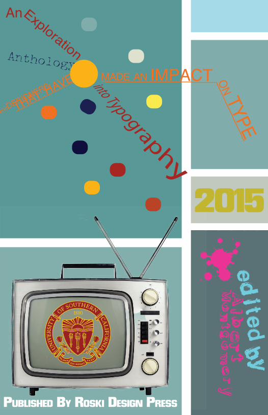
PUBLISHED BY ROSKI DESIGN PRESS
THAT HAVE
An
Anthology
Exploration
MADE AN IMPACT ON TYPE
2015
Typographersand
Designers
CHAPTER ONE

House Industries WRITTEN BY HANNAH CHI
House Industries is an internationally known prolific type foundry and design studio based in Yorklyn, Delaware. The company was created on March 1st, 1993 when Andy Cruz and Rich Boat quit their jobs and set up Brand Design Co., Inc. in the space of Rich’s apartment in Wilmington, Delaware. Despite its garage startup, the company has manifested into making a considerable impact on the world of design as its fonts are widely spread throughout billboards, greeting cards, consumer product logos, and mainstream media—a few which include VH1’s Best Week Ever, Mission Impossible, Nickelodeon’s TV Land, Anne Taylor garment bags, Lucky Charms, and etc.
Behind the apparent success of House Industries is a team of impassioned House artists who have mastered a large cross-section of design disciplines that acts as an infrastructure for the mesh of cultural, musical and graphic elements within in the mastered typography. From early forays into distressed dig-ital alphabets to sophisticated type and lettering systems, House Industries’ work transcends graphic conventions and reaches out to a broad audience.
Within the realm of House Industries’ broad clientele is a wide variety of an unconscious House aesthetic of the studio’s ‘blue-collared’ designers. As House designers draw from an exposure of areas in the American sub-cultural phenomena of unsophisticated yet incredibly formative graphic design, despite the big names of their clients, House designers ultimately create
their own projects of design and illustration. Each House Industries project attempts to administer a component of an art history lesson of sorts by using their font collections to provide an opportunity to draw attention to the impactful and under-appreciated art genres that were a huge influence to the designer’s during their impressionable years. The consistent element of art history embedded into the House aesthetics has inevitably created a style that audiences identify House Industries with.
In accordance, because of the twentieth century metal type inspiration and the diverse references to popular cultur-al imagery, invariably, “retro” is always brought up when discussing House’s work. Regardless of the indifferent categorization of House aesthetics being “retro,” as the term is thoughtlessly used to describe anything that from the past few decades, House designers focus solely in the craft of everything they do. House Industries finds creating artwork by traditional means to be more direct and efficient so ultimately, the hands-on approach preserves the charac-teristic production techniques while drawing from personal interests, which gives a unique flavor of making the House Aesthetic one of a kind.
Jessica HischeWRITTEN BY WINNIE QUAN
Jessica Hische is a Pennsylvania-born, award-winning letterer, illustrator, and graphic designer. Known for her ‘Daily Drop Cap’ project, ‘Should I Work for Free’ flowchart, and beautiful type design and lettering skills, Hische is currently based in San Francisco and works alongside friend and designer Erik Mari-novich. While she’s not in her studio space creating and working on designs, she can be found traveling the world attending and speaking at conferences, finding ways to help others do what they love.
Having worked for wonderful clients such as Wes Anderson, American Express, and Penguin Books, Hische continues to work independently from her studio, designing for advertising, books, weddings, branding, and companies, while still finding time to work on fun side projects for herself. One of her biggest projects included designing book covers for a 26-book classics series with Penguin Books; each with an elegantly-designed letter that pertained to a classic author, and another working with Wes Anderson to create film titles for Moonrise King-dom. Hische is also greatly acclaimed, having been listed in Forbes’ Top 30 Under 30 in art and design twice, nominated as GDUSA’s person to watch in 2011, and featured in many major design and illustration publications. She is greatly admired and respected by those in her industry and lettering-aficionados.
Her hand-lettering skills have been carefully practiced and trator to develop a general skeleton and adding decorations and
ornamentations later on. While Hische’s work for her clients is incredibly expansive and ample, her style is a common element in all of her lettering and illustrations; her work can be described as both whimsical and sophisticated, as she finds inspiration every-where she goes and through all the wonderful people she meets around the world. “Just when you think you figured it out, you find some better way of doing things. The key is to always keep trying to be better.”
Michael BierutWRITTEN BY JOHN LUNA
The Ohio-born Michael Bierut is a highly awarded and famous graphic designer that is attributed with the creation of designs ranging from the environmental graphics for the New York Times building to the development of a new brand strategy for the packaging of Saks Fifth Avenue. However, his work does not only result from his ability to design but also his identity as a designer. He describes the difference between those who design and those who are designers. The designer is also a participant in the design conversation and, as a designer; Bierut is a leader in creating a design community. He has served as the national pres-ident of the American Institute of Graphic Arts, acted as a senior critic at Yale School of Art, and is a founding contributor for the Design Observer. His works and didactic contributions have af-fected the language of typography and the field of design overall. With his book, Seventy-Nine Short Essays on Design, Bierut hopes to create a community for design conversation, which, he comments, was fairly unavailable to a majority of designs de-spite the universality of design in the world. He complains that, in the 1970s, there was only really one, inaccessible, conference for designers to attend and that paid subscriptions to publications tended to be costly – creating a very isolated world of design. He grants insight to the importance, especially due to the ubiquitous nature of design, of the graphic and of the associated text. Men-tions of his mistakes and experiences during his design career inform him and allow him to offer readers advice on spurring conversations about design and challenging the established
design normative. In Bierut’s essay published in the Design Observer, he mentions that design is about making connections between objects. Despite appearing to be an aggregation for essays on design, he also comments on other topics such as politics or business. He mentions, “Design is not everything. But design is about everything.” Bierut praises design for always being about “something else.” These connections allow designs to become a universal entity that has driven Bierut’s inspirations. As a result of his contemporary advice on breaking the design standard, Bierut has become a major, and powerful, contributor to the entire design community.
Herman Zapf WRITTEN BY KEELY VEDANAYAGAM
Herman Zapf is a German type designer who was born in 1918 in Nuremberg during the German revolution and is still alive today at age 96! He is married to a fellow typeface designer, Gudrun Zapf von Hesse. Zapf grew up with an interest in technical sub-jects; as a kid he experimented with electricity and even built an alarm set for his house. At a young age, Zapf was already getting involved with type, inventing cipher-text alphabets to exchange secret messages with his brother.
He left school in 1933 with the ambition to pursue a career in electrical engineering. However, Zapf was not able to attend the Ohm Technical Institute in Nuremberg due to the new political regime in Germany at the time, so he took up an apprenticeship position in lithography where he worked for four years. During this time, Zapf attended an exhibition in Nuremberg in honor of the late typographer Rudolf Koch. This exhibition gave him his first interest in lettering and he began to teach himself calligraphy. In 1938, he designed his first printed typeface, a fraktur type called Gilgengart.
One year later, Zapf was conscripted into World War II and sent to help reinforce the defensive line against France. Not used to the hard labor, he developed heart trouble in a few weeks and was given a desk job, writing camp records and sports certificates. Due to his heart trouble, Zapf was dis-missed early from his unit and shortly thereafter began training as a cartographer. After his training, he traveled to Bordeaux
and became a staff member in the cartography unit where he drew maps of Spain. Zapf enjoyed working in the cartography unit. His eyesight was so excellent that he could write letters 1 millimeter in size without using a magnifying glass – this skill probably prevented him from being commissioned back into the army.
After the war had ended, Zapf was held by the French as a prisoner of war. He was treated with respect because of his artwork and, due to his poor health, was sent home only four weeks after the end of the war. Post-war, Zapf taught calligraphy in Nuremberg before taking up a position as artistic head of a print shop.
Later in his career, he spent time developing two famous typefaces, Palatino and Optima. He then worked for a while in developing computer typography programs before taking up professorship at the Rochester Institute of Technology from 1977 to 1987. Today he is known as the artist of several famous typefaces such as Palatino, Optima, Aldus, Venture, and of course, Zapfino – his most recent typeface which was released in 1998.

Historical Letters
CHAPTER TWO
Bruce RogersWRITTEN BY RALEIGH WARD
Bruce Rogers was an American typographer and type designer that primarily focused on book designers. Some claim that he was among the greatest book designers of the twentieth century. He started his career as a political cartoonist after graduating from Purdue in 1890. Later on, he worked as an artist for the Indianap-olis news which sparked his passion for book design. After falling in love with Kelmscott Press edition books, Rogers moved to Boston, the center of publishing at the time, and began his passion by producing fine books.
Rogers created his first typeface in 1901 when he worked for the Riverside Press in Cambridge, Massachusetts. He started designing advertisements, and created ornate designs, printed on handmade damped paper. He created the font “Montaigne” which was a Venetian style type face, which was used in the book The Essays of Montaigne. Rogers had a very clear style, and when the moderdism trend began to spread across the art world, he con-tinued to focus on his “classical” designs and avoided modern or sans serif fonts.
In 1912, Rogers then moved to New York City where he began his career as an independent designer and house designer for the Metorpolitan Museum of Art. Rogers was asked to design a limited edition of Mauric de Geurin’s The Centaur, and he created his most popular font “Centaur” at this time. His new typeface was recognized among the community and admired for its maturity and classic design. From that point forward, Rogers
specifically used Centaur for the rest of his career.
Rogers became infatuated with book design. Whether he was overseeing other designs or taking on his own special projects, he was always influencing the publishing world with his designs. One of his passion projects included a renovation of the Odyssey. Rogers reprinted the book in Centaur type on gray handmade paper and bound it with black Niger leather. He became ob-sessed with turning iconic books into not only literary works of art, but design works of art as well. Soon after, he spend six years producing the Oxford Lectern Bible. However, this led to Rogers pairing up with Frederic Warde to develop an italic form of his Centaur font.
Along with his typography and type design, Rogers spent a focus on his career designing bookplate designs that showcased his type designs. His designs usually included small images with ornate borders and his own types. Today, his bookplates and books de-signed throughout his career auction at a very high value. Overall, Roger’s impacted the book design world while finding a current way to integrate serif and classic designs into the everyday world.
Max MiedingerWRITTEN BYJOSHUA KIM
In the discussion of most influential people in history, we throw out names like Aristotle, Jesus, Louis Pasteur, Leonardo di Vinci, Alexander the Great, and Walt Disney, but there is one man oft forgotten: Max Miedinger. Yes, I just compared a typographer to Jesus, and I’m not ashamed.
Max Miedinger was born in the most neutral place on Earth, Zurich, Switzerland, but he was far from anything neutral. In fact, Max was a go-getter from the beginning. It was widely rumored that when he was born from his mother’s womb, he was already rearranging his umbilical cord into various shapes and letters. Having discovered his precociousness at the moment of birth, Max’s parents decided to allow him freedom to become his own man, and become his own man he did. At the age of 16, when plebeians like you and I were still sucking our thumbs and just barely getting by basic calculus, Max was already beginning his apprenticeship as a typesetter. For the next four years, Max worked by day at the worth of an unpaid intern and attended class by night at Kunstgewerbeschule in Zurich. This man had both genius and hard work, it’s no wonder he had to fend of girls left and right, day and night.
By age 26, Max evolved into a full-fledged typographer for Globus department store’s advertising studio. For the next 10 years, he perfected his art. During this rather uneventful period the Swiss typically call “the grind” or in German, zerkleinern, Max was only able to travel the globe once, spreading the good
word of typographism throughout the four corners of the world. It should be noted that he did successfully perform a cardiac bypass surgery in the jungles of Africa and recreate the most famous sto-len Rembrandt painting, Jacob de Gheyn III in France. It should also be noted that those latter accomplishments are based purely on rumor.
In 1956-57, he became a freelance graphic artist, and with Eduard Hoffmann, they gifted the world the most important creation of the 20th century in the form of the Haas-Grotesk typeface. Over the next two years, roman and bold version were created, and in 1960, the typeface was renamed from Neue Haas Grotesk to Hel-veticaTM. If you don’t know what Helvetica is or looks like, finish this sentence and then maybe consider exploring that place the rest of us call “outside”. Read some signs, look at some advertise-ments, glance over a book cover and you’ll have probably already experienced HelveticaTM. It is only the most widely used typeface of the 20th century, and many sans-serifs that came after can thank HelveticaTM for laying the way. Helvetica is the Jesus Christ, the Neo, the Dark Knight of typography, it wasn’t the typeface we de-served, but the typeface we needed. It came down from the snowy mountains of the Swiss Alps to save us from our sins of using so many damn serif fonts.
Of course, haters gon’ hate. Erik Spiekermann said: “Neue Haas Grotesk was a redesign of (surprise!) Haas Grotesk, which in turn was partly based on Scheltersche Grotesk from Schelter&Giesecke in those days, type was also quickly assimilated, copied, emulated, ripped-off; the success of Akzidenz Grotesk had alerted Haas to the fact that they were missing sales because all the Swiss designers were specifying AG from Germany.”
This is coming from the guy who thought Michael Jordan was overrated and the Beatles would never amount to much. The fact of the matter is, HelveticaTM has proliferated beyond all expectations and continues to be the standard in typeface for advertisers and designers throughout the world. Whoever marketed Helvetica is a genius and should seriously consider hiring me to wherever firm he works at.
Paul Renner WRITTEN BY RAJIV RAMAKABIR
Paul Renner was a world famous German type designer. Renner can be seen as a bridge between the traditional 19th century and the modern 20th century design. He attempted to fuse the gothic and the roman typefaces. While he was never directly affiliated with the Bauhaus movement, he became an advocate of its aims and principles and became a leading proponent of the “New Typography”. Renner sought to influence culture by designing, writing and teaching and he spent most of his life in applied art, trying to bring high cultural standards to material objects for use – typefaces and books. Although Renner was not associated with the Bauhaus, he shared many of its idioms and believed that a modern typeface should express modern models, rather than be a revival of a previous design. Renner’s design rejected the approach of previous sans-serif designs, which were based on the model of traditional serif typefaces and condensed lettering, in fa-vor of simple geometric forms: near-perfect circles, triangles and squares. It is based on strokes of near-even weight, which are low in contrast. In relation to typography, many people know Renner as the creator of Futura, one of the most successful and most-used typefaces of the 20th century. In some respects, Futura can be seen to reflect his views on the appropriate style for letterforms designed in Germany – an alternative solution to the choice of gothic or roman. When created in 1927, Futura was based on geometric shapes that became representative of visual elements of the Bauhaus design style of 1919–33. In designing Futura,
Renner avoided the decorative, eliminating nonessential elements, but used his knowledge of how people perceive lines and shapes to make subtle departures from pure geometric designs that allow the letterforms to seem balanced. His creation of the sans serif typeface Futura marked a revolutionary change in typography. Futura is still used today because it is so bold and distinctive to typographers and graphic designers. Paul Renner’s work is a good example of how form follows function. Every mark Renner made, he had a reason for making it, not making any arbitrary marks or decisions just because of the style during the 19th and 20th century. Renner, as one of the most influential type designers of the 20th century has successfully created a bridge from traditional typography to modern.
Saul Bass WRITTEN BY ERIN NOGLE
“Design is thinking made visual.”Saul Bass was an incredibly versatile American designer who forged a career in designing everything from corporate identity logos to movie title treatments and filmmaking. Throughout his 40+ years in the industry Bass worked with leading corporations such as, United Way, Continental Airlines, AT&T, Warner Brothers, and the Girl Scout Organization. Bass’ logos are dynamic yet streamlined, and creative yet informative. Bass was one of the most prominent designers of the 60’s and 70’s. The logos and brand identity guidelines of which most of these major corporations still use today, decades after their creation. Additionally, a study in 2011 proved that the average lifespan of a Saul Bass corporate logo was 34 years, an unusual longevity. Additionally, this analysis cited the most common end to a logo was the merge or demise of the company, not a corporate re-branding. Discussing his logo designs, Saul Bass once stated, “If I do my job well, the identity program will also clean up the image of the company, position it as being contemporary and keep it from ever looking dated.”
Although Bass’ work in logo design is impressive, his innova-tions in title credits for movies left an impression on the film industry forever. Prior to Bass’ title treatments movie titles were used solely to display information. The revolutionary idea to use title credit sequences in movies as an opportunity to introduce viewers to a films’ deeper themes was, in fact,
Saul Bass’. Creating a compelling title sequence can make a first impression on an audience by providing a short visual metaphor to viewers and overall they can contribute to the effectiveness of a film. Bass designed for Hollywood’s most established filmmakers, such as: Alfred Hitchcock, Stanley Kubrick, and Billy Wilder. Bass’ last title sequence was for modern director Martin Scorsese, in his film Casino. Regarding his sequence for Casino, Bass stated, “The intent of this opening was to create a mood spare, gaunt, with a driving intensity… [that conveyed] the distortion and jaggedness, the disconnectedness and disjoint-edness of the addict’s life the subject of the film.” Bass designed titles for over 30 films.
Aldus Manutius WRITTEN BY SHIRLEY SUN
If asked about the functional purpose of this soft covered book you are currently reading, what would you say is its main ad-vantage compared to a hardcover? Similarly, reflecting on a time you bought a paperback, what was it that drove you towards this purchase? If the affordability and portability attracted you, then you have Aldus Manutius to thank. What he called libelli portatiles, or portable little books, had soft covers, were small in size and of great use to travelling scholars at the time, and for the masses today.
Aldus Manutius was born 1449 in Bassiano, Papal States (Italy), and passed away in Venice, 1515. During this time, typographi-cal art was in its very early stages of development. Designs and text were crudely etched into wood. Growing up, literary texts were scarce, and many elementary books were painfully dry and unintelligible. “Doctrinale Alexadri de Villa-Dei,” was a grammar study that Manutius was said to have despised reading. His future works may have been influenced by just this.
Manutius became a printer and publisher, whose printing press changed the direction of book formatting and typography at the time. His focused was on printing inexpensive editions of classic texts, Aristotle, Dante, and Homer to name a few, with the hopes that all may have access to literary works.
The italic type was first used by Manutius to print an edition of Virgil in 1501. This slanted design was critical for the production of his pocket sized books; the format allowed letterforms to fit in
narrow and compact spaces. Whereas italics are more contempo-rarily used to emphasize and/or bring attention to a certain word and/or phrase, Manuthius had a much more economic intention. By using italics, smaller pages could hold more words, meaning fewer pages and decreased production costs.
This smaller format in book production revolutionized the avail-ability of knowledge, similar to how laptops and smartphones have influenced lives in the twentieth-twenty first century. Aldus Manutius helped mobilize information.
The Contemporary Wordsmith
CHAPTER THREE
Donald Knuth WRITTEN BY JACOB ROTH
Often when we think if new technology, we automatically think that it will make our lives better. Sometimes this is true, but in the world of typography new technologies actually made print quality worse. Typesetting was traditionally performed on printing presses where metal stamps were meticulously and painstakingly arranged to achieve the best product. Because the printing press was labor intensive and required extensive training, publishers were excited about a new technology, phototypesetting, which drastically reduced the time and skill required to typeset books.While the technology was initially limited to low quality pub-lications like newspapers and magazines, the price eventually forced the new technology into more premium products like text books. Donald Knuth, a professor of computer science at Stanford University, in 1978 received a gallery print of his second edition textbook. Compared to the original version, he lamented, “The quality of typesetting was abominable. It was a pain to read. You couldn’t look at this because they had changed printing technology.” In retaliation, Mr. Knuth de-cided to create a computer program to typeset his new book instead of using the phototypesetting method he loathed.
Just like any self-respecting typography student would, Mr. Knuth began his research by tracing out the letters from ex-isting typefaces onto paper. After many hours of studying the shapes he came to the conclusion that the phototypesetting
system failed because, whereas letters were designed by human beings which something in mind for them, the typesetting process had no way to capture the intelligence or intentions of the type designer. Mr. Knuth decided that in order for a computerized system to produce beautiful text, it must preserve the past tra-ditions of typesetters instead of throwing them out like current technology had. The systems Mr. Knuth developed changed typesetting from a problem with metallurgy to a problem of mathematics. In contrast to previous methods, his system does not rely on static characters but instead digitally creates each character based on the parameters given such as point size and weight. The advantage of using digitally created characters is that each character is a perfect reproduction of the designer’s inten-tions whether printed on paper or displayed on a computer screen. Additionally, because text was represented in an abstract way in-side a computer, Mr. Knuth applied complex algorithms, such as automatic river reduction, that where time and labor prohibitive on traditional presses.
The typesetting systems that Mr. Knuth developed made great progress towards digital publishing but the systems were not perfect. Specifically, the system required many different commands to achieve the desired results. While many academics were able to effectively use the system, graphic artist publishers found the system difficult because they had little computer experience. In the end, Mr. Knuth’s digital publish system never gained much acceptance outside universities. All of his work in not in vein, however, because many of the algorithms and principals he pioneered are now integral parts of the most widely used software packages.
Emigre WRITTEN BY JT WANG
Emigre was a magazine about “the global artist who juggles cultures, travels between them, and who is fluent in the cultural symbols of the world.” It was founded in 1984 in Berkeley, CA by wife and husband Zuzanna Licko and Rudy VanderLans, who created the type foundry. The word émigré, which often refers to a person who has “migrated out” of of something, perfectly de-fines the foundry’s take on art and design. Emigre resisted typical design rules that had existed during its beginning and used its wild creations to offset long-accepted imbalances between form and content.
The foundry was the first of its kind to create and distribute fonts made for and by a computer, and their work was made possible the advent of the Macintosh computer. Licko and VanderLans used the magazine to explore and experiment with new and radical pieces that were created by computers using bitmap design, dot matrix printing and vector-based design, rather than by hand and letterpress. This wasWr a surprise to the design community whose convention at the time placed a high value on calligraphy; the norm was to create typestyles by hand before manipulating them on the computer. However, for Zuzanna Licko, the computer’s tools opened a variety of opportunities because she was left-handed and thus had never been able to do calligraphy.Though the pair of designers had not intended to break rules, Emigre started a typographic rebellion as a result of their explorations of the new tools and
capabilities created by the computer.
Emigre’s radical design choices drew a great deal of attention from designers and critics alike, and in the beginning, they faced severe opposition. Some critics saw the creations as barbaric and described Emigre’s postmodern design as “the degradation of culture” and “The Cult of the Ugly.” However, after awhile, the arguments subsided and Emigre grew to become an influential record label, merchandise vendor, and journal for design dia-logues, and since then, the foundry has designed and licensed over 300 different typefaces from a variety of artists.
Erik SpiekermannWRITTEN BY ANNE NAKAMURA
Erik Spiekermann is a German typographer and designer who started his education at Berlin’s Free University studying art histo-ry. During his stay at the university, he funded himself by running a letterpress printing press in the basement of his house. He later went on to establish FontShop, in 1988, the first mail-order dis-tributor for digital fonts, with his wife Joan. This later evolved into many other companies that strived to publish and distribute fonts to artists and designers all over the world. During this time, he worked at MetaDesign, a global design consultancy. He currently holds an honorary professorship at the Academy of Arts in Bremen as a board member of German Design Council. As an established designer, he has written many books such as Stop Stealing Sheep & Find Out How Type Works and redesigned the magazine The Economist, a publication based in London. Through out his career, he has created many commercial typefaces such as Berliner Grotest, Lo-Type, ITC Officina Sans, FF Govan, and FF Meta Serif.
Spiekermann had achieved many milestones in his career, one of them being a Honorary Doctorship for his contribution to design in April of 2006 from Art Center College of Design. He later collab-orated with designer Christian Schwartz where they successfully designed the Deutsche Bahn family typeface. This won them the Gold Medal at the German Federal Design Prize in 2006. The fol-lowing year, he was elected into the European Design Awards Hall of Fame.
Erik Spiekermann has the opportunity to participate in First Things First 2000 Manifesto, a collaboration of a group of international graphic designers in 1999 that followed the publication of First Things First Manifesto in 1964. The goal was to generate discussion about the education and press exposure in the design profession. Erik Spiekermann was one of the thirty-three designers to sign the manifesto with the concerns of “free design” and the right to take a stand on who and what they are designing for.
Spiekermann is currently residing in Germany and runs his own company called edenspiekermann.
Fun Facts:• His first love when it comes to typefaces is Reklameschrift
Block• He believes FF Info Office is underrated• One of his proudest projects is making the buses and trams in
Berlin as well as designing the German Railways corporate design.
• He believes Arial is the most overrated font in the world
Modern Masters
CHAPTER FOUR
Herb Lubalin: Meaning MattersWRITTEN BY DAWN LEE
Recognized for his unique contributions to the world of design, Herb Lubalin is one of the most successful and foremost American graphic designers and typographers of the twentieth century. Although he is colorblind and started working back in the day when designers utilized drawing boards and workstations, Lubalin’s design is still perceived as futuristic and innovative. As the creative mind behind the culture-shocking magazines of the 20th century, including Eros, Fact, Avant Garde, and U&IC, the designer introduced a fresh and groundbreaking style to his audience. In fact, his logotype for Avant Garde magazine was so high in demand that he later released the complete set of the font called, “ITC Avant Garde.”
The expressive typography of “ITC Avant Garde” is reflec-tive of Herb Lubalin’s vision in his design. The form of the tight, all-majuscule, and sans-serif typography is slanted to the right, as if headed towards the future and embracing the futuristic context of its existence. By giving the letterforms the shape and voice of the meaning of the word “Avant Gar-de” itself, Lubalin manipulated the form into an inseparable part of the word’s meaning.Herb Lubalin was a designer who constantly sought for ways to create typographic innovations. His wildly illustrative typography is a result of his imagination and insight, com-bined with his talent. His inventive typographic designs go
beyond the twenty-six alphabet characters; by bringing a new aesthetic that emphasizes the shock of meaning to the world of design, publishing and advertisement, Lubalin has changed the course and constraints of design for those who were to follow. Lubalin’s typography is significant because it is a representation of how an idea is conveyed from one to another—how meaning is communicated through its form. The designer’s ability to incorporate sensitivity and meaning into his typography has profoundly influenced young designers and continues to inspire those who desire to push the bound-aries of contemporary design.
Ed BenguiatWRITTEN BY ALBERT MONTGOMERY
Ed Benguiat is a scrapper - Ex-military, musician, Illustrator, typography. Supposedly, after walking into the musician’s union one day saw other older musicians, who played wedding receptions and bar mitzvahs. He was like “screw this I want tobe an Illustrator!” Fortunately for Benguiat, his father was a lead illustrator for a New York department store so he was around those type of tools, influence, and opportunity, since the age of nine.
Ed Benguiat became a prolific lettering artist and became the typographic design director at a company called Photo-Let-tering, which failed by the way. But Benguiat’s impact on the type community involves more than just design. He played a critical role in establishing the International Typeface Cor-poration, the first independent licensing company for type designers. Ed jump-started the type industry in the late ‘60s and early ‘70s.Eventually he became known for logo designs for Esquire, The New York Times, Coke, McCall’s, Ford, Reader’s Digest, Sports Illustrated, and Estee Lauder. He created new ITC typefaces such as Bauhaus, Tiffany, Korinna, Panache, Modern No, 216, Bookman, Caslon No. 225, Bar-celona, and Avant Garde Condensed to name some of them. At some point, “The Ed Benguiat Font Collection” came into being, which is listed as a casual font family, named after the designer, which includes not only five typefaces but a series of dingbats, or what House Industries staff dubbed, during an
interview, “bengbats.” This was a collection of glyphs bases on his jazz percussion background. Benjuiat laments that student designers now show more interest in learning the computer rather than mastering the art of designing letterforms. “Too many new designers substitute technology for talent, thinking they’ve got a Mac and now they can draw a logo or a typeface. You have to learn to draw first. The computer won’t do it for you.” He’s convinced that showing a font in an A-B-C format is not the best way to sell it. You’ve got to SEE IT in action, typographically arranged exactly the way the designer had in mind. Each piece of designed typography should be, so to speak, a beautiful work of art within itself. That’s what typo-graphic communication is all about, “Liberating the Letter!”
Ed FellaWRITTEN BY VICTORIA HORNG
Ed Fella was born in 1938. He grew up in Detroit Michigan and studied at Cass Technical High School where he studied hand let-tering, illustration, and commercial art. After that he went into the graphic design industry where he did a lot of work for automobiles. He then went back to school and studied at Cranbrook Academy of Art where he was able to experiment and explore art and design together.
Today, he is an extremely well recognized graphic designer, artist, illustrator and educator. His work is very different from what we usually expect from graphic design in our time, which is expected to be clean and structural. His work breaks the rules. He decon-structs and distorts letterforms, using various different shapes, forms, spaces, and thicknesses. His hand lettering is an outburst of fun movement and combinations of aspects belonging to different categories. Although at first glance his work may look disorganized or too free, each part of it is done extremely skillfully. He combines serifs with san serifs, dingbats, scripts and much more. Since he pushes so many boundaries of people’s common perceptions of design, he is known as a controversial designer. Nevertheless, his design has a great influence in the industry, is extremely well received, and is followed by many people. His way of mixing and matching, creating work that looks perhaps crazy, very quirky, and extremely eccentric really changed how the current generation of designers think and work today. In a world where the definition, methods, and role of design are continuously
changing with the transformation of society and culture; his work helps us to once again question what exactly defines good design by pushing the boundaries of innovation and creativity, yet still creating work which communicates and gives purpose.
Neville BrodyWRITTEN BY KATHERINE VUONG
Neville Brody is perhaps one of the most popular graphic designers of his generation. He studied graphic design at the London College of Printing and first worked on record cover and magazine designs, establishing his reputation as one of the world’s leading graphic designers. In particular, his innovative artistic contribution to The Face brought his artistry to another level. Brody also won much public acclaim through his ideas on incorporating and combining typefaces into design. Later on he took this a step further and began designing his own typefaces, thus opening the way for the advent of digital type design.
He was one of the founding members of FontShop in London and over time has designed 24 font families. A distinctly notable font is the updated font Times Modern for the Times newspaper. In addition to pouring himself into design, he was also partly responsible for starting the FUSE project, holding conferences to bring together speakers from design, architecture, sound, film and interactive design, and web.
What resonated with me more than his multiple decades of pro-voking design and typographic work are his views on creativity and the future of innovation. Brody believes that designers should take more risks and help draw attention to social issues. He advises that with regards to politics, young designers have to find their own platform. The point he makes is that it’s more about being a conscious designer than anything else. Some designers don’t think about the consequence of their work,
they are just motivated by money and making things look ‘nice’. Then there’re others who are only interested in designing for other designers. He hopes to teach by giving context and getting students to engage with the idea that everything they do will somehow affect the society that they live in.
He admits that for a time graphic design had lost its relevance with many designers halting experimentation and simply conforming. Their work became a case of style over substance. Brody that the main medium holding designers back is the digital screen. Digital is becoming a utility. A few decades ago when people first started thinking about the potential of the internet, he expected much more innovation and experimentation by now, and so he tries to push out from being boxed in in order to be great and hopes the same from other designers.
Designer Mayhem
CHAPTER FIVE
David Carson: Type Fanatic or Genius?WRITTEN BY TREVOR THORPE
Despite his indisputable influence in graphic design, David Carson manages to be a controversial designer to this day. Compared to many influential typographers, Carson does not come from any ordinary formal art school background. Rather, into his mid-twen-ties, Carson was a professional surfer in California. It was not until he was twenty-six and enrolled in a short design course that exposed him to the wonders of typography. This unorthodox entry into the field is quite likely responsible for his unique impact. He experimented with type in ways that other artists with more for-mal typography education did not, manipulating text and throwing letters around that often rendered them illegible. Hence, Carson’s most distinguished work was the source of debate seeing that it destroyed much of the communicative value of typography that many hold to be its primary purpose. However, at this expense he enhances the expressionistic qualities of type before a viewer even reads the text.
Carson has worked on a variety of publications over the course of his career, and his first role as an art director was for Transworld SKATEboarding in the 1980s. Over the course of his time there, he refined and began to gain notoriety for his distinct style of design. The covers he designed demonstrate early decisions to manipulate and combine different typefaces, type sizes, and colors into individ-ual headlines. In doing so he successfully captures the youthful and countercultural idealizations of skater culture. Similarly, his other work facilitates its own messages through the messy layouts of
text. He became the first art director of Ray Gun, a surf and music magazine in 1992. Seeing that the beginnings of this publication were rooted in Carson’s vision, it very much had a distinct style, adding to the cutting-edge aesthetic that the magazine embodied. His work in particular building elaborately chaotic typographical designs for Ray Gun garnered him enough fame to be featured in publications such as the New York Times.
After Ray Gun Carson went on to found his own design agency, David Carson Design, which still operates today. As the head of the agency, Carson revisited his passion for publications and created his own travel magazine, Blue which circulated for three years. David Carson Design has done work for companies with as high of profiles as NBC, American Airlines, Pepsi Cola, and Toyota amongst many more. His agency has maintained his unique aesthet-ic, with text all over the place and designs with aesthetics reminis-cent of collage. Carson relays the significance of his upbringing and unique background to be a driving force in his typographic work. Today, he largely lectures including appearing on a TED Talk, and he emphasizes the importance of the individual voice, and that each person’s own unique experiences should shape what he or she produces. Ultimately, Carson’s work is admirable not only in its own inventiveness, but also that it encourages peers and other type designers to think about communication in new ways.
Vincent ConnareWRITTEN BY BRANDON SINGH
The Story Behind the Typeface You Probably Hate The MostComic Sans MS is one of the most polarizing typefaces in the design community. Even people who aren’t designers have learned to dislike the typeface. It’s almost a force of habit for most to despise Comic Sans. While the typeface itself is relatively known by many, neither the man behind the it nor the story of Comic Sans have been brought to light. The history behind Comic Sans and its designer provides in-teresting insight about the typeface and can perhaps enlighten many on a typeface that they have grown to dislike.
Vincent Connare designed Comic Sans when he was working for Microsoft in 1995. Connare is also the designer behind Trebuchet MS as well as one of the designers behind Webdings. He began working on Comic Sans in 1994 after seeing a beta version of Microsoft Bob, a personal assistant software being developed by Microsoft in the ‘90s to appeal to younger users. The software featured cartoon characters with word balloons and messages set in Times New Roman. Connare found the typeface to be inappropriate for the given context of the soft-ware, so he started to design Comic Sans. As implied in the name, the typeface was based on the lettering style in comic books that Connare had in his office, namely The Dark Knight Returns and Watchmen. He was careful not to copy the lettering used, but instead pay close attention to the shapes the letters made considering that comic letterforms were usually manually written at the time.
Comic Sans wasn’t actually completed in time for the launch of Microsoft Bob. A rough copy was made when Microsoft Bob was finished, but the typeface was larger than Times New Ro-man, so it interfered with the metrics of the program. While it was too late for Microsoft Bob, the programmers of Microsoft 3D Movie Maker--which also used cartoon characters and speech bubbles--began to use the font in their software. Comic Sans was later included in the Windows 95 Plus! Pack and then became a standard font for Windows 95. The typeface eventually became one of the default fonts for Microsoft Publisher and Microsoft Internet Explorer.
Interestingly enough, such inclusion of the typeface in other programs was not what Connare had intended. Connare designed Comic Sans for applications that were primarily targeted toward children, which was what Microsoft Bob was at the time. It was the widespread inclusion of the typeface in so many programs that allowed it to gain popularity among people of all ages. Connare believes that people liked the font because it was fun and simple. Apple even used Comic Sans as the default font for Apple iCards when they were first released. Ironically, this lead to wider use of the typeface, perhaps overuse of it in appropriate situations, similar to the situation that lead to Comic Sans being created. According to Connare, the main designer of Twitter said that the most server space is used by complaints about airlines, Comic Sans, and Justin Bieber--in that order.
Lawrence WeinerWRITTEN BY ANDREW HURLBUT
Lawrence Weiner was a leader of the Conceptual Art movement of the 60s. Thus, in order to understand Weiner as an artist and typographer one must understand the Conceptual Art movement as a whole. Conceptualism, like its counterpart Minimalism, is more easily described as a philosophy than as purely an artistic movement. As a reaction of the Contemporary and High Mod-ern art scene during its time, Conceptualism was arguably born through Marcel Duchamp’s works known as readymades. These readymades have made it possible for the art world to expand its mind into accepting more conceptual works such as the works of Lawrence Weiner.
Weiner is most well known for his typographic pieces. One of the initial pieces that he made based in typography was his book “Statements” which contained exactly that, statements, throughout the entire book. Weiner’s work despite being made primarily in text has been described as embodying every aspect and dimension of physical art. Weiner’s most famous workers use a phrase or statement and typographically lay them out onto a wall or site. Through his typography he was able to transcend his art from a conceptual realm into a metaphysical one. One other approach that Weiner uses is site-specificity to encapsu-late the site as a whole and adding his statement into the site thus creating a new meaning for the site as a while.
Lawrence Weiner’s “Bits and Pieces” piece spells the line “bits and pieces put together to present a semblance of a whole” on the
side of a building with a crevice going through the middle of the text. Weiner uses crevice as a guide for his work by aligning some words to it and more cleverly kerning evenly but also words are not obstructed by the crevice. Other pieces he has made use this same method of combining site and type to create a piece that is greater than each individually.
Comic Sans and Helvetica WRITTEN BY IVY LI
Comic Sans has been the most hated font of this era by designers, and Helvetica, too, is receiving a rising controversial reaction from the design community, and there are historical, technical, and sub-jective reasons to account for the phenomenon.
First of all it is the exposure. Comic Sans is a casual, non-con-necting script font that was made by Vincent Connare for a very specific situation—a friendly speech bubble for Windows 95. And it was then carried out by Microsoft as one of the default fonts in its operating system, and very soon it was largely celebrated by the public, and reached its high time of misuse. It quickly appeared everywhere and on any publications, as it seemed to draw more attention from the general public in the pool of traditional fonts. The exposure resulted in backlash, especially when they are used in inappropriate situations like formal emails, legal documents and serious notifications. Helvetica, at the same time, is used massively around the world as a professional Swiss font since 1957, when first developed by Max Miedinger. It was so loved and there is even a film for it. Its wide popularity makes it one of the most used fonts in the entire planet, and several large companies have used it for their brand identities.
These two fonts also have technical reasons for the controversial reactions they are getting. Comic Sans has very poor kerning when used as the body copy. And in terms of font design, it is constituted of inconsistent edges and weird angles. Besides, it may not even be a good comic font due to its awkward and unnatural strokes.
However, it is often praised for its legibility. Helvetica, despite that it is a professionally designed sans serif typeface that follows design principles, has strokes that are too ubiquitous that barely communicate to the contemporary audience at all.
And sometimes we designers just hate popular things, especially design related stuff that are mindlessly used by “the average people”. When some fonts are used too much, they are perceived emotionally different in the social context. Comic Sans would imply “bad taste” and everyone knows immediately that you are not are well-trained designer. Helvetica, on the other hand, means “tasteless” ‘’boring” and “playing safe”. Partially due to these implications, Comic Sans and Helvetica are generally not favored as much by contemporary designers.
Interestly, there is a revival of Comic Sans going on right now. The Comic Sans Project includes some very impressive examples to use Comic Sans the “right” way, which really emphasize its playfulness and try to avoid some technical issues it may have. Overall, the conversation around type showcases the awareness not only from within the design community but also the general public, which is an achievement by itself.