responsive web - cc fe & ux
TRANSCRIPT

Responsive webAn introduction to responsive web design
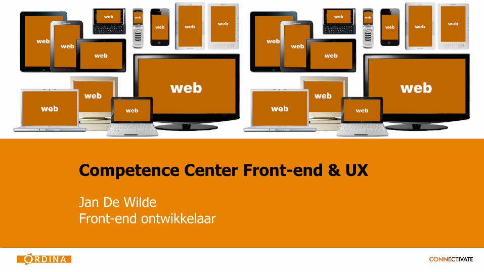
Competence Center Front-end & UX
Jan De WildeFront-end ontwikkelaar

Topics
1. Introduction
2. Graceful degradation vs. progressive enhancement
3. Mobile first
4. Media queries
5. Fixed, fluid or mixed
6. Images for HiDPI displays
7. Frameworks

1. Introduction
What happened to the internet
• Multitude of different devices
- Great range of screen sizes
- Wearables
- Pixel density different per device (HiDPI displays)
• Mobile data traffic
• Fast and slow devices
• The internet in our hands
Responsive web to the rescue
• Responsive web responds to the environment
• Different experience depending on screen size
• One platform for every screen
• Landscape and / or portrait adaptations
• New way of developing for the web
• Modular systems
• Easy to adapt to other screen sizes or device formats

2. Graceful degradation vs. progressive enhancement
Graceful degradation
• Desktop > Tablet > Smartphone
• Focused on desktop
• Put everything for desktop in it
• Scale down to mobile devices
• Spend / waste time on workarounds
• Difficult to adapt to larger platforms
More info: http://en.wikipedia.org/wiki/Fault-tolerant_system
Progressive enhancement
• Smartphone > Tablet > Desktop
• Focused on mobile
• Mobile first approach
• Add more functionality depending on the platform
• No time wasted on finding workarounds
• Easy to expand to other larger platforms with fewer constraints
More info: http://en.wikipedia.org/wiki/Progressive_enhancement

3. Mobile first
Book in cover: http://www.abookapart.com/products/mobile-first

Mobile what
• Design and build a website from the mobile point of view
• Using progressive enhancement
• Preferably use media queries with only min-width properties
• Define content and logic depending on screen size
• Adapt visuals to HiDPI displays
• Higher scalability

Do your research
• On which devices
• What is the content
• Define content per device type
• Small screen users want the essentials
• Bigger screen users get all the details
Content
• Define content for mobile and add more content for desktop
• Or define content for desktop and strip down for mobile
• Richer experiences for mobile and desktop
• Smaller screens only get served what matters the most
• Mobile users want to find and consume information quickly
• Desktop users spend more time consuming information
Design
• Convince designer to design mobile firstHint: bribe him
• Design each screen based on defined content • When reducing horizontal space, also reduce vertical space• White space is King

Style
• Mobile:
- Easy and pleasant to use
- Fewer or lightweight graphics
- Always leave margins on each side of the screen
• Larger platforms:
- More presentational graphics
• General:
- Use white space! It's free and creates a better experience
Development
• Mobile first progressive enhancement
• No time wasted on workarounds
• Invest that time in a better experience
• Use fluid design, it does make your responsive life easier

4. Media queries
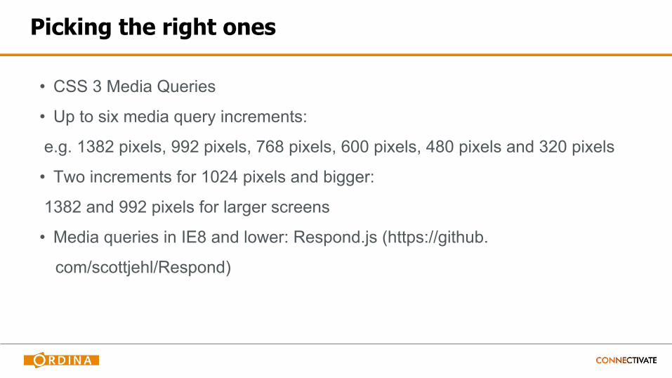
Picking the right ones
• CSS 3 Media Queries
• Up to six media query increments:
e.g. 1382 pixels, 992 pixels, 768 pixels, 600 pixels, 480 pixels and 320 pixels
• Two increments for 1024 pixels and bigger:
1382 and 992 pixels for larger screens
• Media queries in IE8 and lower: Respond.js (https://github.
com/scottjehl/Respond)

How to
<meta name="viewport" content="width=device-width, initial-scale=1.0">
@media only screen and (min-width: 480px) {
… styles for 480px and up go here
}
@media (-webkit-min-device-pixel-ratio: 2), (min-resolution: 192dpi) {
/* Retina-specific stuff here */
}

5. Fixed, fluid or mixed
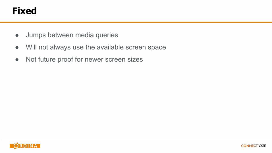
Fixed
● Jumps between media queries
● Will not always use the available screen space
● Not future proof for newer screen sizes
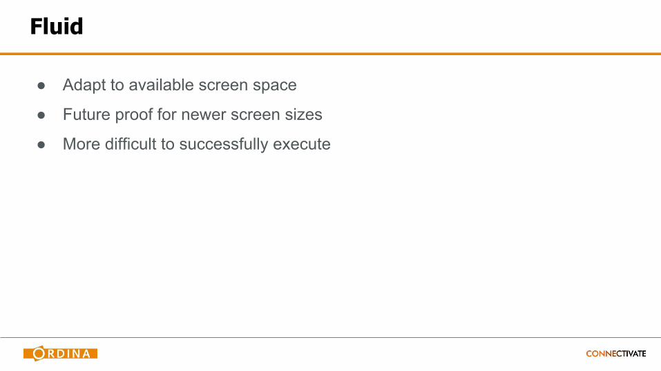
Fluid
● Adapt to available screen space
● Future proof for newer screen sizes
● More difficult to successfully execute
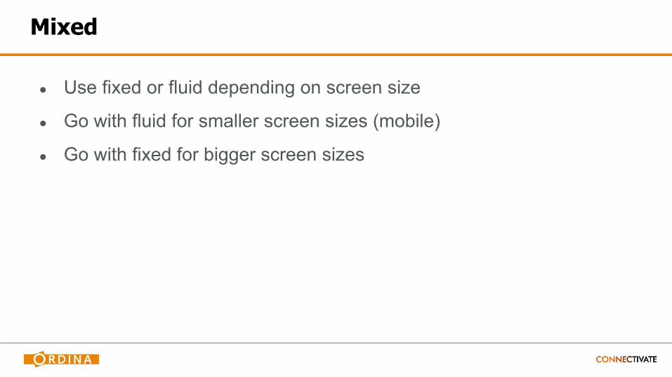
Mixed
● Use fixed or fluid depending on screen size
● Go with fluid for smaller screen sizes (mobile)
● Go with fixed for bigger screen sizes

6. Images for HiDPI displays

Images and HiDPI displays
• Add media query for HiDPI
e.g. @media (-webkit-min-device-pixel-ratio: 2), (min-resolution: 192dpi) { /*
Retina-specific stuff here */ }
• Use @2x in file name to know which image is for HiDPI screens (defined by
Apple's high-resolution modifier)
e.g. background-header.jpg, [email protected]
Images and HiDPI displays
• Adapt images used in styles
- HiDPI image is twice as big
- Scale to 50% using CSS3's background-size property
• Inline and content images
- Create one image that is twice the size
(more info: http://blog.netvlies.nl/design-interactie/retina-revolutie-follow-up/)
- This image is likely to be smaller in file size than the higher quality smaller
image

7. Frameworks
Less Framework 4
• Only media queries
• HiDPI media query optional
• Simple, fast and easy to use
• Fixed (fluid after adaptation)
• Very basic typography
• Increments: 992 pixels, 768 pixels, 480 pixels and 320 pixels
More info: http://lessframework.com/ or successor: http://framelessgrid.com/
Skeleton
• Only media queries
• Simple, fast and easy to use
• Has basic grid system
• Fixed (fluid after adaptation)
• Typography, forms, buttons
• Increments: 960 pixels, 768 pixels and 480 pixels
More info: http://www.getskeleton.com

Zurb Foundation version 5
• Super advanced
• Media queries, JavaScript, Sass
• Works fluid until defined max size
• Good for prototyping
• Possibility to customize download
• Learning curve: support forum
More info: http://foundation.zurb.com/
Twitter Bootstrap version 3
• More advanced
• Media queries, JavaScript, Sass, {Less}
• Big library of components
• Prototyping
• 12-column grid
• Learning curve: documentation
More info: http://twitter.github.com/bootstrap/
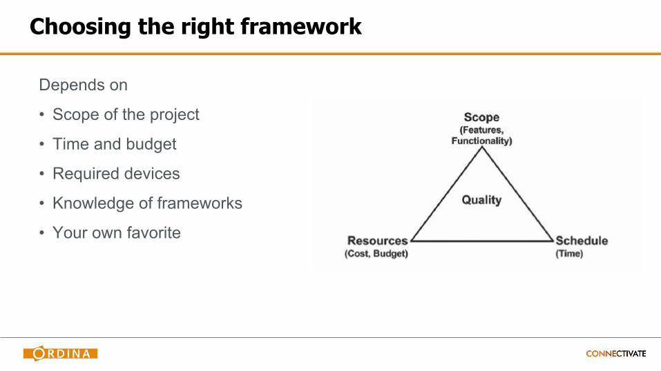
Choosing the right framework
Depends on
• Scope of the project
• Time and budget
• Required devices
• Knowledge of frameworks
• Your own favorite

Questions
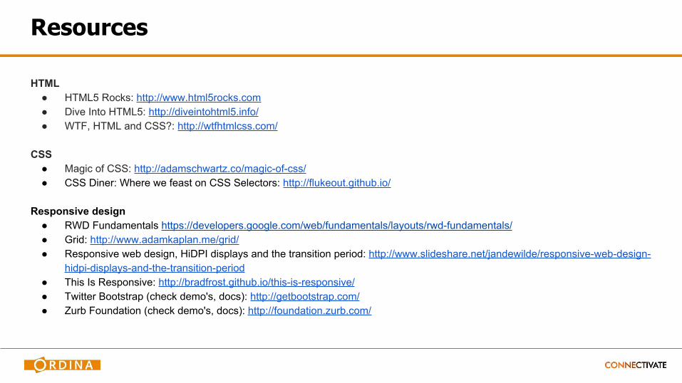
Resources
HTML● HTML5 Rocks: http://www.html5rocks.com● Dive Into HTML5: http://diveintohtml5.info/ ● WTF, HTML and CSS?: http://wtfhtmlcss.com/
CSS● Magic of CSS: http://adamschwartz.co/magic-of-css/ ● CSS Diner: Where we feast on CSS Selectors: http://flukeout.github.io/
Responsive design● RWD Fundamentals https://developers.google.com/web/fundamentals/layouts/rwd-fundamentals/ ● Grid: http://www.adamkaplan.me/grid/ ● Responsive web design, HiDPI displays and the transition period: http://www.slideshare.net/jandewilde/responsive-web-design-
hidpi-displays-and-the-transition-period ● This Is Responsive: http://bradfrost.github.io/this-is-responsive/ ● Twitter Bootstrap (check demo's, docs): http://getbootstrap.com/ ● Zurb Foundation (check demo's, docs): http://foundation.zurb.com/