uni studies 3 - donald bren school of information and...
TRANSCRIPT

Uni Studies 3:The Visual Display of Quantitative Information:Graphical Excellence
Assoc. Professor Donald J. PattersonUni Stu 3 Fall 2012
1Thursday, November 8, 12
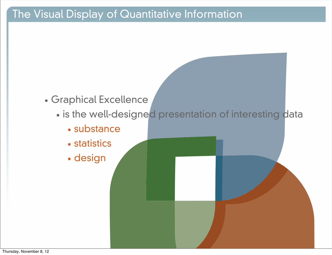
•Graphical Excellence
• is the well-designed presentation of interesting data
• substance
• statistics
• design
The Visual Display of Quantitative Information
Thursday, November 8, 12

•Graphical Excellence
• consists of complex ideas communicated with
• clarity
• precision
• efficiency
The Visual Display of Quantitative Information
Thursday, November 8, 12

•Graphical Excellence
• is that which gives the viewer
• the greatest number of ideas
• in the shortest time
• with the least ink
The Visual Display of Quantitative Information
Thursday, November 8, 12

•Graphical Excellence
• is nearly always multivariate
• requires telling the truth about the data
The Visual Display of Quantitative Information
Thursday, November 8, 12

The Visual Display of Quantitative Information
Thursday, November 8, 12

•Why graphical representations at all?
• reveal data
• precisely
• in large quantity
• leveraging the visual part of our brains
The Visual Display of Quantitative Information
Thursday, November 8, 12

The Visual Display of Quantitative Information
Thursday, November 8, 12

The Visual Display of Quantitative Information
Thursday, November 8, 12

The Visual Display of Quantitative Information
Thursday, November 8, 12

• The story...
• Infographics comes from
• geographical representation
• time-series representation
• combinations
• abstractions
The Visual Display of Quantitative Information
Thursday, November 8, 12
The Visual Display of Quantitative Information
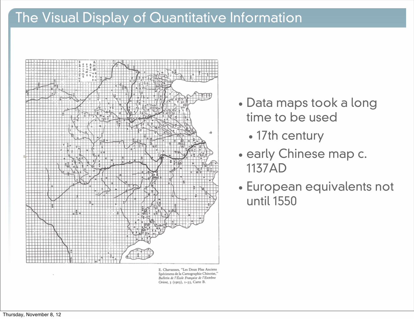
• Data maps took a long time to be used
• 17th century
• early Chinese map c. 1137AD
• European equivalents not until 1550
Thursday, November 8, 12

The Visual Display of Quantitative Information
• Data maps took a long time to be used
• 17th century
• early Chinese map c. 1137AD
• European equivalents not until 1550
Thursday, November 8, 12
The Visual Display of Quantitative Information
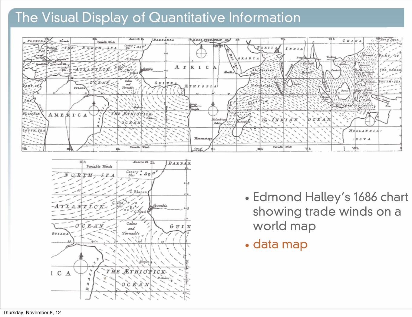
• Edmond Halley’s 1686 chart showing trade winds on a world map
• data map
Thursday, November 8, 12

The Visual Display of Quantitative Information
•Minard 1845
• data mapThursday, November 8, 12

Google Maps API
Credit: John Snow, On the Mode of Communication of Cholera, 1855Thursday, November 8, 12

The Visual Display of Quantitative Information
• 10th century monastic diagram of celestial bodies
• time series
Thursday, November 8, 12

The Visual Display of Quantitative Information
• It was not until 1700s that time-series charts began to appear in scientific writings
Thursday, November 8, 12

The Visual Display of Quantitative Information
• 1861
• combination space and time
Thursday, November 8, 12

The Visual Display of Quantitative Information
• 1885
• combination
Thursday, November 8, 12
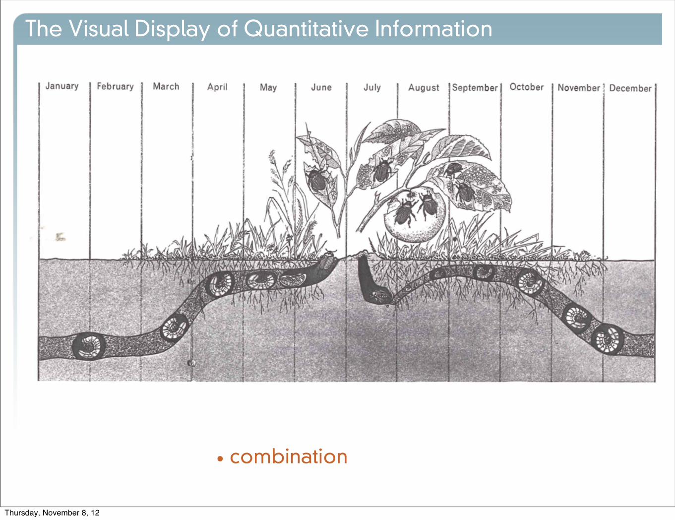
The Visual Display of Quantitative Information
• combination
Thursday, November 8, 12

The Visual Display of Quantitative Information
• 1765
• abstraction
• By 1800’s graphical design was no longer dependent on direct analogy to the physical world. Any quantity could be placed in relationship to any other variable quantity. [Infographics] became relevant to all quantitative inquiry.
Thursday, November 8, 12

The Visual Display of Quantitative Information
• Support and deny causal relationships
Thursday, November 8, 12

Thursday, November 8, 12