adverts and covers
TRANSCRIPT

The album is the second release from The XX, called ‘Coexist’. The
band have kept a simplistic
and minimalistic theme throughout their releases and posters, reflecting
the genre of their music
(electronic and minimalistic musical style)
The artwork is inspired by an iridescent oil spill,
which is in the shape of an
X, which obviously links to the bands name The XX
The use of the letter ‘X’ is a running
theme for the band , with
them creating many different versions of
the artwork from previous
albums and singles. Keeping an
identical size, shape
and font for the letter ‘X’
The XX like to keep the colour palette they use for the work
similar throughout. manly using black and white, however in
this cover and a few others they have used paste pinks, blues
and yellows, which gives the covers a iridescent quality

the album cover completely
revolves around a graphic which is
placed in the centre. Although
I’ve previously seen covers that use
have an object on the cover this is
the first time I’ve seen as
cover that is just a graphic. I
thought this was really eye
catching.
The image on the cover appears to be made up of
three V shaped or triangular shapes, this
could represent the fact that there are three members
in the band, or possibly, it could be linked
to the V in the bands name, ‘CHVRCHES’. The shape
is also similar to the symbol for radiation. The bands name is ‘CHVRCHES’
and the album name is ‘The Bones
Of What You Believe’, they are in
a cream coloured font, this colour
can also be seen in the graphic
image above. ‘CHVRCHES’ is
typed in capitals with the ‘U’ being
replaced with a ‘V’ and the ‘E’
placed with three horizontal lines.
This is how the bands time is
written on all their merchandise,
this is a trend they follow through.
The album name is considerably
small for the cover of the album
this gives the view that the name is
not the main
focal point.
The colour scheme is mainly black,
blue and red, with the occasional
flick of cream, violet and cream
through out. By using black and a
violet/blue colour against a deep
red background ensures that the
cover is eye catching and will
stand out on the shelf of a record
store.The deluxe version of this album has
the same graphic on the cover, but
switches the position of blue and red.
Also ‘Deluxe Addition’ has been
added under the album name in a
small black font. The colours used
through out both cover are bright
for a ‘normal’ electronic, synth pop
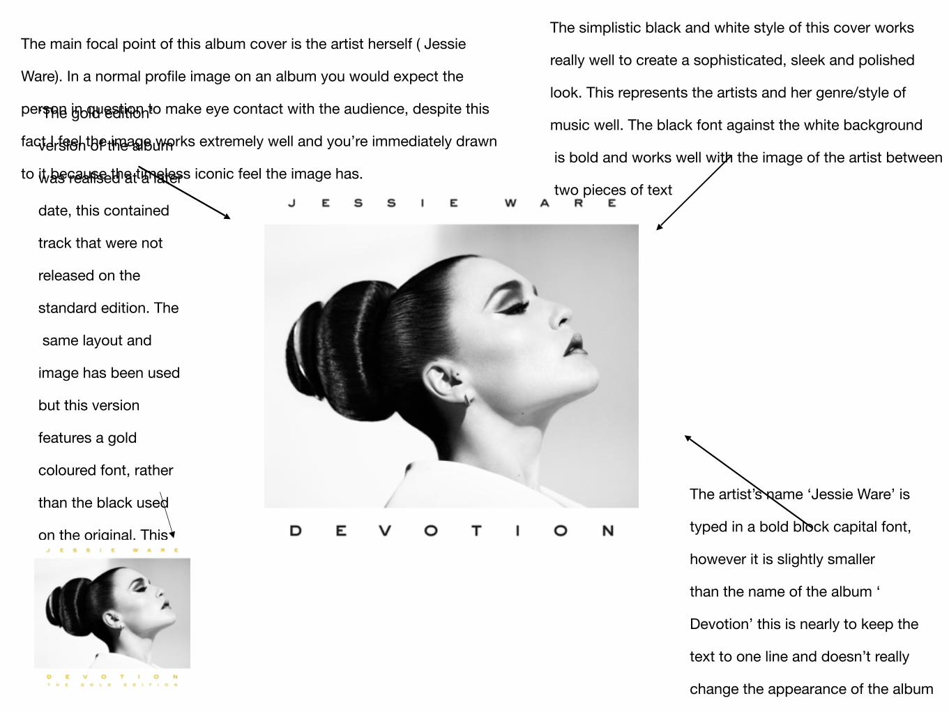
The main focal point of this album cover is the artist herself ( Jessie
Ware). In a normal profile image on an album you would expect the
person in question to make eye contact with the audience, despite this
fact I feel the image works extremely well and you’re immediately drawn
to it because the timeless iconic feel the image has.
‘The gold edition’
version of the album
was realised at a later
date, this contained
track that were not
released on the
standard edition. The
same layout and
image has been used
but this version
features a gold
coloured font, rather
than the black used
on the original. This
clearly represents the
fact that this is the
‘gold edition.’
The simplistic black and white style of this cover works
really well to create a sophisticated, sleek and polished
look. This represents the artists and her genre/style of
music well. The black font against the white background
is bold and works well with the image of the artist between
two pieces of text
The artist’s name ‘Jessie Ware’ is
typed in a bold block capital font,
however it is slightly smaller
than the name of the album ‘
Devotion’ this is nearly to keep the
text to one line and doesn’t really
change the appearance of the album
too much, in comparison to how an
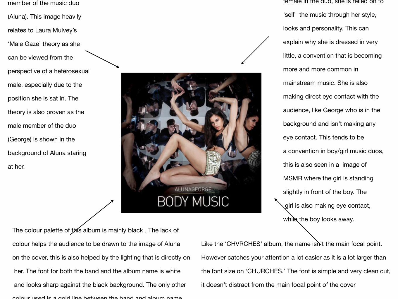
member of the music duo
(Aluna). This image heavily
relates to Laura Mulvey’s
‘Male Gaze’ theory as she
can be viewed from the
perspective of a heterosexual
male. especially due to the
position she is sat in. The
theory is also proven as the
male member of the duo
(George) is shown in the
background of Aluna staring
at her.
The colour palette of this album is mainly black . The lack of
colour helps the audience to be drawn to the image of Aluna
on the cover, this is also helped by the lighting that is directly on
her. The font for both the band and the album name is white
and looks sharp against the black background. The only other
colour used is a gold line between the band and album name
Like the ‘CHVRCHES’ album, the name isn’t the main focal point.
However catches your attention a lot easier as it is a lot larger than
the font size on ‘CHURCHES.’ The font is simple and very clean cut,
it doesn’t distract from the main focal point of the cover
female in the duo, she is relied on to
‘sell’ the music through her style,
looks and personality. This can
explain why she is dressed in very
little, a convention that is becoming
more and more common in
mainstream music. She is also
making direct eye contact with the
audience, like George who is in the
background and isn’t making any
eye contact. This tends to be
a convention in boy/girl music duos,
this is also seen in a image of
MSMR where the girl is standing
slightly in front of the boy. The
girl is also making eye contact,
while the boy looks away.
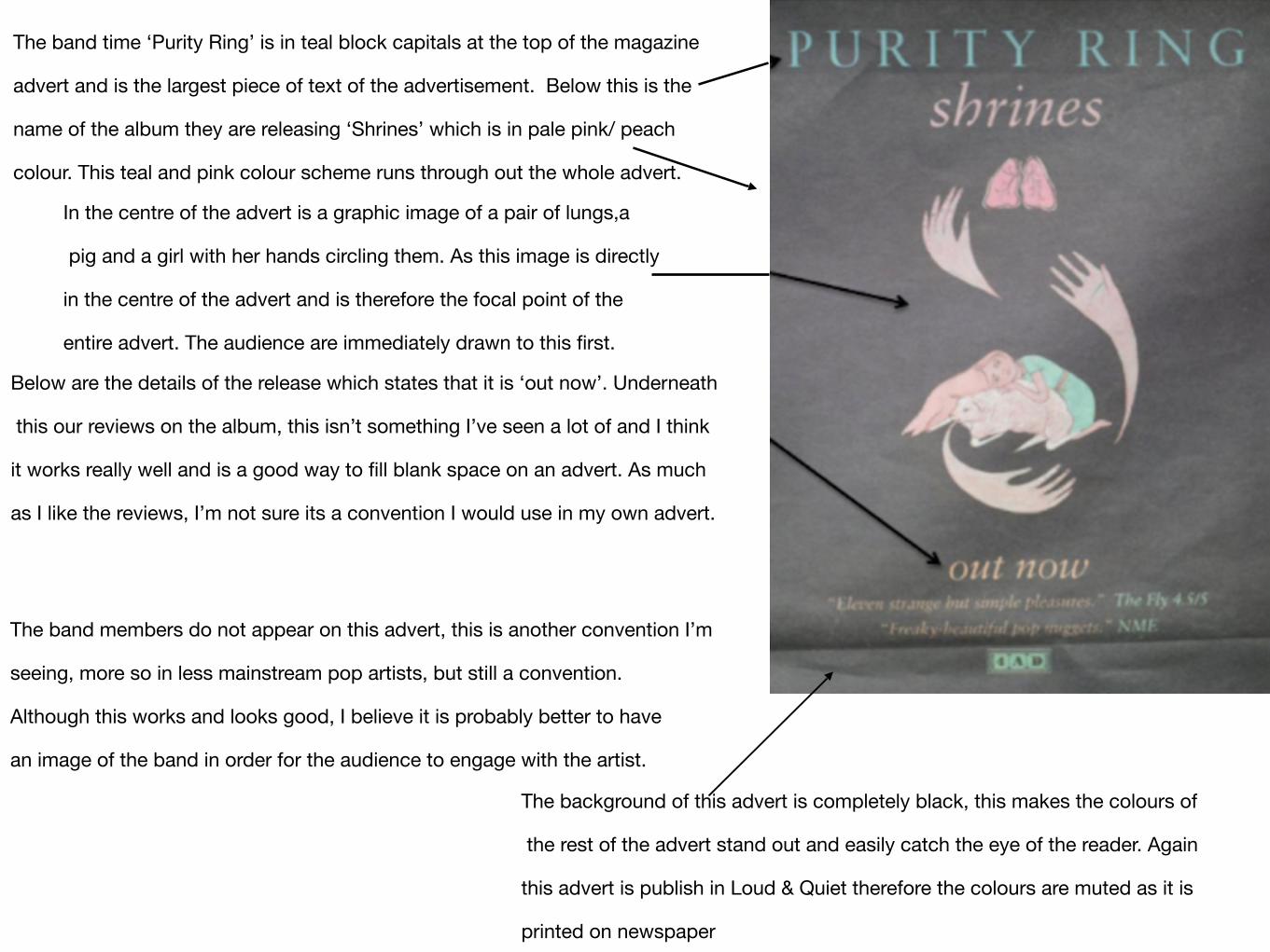
The band time ‘Purity Ring’ is in teal block capitals at the top of the magazine
advert and is the largest piece of text of the advertisement. Below this is the
name of the album they are releasing ‘Shrines’ which is in pale pink/ peach
colour. This teal and pink colour scheme runs through out the whole advert.
In the centre of the advert is a graphic image of a pair of lungs,a
pig and a girl with her hands circling them. As this image is directly
in the centre of the advert and is therefore the focal point of the
entire advert. The audience are immediately drawn to this first.
Below are the details of the release which states that it is ‘out now’. Underneath
this our reviews on the album, this isn’t something I’ve seen a lot of and I think
it works really well and is a good way to fill blank space on an advert. As much
as I like the reviews, I’m not sure its a convention I would use in my own advert.
The band members do not appear on this advert, this is another convention I’m
seeing, more so in less mainstream pop artists, but still a convention.
Although this works and looks good, I believe it is probably better to have
an image of the band in order for the audience to engage with the artist.
The background of this advert is completely black, this makes the colours of
the rest of the advert stand out and easily catch the eye of the reader. Again
this advert is publish in Loud & Quiet therefore the colours are muted as it is
printed on newspaper