design guidelines for the visual environment (draft)c.ymcdn.com/sites/ · sight, visual cues in the...
TRANSCRIPT
Design Guideline for the Visual Environment: Version 4.3 October 2, 2013 ©National Institute of Building Sciences
0
Developed with generous support from the Hulda B. and Maurice Rothschild Foundation

Design Guideline for the Visual Environment: Version 4.3 October 2, 2013 ©National Institute of Building Sciences
1

Design Guideline for the Visual Environment: Version 4.3 October 2, 2013 ©National Institute of Building Sciences
2

Design Guideline for the Visual Environment: Version 4.3 October 2, 2013 ©National Institute of Building Sciences
3
Table of Contents Table of Contents ............................................................................................................. 3 Acknowledgements .......................................................................................................... 5 Foreword .......................................................................................................................... 6
The Need for Guidelines ............................................................................................... 6 Scope ............................................................................................................................ 7 Measurements .............................................................................................................. 7
What is Low Vision? ......................................................................................................... 8 Prevalence of Low Vision in the Population .................................................................. 8 Aging and Low Vision ................................................................................................... 9 Low Vision and Design ................................................................................................. 9
CHAPTER 1 – General Design Principles ...................................................................... 11
1.1 Two Primary Bases of Lighting Design ............................................................. 11 1.2 General Design Considerations ........................................................................ 13 1.3 Tables of Criteria ............................................................................................... 21 1.4. Additional Considerations .................................................................................. 36
CHAPTER 2 – Site and Landscape Design ................................................................... 37
2.1 Approaches to the Site and Building(s) ............................................................. 37 2.2 Building Orientation ........................................................................................... 37 2.3 Site Circulation .................................................................................................. 38 2.4 Courtyards and Plazas ...................................................................................... 38 2.5 Street and Site Furniture –Signs, Benches, Containers, etc. ............................ 39 2.6 Landscaping ...................................................................................................... 39 2.7 Water Features .................................................................................................. 39 2.8 Wayfinding and Signage ................................................................................... 40 2.9 Other Design Issues .......................................................................................... 41
CHAPTER 3 – Architecture and Interior Design ............................................................. 43
3.0 Overall Building Concern: Daylighting Control .................................................. 43 3.1 Building Entrances ............................................................................................ 45 3.2 Lobbies .............................................................................................................. 46 3.3 Lounges and Waiting Areas .............................................................................. 48

Design Guideline for the Visual Environment: Version 4.3 October 2, 2013 ©National Institute of Building Sciences
4
3.4 Interior Circulation Spaces ................................................................................ 49 3.5 Stairways ........................................................................................................... 50 3.6 Elevators ........................................................................................................... 51 3.7 Toilet and Bath Rooms ...................................................................................... 51 3.8 Offices and other Workspaces .......................................................................... 53 3.9 Dining Areas ...................................................................................................... 54 3.10 Assembly and Conference Areas ...................................................................... 56 3.11 Dwellings, Resident and Patient Rooms ........................................................... 57
CHAPTER 4 – LIGHTING DESIGN ................................................................................ 61
4.1. Design for Daylighting ....................................................................................... 61 4.2 Site Lighting ...................................................................................................... 61 4.3 Interior Lighting .................................................................................................. 62 4.4 Lighting for Signage and Artwork ...................................................................... 64
5. REFERENCES AND BIBLIOGRAPHY ....................................................................... 65
5A. References ........................................................................................................... 65 5B. Bibliography .......................................................................................................... 68 5C: Summary Review of Literature for Criteria ........................................................... 68
5D. Index ...................................................................................................................... 78 5E. Background on this Guideline ................................................................................ 79 5F: LVDC Committee Members ................................................................................... 81 6. TECHNICAL APPENDICES ....................................................................................... 83
6A. Health Effects ....................................................................................................... 83 6B. Basic Calculations and Measurements ................................................................ 85 6C. Additional Definitions and Calculations ................................................................ 87 6D. Dimming and other Control Strategies ................................................................. 95 6E. Thermal Loads and Energy Impact ...................................................................... 98 6F. Building Systems and Controls ........................................................................... 102 Footnotes .................................................................................................................. 105

Design Guideline for the Visual Environment: Version 4.3 October 2, 2013 ©National Institute of Building Sciences
5
Acknowledgements This guideline was developed by the Low Vision Design Committee of the National Institute of Building Sciences (NIBS) through initial funding from the U.S. General Services Administration (GSA) and subsequent grants from the Hulda B. and Maurice L. Rothschild Foundation and the Jim H. McClung Lighting Research Foundation. The Low Vision Design Committee was established by the NIBS Board of Directors in September 2011 as an outcome of the September 2010 Workshop on Improving Building Design for Persons with Low Vision. That workshop was sponsored by the U.S. General Services Administration at the request of Vijay K. Gupta, who was the chief mechanical engineer at GSA until his retirement in January 2011. The committee expresses its gratitude to Vijay for his continued active participation in its activities since his retirement.
Development of the guideline began as a committee activity in September, 2012. Members of the Low Vision Design Committee are listed in Appendix 5F. The committee thanks the Hulda B. & Maurice L. Rothschild Foundation for its early strong encouragement, endorsement, and funding, which enabled the committee to organize and to commence its work. The ongoing financial support and guidance of the foundation, and especially the active participation of its president, Robert N. Mayer, PhD, for a wide range of very significant tasks has been instrumental in the ability of the Committee to continue to move towards its objectives. The Committee also expresses our sincere gratitude to the Jim H. McClung Lighting Research Foundation, for its generous encouragement and financial support.

Design Guideline for the Visual Environment: Version 4.3 October 2, 2013 ©National Institute of Building Sciences
6
Foreword We see with our brains, not with our eyes. Light—from both direct sources and surface reflections—enters the eye and impacts the retina. Signals produced by the rods and cones within the retina then are transmitted to the brain, which, influenced by our psychology, translates that information into what we know as our “visual experience.” To evaluate the effects of light in a design, we need to know:
• Calculated values for the quantity and quality of light entering the eye • The vision (or view) expected to be perceived by the occupants • The impact that light has on health and safety.
The design then can be evaluated in terms of its performance and its energy and economic consequences can be predicted more accurately. While the pathologies and treatment of low vision and other visual disorders are medical issues, assuring optimal access to the built environment for persons with visual impairments is a design priority. Whether we are fully sighted or have limitations to our sight, visual cues in the architecture and interior design of a space aid us in our interactions with our surroundings – supplemented by non-visual cues such as acoustic, thermal, olfactory, kinesthetic, and tactile ones. Any lack of clarity in visual cues or any defect in our interpretation (or comprehension) of the environment can reduce our abilities to wayfind and navigate the environment safely and to understand our surroundings. As low vision affects an increasing percentage of the population, particularly as a consequence of aging, the need to accommodate persons with low vision in the built environment is critical and must be addressed. Of course, lighting design is key: Using natural and electric lighting to illuminate objects in a space while minimizing negative effects such as glare and low contrast is beneficial to all sighted persons. The use of luminance, color, and value contrast to improve visual clarity of the environment is especially helpful to persons with low vision. Glare, improper low contrast, and low illuminance levels are three of the most common visual impediments in the built environment. Many modern buildings are designed with large areas of glazing for daylight and views, and with extensive electric lighting systems. Glare along with contrast problems created by these light sources and finishes are major causes of distraction, discomfort, and impediment to vision for many who use these building, especially for those with low vision and other visual impairments. Additionally, many newer or recently renovated building interiors use monochromatic or low-contrast finishes that are difficult for persons with low vision to negotiate.
The Need for Guidelines Low vision is distinguished from legal blindness (i.e., visual acuity worse than 20/200 in the better-seeing eye) not only for the type of medical reimbursement provided for patient care, but also for accommodation requirements in the design and operations of the built environment in accordance with the Architectural Barriers Act of 1968 (ABA) and the Americans with Disabilities Act of 1990 (ADA). The ADA made access to all facilities by all Americans a national priority as a civil right, and was incorporated into

Design Guideline for the Visual Environment: Version 4.3 October 2, 2013 ©National Institute of Building Sciences
7
building codes and other requirements for facilities design by jurisdictions nationwide. The federal government, through the Architectural Barriers Act (ABA), has made accessibility to federal buildings a mandatory requirement. These statutes have been translated into physical design guidance through the development of guidelines. The ADA/ABA design guidelines accommodate some needs of blind people, but do not consider those with low vision. This document includes guidelines that encompass design for persons with low vision and other visual impairments, for which there is a dearth of appropriate codes and standards. It is the intent of this guideline to inform the regulatory and design communities about the challenges experienced by low vision populations and to provide specific design recommendations regarding the visual environment in order to afford equal access to all facilities through universal design principles.
Purpose Clinicians indicate that it would be useful to quantify values of light by measurable parameters that take into account occupant/visitor perception. Likewise, it would be helpful for designers and others accountable for building performance to be able to quantify visual environments/occupant perceptions using the same measurable values. The purpose of this guideline is to offer both groups the means to achieve these values, based on empirical data from published laboratory and field studies, as well as from published post-occupancy evaluations of buildings occupied by both low vision and normally sighted persons. In developing this guideline, it has become clear that there are many issues related to the visual environment that have not been studied and tested sufficiently to yield good data. Therefore, we hope that this guideline will also serve as a roadmap for future research and feedback in order to create a more robust universe of empirical data to guide the regulatory and design communities.
Scope This design guideline is intended for use in new construction and alterations of public accommodations and commercial facilities required to be accessible by the Americans with Disabilities Act of 1990 (ADA) and the Architectural Barriers Act (ABA) of 1968 (as amended), which applies to federal buildings. This guideline addresses planning and design of a building and facility site, including all features used to access the building or facility such as walkways and pathways, stairs, and ramps; interior spaces, including finish materials, and fixed and moveable furniture; and the lighting design, including the use of daylighting and electrical lighting. It may also be of use to home designers and builders of senior housing facilities.
Measurements All dimensions in this document show the dimension designated by code or regulation in parentheses with the corresponding international metric designation preceding it. For example: 1.52 m (5 ft.) diameter clearance for navigation of a wheeled chair in an accessible toilet room.

Design Guideline for the Visual Environment: Version 4.3 October 2, 2013 ©National Institute of Building Sciences
8
What is Low Vision? “Low vision” has been defined as “chronic visual impairments that cause functional limitations or disability” (1) where:
• Chronic means that low vision cannot be corrected with medical or surgical intervention or refractive error correction
• Visual impairment means loss of visual acuity, loss of contrast sensitivity, loss of peripheral vision, or the occurrence of central blind spots
• Functional limitations means increased difficulty with reading, mobility, visual motor activities, interpreting visual information
• Disability means unable to perform usual or customary daily activities. Major contributors to vision impairments include:
• Cataracts are a clouding of the crystalline lens of the eye that is a natural process of aging. Contrast is lost because the scattered light reduces the sharp edges between letters and surfaces. Adding light judiciously can reduce the impact of poor contrast. When cataracts are advanced, surgical intervention may be indicated.
• Glaucoma results in optic nerve atrophy caused by intolerance to pressure. This causes peripheral vision loss. Contrast and glare both combine to create challenges, because the visual receptors lost are those that respond to dim light. Good contrast is important in wayfinding; the peripheral visual field is affected and patients use different cues to keep from bumping into objects. Glaucoma is treated with drugs, lasers, and surgery.
• Age-Related Macular Degeneration (AMD) affects central vision. Glare from bright direct light can wash out the peripheral receptors that the patient becomes more reliant on, and filtered lenses are often very useful to reduce this effect. Additionally, contrast improvements can help the brain fill in the gaps in missing vision. Risk factors include ultraviolet exposure, diet, and smoking. Treatment includes vitamins, lasers, photo-dynamic therapy, anti-VEFT injections for wet type AMD, and surgery.
• Diabetic Retinopathy is the leading cause of new blindness. In fact, there are many different manifestations of diabetic vision loss: Some have peripheral vision loss mimicking glaucoma, others have central loss similar to AMD, still others experience bleeding in the vitreous that can create a glare problem like cataracts. Prevention of diabetic retinopathy is much better than treatment, which can be laser treatment or in the case of diabetic retinopathy, vitrectomy (2).
Prevalence of Low Vision in the Population The low vision population is comprised of people who have disease-related or age-related vision loss as well as people with eye conditions that affect vision temporarily or permanently (3). Most of these individuals are used to having good vision and may not have adapted to reduced vision nor have most of them had low vision services. Most

Design Guideline for the Visual Environment: Version 4.3 October 2, 2013 ©National Institute of Building Sciences
9
have not received skills-training such as orientation to the environment, trailing or self-protective techniques, or braille. Most do not use mobility canes. If traveling with others, most do not know proper human guide techniques.
Approximately 89 million people in the U.S. over the age of 40 (i.e., 63%) have vision problems, according to 2010 data and statistics from the National Eye Institute of the National Institutes of Health (4). Within this population, nearly 17 million (i.e., 19%) have chronic visual impairments including:
• 2.9 million with reduced visual acuity that cannot be corrected with medical or surgical interventions or refractive error corrections, defined as Low Vision (> 20/40 in the better seeing eye)
• 1.3 million with legal blindness (> 20/200 in the better seeing eye) o The sum of these two populations, 4.2 million persons, is in agreement
with the estimate of 4.5 million from the clinical database of over 1000 patients, cited above
• 2.1 million with macular diseases (e.g., age-related macular degeneration)
• 7.7 million with retinal diseases (e.g., diabetic retinopathy)
• 2.7 million with glaucoma. These numbers are growing with the general population, but with acceleration in the age groups above 75 years old. From five carefully controlled and published studies, prevalence is projected to increase linearly by approximately 33% during the next 15 years (1).
Aging and Low Vision Empirical data from five studies (1) reveal that the prevalence rate for those with low vision, defined as visual acuity worse than 20/70 in the better eye, is relatively flat at approximately 1% for ages less than 55 to 60 but then accelerates and becomes very steep at age 75. At the age of 80, the prevalence rate is about 10% of the general population at that age (1). These studies also reveal that two-thirds of the people with low vision are women, primarily because women live longer (1), but the age distribution among women with low vision is similar to the age distribution among men with low vision.
Low Vision and Design The environment exerts strong influences on us through our senses and allows us to understand our place in space. The design of the built environment can enhance or vex our understanding and help or hinder our navigation of the world around us. Often the designer has not considered low vision, so many existing buildings present hazards and confusion through such common features as:
• Glare from windows and lighting fixtures
• Confusing reflections in polished wall and floor surfaces

Design Guideline for the Visual Environment: Version 4.3 October 2, 2013 ©National Institute of Building Sciences
10
• Optically misleading geometries in floor patterns and stair finishes
• Inadequate lighting and insufficient contrast in values and hues for objects against background space, and for signs and graphics.

Design Guideline for the Visual Environment: Version 4.3 October 2, 2013 ©National Institute of Building Sciences
11
CHAPTER 1 – General Design Principles Design for the built environment, whether buildings or other places for people, has multiple components: successful accommodation of functional requirements; safe and durable construction; and aesthetic quality. We react to all of these through our senses – by seeing, hearing, touching, moving and even by smelling. A design may be considered successful when all of the components are perceived by peoples’ senses and they are able to use and enjoy the environment. When there is a shortfall in any of these perceptions by building users, their enjoyment of life and their well-being may be compromised. Because one of the more common shortcomings of design is the inability of persons with low vision to be able to fully engage with their environment, it is the purpose of these guidelines to help designers more fully accommodate this population. A visual environment is comprised of four essential, interrelated components;
• Sources of light • Materials and surfaces that reflect light from the sources
• Receptors of the direct and reflected light
• Responses to the signals from the receptors. This chapter defines the characteristics of these components in terms that can be used in the design, operation, and evaluation of indoor and outdoor visual environments. They are consistent with terminology used by health-care professionals. Where possible and appropriate, these characteristics are expressed as measurable parameters and values based on empirical evidence obtained in laboratory tests or from verifiable field data as currently available.
1.1 Two Primary Bases of Lighting Design Light that enters the eye is characterized and measured both indirectly and directly. Signals from this light impingement are emitted from receptors in the retina. These signals are transmitted to two different parts of the brain where: 1) perception and vision occur (1) and 2) circadian rhythms are regulated (see Appendix 6A). Recognizing these effects on normally sighted and visually impaired persons, two basic lighting design methods are described in this section: Illuminance-Based Design and Luminance-Based Design: 1.1.1 Illuminance is the most common lighting parameter in current building standards
and guidelines. Illuminance-Based Design is the traditional method of design, which is based on lighting horizontal and vertical surfaces to provide “acceptable” (i.e., “standardized”) levels of illuminance for general (i.e., ambient) lighting and for specific task lighting (5; 6) Thus, this method relates only indirectly to light impinging on the eye. While ambient levels of illuminance are intended for comfort and safety in general spaces, task levels are intended to enhance visual performance, productivity, and safety while reducing operating costs. Illuminance-Based Design does not directly address light impingement on the eye nor does it include such factors as luminance contrast and glare that affect

Design Guideline for the Visual Environment: Version 4.3 October 2, 2013 ©National Institute of Building Sciences
12
vision. Illuminance-Based Design is not sensitive to the circadian response. Although this method is useful in the conceptual design phase, it may not be sufficient in the design refinement phase to ensure the intended visual responses of low vision as well as normally sighted occupants with regard to brightness, luminance contrast, and glare. Procedures for calculating values of illuminance are described in Appendix 6B
1.1.2 Luminance is a direct measure of light at the eye. It is specifically used to characterize circadian rhythm entrainment (see Appendix 6A), but is not a common basis for visual design standards and guidelines for buildings. It is, however used as the primary measure for special applications, such as design and operations of video equipment, computer monitors, theaters, art galleries, and museums where perception and vision is a primary design objective (7; 8) Luminance is the basis from which values for luminance contrast and glare should be calculated in design, especially for spaces that persons with low vision may occupy. Luminance is also a primary parameter that is used by clinicians in patient care. Luminance-Based Design provides a basis to describe and plan the optical effects on occupants throughout an entire space or room, or at specific locations (7). Unlike Illuminance-Based Design, which only characterizes the quantity of light that impinges on horizontal or vertical surfaces, Luminance-Based Design characterizes both the quantity and quality of light from within a field of view1 that enters the eye. This method, which is sensitive to the occupant’s location within the space or room, is the basis for addressing other factors, such as luminance contrast and glare. Procedures for calculating values of luminance are described in Appendix 6B.
1.1.3 Luminance Contrast is a function of luminance, and glare is a function of luminance contrast. Many modern buildings are designed with large areas of glass for daylight and views, and with extensive electric lighting for comfort and aesthetics. High luminance contrast and high glare from both sources of light are major causes of distraction, discomfort, and impediment to viewing for many building users, especially those with low vision. Also, many newer or recently renovated building interiors have monochromatic or low-value contrast surface finishes treatments that are difficult for persons with low vision to negotiate (see Section 1.3, Tables 1 and 2, and Appendices 6B and 6C for additional information). Procedures for calculating values of luminance contrast and glare, including the Daylight Glare Index (DGI) are described in Appendix 6C.
1.1.4 Color and value of light sources are also functions of luminance. The ability to see and to differentiate between surfaces and objects in the visual environment is dependent on the various characteristics of the color of light source, color of objects/materials, and the combination of these characteristics. In addition, the light source shining on a surface will affect the perception of the material and the space. Circadian rhythms may also be affected by these light sources and
Design Guideline for the Visual Environment: Version 4.3 October 2, 2013 ©National Institute of Building Sciences
13
reflections (see Appendix 6A for further information on circadian rhythms and other health effects). Procedures for calculating values of color and value are described in Appendices 6B and 6C.
1.1.5 Rationale for design and clinical practice. A workshop whose members were drawn from subject matter experts (see Appendix 5E) revealed a need to develop a common vocabulary with a common set of measures for clinicians, design practitioners (e.g., architects, interior designers, lighting designers, engineers), building owners and managers, and policy makers to provide for the visual comfort and safety of low vision as well as normally sighted populations in the built environment.
• Illuminance-Based Design affords designers a relatively simple method to evaluate selections of fenestrations and lighting fixtures (e.g., luminaires) for “natural” and “electrical” illumination of surfaces: o Traditional values of illuminance and power requirements (i.e., lighting
power densities – LPD) are provided in building codes and standards (9)
o This method provides inadequate information for the designer or the clinician to evaluate the effects of the design on light entering the eye or the resultant perception and vision
o This method provides little information that the clinician can use in patient diagnosis and treatment of visual impairments
• Luminance-Based Design is a more comprehensive method with which to design and evaluate the performance of a lighting system and its effect on occupants, including those with low vision. This method also offers the clinician a set of space or room parameters that can serve as background information for patient diagnosis and treatment: o The definition of luminance, LT, and its functional relationships to
various measures of contrast (i.e., CR, CW and CM) and glare (i.e., DGI, GSV), defined and described in Appendices 6B and 6C, are similar, if not synonymous, for the designer and the clinician
o Although the methods of determining the values for these parameters may differ for the designer and the clinician, the results with regard to values of luminance used to calculate CR, CW, CM, DGI and GSV should be similar, if not synonymous
o Therefore, Luminance-Based Design should be used whenever the objective is to design or evaluate the visual environment of a facility for health or safety.
1.2 General Design Considerations The following considerations incorporate both Illuminance-Based Design and Luminance-Based Design. Use of these considerations is recommended when
Design Guideline for the Visual Environment: Version 4.3 October 2, 2013 ©National Institute of Building Sciences
14
evaluation of the impact of the visual environment on the health, safety, and well-being of all persons, including those with low vision and other visual impairments. (See Appendices 6B and 6C for formulas and details). 1.2.1 Owner’s Program Requirements (OPR):
Prior to the onset of design, criteria and other requirements for lighting should be defined and incorporated into an Owner’s Program Requirements (OPR) document. Owner’s requirements and building codes and standards should be reviewed for criteria that provide accommodations for persons with low vision including:
• Functional requirements of the exterior areas, and rooms or spaces
• Daylight considerations: o Areas where view and relationship to the outside are desirable o Areas where daylight must be excluded for technical reasons o Building occupants benefit from the cooler color of daylight to regulate
their circadian patterns, especially when they are indoors for long periods of time during the day
o A balanced spectrum of lighting is important for color rendering and color contrast, in particular for persons with low vision (see Section 1.3 and Tables 1 and 2 for further information)
o Areas where circadian patterns may benefit
• Functional requirements of the site, building, spaces, and rooms: o Exterior lighting on-site. Owner’s requirements and building codes and
standards should be reviewed for criteria that provide accommodations for persons with low vision, including: site lighting; walkways; courtyards and plazas; security features and lighting; water features; façade lighting; signage and wayfinding
o Spill light or light trespass (especially non-shielded security flood lighting) from adjacent buildings and sites and from on-site fixtures luminaires onto unwanted sidewalks, parking areas and pathways, etc. is a common glare problem. Non-shielded exterior lighting viewed inside buildings can also be a source of glare—even outside security (or building façade lighting) into windows of occupied spaces. Light trespass—spills onto other properties and rights-of-way--may be regulated by ordinances
• Functional Areas within the building: Owner’s requirements and building codes and standards should be reviewed for criteria that provide accommodations for persons with low vision and other visual impairments, including: o Areas where safety and security provisions are critical, such as
stairways, elevators, corridors, and other circulation spaces o Areas where ambient lighting is needed with or without daylighting
Design Guideline for the Visual Environment: Version 4.3 October 2, 2013 ©National Institute of Building Sciences
15
o Areas where the full visible-spectrum of high color rendering lighting is important for color rendering
o Areas where light exposure for circadian patterns is important (see Chapters 2 and 3 for more detailed site and functional area considerations)
• The sizes and shapes of these areas, rooms and spaces (see Chapters 2 and 3) Daylighting is one of the factors upon which the location, size, shape and orientation of a building should be optimized. Other owner-defined factors to be considered in optimization studies are:
o Access to site and building o Availability of utilities o Security o Interaction with other buildings o Sustainability
• Selection of the field(s) of view2 within the rooms or spaces to be analyzed
• Selection of appropriate design and evaluation criteria from Tables 1 and 2 The amount of daylight admitted to a building may affect building energy consumption. Energy codes, regulations, and standards require a Daylight Factor of 2% for as much as 75% of the building area (10; 9). This requirement imposes rigorous control to achieve acceptable contrast and glare values (see Table 1)
• Compliance with energy codes, regulations, and standards should be reviewed for maximum allowable Lighting Power Density (LPD) values for indoor and many outdoor areas (9). These requirements:
o Impose potential conflicts between the LPDs intended to reduce building energy consumption and the illuminances or luminances required for functional areas, especially for spaces to be occupied by persons with low vision
o Are based on computer calculations for presumed values of illuminances, not from empirical evidence
o LPDs, which have been increased in common areas for facilities used primarily by persons with low vision (9), can account for a significant percentage of the building energy consumption.
1.2.2 Conceptual Design Phase: For all environments:
• Develop quality daylight parameters

Design Guideline for the Visual Environment: Version 4.3 October 2, 2013 ©National Institute of Building Sciences
16
• Identify interior architectural surfaces to be lighted especially walls and ceiling
• Identify visual tasks and lighting requirements
• Select generic luminaires, and lighting sources describe important and characteristics such as low brightness, directional or uniform, efficacy and dimmability
• Identify background architectural and site surfaces such as walls and other vertical surfaces, ceilings, floors and other horizontal navigational surfaces, task surfaces and furnishings including: and characteristics, including:
o Interior areas: § Circulation and other non regularly occupied spaces that
require navigation § Regularly occupied spaces where visual tasks are
performed. o Exterior and transition areas:
§ Surface areas of circulation areas o Exercise and recreation areas
§ Furnishings and coverings
• Describe important surface characteristics, including: o Surface characteristics o Light Reflective Values o Colors Contrast: hues, chroma saturation and values o Sheen o Textures o Patterns
• Perform Lighting Calculations: o Spatial daylight autonomy and annual sun exposure calculations for
all regularly occupied spaces, and preferably for all non regularly occupied spaces
o Calculation point by point illuminance calculation for each area. Refer to Appendix 6B for procedures
§ In regularly occupied spaces, calculate task surface illuminance
• In intermittently occupied spaces, calculate circulation surface illuminance such as the floor or stairs. Point-by-point, area-by-point, or utilization
Design Guideline for the Visual Environment: Version 4.3 October 2, 2013 ©National Institute of Building Sciences
17
factor methods may be used to estimate illuminance values (see Appendices 6B and 6C)
• Compare results and rationalize with illuminance criteria in Table 1
• Calculate thermal loads from natural and electrical lighting sources and estimate impacts on sizing the HVAC system capacities. The thermal and electrical loads for lighting systems that accommodate LV occupants may exceed those required by low energy codes and standards (see Appendix 6E)
• Estimate impact of proposed lighting system on whole building energy consumption and costs (see Appendix 6E)
• Compare and rationalize results with the OPR. For environments in which daylighting is used:
• Control glare. If daylight is not properly regulated, glare results, and may interfere with visual comfort, wayfinding, safe ambulation, and performing tasks particularly in today’s computer environment
• Avoid a single source of daylight: Daylighting from more than one direction in a space may be beneficial in balancing the light throughout the room during the day. However, these sources may require controls to prevent direct sunlight from falling on surfaces where not desired: o The shape of the ceilings can significantly affect how ambient daylight
can be provided throughout a room o Multiple sources of penetration (e.g., windows in adjacent walls) may
be more difficult to provide in office buildings, particularly with relatively low ceiling heights. But interplay with electric ambient light to balance the light levels and colors becomes an option
• Spaces reliant on daylighting can become too dark without supplemental lighting for a person with low-vision to navigate. Luminance contrast for wayfinding in daylit spaces should be considered both with and without the impact of the daylighting to maximize the navigational assistance provided for low-vision individuals
• Lighting and thermal transmission characteristics of glazing and fenestration assemblies significantly affect daylighting quality
• Highly reflective surfaces in any space may confuse the person with low vision and may compound glare for everyone
• Shadows can be beneficial and detrimental: Corners and surfaces with high definitions are difficult to see without contrast
• Brilliant sunlight on a building’s façade can obliterate detail for the person with low vision even to the point where a door may be indistinguishable from the surrounding construction. Glass doors in a window wall may require solid surfaces, visible characters/marking or other architectural

Design Guideline for the Visual Environment: Version 4.3 October 2, 2013 ©National Institute of Building Sciences
18
features to distinguish the door from the window wall, even for the fully-sighted user
• Reflective mirror images on vertical surfaces confuse the low vision and fully-sighed population.
For environments using electric lighting: For areas where daylighting is not provided, as well as for areas where electric lighting is used to supplement daylighting, provision of illuminance to meet the criteria with minimum glare is dependent on the characteristics of the selected lighting sources (i.e., lamps and fixtures), and the layout and control of the sources with respect to the functions of the space and layout of furniture.
• Lamps. Lamp selection is primarily determined by these characteristics: o Lighting Efficacy is the ratio of lumens output per input power
(lumens/watt). Lamps with higher lighting efficacy are typically more energy efficient but are likely to result in more glare unless adequately shielded (11; 12)
o Correlated Color Temperature (CCT) is the color temperature of a black body radiator which to human color perception most closely matches the light from the lamp. The CCT selection is not necessarily for “accuracy” of color, but may be for aesthetic, enhancement, or psychological purposes (see Section 1.3 and Appendices 5C and 6C for further information). Examples of CCTs from lamps and daylight are:
§ High Pressure Sodium 1,900 K § Incandescent – 2,700 – 3,300 K § Soft White compact fluorescent – 3,000 K § Tungsten Halogen – 3,000 K § Tubular Fluorescent: range of 3000K – 6,500K § Cool White/Daylight tubular or compact fluorescent lamps
(CFL) – 4,100 - 5,000 K § Daylight, overcast – 6,500 K § Clear blue poleward sky – 15,000 – 27,000 K.
o Color Rendering Index (CRI) is a measure of the degree of color shift objects undergo when illuminated by the light source as compared with the color of the same objects when illuminated by a reference source of comparable color temperature. CRI does not indicate the apparent color of the light source. Light sources with a high CRI are desirable in color-critical applications (see Section 1.3, Table 1 and Appendix 6C for additional information)
§ Light sources with a CRI of 80 + are recommended § Fluorescent light sources are typically in the range of 82 to 95 § Some LEDs are becoming available with CRIs at
approximately 95

Design Guideline for the Visual Environment: Version 4.3 October 2, 2013 ©National Institute of Building Sciences
19
§ Incandescent lamps may have high CRI ratings, but typically have lower lighting efficacies.
• Fixtures. Fixtures or luminaires should be selected for their photometric qualities, and also for their aesthetics. Luminaires, both stationary and moveable, should be selected to provide the needed illuminance with minimum glare. o Each fixture should:
§ Have a lens, cutoff angles, or baffles that shield the lamps from direct view and obscure the lamp image
§ Be rated to have a low surface brightness § Have reflectors with matte clear finish and shape to prevent
reflected glare from the lamp § Have light distribution from the combination of fixtures that
extends to the ceiling, walls, and floors. The intensity of the lighting should be controlled to avoid high contrast ratios on architectural surfaces
§ Provide appropriate cut-off angles to avoid glare for standing, sitting, or reclining occupants
§ Be selected to be energy-efficient within the constraints of the lighting requirements
• Layouts. The selection of fixtures with appropriate lamps should be reviewed to assure that the uniformity and luminance contrast criteria for vertical and horizontal surfaces and intersections, and for times of day can be achieved. Of particular concern: o Uniformity of illuminance, CCT, and CRI in zones with daylighting that
require supplemental electric lighting o Uniformity of illuminance, CCT, and CRI in circulation spaces and
other areas where safety and adaption periods are critical o High luminance contrast should be avoided in circulation spaces
• Materials and Areas of Surfaces: o Lighting and thermal transmission characteristics of lamp and fixture
assemblies are significantly affected by LPD requirements. Fixtures with lower LPDs will typically release less heat to the environment that has to be dissipated by the HVAC system. The design of the fixture will also influence the direction of heat transfer (e.g., into the space or into the plenum)
o Highly reflective surfaces can be problematic with artificial light in spaces
• Shading and Transition Areas. Shading and shadows can be beneficial and detrimental (13). Transitions between lighting zones can be difficult to

Design Guideline for the Visual Environment: Version 4.3 October 2, 2013 ©National Institute of Building Sciences
20
control in spaces with daylighting, especially in spaces where occupancy times are less than the expected adaption periods at peak contrast or glare (14): o Corners and surfaces are difficult to see without shade and/or shadows o Changing shadows and moments of glare can adversely affect an
occupant’s ability to navigate a space safely, or to identify obstacles such as stairs or changes in elevation
o A person walking from a dimly lit corridor into a bright, sunlight filled space, or from a brightly lit space to a dimly lit corridor, is likely to have difficulty adapting to the light level, which may be a comfort and safety issue
o Daylight can impede the ability of a person to find the door in a wall of glass. This is a common scenario in many public buildings: § The intense light level of the exterior creates glare and makes all
the fenestrations look the same, unless the doors are highlighted § Unless there is additional lighting or other architectural features to
distinguish the door, even the average user may have difficulty exiting the building.
1.2.3 Design Refinement Phase: For all projects:
• For the selected/critical areas, (e.g., regularly occupied spaces, locations where wayfinding is the primary task, where potential hazards exist) calculate the luminance values, LT, within the selected field(s) of view in accordance with Appendix 6B, Eqn [6], or with an appropriate computer program, such as Radiance (15)
• Calculate values for appropriate luminance contrast parameters and DGI in accordance with selected criteria and Equations [7a] – [10] in Appendix 6C
• For areas where view to the outside is important or where the light spectrum is important for color rendering or circadian patterns (See Appendix 6A):
o Determine values for appropriate luminance and color contrast parameters and DGI (i.e., daylight glare index) (see Section 1.3 and Tables 1 and 2)
o Calculations for comparison with these criteria should be determined from equations in Appendices 6B and 6C or computer simulations
• Table 1 lists recommended maximum and minimum lighting values for illuminances and for luminances. Dimming of the lighting to the minimum values of the range should be achieved by the type of controls described in Section 1.4.3, and Appendices 6D and 6F)

Design Guideline for the Visual Environment: Version 4.3 October 2, 2013 ©National Institute of Building Sciences
21
• Resultant values of luminance contrast and glare should be compared and rationalized with the OPR: o Where conceptual designs for daylighting are detected to be out of
compliance with the OPR, modifications should be implemented before detailed design of electric lighting systems are developed
• Alternative daylighting and electrical lighting strategies should be considered that will reduce heating and cooling thermal loads while achieving the design criteria for luminance contrast and glare.
1.3 Tables of Criteria Recommended performance criteria for outdoor and indoor visual environments are provided in Tables 1 and 2 for lighting and for surface material characteristics, respectively. Definitions of the measurable parameters in Tables 1 and 2 are given in Appendices 6B and 6C. The values in Table 1 are based on experimental data that were found through preliminary literature searches. A summary of the current literature review for Table 1 is provided in Appendix 5C. The values in Table 2 are based on experimental studies and on consensus documents. Some of the values in these Tables differ from those found in standards and guidelines that emphasize energy reductions as primary design criteria (6; 9). For some applications, the committee was unable to find sufficient supporting evidence upon which to make recommendations. Voids in the tables represent gaps in current knowledge, and suggest areas for additional research to establish experimental evidence that can be used in future editions of this guideline. One of these parameters is the Correlated Color Temperature (CCT) based on time of day/night.
• The CCT is a convenient means of characterizing the color appearance of light emitted by a source as it relates to the color of light from a reference source when heated to a particular temperature, measured in degrees Kelvin (K). Common CCTs of light sources range from 2,700 K (e.g., incandescent, warm white fluorescent) to 6,500 K for “cool-white fluorescent (16) Some LED luminaires are becoming available with features to control CCTs by pre-programming or remote sensors
• Although convenient for specifying a light fixture and lamp during the design process, several issues preclude listing recommended ranges in Table 1 at this time: o Light sources with the same CCT can have different color
appearances. For example, at 3,000 K, one source may appear greenish-white, while another may appear purplish-white. To address the potential problem of lamps with the same CCT having a different color appearance, the lighting industry is utilizing a color tolerance system in conjunction with CCT to specify “color consistency” (16)
o Some studies3 have indicated that lighting with higher values of CCT (e.g., 4,500 – 6,000 K) and increased luminance have beneficial effects on normally sighted and low vision persons. However, these
Design Guideline for the Visual Environment: Version 4.3 October 2, 2013 ©National Institute of Building Sciences
22
studies do not definitively show the independent effects of CCT on the outcome variables of the studies
o Light in the “blue” range (460 – 480 nm), similar to what is found in daylight or light from the blue sky during the day has a positive biological impact, but this same wavelength in the evening and at night from electric light sources may have a negative impact on circadian rhythm entrainment and melatonin secretion (17)
o While outside of the quantitative scope of this guideline, there are also qualitative aspects related to physiological influence and occupant acceptance and tolerance of CCTs in specific environments that cannot be ignored. What might be statistically ideal for vision may conflict with the desired ambiance, interior design or culturally acceptable appearance.
The values in Tables 1 and 2 are shown as rational sets that have been derived from experimental studies, evaluations of existing facilities, and professional judgment. These values are intended for use in the conceptual design and design refinement procedures, and should be compared to those calculated by methods described in Sections 1.2.2 and 1.2.3, and rationalized as necessary to comply with the owner’s requirements. These values are provided as guidance for a population that includes a mix of normally sighted and visually impaired persons. Applications for specific visual impairments will require consultation with the appropriate medical personnel. Design values from Tables 1 and 2 should be selected as a set for the intended application and not as disaggregate components. For example, the values for illuminance, luminance, contrast and glare in Table 1 are influenced by the values in Table 2 and should be rationalized with the calculated values for the designed space from the equations in Appendices 6B and 6C.
Design Guideline for the Visual Environment: Version 4.3 October 2, 2013 ©National Institute of Building Sciences
23
Table 1. Performance Criteria for Outdoor and Indoor Visual Environments. (See notes at bottom of table for explanations of columns)
Area or Place Condition Min-Max Illuminance at surface (lm/m2) (See notes 1 an2)
CCT of fixture (oK)
Min CRI of the fixture (ND) (See note 3)
Min-Max Luminance at occupant (cd/m2) (See notes 4 and 5)
Max Daylight Glare Index (DGI) at occupant (ND) (See note 6)
Comments Reference numbers are from Appendix 5C
Exterior – Night Lighting Vehicles Driveways and
roads;
Drop-off/pickup; Parking
Loading/unloading
Security inspection
Pedestrians Urban Public Sidewalks
Main Building Access
Secondary Building Access
Emergency and Maintenance
Seating
Assembly
Dining

Design Guideline for the Visual Environment: Version 4.3 October 2, 2013 ©National Institute of Building Sciences
24
Area or Place Condition Min-Max Illuminance at surface (lm/m2) (See notes 1 an2)
CCT of fixture (oK)
Min CRI of the fixture (ND) (See note 3)
Min-Max Luminance at occupant (cd/m2) (See notes 4 and 5)
Max Daylight Glare Index (DGI) at occupant (ND) (See note 6)
Comments Reference numbers are from Appendix 5C
Other
Objects Signs-directional
Signs-identification
Seating
Artwork
Landscape
Water Features
Other
Interior Transition from Exterior
Entry and Vestibule 750-‐1500 day at floor; 150 night
80 120-‐250 day: 35 night
22 RP 28-‐07 = 1000 lux, 76 cm (30 in) above floor, with daylight encouraged. RP-‐28-‐07 = 100 lux for night Luminance based on Ref 6
Canopied Entry 150 night 80 35 night 22 RP 28-‐07 = 100 lux for night Luminance based on Ref 6.
Lobby 750-‐1500 day at floor; 500 night
80 120-‐250 day; 75 night
18-‐26 RP 28-‐07 = 300 lux, 76 cm (30 in) above floor; RP 28-‐07 = 100 lux for night. Luminance based on Ref 6. See Ref 8: DGI = 18-‐26 depending on view.

Design Guideline for the Visual Environment: Version 4.3 October 2, 2013 ©National Institute of Building Sciences
25
Area or Place Condition Min-Max Illuminance at surface (lm/m2) (See notes 1 an2)
CCT of fixture (oK)
Min CRI of the fixture (ND) (See note 3)
Min-Max Luminance at occupant (cd/m2) (See notes 4 and 5)
Max Daylight Glare Index (DGI) at occupant (ND) (See note 6)
Comments Reference numbers are from Appendix 5C
Security Screening 750-‐1500 95 120-‐250 18 Based on Refs 2, 4, 6, 7, 8. Stairway 500-‐1500
day at treads; 500-‐750 night
80 75-‐400 day; 75-‐120 night
18 RP 28-‐07 = 300 lux, 76 cm above floor. Luminance based on Refs 4 and 6. DGI based on Ref 8 (for safety).
Corridor 500-‐750 at floor, active periods; 200-‐400 inactive periods
80 75-‐120 active periods; 35-‐65 inactive periods
20 RP 28-‐07 = 300 lux, 76 cm above floor, for active periods. RP 28-‐07 = 100 lux for inactive periods. Luminance based on Refs 4 and 6. DGI based on Ref 8.
Public Circulation
Lobbies/Atriums 750-‐1500 day, at floor; 150-‐500 night
80 75-‐400 day 35-‐75 night
18-‐26 RP 28-‐07 = 300 lux, 76 cm above the floor, day; RP 28-‐07 = 100 lux for night. Luminance based on Refs 4 and 6. DGI based on Ref. 8.
Main Stairs 500-‐1500 day at treads; 500-‐750 night
80 75-‐400 day; 150-‐250 night
18 RP 28-‐07 = 300 lux, 76 cm above floor. Luminance based on Refs 4 and 6. DGI Based on Ref. 8 (for safety)
Egress Stairs 500-‐750 at treads
80 75-‐200 18 RP 28-‐07 = 300 lux, 76 cm above floor. Luminance based on Refs 4 and 6. DGI based on Ref 8 (for safety).
Egress Corridors 200-‐500 at floor
80 75-‐150 18 RP 28-‐07 = 300 lux 76 cm above floor; See Ref 3: 200 lm/m2, vertical in gazing

Design Guideline for the Visual Environment: Version 4.3 October 2, 2013 ©National Institute of Building Sciences
26
Area or Place Condition Min-Max Illuminance at surface (lm/m2) (See notes 1 an2)
CCT of fixture (oK)
Min CRI of the fixture (ND) (See note 3)
Min-Max Luminance at occupant (cd/m2) (See notes 4 and 5)
Max Daylight Glare Index (DGI) at occupant (ND) (See note 6)
Comments Reference numbers are from Appendix 5C
direction 1.6m above floor. Luminance based on Refs 4 and 6. DGI based on Ref 8 (for safety).
Other Corridors/Hallways
500-‐750 at floor, active periods; 200-‐400 inactive periods
80 75-‐200 active; 75-‐125 inactive
18 RP 28-‐07 = 300 lux, 76 cm above floor, for active periods; RP 28-‐07 = 100 lux for inactive periods. Luminance based on Refs 4 and 6. DGI based on Ref 8 (for safety).
Elevator Cabs 500=750 at floor
80 75-‐150 18 RP 28-‐07 = 300 lux, 76 cm above floor; Luminance based on Refs 4 and 6. DGI Based on Ref 8 (for safety).
Elevator Lobbies 500 – 750 day, at floor; 200 – 400 night
80 150-‐250 active periods; 65-‐125 inactive
20 RP 28-‐07 = 300 lux, 76 cm above floor, active periods; RP 28-‐07 = 100 lux for inactive periods. Luminance based on Refs 4 and 6 DGI based on Ref 8.
Other Assembly Theater Aisles 50-‐500 at the
seats 80 10-‐150 18 Based on Refs 2, 6, 7, 8.
Theater Seating 10-‐200 90 3-‐65 18 Based on Ref 4. Conference Worksurfaces
500-‐1000 at worksurfaces
90 75-‐150 18 Based on Refs 2, 6, 7, 8.
Classrooms 500-‐1000 at vertical and horizontal worksurfaces
90 75-‐150 18 Based on Refs 2, 6, 7, 8.
Design Guideline for the Visual Environment: Version 4.3 October 2, 2013 ©National Institute of Building Sciences
27
Area or Place Condition Min-Max Illuminance at surface (lm/m2) (See notes 1 an2)
CCT of fixture (oK)
Min CRI of the fixture (ND) (See note 3)
Min-Max Luminance at occupant (cd/m2) (See notes 4 and 5)
Max Daylight Glare Index (DGI) at occupant (ND) (See note 6)
Comments Reference numbers are from Appendix 5C
Lecture Rooms 500-‐1000 at
vertical and horizontal worksurfaces
90 75-‐150 18 Based on Refs 2, 6, 7, 8.
Chair-tablet Arms 500-‐1000 at horizontal worksurfaces
90 75-‐150 18 Based on Refs 2, 6, 7, 8.
Display Walls 100-‐1000 at floor and vertical display surfaces
95 50-‐150 18 Based on Refs, 2, 3, 6, 7, 8.
Circulation 500-‐740 active periods, at floor; 100-‐400 inactive periods
80 75-‐125 active periods; 65-‐125 inactive periods
18 RP 28-‐07 = 300 lux, 76 cm above floor for active periods. RP 28-‐07 = 100 lux for inactive periods. See Ref. 4: 75-‐150 cd/m2.
Lounge Areas 100-‐1000 active periods, at floor; 100-‐400 inactive periods
80 30-‐250 active periods; 30-‐125 inactive periods
18-‐26 Based on Refs 2, 3, 4, 6, 7, 8.
Other Dietary Areas Residential 750-‐2000 90 120-‐300 18 Based on Refs 2, 3, 4, 6, 7, 8.

Design Guideline for the Visual Environment: Version 4.3 October 2, 2013 ©National Institute of Building Sciences
28
Area or Place Condition Min-Max Illuminance at surface (lm/m2) (See notes 1 an2)
CCT of fixture (oK)
Min CRI of the fixture (ND) (See note 3)
Min-Max Luminance at occupant (cd/m2) (See notes 4 and 5)
Max Daylight Glare Index (DGI) at occupant (ND) (See note 6)
Comments Reference numbers are from Appendix 5C
Kitchens Institutional Kitchens
750-‐2000 90 120-‐300 18 Based on Refs 2, 3, 4, 6, 7, 8.
Cafeteria Services 750-‐2000 90 120-‐300 18 Based on Refs 2, 3, 4, 6, 7, 8. Public Circulation 500-‐750
active periods; 200-‐400 inactive periods
80 75-‐125 active periods; 35-‐120 inactive periods
18 RP 28-‐07 = 300 lux 76 cm above floor for active periods; RP 28-‐07 = 100 lux for inactive periods. See Ref 4: 75-‐150 cd/m2.
Dining Tables 500-‐750 active periods, at table surface; 200-‐400 inactive periods, at floor
90 75-‐125 active periods; 35-‐120 inactive periods
18 RP 28-‐07 = 500 lux, 76 cm above floor for active periods; See Refs 3, 4, 6, 7, 8.
Other Administrative Areas
Offices 300-‐1000 ambient; 750-‐1500 at task surface
95 50-‐150 ambient; 200-‐400 for tasks
18-‐26 Based on Refs 2, 4, 6, 8.

Design Guideline for the Visual Environment: Version 4.3 October 2, 2013 ©National Institute of Building Sciences
29
Area or Place Condition Min-Max Illuminance at surface (lm/m2) (See notes 1 an2)
CCT of fixture (oK)
Min CRI of the fixture (ND) (See note 3)
Min-Max Luminance at occupant (cd/m2) (See notes 4 and 5)
Max Daylight Glare Index (DGI) at occupant (ND) (See note 6)
Comments Reference numbers are from Appendix 5C
Notes regarding values in columns: 1. The maximum values of illuminance in column 3 represent the maximum capacity anticipated illuminance of the lighting
necessary for that area and should also provide guidance regarding the required electrical power requirements. 2. The minimum values of illuminance in column 3 represent the minimum anticipated illuminance necessary controllability of
the lighting system for that area and are intended to provide general guidance regarding the type of control needed for that area. Appendix 6D provides additional information regarding types of dimming and other controls.
3. The minimum values of CRI in Column 5 represent the most amount of color distortion that would be acceptable during minimum and maximum values of luminance.
4. The maximum values of luminance in Column 6 represent the total amount of both direct and reflected light flux that enters the eye, without discomfort or glare, during maximum illuminance.
5. The minimum values of luminance in Column 6 represent the total amount of both direct and reflected light flux that enters the eye to provide acceptable photopic vision during minimum illuminance. Appendix 6D provides additional information regarding types of dimming and other controls.
6. The maximum values of DGI in Column 7 represent the most contrast that would be acceptable to populations including persons with low vision while facing the source of maximum luminance. Appendix 6C provides additional information regarding contrast and glare.

Design Guideline for the Visual Environment: Version 4.3 October 2, 2013 ©National Institute of Building Sciences
30
Table 2. Performance Criteria for Surfaces and Materials. References [ ] are listed at the end of this Table.
Specific Area
General Light Reflectance Value Range [1,2,10] (See note 1)
Minimum Value Contrast at Edge (%) [2,3,4,8,10, 11] (See note 2)
Minimum Value Contrast to Adjacent or Background Surfaces [2,3,4, 11] (See note 2)
Maximum Sheen (Gloss Units GU) [2,4,5,6,10] (See note 3)
Change of Texture [2,4] (See note 4)
Pattern Restriction [2,4] (See note 5)
Comment [2,5,9]
Exterior Spaces for Pedestrians
Horizontal Surfaces
Roadway <35 N/A (Not Applicable)--
N/A <10 N/A N/A
Curbs <35 30 30 <10 N/A - N/A - Sidewalks/Paving <35 30 30 <10 - N/A - YES Crosswalks <35 50 50 <10 YES N/A Ramps <35 50 50 <10 YES YES Steps/Stairs <35 50 50 <10 YES YES
Vertical Surfaces & Objects in Circulation Pathway
Poles/Post/Bollards N/A N/A 50 <70 N/A N/A Drinking Fountains N/A N/A 50 <70 N/A N/A Sculpture N/A N/A 50 <70 N/A N/A Seating N/A N/A 50 <70 N/A N/A Trash/Recycling N/A N/A 50 <70 N/A N/A Gates N/A N/A 50 <70 N/A N/A Turnstiles N/A N/A 50 <70 N/A N/A
Directional Signage N/A N/A 50 < 19 N/A N/A Signs Character: 70% Contrast
Directory N/A N/A 50 <19 N/A N/A Signs Character: 70% Contrast

Design Guideline for the Visual Environment: Version 4.3 October 2, 2013 ©National Institute of Building Sciences
31
Specific Area
General Light Reflectance Value Range [1,2,10] (See note 1)
Minimum Value Contrast at Edge (%) [2,3,4,8,10, 11 (See note 2)]
Minimum Value Contrast to Adjacent or Background Surfaces [2,3,4,11] (See note 2)
Maximum Sheen (Gloss Units GU) [2,4,5,6,10] (See note 3)
Change of Texture [2,4] (See note 4)
Pattern Restriction [2,4](See note 5)
Comment [2,5,9]
Building Entry Floor <50 50 50 <40 YES YES Solid Doors N/A- N/A 50 <40 -- --
Glazed Doors N/A- N/A 50* N/A N/A N/A *Visible Characters @ 4’6”- 5’3”
Door Frames N/A N/A 50 <40 N/A N/A
Interior Spaces Building Lobby Floors 20 – 50 50 50 <25 YES YES Walls 50 - 80 N/A 30 <40 N/A N/A Public Doors/Frames N/A N/A 30 < 40 N/A N/A Non-Public Doors N/A N/A 0 < 40 N/A N/A Directory N/A N/A 50 <19 N/A N/A Directional Signage N/A N/A 50 < 19 N/A N/A Furniture N/A N/A 30 < 70 N/A N/A Vertical Circulation Approach to Stairs and Escalators
N/A 50 50 <25 YES YES
Stair Treads/Landing 30 – 60 50 30 < 40 YES YES Stairway Walls 60 – 80 N/A 50 <40 N/A N/A Stairway Handrails N/A N/A 50 < 40 N/A N/A Elevator Doors N/A N/A 30 < 70 N/A N/A Elevator Floors 30 - 60 N/A 50 <25 YES YES

Design Guideline for the Visual Environment: Version 4.3 October 2, 2013 ©National Institute of Building Sciences
32
Specific Area
General Light Reflectance Value Range [1,2,10] (See note 1)
Minimum Value Contrast at Edge (%) [2,3,4,8,10, 11] (See note 2)
Minimum Value Contrast to Adjacent or Background Surfaces [2,3,4,11] (See note 2)
Maximum Sheen (Gloss Units GU) [2,4,5,6,10] (See note 3)
Change of Texture [2,4] (See note 4)
Pattern Restriction [2,4](See note 5)
Comment [2,5,9]
Elevator Walls 40 - 80 N/A 30 < 40 N/A N/A Elevator Buttons N/A- N/A 50 <10 N/A N/A Escalator Steps N/A 50 50 <25 N/A N/A Escalator Landing N/A 50 50 <25 YES YES Horizontal Circulation Floor Surfaces 30 – 50 50 30 <25 YES YES Walls 50 -80 N/A 30 < 40 N/A N/A Public Doors/Frames N/A N/A 30 <40 N/A N/A Non-Public Doors N/A N/A < 10 <40 N/A N/A
Signage N/A N/A 50 11 - 19 N/A YES Signs Character: 70% Contrast
Interior Spaces Restrooms Signage N/A N/A 50 <19 N/A N/A Doors/Frames N/A N/A 30 <40 N/A N/A Floors 30 – 50 30 30 <25 YES YES Walls 60 – 80 N/A 30 <40 N/A N/A Partitions 60 -80 N/A 30 <40 N/A N/A Countertop 30 – 60 30 30 <25 N/A N/A Sinks N/A N/A 30 N/A N/A N/A Toilet/Urinal N/A N/A 50 N/A N/A N/A Fixture Controls N/A N/A 50 N/A N/A N/A

Design Guideline for the Visual Environment: Version 4.3 October 2, 2013 ©National Institute of Building Sciences
33
Specific Area
General Light Reflectance Value Range [1,2,10] (See note 1)
Minimum Value Contrast at Edge (%) [2,3,4,8,10, 11] (See note 2)
Minimum Value Contrast to Adjacent or Background Surfaces [2,3,4,11] (See note 2)
Maximum Sheen (Gloss Units GU) [2,4,5,6,10] (See note 3)
Change of Texture [2,4] (See note 4)
Pattern Restriction [2,4](See note 5)
Comment [2,5,9]
Theatre
Theater Aisle 20 - 40 50 30 <25 YES YES
Theater Steps 20 - 40 50 30 <25 YES YES Theater Seating N/A N/A 30 N/A N/A N/A Seating Numbers N/A N/A 50 N/A N/A N/A
Meeting Rooms
Floors 30 - 50 30 30 <25 YES YES Walls 60 -80 N/A 30 <40 N/A N/A Display Walls N/A N/A 30 <40 N/A N/A Seating N/A 50 30 N/A N/A N/A Table Tops/Counters 30 - 60 30 30 < 25 N/A N/A Window Covering ? N/A N/A N/A N/A N/A Offices & Class Rooms Floors 20 – 50 30 30 1 – 25 YES YES Walls 60 – 80 N/A 30 25 – 40 N/A N/A Display Walls N/A N/A 30 25 – 40 N/A N/A Seating N/A N/A 30 N/A N/A N/A Table Tops/Counters 30 – 60 30 30 10 - 25 N/A N/A Window Covering ? N/A N/A N/A N/A N/A

Design Guideline for the Visual Environment: Version 4.3 October 2, 2013 ©National Institute of Building Sciences
34
Specific Area General Light
Reflectance Value Range [1,2,10] (See note 1)
Minimum Value Contrast at Edge (%) [2,3,4,8,10, 11] (See note 2)
Minimum Value Contrast to Adjacent or Background Surfaces [2,3,4,11] (See note 2)
Maximum Sheen (Gloss Units GU) [2,4,5,6,10] (See note 3)
Change of Texture [2,4] (See note 4)
Pattern Restriction [2,4](See note 5)
Comment [2,5,9]
Food Service
Residential Kitchens 20 – 50 N/A 30 1 – 25 N/A N/A Institutional Kitchens 60 – 80 N/A 30 1 – 40 N/A N/A Cafeteria Serveries 60 - 80 N/A 30 1- 40 N/A N/A
Dining Areas
Floors 20 - 50 30 30 <25 YES YES Walls 60 – 80 N/A 30 <40 N/A N/A Door/Door Frames N/A -- N/A 30 <40 N/A N/A Dining Tables 30 - 60 30 30 <25 N/A N/A Dining Counters 30 - 60 30 30 <25 N/A N/A Seating N/A - N/A - 30 N/A N/A N/A References 1. Barker P, Barrick J, and Wilson R. 1995. Building Sight. HMSO in association with Royal National Institute for the Blind. London 2. Bright K, Cook G, Harris J. 1997, Revised 2004, Colour, Contrast & Perception - Design Guidance for Internal Built Environments – The Rainbow Project.
(2004 Revision) The Research Group for Inclusive Environments, The University of Reading, UK. 3. Colour and Contrast, CD design guide and colour schemes 2007. ICI Dulux Trade in association with Royal National Institute for the Blind .
www.duluxtrade.co.uk. 4. Bright K, Cook G, Harris J. 1999. Building Design: The Importance of Flooring Pattern and Finish for People with a Vision Impairment. British Journal of
Visual Impairment, 17: 121-125 5. ADA Standards for Accessible Design 2010, 2012 Signage Update paragraph A430.5 6. Standard Test Methods for Specular Gloss. 2008. ASTM D 523 – 08 International. West Conshohocken, PA . 7. Technical Data – Finish. 2012. Pratt & Lambert Paints. http://www.paintdocs.com/webmsds 8. Owsley C, Sekuler R, Siemsen D. 1983. Contrast Sensitivity Throughout Adulthood. Vision Res. Vol 23, No 7, pages 689-699 9. Meeting the needs of disabled travelers – A guide to good practice for bus passenger technology providers. 2012. RTIGPR003-D002-1.8 10. ANSI/IES RP-28-2013: Lighting and the Visual Environment for Seniors and Low Vision Population. 2013. Illuminating Engineering Society. NY 11 British Standards Institute (BSI) 2001 and in 2009 updated BS 8300-: Design of buildings and their approaches to meet the needs of disabled people – Code of
practice. Practices described in BS 8300-2009 and Evaluating access statements requirements in Part M of the building regulations and minor technical

Design Guideline for the Visual Environment: Version 4.3 October 2, 2013 ©National Institute of Building Sciences
35
Notes regarding values in columns: 1. The maximum values for the parameters of LRV, shown in Column 2, represent the most reflection from exterior and interior
surfaces that would be acceptable to populations including persons with low vision to minimize glare. o See Appendix 6C for methods in calculating luminance contrast and the glare index, DGI. o Otherwise, ranges of LRVs represent reflections from interior surfaces that would enhance luminance and be acceptable
to populations including persons with low vision and would provide flexibility in meeting the minimum value contrasts in Columns 3 and 4.
2. The minimum Value Contrasts, shown in Columns 3 and 4, represent the lowest contrast that would be acceptable to populations including persons with low vision while viewing the edge of a step, a change in level, or adjacent surfaces or objects and their backgrounds. o See Appendix 6C for the method of calculating Value Contrast. Note that this term is an application of the Weber Equation
and that coordination of terminology between design and clinical professionals is needed. 3. The maximum Sheen for surfaces, shown in Column 5, represents the most specular reflection that would be acceptable to
populations including persons with low vision for reducing reflected glare. o Sheen of a surface in measured in Gloss Units (GU). See Appendix 6C for additional information.
4. A Change of Texture on a walking surface. where shown in Column 6, provides useful sensory information for a person with low vision as a subtle cueing or a warning. See Appendix 6C for additional information.
5. Patterns should be restricted to plain uniform surfaces where shown in Column 7, See Appendix 6C for additional information.
amendments to Part M of the building regulations – Impact Statement, 2012

Design Guideline for the Visual Environment: Version 4.3 October 2, 2013 ©National Institute of Building Sciences
36
1.4. Additional Considerations 1.4.1 Architectural Controls A primary means to achieve control of contrast and glare from daylighting is through architectural treatments of the site, building, and façade treatments (also see Chapter 3 Appendix 6F). Building orientation, exterior controls (reveals, louvers, and light shelves), glazing systems, and interior shelves and shading all should be considered, especially during the conceptual design phase. 1.4.2 Thermal and Energy Implications The recommendations in this Guideline are intended to be employed while exercising high-performance design strategies for energy use and sustainability that produce efficient buildings to operate with increased asset value and higher occupant productivity (See Appendix 6E). 1.4.3 Building Systems and Controls Because every individual has unique vision capabilities and personal tolerances, flexibility in controlling environmental quality is very important, especially when trying to accommodate the spectrum of low vision disorders. See Appendices 6D and 6F.

Design Guideline for the Visual Environment: Version 4.3 October 2, 2013 ©National Institute of Building Sciences
37
CHAPTER 2 – Site and Landscape Design Site planning must be integrated with the design of the building and respect the surrounding context. For more information on site planning related to building design, see Chapter 3, Architecture, Lighting and Interior Design. The following are typical site design considerations that can affect persons with low vision. As each site is unique, it is recommended that the site analysis be performed before design begins, be alert to other possible impacts of the site planning and design that could result in glare, which is both distracting and uncomfortable to vision but may also contribute to cooling loads.
2.1 Approaches to the Site and Building(s) Wherever possible, it is recommended that all approaches to a building or facility be considered an accessible route as defined in the Americans with Disability Act Accessibility Guidelines (ADAAG) (18; 19), or be accessible for persons with low vision with features recommended in this Section 2.1, or without steps or stairs. (If some approaches cannot be made accessible for persons with low vision, it is recommended that visual or other directions be provided to direct persons to the accessible route.)
• Where bollards and other barriers are used in sidewalks and other pedestrian pathways, they should be a minimum of 1 m (40 in.) (20). It is recommended that the color, form, and other features of the bollards and other barriers contrast with the surroundings so that they do not present a hazard which could cause pedestrians to collide with the barriers in daylight and darkness (see Section 1.3 and Table 2 for recommended performance criteria). Bollards that have horizontal ornamental projections, or are linked by chain or rope are a hazardous falls risk to many persons, including those with low vision
• It is recommended that paving be of medium color value and not glaringly reflective, especially in plazas, outdoor eating areas, and other open spaces where reflections of sunlight into the building could add to glare and to heat load (see Section 1.3 and Table 2 for recommended performance criteria)
• It is recommended that curbs, wheelstops, and other changes to the level of paving be of contrasting color and value (see Section 1.3 and Table 2). Where bollards with linking chains are used as barriers to prevent pedestrians from stepping into traffic, the chains must be visually prominent in dimensions and color so people with low vision do not miss seeing them
• However, caution should be used in selection of use of varying colors and patterns in paving that might obscure actual steps or other changes in paving levels or, conversely, may become false suggestions of level changes.
2.2 Building Orientation Building orientation will affect the amount of direct and reflected solar penetration of interior spaces, and the need for controls to mitigate or prevent consequent glare and may add to solar loads that may need additional cooling. Wherever possible under site and location conditions, the following are recommended:

Design Guideline for the Visual Environment: Version 4.3 October 2, 2013 ©National Institute of Building Sciences
38
• Direct east and west-facing exposures should be avoided for building occupancies such as offices and other workspaces to avoid the direct low angle light from the rising or setting sun
• Large expanses of pavement that could reflect light and heat into large expanses of building fenestration should be mitigated with landscaping or light-absorbing pavement, or should be located away from the building.
2.3 Site Circulation It is recommended that walkways in the public right-of-way comply with the following, in addition to the standards of the governing authority:
• Walkways must not present hazards of tripping and falling due to uneven surfaces or from steps, curbs and edging that are not clearly visible with change of color, value and texture. Curbs and other walkway edges should be raised above the walkway pavement a minimum of 100 mm (4 in.) (20), and be of contrasting color or value enough to be clearly visible to the pedestrian as a pavement boundary (see Table 2). Pavement edge curbs are generally not needed where there are handrails
• The approach pathways to public entrances must be easily identified with signs or visual clues such as architectural or landscape features so that approaching persons will be able to locate the entrance door.
Stairs and steps should be designed with leading edges (i.e., nosings) that clearly contrast in color and value with treads and risers (19). Where steps cross grades, tapered risers to meet grade may be hazardous to the unwary pedestrian pedestrians who may be unable to see the edge of the step and/or detect them visually or who may have balance issues. Where possible, avoid tapering or, in addition to contrasting leading edges, use handrails to lead or guide the pedestrian to the full step and riser section of the stair/steps.
• Pavement patterns and color changes that could be mistaken for steps should be avoided where they cross paths of pedestrian travel.
Drains and gratings should be placed to the sides rather than in the pathways in paved pedestrian areas. Gratings bars should run perpendicular to the path of travel and be spaced not more than 13 mm (1/2 in.) apart (20). Walkway lighting should be provided to minimize glare. For example, bollard lighting should be directionally downward and overhead, and post lighting should be baffled from view by walkers looking at the pathway.
2.4 Courtyards and Plazas In general, courtyards and plazas are subject to many of the same recommendations as other paved areas with the following additional considerations:
• Because people with low vision have longer adaptation times when moving from areas of dim to bright lighting and vice versa, where courtyards and plazas are accessed from the building or are part of the entrance design, transition from the
Design Guideline for the Visual Environment: Version 4.3 October 2, 2013 ©National Institute of Building Sciences
39
bright light of an outdoor space to an indoor space should be made with a vestibule in which the daylight level is muted with tinted glass or shading
• Where courtyards are adjacent the building walls, large glass areas such as doors and windows in the building perimeter could be mistaken for openings by the person with low vision, so clearly visible barriers to prevent accidental collision are recommended, including horizontal rails or raised sills height
• Fixed seating, tables, containers, etc. should comply with Section 2.5 below • Landscaping within the courtyard or plaza should comply with Section 2.6 below
• Sculpture placed within paved areas of a courtyard or plaza if not of a size, form, and/or color that is readily visible in contrast with the surroundings should be placed or mounted to avoid accidental collision by pedestrians with low vision
• Lighting in courtyards and plazas should be provided to minimize glare. Bollard lighting should be directionally downward.
2.5 Street and Site Furniture –Signs, Benches, Containers, etc. • Site furniture (and pole-mounted lighting, signs, etc.) should be placed out of the
path of pedestrian travel and be designed and located so as to be visible to pedestrians at all times and under natural and artificial lighting
• Benches and other seating should be of contrasting color value to the surroundings to be clearly visible and be placed offset from the pedestrian route in order not to present a collision or tripping hazard
• Trash and recycling containers should be clearly visible in form, color and value contrasts with the surroundings in color and design contrasting with adjacent glazed areas at 1 m (40 in.) (20), and be placed offset from the pedestrian route in order not to present a collision or falls hazard
• Security measures, which take the form of barriers at the perimeter of the building, should be designed to pose no hazard to the pedestrian with low vision who may not be able to discern these barriers when they occur in unexpected places in the pedestrian access path, such as bollards, low fences, or walls.
2.6 Landscaping • Trees should be selected to avoid low-hanging branches projecting into paved
walkways and plazas such that they might present a hazard to pedestrians
• Trees that drop fruit, nuts or cones seasonally should be avoided next to paved walkways to minimize falls risk
• Landscaping can be used to help guide pedestrians in large, open paved spaces as “landmarks” along with bollards and site furniture to assist in wayfinding.
2.7 Water Features Water features such as fountains, ponds, etc. should be ringed with seating or otherwise placed to avoid falls risk

Design Guideline for the Visual Environment: Version 4.3 October 2, 2013 ©National Institute of Building Sciences
40
• Raised perimeters such as walls, seating, etc. of 600 mm (24 in.) (20) height above adjacent walkways or other paving can provide safe barriers from accidents.
2.8 Wayfinding and Signage Buildings and complexes such as campuses that are accessible to the public should be provided with information to assist in locating destinations with signs, maps, and other visual and auditory aids. These are especially useful to first-time visitors and should be designed to be used by low-vision as well as normally-sighted people. The following recommendations supplement Section 703 of the Americans with Disability Act Accessibility Guidelines for Buildings and Facilities (19).
• Viewing distance for various types of signs should be considered to be at least 2 m (7 ft) (21). However in some circumstances (e.g. where areas at signs are congested or where information needs to be conveyed at greater distances to allow appropriate reaction and response), it may be appropriate to allow for considerably greater viewing distances
• Signs should be located in prominent positions perpendicular to the flow of traffic, where possible, for easy discovery from vehicles—where appropriate—and foot traffic
• Signs mounted on posts are vulnerable to damage and may be hazardous if too close to the path of travel. Signs suspended overhead may be difficult for low-vision users to see and may be missed since such users frequently concentrate downward to avoid stumbling hazards. However, if overhead signs are used, they should be mounted at a minimum of 2100 mm) above the path of travel. (Signs on walls may be preferable, and should be mounted at between 1400 mm and 1700 mm (55 – 67 in.) for standing persons and between 1000 mm and 1100 mm (40 – 43 in.) for wheelchair users (21)
• Tactile signs are generally not familiar to persons with low vision and visual signs should comply with the following:
o Lettering styles, spacing and other features should comply with ADAAG 703.2 (19), and as follows: § Signs are more legible for visually impaired people when characters
contrast with their background with an LRV as recommended in Table 2
§ Lettering and other graphics should be monochromatic white information on black field since many persons with low vision have some degree of color blindness and difficulty with low contrast. See also Table 2
§ Raised or incised lettering not contrasting in color or value with the surrounding field is not recommended for use by persons with low vision. Shadows may confuse rather than enhance visibility
o Sign surface illumination should be uniform and as recommended in Table 5C-1, Ref. 4, in daylight and after dark and the sign surfaces should be

Design Guideline for the Visual Environment: Version 4.3 October 2, 2013 ©National Institute of Building Sciences
41
shielded from the light source to avoid reflected glare. o Internally illuminated or backlit signs may be difficult for persons with low
vision due to glare. o Variable message signs may be suitable with the following
recommendations (21): § Use left-justified text a minimum of 22 mm (7/8 in.) high but not less
than 1% of the distance at which the sign is to be read § Use sans-serif fonts with upper and lower-case in simple sentences
without abbreviations § Space characters about ¼ of the font width, and space words more
than characters § Space lines apart 50% of text height where multiple lines are
needed, but avoid fewer than 3 lines § Do not use multiple colors or flashing messages
o Liquid crystal displays may be difficult for persons with low vision, especially where they may be subject to direct sunlight or strong shadows. LED and other internally illuminated displays are preferable.
2.9 Other Design Issues The following additional design recommendations will benefit fully-sighted as well as low-vision persons:
• Curbs and other steps or changes in level in any pedestrian route should be painted with a reflective paint material to be more visible in the dark
• Card key door lock systems are preferable to numeric keypads because combination numbers may be forgotten, and keypads are more difficult to use. Card operated systems are available which can be programmed to invalidate lost cards and issue replacements
• When necessary to use them, keypads and instructions for entrance lock, parking meters and ticket machines should be illuminated as recommended in Table 5C-1, Ref 4, at all times and be designed with the features recommended below:
o The telephone layout (rather than the calculator layout) is recommended for keypads, with a single raised dot on the 5 for keypads on public access terminals
o The font for numeric keypads should have an open shape and be at least 4mm high. A closed shape makes it more difficult to distinguish numbers such as 3 and 8, and ensure a good contrast between the typeface and the color of the keys
o All keys should be tactually discernible and raised by at least 2mm (±.07 in.). Recessed keys can be difficult for people with arthritic conditions and others with poor manual dexterity. Edges of key buttons should be 2.5 mm (±0.1 in.) apart

Design Guideline for the Visual Environment: Version 4.3 October 2, 2013 ©National Institute of Building Sciences
42
o Where possible, use equipment that provides tactile and/or audible feedback when buttons are depressed
o Color-coded keys may not be discernible to some persons with low vision, but if used, use red for cancel; yellow for clear; and green for enter, proceed, accept, etc. If possible, use different shapes for these keys
• Door hardware and lighting at entrances should be coordinated to ensure that lock keyways, intercom devices, doorbell buttons, etc. are illuminated after daylight hours.
Design Guideline for the Visual Environment: Version 4.3 October 2, 2013 ©National Institute of Building Sciences
43
CHAPTER 3 – Architecture and Interior Design Designs that accommodate persons with low vision require more than usual attention to the need for continuity between the site and building or other facility. This is especially so with respect to transitions from the daylight of outdoors to the conditions of the interior and, after dark, the reverse from darkness to interior lighting because people with low vision have longer adaptation times when moving from areas of dim to bright lighting and vice versa. Also, planning of the entrance area for persons with low vision should provide for the first-time visitor, without a guide companion, who may need assistance finding information about navigating the building. This might suggest placing reception personnel as close to and directly visible from the point of entry as possible. In buildings with security screening, security personnel should be sensitized to the needs of persons with low vision to assist them through the screening process and direct them to the reception and building information directory. Touchscreens for building directory and wayfinding information may be a suitable aid if the design provides fonts and graphics that persons with low vision can read, and if augmented with sound. Placement of the device must be such that it is easily seen from the entry door and activation of the screen must be obvious such as by a large visible target button. The use of electronic audio communications as audio guidance assistance in buildings may not be adequate if visitors cannot be assumed to be equipped with the necessary receiving devices before they enter the building. Audible announcement systems are useful for emergency announcements, however. Personal audio assistance receivers using triggering key fobs, smart phones or similar handheld devices may be useful for populations who frequent facilities such as schools and places of employment where the system can be designed to serve that population and devices can be made available for regular use. Careful design of the audio assistance system’s speech quality, message length and clarity, and coordination with other audible systems is crucial to avoiding confusion and misunderstandings. Dynamic tactile systems (electro-mechanical arrays for changeable Braille characters) for Braille users might be located adjacent the touch screens (21).
3.0 Overall Building Concern: Daylighting Control A primary means to achieve control of contrast and glare from daylighting is through architectural treatments of the site, building, and façade treatments (also see Section 1.4.1). The following items should be considered, especially during the conceptual design phase: 3.0.1 Building Orientation
• The basics of architectural design reveal that north and south exposures of a building are the most uniform in terms of light and the easiest to control. The east and west exposures tend to produce the most glare penetration into a building because of the severe angles of sun angles at sunrise and sunset

Design Guideline for the Visual Environment: Version 4.3 October 2, 2013 ©National Institute of Building Sciences
44
• An Aspect Ratio (i.e., length of main axis compared to minor axis) of greater than 3.0 will enhance the penetration of daylight into the center of the building (22)
• A practical depth of daylight penetration is approximately 15 m (45 ft.) without skylights or light shelves (22).
3.0.2 Reveals, Exterior Louvers, and Exterior Light Shelves Exterior controls, such as reveals, louvers and light shelves intercept the visual and thermal components of daylight, which can reduce glare and thermal loads.
• Exterior louvers may be vertical or horizontal. Orientation of the louvers may be fixed, adjusted manually, or adjusted automatically with photosensors and motors (see Section 1.4.1)
• Exterior light shelves, which are horizontal elements that can be built into the building façade, reflect luminance flux through glazing to ceilings where it is re-reflected to interior spaces
• A reveal is the part of a jamb that lies between the glass or door and the outer wall surface. If cut diagonally, the reveal is called a splay. Deeper reveals and splays intercept more of the visual and thermal components of daylighting but may not adversely affect view.
3.0.3 Glazing Systems Glazing systems include windows, curtain walls, doors, skylights, and other fenestrations through which visible light is transmitted. Ultraviolet and infrared parts of the electromagnetic spectrum may also be transmitted. Glazing systems can represent large percentages (e.g., 40 – 90+ %) of the walls and roof (9). Treatments of the glazing materials include:
• Low-emission (i.e., Low-e) solar and patterned glass
• Reflective coatings
• Double and triple glazing
• Exterior shading
• Interior shading. 3.0.4 Interior light shelves and shading Interior devices can reduce glare but seldom reduce the thermal load that must be balanced by the capacity and controllability of the HVAC system.
• Interior light shelves
• Blinds
• Drapes

Design Guideline for the Visual Environment: Version 4.3 October 2, 2013 ©National Institute of Building Sciences
45
3.1 Building Entrances 3.1.1 Doors All entrance doorways shall have thresholds compliant with ADAAG and shall not have steps or stairways closer than 1 m from the doorways. All stairs and steps leading to building entrances should be designed with handrails and nosings that clearly contract contrast in color and value with treads and risers. Where steps cross grades, tapered risers to meet grade may be hazardous to the unwary pedestrian. Where possible, avoid tapering or use handrails to guide the pedestrian to the full step and riser section of the stair/steps.
• Public entrances must be easily identified as such from the street, by their design, architectural setting and location in the building facade, or signage must be provided at the street to direct people to the public entrance. Other doors, such as restricted use doors for employees-only and egress-only doors, could be misconstrued as entrances by the unwary unless they are placed in less conspicuous locations, have less commanding design or have signage to inform the approaching persons to direct them
• Doors must be visually distinguishable from sidelights and other adjacent features to avoid confusion in approaching users. This is most simply accomplished by designing stiles and rails to make transparent areas different from adjacent sidelights
• Power operated and power-assist doors should be easily identified visually. Power sliding doors are preferable to swinging doors Power-operated out-swinging doors should be provided with sensors far enough away from the door on the approach side to prevent collisions between doors swings and entering users
• Glazed doors and side panels should have characters, i.e. signs, logos, emblems or other decorative features at eye level (between 1.4 and 1.6 m (54 and 62 in.) above floor level) and repeated at a lower level (1m (39 in.)). The size of the characters should be larger than 150 mm (6 in.) and visible from both inside and outside the building (20)
• Width – Because some persons with severe sight limitations may be escorted by another person, consideration should be given to providing at least one door wide enough (e.g., 1200 mm (48 in.)) for two persons to pass. This should include revolving doors if no swinging doors are used.
3.1.2 Vestibules It is recommended that vestibules be provided for all exterior entrances—especially at the main public entrance to a facility. The vestibule should be not less than 2,400 mm (8 ft.) (20) between doors to provide room for people to pause for visual adjustment to changing light between the two sets of doors without obstructing the door swings. Greater distances may be needed for power-operated out-swinging doors with approach sensors.
• Thresholds, gratings, and floor mats can become tripping hazards if not designed to be flush with the adjacent floor finishes

Design Guideline for the Visual Environment: Version 4.3 October 2, 2013 ©National Institute of Building Sciences
46
• Surface Finishes. Since vestibules are relatively compact spaces, surface finishes that are highly reflective can be visually confusing and should be avoided
• Fenestration. Transparent door areas are desirable to allow users to see other people approaching on the opposite side. Since fully-glazed doors may confuse some persons with reflections of themselves seen as another approaching person, smaller glazed areas are preferable. Large, transparent doors areas can be a hazard if not protected with divisions or mullions to prevent accidental collisions. Glazed sidelights should be similarly protected
• Lighting. The vestibule can serve as a transitional space between indoor and outdoor lighting levels. Provisions should be made for adjusting the lighting to suit various day and night lighting conditions. A place should be provided to sit that is out of the pathway where the users can allow their eyes to adapt to the change of light levels from interior to exterior.
3.2 Lobbies Traditional building lobbies are typically large, high-ceilinged open spaces to serve as reception, orientation, wayfinding, and security screening spaces, which are consequently well-populated and visually confusing at peak periods. They are the transitional spaces from the outside world to the building’s interior circulation, and often include monumental stairs, elevators, escalators, and other circulation features. 3.2.1 Atriums Many modern public buildings are designed with lobbies and other interior areas that are multi-story glazed spaces often referred to as an “atrium.” These spaces may serve as lobbies with the same features as traditional lobbies, or as interior courtyards used for many purposes in addition to circulation, such as for dining and assembly. These are often challenging to the person with low vision because of the amount of daylight introduced to them by wall glazing and skylights, and because they are adjacent interior, artificially illuminated rooms, corridors, and other areas. Transitional spaces between the atrium and adjoining corridors, elevator lobbies and other circulation spaces to permit adjustment to changes in lighting level are strongly recommended. 3.2.2 Signage and Wayfinding Aids Directional and wayfinding graphic aids are important for all in buildings used by the public, especially those visiting for the first time. In addition to the guidance provided for signs in ADAAG 703 (18), the following are recommended to accommodate persons with low vision:
• Persons with low vision generally are not accustomed to tactile aids such as Braille, so visual aids are more appropriate, and should be placed as conveniently close to the main entrance doors as possible to be readable before entering the lobby without having to search for the reception desk, security facilities, etc.
• All graphics must be adequately illuminated at all hours, and should have high-contrasts between figures or text and background field. See introductory
Design Guideline for the Visual Environment: Version 4.3 October 2, 2013 ©National Institute of Building Sciences
47
discussion to this chapter, and Section 1.3, Table 2, and Section 2.9 for additional guidance.
3.2.3 Reception Where a lobby reception is provided, the location must be easily found and coordinated with any security procedures located in the lobby. See introductory discussion to this chapter for additional guidance.
• Such reception facilities should be provided with seating if visitors are required to wait to be escorted by facility personnel. Furniture must be positioned and be of color values to be easily seen by persons with low vision and to avoid accidental collisions and falls risk. See Section 1.3 and Table 2 for recommended performance criteria.
3.2.4 Vertical Circulation Stairs in lobby areas should be designed with contrasts between treads and risers as required for all other stairs below. As for freestanding monumental stairs, the design must prevent collision with the underside of the stair by means that do not also result in tripping or collision (such as curbs or low planters).
• Escalators and moving walkways should be designed with the following, in addition to all code and regulatory requirements:
o Tread nosing edges in yellow or other highly visible color with permanent solid materials rather than painted
o Underside protections as recommended for monumental freestanding stairs above
o Under step demarcation lighting and yellow combs at the entry to and exit to make the access safe and visible
• Elevators should be designed with the following, in addition to all code and accessibility requirements:
o Elevators are often softly lit inside, and should not open directly to a day lit atrium, but should open to a transitionally brighter lobby.
3.2.5 Surface Finishes • Highly polished floor finishes are potentially difficult for persons with low
vision due to glare and reflections, especially where floor-to-ceiling windows are in use. It is recommended that floors be a matte finishes be textured rather than polished. Sheen and contrast should be as recommended in Section 1.3 and Table 2
• Flooring patterns such as colors in strips that could be mistaken for steps or changes in floor surface can also be confusing, especially where the color change line is perpendicular to the direction of travel. These can be especially hazardous in broad steps leading to level changes. See also Table 2
• Vertical surfaces that are reflective also may be confusing to those with low vision, and mirrors should not be used in contact with the floor where the reflection could be mistaken for a doorway or extension of the space.
Design Guideline for the Visual Environment: Version 4.3 October 2, 2013 ©National Institute of Building Sciences
48
3.2.6 Fenestration Fenestration in lobbies is often primarily a matter of aesthetics rather than illumination needs. Allowing daylight and outdoor views in lobby spaces is balanced against energy and security considerations, but the impact of glare should also be given consideration – especially when one is entering a lobby space with daylighting from an interior corridor or elevator lobby where there may be more muted artificial lighting. See Chapter 1 for additional guidance.
3.3 Lounges and Waiting Areas The purpose of the lounge or waiting area—whether for short-term holding or longer term, including reading, break and relaxation needs—must be considered. 3.3.1 Surface Finishes
• Flooring: If the lounge or waiting space is a part of a circulation space such as a lobby or corridor, a change in flooring may be desired for aesthetic, acoustic, or other reasons, so care should be taken to avoid tripping hazards such as rugs
• Wall finishes: Consideration should be given to reducing contrast between wall finish colors and values with adjacent windows. Where it is useful or important to distinguish one wall element from another such as door frames, increasing contrast can be helpful to the person with low vision
• See Table 2 for further guidance. 3.3.2 Furniture Lobby waiting and lounge furniture should be selected to be clearly visible in form, color and value against the flooring and other surrounding surfaces to the people in these busy traffic areas so that they don’t become collision hazards. Low ottomans and coffee tables can be particularly hazardous when “floated” in open lobby and other circulation areas.
• Arrangement of seating should allow users to choose a location that is facing toward a view or away from the source of glare. Seating arranged for conversation should avoid putting anyone facing another with a window behind—obscuring their faces with glare
• Many people who are hearing impaired rely on lip reading to augment their understanding of verbal communication. Facing toward a window will make it impossible to see the fine details of the other person’s face and lips.
3.3.3 Fenestration • Fenestration placement and design for a lounge or waiting space should
consider potential impact of glare for those in the seating area. Therefore, use of sun control measures such as window coverings—blinds, shades, etc., and glass tinting or patterns— are means of allowing response to glare under varying circumstances

Design Guideline for the Visual Environment: Version 4.3 October 2, 2013 ©National Institute of Building Sciences
49
• Arrangement of seating should allow users to choose a location that is facing toward a view or away from the source of glare.
3.4 Interior Circulation Spaces 3.4.1 Corridors Generally, circulation corridors, etc., should maintain constant widths and where wall offsets, columns, furnishings, and other objects occur, they should be placed outside the paths of circulation and be clearly visible by contrasting color and value to avoid obstructing free and safe movement. 3.4.2 Ramps Ramps and steps in circulation pathways should be clearly distinguished from the level areas by color value and texture. Color value changes and patterns for floor coverings should avoid designs such as strips that could be mistaken for level changes or steps. See Sections 1.3, 1.4 and Appendix D for additional guidance. 3.4.3 Railings
Railings may be useful in many circulation areas, and when in contrasting color and value persons with low vision more easily locate the railings, especially at interruptions such as for doors. 3.4.4 Doorways
Doorways should contrast with the surrounding walls in finish and color to make them more easily located. Hardware such as lock, latches, and pulls should be contrasting in color and value with the door, and room numbers and other graphics must be placed and lighted to be easily read. See Sections 1.3, 1.4 and Appendix 6C for additional guidance. 3.4.5 Elevator lobbies
• Contrasting colors and textures are recommended between elevator doors, frames, and walls of the elevator alcove
• Elevator lobbies or alcoves should be varied in design, finishes, and other features from floor to floor to help elevator users identify the floor, including large-type floor numbers or names
• See Sections 1.3, 1.4 and Appendix 6C for additional guidance. 3.4.6 Surface Finishes
• In some buildings where corridor systems may be complex or potentially confusing to the user, it may be helpful to vary the finish colors, patterns, or materials to help orient the user.
3.4.7 Fenestration Fenestration may be introduced to circulation areas such as corridors to relieve the sometimes relentless monotony of corridor systems, to improve security and to help in orientation by maintaining views of the outdoors. The following are recommendations for design for low vision:

Design Guideline for the Visual Environment: Version 4.3 October 2, 2013 ©National Institute of Building Sciences
50
• Fenestration at the end of a corridor can introduce blinding glare unless diffused or mitigated with curtains or other means, though the loss of an outdoor view could result in discomfort or disability glare (see Sections 1.3 –1.5 for additional guidance)
• A window in the side of the corridor allowing daylight to fall on the corridor end wall may be a better alternative.
3.4.8 Signage and Wayfinding Aids Wherever possible, signs and wayfinding aids should be placed facing the directions of travel rather than on walls and doors along the corridor sides. Signage placed across corridors at the ceilings are difficult to see for some people with low vision who concentrate more on the floor than ceiling, and may be difficult to illuminate properly.
• All signage and wayfinding aids must be in high contrast with the surrounding fields in color and value. See Table 2
• All signage and wayfinding aids require artificial illumination that does not result in glare from reflections off the signage or adjacent surfaces4 (23).
3.5 Stairways 3.5.1 Surface Finishes
• Stair risers should contrast with treads to aid in visibility to persons ascending the stairs
• Stringers or skirting should be darker and have a strong value contrast with treads and risers to enhance their visibility.
• Stair treads with highly figured or patterned materials may be confusing to those with low vision. Continuous carpet stair runners with such designs can be hazardous
• See Table 2 for further guidance. 3.5.2 Railings In addition to code and regulatory requirements, the following is further recommended:
• Hand railings should contrast with wall surfaces in color and value
• Where railings turn corners, it is preferable that they be continuous rather than interrupted.
3.5.3 Undersides The sloping undersides of stairs could become a head-bumping hazard, so spaces under the stairs should be enclosed or otherwise protected to prevent access below a height of 2030 mm (80 in). 3.5.4 Fenestration Fenestration may be introduced to stairways to improve aesthetics of emergency stairs, to improve security and to help in orientation by maintaining views of the outdoors. The following are recommendations for design for low vision:

Design Guideline for the Visual Environment: Version 4.3 October 2, 2013 ©National Institute of Building Sciences
51
• Fenestration facing the direction of travel can introduce blinding glare unless diffused or mitigated with curtains or other means, though the loss of an outdoor view could be unacceptable
• A window in the side of the stair allowing daylight to fall on the stair end wall, but not on the treads may be a satisfactory alternative. Shadows of handrails or supports may create optical illusions.
3.6 Elevators The following are recommended in addition to requirements of applicable codes and regulations: 3.6.1 Surface Finishes Include car handrails on three sides using tubular in preference to flat rails. See Table 2 for further guidance. 3.6.2 Controls and Signals
• Locate call buttons and other controls to be readable by persons standing in the car as well as persons seated in wheelchairs
• Select car controls and floor position signals so that floor number buttons and other graphic information are internally illuminated and not obscured by glare from the cab lighting.
3.7 Toilet and Bath Rooms Public toilets and baths are problematic for persons with low vision often because the spaces are small relative to the amount of objects typically in them such as fixtures, compartments, accessories, etc. Designers may attempt to compensate for this potentially cluttered appearance by selecting somewhat monochromatic color schemes. These have the effect of confusing the viewer with low vision. Entrance doorways and screening entrance vestibules are often difficult for a person with and escort to use, so wherever space permits, entries without doors and with extra width is desirable (such as is common for high volume use in airports). The following recommendations are offered to improve the definitions of these objects to make them easier to see and use. 3.7.1 Surface Finishes
• Matte finish surfaces are preferable to highly polished ones
• Colors and values of wall surfaces should contrast with from those of the plumbing fixtures
• Partitions arranged to baffle views into the toilet room from the public areas outside can be confusing to the person with low vision, so it may help to vary the colors and values of the baffle wall to make it clearer by contrast with other walls

Design Guideline for the Visual Environment: Version 4.3 October 2, 2013 ©National Institute of Building Sciences
52
• Lavatory bowls should differ in color and value from the countertop in which the bowl is set
• Toilet partitions should differ in color and value from the walls of the rooms
• See Table 2 for further guidance. 3.7.2 Fixtures In many public buildings, white plumbing fixtures are the most practical to maintain, clean and replace, so these may be the brightest objects in the room. This is appropriate since they will be most discernible when set against darker finishes surrounding them. 3.7.3 Plumbing Trim and Accessories
• Plumbing Trim (such as faucets and flush valves) may be more easily seen if specified in finishes darker and less mirror-like than polished chrome such as pewter or oil rubbed bronze
• Everyone easily uses electronically activated faucets and flush valves, and they are especially convenient for people with vision problems
• Accessories such as paper towel and other dispensers may be more easily used when their finishes contrast with the background in which they are mounted such as walls and countertops
• Liquid and foam soap dispensers should be placed so that spillage falls into lavatory basins or on countertop rather than on the wall or floor. Designs that have larger spaces under the dispensing nozzle are easier for everyone to use
• Full-length mirrors may be mistaken for doorways by persons with low vision if the mirrors are located where a door might be expected at the entrance to a public toilet room. Many building owners prefer not to place mirrors over the lavatories to reduce hair grooming over the lavatories, but these can be placed on other walls without being full-length.. They should be placed to allow lighting from the sides rather than from directly above.
3.7.4 Fenestration • Generally, public toilet and bath rooms will not have fenestration in new
buildings, but where windows occur, such as in older buildings, glare from daylight may be exacerbated by the light colors and polished surfaces often used in these spaces. Color choice and window covering to control the amount of daylight entering should be considered
• Windows facing the user upon entering a toilet room are especially challenging to persons with low vision, so it is recommended that the room entrance be placed, if possible, to avoid opening directly opposite a window.

Design Guideline for the Visual Environment: Version 4.3 October 2, 2013 ©National Institute of Building Sciences
53
3.8 Offices and other Workspaces 3.8.1 Layout Daylighting conditions in a room and the associated view connections are key factors influencing an occupant’s choice of workspace layout. Sharing a workspace with others will result in different layouts than having an individual space due to privacy needs and relationships with co-workers. This will likely result in very different luminance distributions in the visual field:
• Circulation patterns should be clearly recognizable, and wayfinding must be user friendly. Proceeding through the office should be simple and intuitive for the users
• Grouping workstations around open, informal meeting areas can increase communication between workers
• Glazed partitions with glare control fronting the open area add to a feeling of spaciousness and should be used extensively where appropriate, but must not present a hazard by being dangerously less visible in circulation pathways
• In laying out workstations, avoid long rows of cubicles, but do not create mazes or confusing paths of travel among workstations.
3.8.2 Furniture and Workstations Furniture for private offices may be selected to suit the tastes of the occupant, but in open offices with modular workstations, the following are recommended:
• Vertical surfaces of cubicle panels and upholstery for seating should contrast with flooring and main walls in hue and value or be trimmed with contrasting material to make these forms visible for individuals with low vision
• Persons with low vision can find their way more easily through modular workstations when they are arranged with clearly visible aisles of generally constant clear widths. Flooring texture and color may be used to define the aisles more clearly
• Modular office cubicle panels may provide screening from glare from windows, but care should be taken to avoid glare through sun control when cubicle panels are omitted or are transparent on sides facing windows.
3.8.3 Surface Finishes • High gloss finishes should be avoided on horizontal and vertical surfaces to
avoid reflected glare
• Highly figured or patterned floor and wall surfaces in a space with many workstations and other furniture can be visually disorienting and should be avoided
• See Table 2 for further guidance.

Design Guideline for the Visual Environment: Version 4.3 October 2, 2013 ©National Institute of Building Sciences
54
3.8.4 Fenestration • For daylighting design, the most critical luminance relationships are those
between the daylight opening, its immediately adjacent surfaces and the surfaces surrounding the work tasks.
• Understanding the geometry between sun, sky, daylight openings, and interior space at different times of the day and throughout the seasons is the key to setting the stage for visual comfort. But placing the opening just right to achieve a good balance between views of the outdoors, visual comfort, thermal control, and architectural integrity can be challenging
• For visual and thermal comfort there might be some overlap, but this depends on the location and season. In winter, direct sunlight might contribute to warmth, but might at the same time create visual discomfort in the form of distracting patterns on the work plane or even glare
• With few exceptions, daylighting will have to be controlled to adjust to seasons and time of day
• For additional guidance, refer to Sections 1.2 – 1.7.
3.9 Dining Areas 3.9.1 Layout In situations where the dining facility is specifically for older persons and other populations where low vision is common, self-service cafeterias may need to be staffed to provide assistance in guiding patrons to food, condiment, and beverage stations and to carry trays and locate seating.
• Scatter-type cafeteria serveries can be confusing for persons with low vision, and lighting levels should be maintained throughout the space rather than concentrated at each service island
• Older patrons, especially those with low vision, are often slower to make choices than others, so in-line serveries should provide a wide enough space for other patrons to pass
• In general, a dining space has relatively simple circulation needs which may confuse the person with low vision if the circulation routes are not clearly visible and with easily read and lighted signage, augmented with color and texture changes in flooring as guidance. Some of the destinations needing clear guidance and definition include: o Entrances to destinations such as cafeteria line or captain (for seating
assistance), menu and notice boards or empty tables o Scatter-type cafeteria food and beverage stations o Cafeteria line to condiment and tableware stations and to cashier o Dining tables to self-help tables such as for salads, desserts, etc. o Dining table area to restrooms

Design Guideline for the Visual Environment: Version 4.3 October 2, 2013 ©National Institute of Building Sciences
55
o Dining table area to exits. 3.9.2 Furniture To avoid a sterile, institutional appearance, dining tables are typically grouped non-orthogonally where possible. This, however, makes wayfinding more difficult where patrons self-seat such as in cafeterias. Use of distinctive visual benchmarks such as columns, sculpture, planters, and other features can assist in visually locating a table in a large dining space. Variation in furniture upholstery colors may also help, though some types of low vision involve difficulty in color perception. 3.9.3 Surface Finishes
• Reflective or highly polished floors and walls can be visually challenging, so these types of surface finishes should be avoided
• Table and chair colors and patterns that contrast in color and texture with wall and floors are easier to see and less likely to cause collisions
• See Table 2 for further guidance. 3.9.4 Fenestration
• Skylights should be diffused to prevent glare and shadows on floors and table surfaces, especially if they are light in color and are glossy or polished
• Window areas facing direction of travel from the entrance and cafeteria serving area may present glare and interfere with the diner’s ability to navigate the space. Landscaping outdoors or window shading can mitigate this problem.
3.9.6 Other Design Considerations Menus may be a reading problem for many people with low vision. Menu boards mounted on the wall behind preparation areas of cafeteria stations and short order counters are difficult for many people to read, especially when the selection is large and space is restrictive resulting in small fonts. At tables in restaurants with wait staff, printed menus at times cannot be read due to low lighting. Some options to be considered to address this issue follow (21):
• If space is available at the beginning of the cafeteria line or short order counters, menu boards and other information may be located there. Labels of food and beverage selections at the place of display such as at the steam table or dessert case may also be helpful
• Hand-out paper menus in large type at the beginning of the cafeteria line or short-order counter may be a simple way to accommodate low-vision customers
• Task lighting fixtures at tables can help diners read traditional menus in otherwise low ambient light
• Video and touchscreens may also be useful tools for presenting menus and other information.

Design Guideline for the Visual Environment: Version 4.3 October 2, 2013 ©National Institute of Building Sciences
56
3.10 Assembly and Conference Areas 3.10.1 Layout In general, an assembly space has relatively simple circulation needs, which may confuse the person with low vision if the main paths for travel are not clearly visible and provided with easily read and lighted signage as guidance in varying ambient lighting conditions:
• In fixed seating auditoriums, aisles leading to seats may be difficult to follow without lighting from row ends and on any steps
• In flexible-seating spaces, the way to seats, tables, etc. will be facilitated when the arrangements are in simple geometries with clear pathways to and from entrances, restrooms, refreshment tables and exhibits
• In conference rooms, seating that faces directly into windows is problematic due to glare. Window shading will help mitigate this
• Placement of speakers’ rostrum, screens, etc. must be such as to avoid direct sunlight on these from windows or skylights.
3.10.2 Furniture • Where possible, rectangular conference tables should be arranged
perpendicular to windows so that neither long side faces the glare of the windows directly which also obscures the view of the person silhouetted by the window
• Round conference tables allow a variety of choices of seating with respect to windows and glare
• Glass-topped or other reflective table surface may reflect glare into the eyes of those seated at the table
• In conference rooms with fixed seats in auditorium-style arrangements, light-colored seating fabrics can make finding seats easier in the dark.
3.10.3 Surface Finishes • Polished floors and walls may confuse the person with low vision for whom
flat or low-luster finishes are more comfortable. Polished floors may create glare and potentially be a safety issue
• Seating upholstery colors and textures that contrast with surrounding walls and floors make it easier to negotiate the space and find seats
• See Table 2 for further guidance. 3.10.4 Fenestration
• All fenestration can produce glare, and may need shading of some type.
• Most assembly functions will need to be darkened for some presentations, so signage and other directional assistance must be visible under all daylight or darkened conditions

Design Guideline for the Visual Environment: Version 4.3 October 2, 2013 ©National Institute of Building Sciences
57
� Where tables are set aside for refreshments, information materials, etc. during conferences, dedicated lighting of these areas is recommended when the main space is darkened
• See Table 1 for further guidance.
3.11 Dwellings, Resident and Patient Rooms The most intimate spaces for human occupancy are also the most Important for day-to-day living and are therefore most subject to choices by the occupants according to their tastes and preferences. Because the spaces become so familiar to the occupant and user, many features that could be hazardous or problematic for the occasional user (as in a public facility) will be entirely acceptable. Following are recommendations that can be helpful to persons with low vision. 3.11.1 Layout
• Since residents will become very familiar with their dwelling or room layout, the need for signage or other aids may be minimal, but the placement of doors and passages connecting rooms should be coordinated with potential furniture arrangements to keep paths of travel simple, direct and unencumbered
• Recommended design minimum dimensions for persons with low vision are as follows except as provided in applicable codes and regulations:
Table 3. Widths of Pathways (20)
Person with cane 750 mm (30 in.) Person with guide dog 1100 mm (44 in.) Person with escort 1200 mm (48 in) Doorways (clear opening) 900 mm (36 in.) Corridors 1200 mm (48 in.)
• Light switches and power outlets should contrast in color and value with wall
surfaces, and be mounted at the following recommended heights above finish floor:
Table 4. Mounting Heights (20) Light switch 1300 mm (52 in.) Power outlet 500 mm (20 in.)
• All doors should be completely closed or completely open with predictability. Swinging doors can be hazardous unless they can open with a mechanism for staying open against a wall
• Raised thresholds may present a tripping hazard, so they should be avoided wherever possible
• Corridors, passageways, and other spaces used for circulation may be made safer by providing handrails along the path of travel in a contrasting color and value to the walls
Design Guideline for the Visual Environment: Version 4.3 October 2, 2013 ©National Institute of Building Sciences
58
• Wiring for power, data, phone, and cable TV can be tripping hazards if room arrangements and furniture require long wires to reach outlets. This can be mitigated with additional outlets over and above code minimums to reduce distances from appliances to outlets.
3.11.2 Furniture Wherever possible, familiar furniture owned or selected by the occupant is important to retain. Coffee tables and other furniture with transparent glass tops and without opaque edges can be hazardous even to the regular occupant, and should be avoided. 3.11.3 Surface Finishes
• Rugs and carpets may present tripping hazards unless well secured to the floor and with edges firmly attached to avoid entangling the person’s feet, cane or crutches
• Doors and frames may be easier to find when they contrast with the surrounding walls in color and value
• Full-length mirrors may be mistaken for openings if the mirror extends to the floor, so the bottom of the mirror should be kept above the baseboard
• Floors and walls should be of contrasting colors or values so the person with low vision can know where the floor and wall meet. This may also be enhanced with a baseboard or border that contrasts with both surfaces
• Ramps and steps are hazardous if they cannot be easily seen such as by change in color or pattern at the beginning and end of the ramp and by contrasting color and value between treads and risers
• Floor patterns in carpeting, tile and other materials may be visually confusing to the person with low vision, and it may become especially difficult to retrieve dropped items. Solid colors may make this less of a problem
• Highly polished flooring may be a visual and slipping hazard, so matte finishes may be more appropriate
• See Table 2 for further guidance. 3.11.4 Toilet and Bath Fixtures
• Wall and floor colors and finishes that too closely match the plumbing fixtures and fittings such as light switches, power outlets, robe hooks, towel bars, toilet paper holders, and soap dishes can make those items harder for the person with low vision to locate and use properly, so contrasting colors and values are recommended
• Towel bars may be used accidentally as grab bars by their placement in or near tubs and showers and adjacent water closets, so they should be designed to support the same loads as grab bars as required by code
• Shelving for bathroom items such as lotions, gels, etc. may be accidentally used for support when in or adjacent tub/shower and lavatory areas, so

Design Guideline for the Visual Environment: Version 4.3 October 2, 2013 ©National Institute of Building Sciences
59
shelving should be designed to support the same loads as grab bars or they should be constructed as ledges or recesses into the walls
• The wall behind a mirror should be painted in a medium value to provide the most contrast for the outline of hair that is either light or dark
• Vanity tops for lavatories that are highly polished may reflect glare from lighting if the angles of reflection are not carefully calculated to avoid direct reflections. It is recommended that matte finishes be used when possible
• Highly patterned or textured finishes on floor and countertop surfaces (including granular materials) may make retrieval of small dropped items very difficult for persons with low vision, so untextured and unpatterned surfaces with a matte finish are recommended. See Table 2 for further guidance.
3.11.5 Kitchens and Kitchenettes • Floor and wall colors that contrast with base and wall cabinets and with
countertops are recommended to assist in visual orientation. The edge of the countertop should contrast in value to the counter surface to clearly define the horizontal from vertical
• Highly patterned or textured finishes on floor and countertop surfaces (including granular materials) may make retrieval of small dropped items very difficult for persons with low vision, so untextured and unpatterned surfaces with a matte finish are recommended
• Countertops for kitchens that are highly polished may reflect glare from overhead or under-cabinet lighting if the angles of reflection are not carefully calculated to avoid direct reflections. It is recommended that matte finishes be used when possible. Some countertop surface areas might be provided that are dark while others are light to facilitate working with objects such as foods that are of the opposite values. Two cutting boards, one white and one dark will also provide the desired contrast
• Cabinet drawer and door pulls are more easily seen and used when they contrast with the cabinets in texture, hue, and value. Configuration should be easy to grip when hands may be less agile
• Where cooking appliances such as burners are provided, care in selection and placement of burners and controls is recommended to ensure safety for persons with low vision who may not see hot burners easily
• See Table 2 for further guidance. 3.11.6 Fenestration
• Windows at the end of corridors or passageways can be a problem of glare, and blinds or other controls should mitigate glare if windows cannot be avoided
• Sliding glass doors and fixed adjacent sections may be hazardous when mistaken for an opening. Horizontal rails or decals on the glass can prevent this.

Design Guideline for the Visual Environment: Version 4.3 October 2, 2013 ©National Institute of Building Sciences
60
• Brilliant sunlight on a building’s façade can obliterate detail for the person with low vision even to the point where a door may be indistinguishable from the surrounding construction. Glass doors in a window wall may require solid surfaces, visible characters/marking, or other architectural features to distinguish the door from the window wall, even for the fully-sighted user

Design Guideline for the Visual Environment: Version 4.3 October 2, 2013 ©National Institute of Building Sciences
61
CHAPTER 4 – LIGHTING DESIGN 4.1. Design for Daylighting Although daylighting was once the primary means of illuminating indoor spaces, it is now often limited to spaces on the perimeter of buildings or with skylights, resulting in large amounts of the interior spaces having no openings to the outdoors and no access to daylight. Most modern buildings are in use before and after daylight hours, and in all seasons and weather, so that even rooms with access to daylight at some times, cannot depend on it as the primary source of lighting. Windows, skylights and other openings to the outdoors bring important spatial and psychological benefits to the rooms they serve by enticing people to go outside or by allowing occupants to view the outdoors, sense the time of day (affecting circadian rhythms) and weather changes, and feel less confined in an artificial interior environment. The daylight, especially direct sunlight, admitted by windows and skylights must often be controlled since the light is in a continuous state of change and intensity (see Section 3.0, above). While the daylight admitted by windows and skylights may at times reduce the need for energy for electric lighting, it may also add to the need for energy for cooling or heating in some climates (see Appendix 6E). The energy impacts of fenestration may be very large in some buildings, so it is a matter that must be considered carefully by the designer. For more than a century, electric lighting has been used to supplement daylighting, and to provide ambient and task lighting for vision that is independent of the presence of daylight. Today, designs can integrate electric and daylighting to provide:
• Enhanced control of the indoor visual environment
• Improved methods of achieving acceptable responses from occupants with normal and low vision
• Objective data that are consistent with those used in diagnostics and treatment of low vision persons
• Objective data that enable improvements in building energy management
• Control to change the color and intensity of light for circadian rhythm appropriate for day and night.
4.2 Site Lighting In addition to the recommendations for lighting in Chapter 1, the following are recommended for outdoor lighting to accommodate persons with low vision:
• Because glare can be both uncomfortable and disabling, especially for persons with low vision, avoid lighting placement that shines directly into pedestrians’ eyes
Design Guideline for the Visual Environment: Version 4.3 October 2, 2013 ©National Institute of Building Sciences
62
• Low-level lighting of pathways and other traffic areas using bollard lighting or similar designs that direct the lighting downward will illuminate the needed surfaces without blinding the user
• Lighting directed toward the facades and other vertical surfaces of a building or facility is preferable to fixtures directed outward from eaves as often is done for security. Careful coordination of lighting is needed to avoid “blinding” closed circuit televisions (CCTV security cameras) on one hand and building occupants on the other, while providing desired building and landscaping lighting for aesthetic purposes.
4.3 Interior Lighting 4.3.1 Lobbies Special consideration should be given to electric lighting for persons with low vision in lobby areas include the following:
• Lighting on stairs, steps and other changes in level should make the edge of the level change clear and avoid confusing shadows that obscure or misrepresent the edge of a step
• Lighting levels at the floor level should not change suddenly such as where accent downlighting is used
• Atrium travel may also be enhanced by the use of tactile flooring, change in lighting level and visual contrasts of floor surfaces for guidance to important destinations such as emergency exits, information/registration desks, elevators, etc.
• Elevators should be placed in separate alcoves off the main lobbies that are well-defined by lighting and other visual cues to provide, where applicable, lighting transition between low-level elevator cab lighting and high-level lobby lighting.
4.3.2 Lounge/Waiting Room Generally, high-intensity down lighting may be unsuitable in lounge seating areas where people may sit to read, because the down lighting may present difficult shadows on reading matter. Table lamps or similar task lighting may be more appropriate. See Tables 1 and 2 for further guidance:
• Fenestration at the end of a corridor can introduce discomfort or disability glare unless diffused or mitigated with curtains or other means, (see Sections 1.3 – 1.5 and Appendix 6C for additional guidance)
• A window in the side of the corridor allowing daylight to fall on the corridor end wall may be a satisfactory alternative.
4.3.3 Interior Circulation Spaces Electric lighting should generally be uniform along the length of corridors. The use of task lighting such as at hotel room entrance doors facilitates reading the room number and using a key or card key. Higher lighting levels at elevators help to locate the

Design Guideline for the Visual Environment: Version 4.3 October 2, 2013 ©National Institute of Building Sciences
63
elevator as a wayfinding device. Lighting should be even; avoiding pools of light in an overall dim environment. See Tables 1 and 2 for further guidance. 4.3.4 Stairways In addition to requirements of life safety codes, electric lighting of stairways must be designed to make the step edges clearly visible, especially in the direction of egress— usually in the downward direction. Uniform, diffused lighting which does not produce shadows on the treads is desirable. See Tables 1 and 2 for further guidance:
• Stair tread nosings should be in high contrast colors and values from stair treads and should be 50 mm (2 inches) wide so that the edge of each tread is highly visible to the user descending
• Stringers or skirting should contrast with treads and risers to enhance their visibility
• The sloping undersides of stairs and escalators could become a head-bumping hazard, so spaces under the stairs or escalators must be enclosed or otherwise protected to prevent access below a height of 2030 mm (80 in) See also ADAAG 307.4 (18)
4.3.5 Elevators Lighting from the elevator car ceiling should be diffused and uniform rather than strong downlights, which create pools of high-contrast light and glare. See Tables 1 and 2 for further guidance. 4.3.6 Toilet Rooms
• General lighting for restrooms must cover all areas evenly to avoid shadows and dark areas, including toilet stalls and entrance vestibules. Shadows and dark areas often occur in the entrance areas, and create discomfort and confusion because of the decrease in visual functioning they engender
• Vanity lighting at mirrors should be selected to avoid glare while illuminating the face of the user
• See Tables 1 and 2 for further guidance. 4.3.7 Offices and Other Work Spaces Electric lighting of office and other work areas must be designed to coordinate with the fenestration and natural daylighting:
� Lighting controls that react to fluctuations in daylight levels can assist in maintaining comfortable lighting levels for general illumination (also see Appendix 6D)
• For task work, and to suit individual preferences, individual task lighting may be necessary, especially where the illumination level needed for particular tasks may be higher than is justified for circulation and other areas. For optimal positioning and flexibility, task lighting that is movable and adjustable in brightness is usually desirable

Design Guideline for the Visual Environment: Version 4.3 October 2, 2013 ©National Institute of Building Sciences
64
� Electric lighting on surfaces adjacent to fenestration may reduce high luminance contrast and glare effect from daylight
� Fixtures should be selected with cutoff angles for lenses and baffles that reduce visibility of lamps to the occupants at their tasks
• See Tables 1 and 2 for further guidance. 4.3.8 Dining Areas Generally, the recommendations for lighting in Section 4.3.7 may apply to dining areas, and the following additional provisions are recommended:
• Lighting at cafeteria lines and steam tables must be placed to avoid glare on such surfaces as glass separators and polished surfaces of tables
• Menu boards and other information must be easily visible and lighted without glare
• See Tables 1and 2 for further guidance. 4.3.9 Assembly and Conference Areas Electric lighting requirements for assembly spaces are complex and vary widely with the type of assembly function, but in spaces where darkened audience seating areas may be needed, the following special recommendations may apply:
• Aisles must always be visible even when seating is not fixed. Lighter value floors to contrast with darker value seating may assist in achieving this. But there must be enough ambient light to support this
• Transition lighting levels at entrances can lessen the impact of entering and leaving the assembly space when the space is darkened.
4.3.10 Dwellings, Residents, and Patients Room Where polished countertops are used (though not recommended), placement of overhead or under-cabinet lighting must be done to avoid reflections and glare at the work surfaces.
• In any case, diffuse lighting is preferable to “spotlighting” from downlights, which can leave stark contrasts and annoying reflections
• Lighting for signage and artwork, where appropriate, should comply with ADAAG and recommendations in Tables 1 and 2.

Design Guideline for the Visual Environment: Version 4.3 October 2, 2013 ©National Institute of Building Sciences
65
5. REFERENCES AND BIBLIOGRAPHY 5A. References 1. Definition of Low Vision and its Impact on Accessibility and Performance. Massof, Robert. Washington, DC : National Institute of Building Sciences, 2010. Proceedings of Workshop on Improving Building Design for Persons with Low Vision. pp. 24-35. 2. Facts about Diabetic Retinopathy . [Online] June 2012. [Cited: July 23, 2013.] http://www.nei.nih.gov/health/diabetic/retinopathy.asp. 3. What Our Laws and Regulations Do Not Say About Low Vision and the Built Environment. Rogers, Priscilla. Washington, DC : National Institute of Building Sciences, 2010. Proceedings of Workshop on Improving Building Design for Persons with Low Vision. pp. 58-61. 4. NEI/NIH. Prevalence of Adult Vision Impairment and Age-Related Eye Diseases in America. [Online] November 2012. [Cited: July 23, 2013.] http://www.nei.nih.gov/eyedata/adultvision_usa.asp. 5. IESNA. ANSI/IESNA RP-28-07: Recommended Practice for Lighting and the Visual Environment for Senior Living. New York : Illuminating Engneering Society of North America, 2007. 6. IES. IES Handbook, 10th Edition. s.l. : Illumination Engineering Society of North America, 2010. 7. Ganslandt, R and Hofmann, H. Handbook of Lighting Design. s.l. : ERCO Edition, Vieweg Publishing Co., Germany, 1992. 8. NASA. Luminance Contrast. [Online] 2013. [Cited: July 23, 2013.] http://colorusage.arc.nasa.gov/luminance_cont.php. 9. ASHRAE. Standard 90.1-2013: Energy Standard for Buildings Except Low-Rise Residential Buildings. Atlanta : ASHRAE/IES, 2013. 10. Public Law 110-140. Energy Independence and Security Act of 2007, Title IV: Energy Savings in Buildings and Industry. Washington, DC : U.S. Government Printing Office, December 19, 2007. 11. Lighting Design. Munson, David L. Washington, DC : National Institute of Building Sciences, 2010. Proceesings of Workshop on Improving Building Design for Persons with Low Vision. pp. 48-50. 12. Glare and Contrast. Hayes, Mary Ann. Washington, DC : National Institute of Building Sciences, 2010. Proceedings of Workshop on Improving Building Design for Persons with Low Vision. pp. 64-65. 13. Requirements for Accessibility. Mazz, Mark J. Washington, DC : National Institute of Building Sciences, 2010. Proceedings of Workshop on Improving Building Design for Persons with Low Vision. pp. 79-82. 14. Daylingting. Knoop, Gregory. Washington, DC : National Institute of Building Sciences, 2010. Proceedings of the Workshop on Improving Building Design for Persons with Low Vision. pp. 86-91. 15. Radsite. Radsite: online.org. [Online] 2013. [Cited: September 10, 2013.] http://www.radiance-online.org/. 16. Lighting Research Center. What is Correlated Color Temperature? . [Online] 2013. [Cited: August 25, 2013.] http://www.lrc.rpi.edu/programs/nlpip/lightinganswers/lightsources/whatisCCT.asp. .

Design Guideline for the Visual Environment: Version 4.3 October 2, 2013 ©National Institute of Building Sciences
66
17. Phototransduction in ganglion-cell photoreceptors. Berson, M. 2007, Pflugers Archiv : European journal of physiology, pp. 454 (5): 849–855. 18. U.S. Department of Justice. Guidance on the 2010 ADA Starndards for Accessible Design. Washington DC : U.S. Department of Justice, 2010. 19. —. 2010 ADA Standards for Accessible Design. [Online] 2010. [Cited: September 12, 2013.] http://www.ada.gov/regs2010/2010ADAStandards/2010ADAstandards.htm. 20. Barker P, Barrick J, and Wilson R. Building Sight - A Handbook of Building Interior Design Solutions to Include the Needs of Visually Impaired People. London : HMSO in association with Royal National Institute for the Blind., 1995. 21. RTIG. Meeting the Needs of the Disabled Traveller RTIG-PR003-D002-1.8 (RTIG, 2012). [Online] 2012. [Cited: September 10, 2013.] http://www.rtig.org.uk/web/RTIGdocuments/tabid/56/Default.aspx . 22. USAF. Chapter 2: Energy and Site Planning - Planning for Daylight; pp 28-31. [Online] [Cited: September 13, 2013.] http://www.wbdg.org/ccb/AF/AFH/pshbk_v1.pdf- 2923.7KB. 23. U.S. Department of Justice. ADA. Guide for places of Lodging and Serving Guests who are Blind or have Low Vision. [Online] 2001. [Cited: September 10, 2013.] http://www.ada.gov/lodblind.htm. 24. British Standards Institute (BSI). BS 8300-2009: Design of Buildings and their Approaches to meet the needs of Disabled People – Code of Practice. London : British Standards Institute, 2009. 25. Relationship between Melatonin Rhythms and Visual Loss in the Blind. Lockley SW, Skene DJ, Arendt J, Tabandeh H, Bird AC, Defrance R. 1997, Journal of Clinical Endocrinology and Metabolism, pp. Vol. 82, No.11, pp 3763 - 3770. 26. Effects of light on human circadian rhythms. Skene DJ, Lockley SW, Thapan K, Arendt J. 1999, Reproduction, Nutrition, Development, pp. 39(3):295-304. 27. Brainard GC, Hanifin JP. The Effects of Light on Human Health: Behavior and Relevance to Architectural Lighting. CIE Symposium ’04 “Light and Health..” CIE X027:2004. 2004, pp. 2-16. 28. Action Spectrum for Melatonin Regulation in Humans: Evidence for Novel Circadian Photoreceptor. Brainard, GC et al. 2001, Journal of Neuroscience, pp. 21(16):6406-6412. 29. High Sensitivity of the Human Circadian Melatonin Rhythm Resetting by Short Wavelength Light. Lockley SW, et al. 2003, Journal of Clinical Endocrinology & Metabolism, pp. 88(9): 4502-4505. 30. IES. ANSI/IES RP-16-10: Nomenclature and Definitions for Illuminating Engineering. New York : Illuminating Engineering Society, 2010. 31. Contrast in Complex Images. Peli, E. 1990, J. Opt Soc of Am, pp. Vol 7, No 10: 2032-2040. 32. Hopkinson RG, Petherbridge P, Longmore J. An Emperical Formula for the Computation of Indirect Component of Daylight Factor. [book auth.] IES. Transactions of the Illuminating Engineering Society. New York : Illuminating Engineering Society, 1954, pp. vol 19, no. 7: 201-219. 33. Historical Survey of Daylighting Calculation Methods and their Use in Energy Performance Simulations. Kota S, Haberl JS. Austin, TX : Texas A&M University, 2009. Proceedings of the Ninth International Conference for Enhanced Building Operations.

Design Guideline for the Visual Environment: Version 4.3 October 2, 2013 ©National Institute of Building Sciences
67
34. Winkelmann F, Selkowitz S. Daylighting Simulations in DOE-2: Theory, Validation and Applications. Berkley, CA : Lawrence Berkley Laboratory, 1984. Report No. LBL-19829. 35. View and Discomfort Glare from Windows. Tuaycharoen N, Tregenze PR. 2007, Lighting Research and Technology, pp. Vol 39: 185-201. 36. CIE. International Lighting Vocabulary, Third Edition. Vienna Austria : Commission International de l'Eclairage, 1987. CIE Document 17A. 37. Ultraviolet Radiation as a Risk Factor for Cataract and Macular Degeneration. Roberts, JE. 2011, Eye andContact Lens, pp. Vol 37, no. 4: 246-249. 38. IES. Light + Design: A Guide to Designing Quality Lighting for People and Buildings. New York : Illuminating Engineering Society, 2008. 39. Wikipedia. Light Reflectance Value. [Online] 2013. [Cited: September 14, 2013.] http://en.wikipedia.org/wiki/Light_Reflectance_Value. 40. Color Preview (R) - Paint Color Palette. [Online] 2013. [Cited: September 14, 2013.] http://www.benjaminmoore.com/portals/bmps.portal?_nfpb=true&_br=1&_pageLabel=fh_home&np=public_site/articles/explore_color/ec_color_preview. 41. ASTM. Standard Test Methods for Specular Gloss. ASTM D 523 – 08 International. . West Conshohocken, PA : ASTM, 2008. 42. Building Design: The Importance of Flooring Pattern and Finish for People with a Vision Impairment. Bright K, Cook G, Harris J. British Journal of Visual Impairment. 1999, British Journal of Visual Impairment , pp. Vol 17: 121-125. 43. Bright, K, Cook, G and and Harris, J. Colour, Contrast & Perception – The Rainbow Project. Design Guidance for Internal Built Environments. s.l. : The Research Group for Inclusive Environments, The University of Reading, UK, 1997 (Revised 2004). 44. Colour and Contrast, CD design guide and colour schemer. 2007. ICI Dulux Trade in association with Royal National Institute for the Blind. [Online] [Cited: September 11, 2013.] www.duluxtrade.co.uk.. 45. Pratt and Lamert Paints. Technical Data – Finish. [Online] 2012. http://www.paintdocs.com/webmsds. 46. Contrast Sensitivity Throughout Adulthood. Owsley C, Sekuler R, Siemsen D. . Vision Res. Vol 23, No 7. 1983, Vision Res, pp. Vol 23, no. 7 . 47. Illumination and reading performance in age-related macular degeneration. Bowers AR, Meek C, Stewart N. 2001, Clin Exp Optom, May 84(3): 139-147., pp. May 84(3): 139-147. 48. Miller D, Sarmiento JS, and Burns SK. Light Units. [book auth.] Dunker J, and Augsburger J Yanoff M. Opthamology, 3rd Edtion. Amsterdam : Mosby-Elsevier, 2009, p. 51. 49. Sinoo MM, van Hoof J, Kort HSM pp 3-7. Lighting Conditions for Older Adults, a Description of Light Assessment in Nursing Homes. [book auth.] Schoutens T, and Beersma D Tenner A. Symposium Proceedings: Light & Care 2010. Eindhoven : Light & Health Research Foundation, 2010, pp. 3-7. 50. Lenoir M, et al. AISBL, Avenue de Ter. New Standard for the Visual Accessibility of Signs and Signage for People with Low Vision, Final Report, 15 March 2010, (ANEC-DFA-2008-G-044-Annex 6rev). Brussels : ANEC , 2010. 51. Jenness J, and Singer J. Visual Detection of Detectable Warning Materials by Pedestrians with Visual Impairments. Rockville, MD : Westat Corp, 2006. Final Report

Design Guideline for the Visual Environment: Version 4.3 October 2, 2013 ©National Institute of Building Sciences
68
to Federal Highway Commission, Task Order 18 under Project DTFH61-01-C-00049, 24 May 2006. 52. Subjective Lighting Needs of the Old and the Pathological Eyes. Lindner H, Hubnert K, Schlote HW, and Rohl F. 1989, Lighting Research and Technology, pp. Vol 21: 1-10. 53. Color Rendering: A Tale of Two Metrics. Rea MS, Freyssinier-Nova JP. 2008, Col Res Appl, pp. Vol 33: 192-202. 54. Spatial Brightness Perception of Trichromatic Stimuli. Royer MP, Houser KW. 2012, Leukos, pp. Vol 9, No. 2: 80-108. 55. Boyce PR, Sanford LJ. Chapter 34 - Lighting to Enhance Visual Capabilities. Lighthouse Handbook on Vision Impairment (Vol I) and Vision Rehabilitation. 2nd Editon. s.l. : Oxford Press, 2000, pp. 617-636. 56. Challenges to Integrate Daylighting and Electric Lighting Simulation Methods in a Whole Building Energy Simulation Context. Guglielmetti R, Scheib J. Madison, WI : s.n., 2012. Fifth National Conference of IBPSA-USA. pp. 585-594.
5B. Bibliography [Material may be added here. Based on the extensive Reference, a separate Bibilography may not be needed. If anyone has material they would like to add that we have not referenced, please let us know.]
5C: Summary Review of Literature for Criteria In preparing to “populate” the cells in Table 1, very few references were available with original experimental data upon which to rely, especially for the “Low Vision” and “Senior” populations. Therefore preliminary literature searches were conducted in February 2013, primarily using Google, with sets of key words including: 1) Illumination, Low Vision, and Lighting Criteria; 2) Luminance and Low Vision Design; 3) Luminance, Contrast, and Low Vision Design; 4) Experimental Data on Luminous Contrast for Low Vision Persons; and 5) Experimental Data on CCT, CRI, and Low Vision. From these searches (i.e., in excess of 500 Google “hits”), less than 50 published papers were identified that have original experimental data pertaining to buildings (i.e., many of the references address graphic design, webpage design, and highway lighting). Less than 15 published papers were identified that have original experimental data on lighting exposures and human responses from Low Vision “subjects.” Of these, findings from 9 references have been summarized in Table 5C-1: Summary of Literature. A tenth reference, which was subsequently found, shows impact of peak wavelengths on perceived brightness for younger and older subjects. The blank cells represent “gaps” in evidence-based information. In trying to develop a rational basis that includes all of the listed attributes; each paper was found to address only 2 or 3 of the attributes. However, this summary table provide a good basis for the initial attempt to populate Tables 1 and 2. It is reassuring to find that some of the Illuminance values from the experimental data are compatible with the recommended values in new draft of RP-28 (RP 28-2007R). This summary review also revealed that some visually impaired persons are adversely affected by the upper end of the values in this table while others are adversely affected
Design Guideline for the Visual Environment: Version 4.3 October 2, 2013 ©National Institute of Building Sciences
69
by the lower end, so “flexibility” and “control” are important factors. It is also reassuring that some of the studies provided data on Luminance values that are appropriate for Low Vision persons. But, how Luminance was measured is not consistent among the papers: some measured Luminance at the plane of the eye, some measured Luminance from specific material surfaces, and some approximated Luminance with Vertical Illuminance values. Two references were found with experimental data on Contrast for signage (refs 4 and 5) for Low Vision persons. No references were found with experimental data on glare indices for low vision persons, but Reference 8 may provide some guidance for the “no view” condition.

Design Guideline for the Visual Environment: Version 4.3 October 2, 2013 ©National Institute of Building Sciences
70
Table 5C-1. Recommended values for illuminance, luminance, contrast and glare to accommodate low vision, based on publications of data collected in controlled studies.
Ref Type of Study
Number of Subjects
Type of Space
Values or Ranges Illuminance
(lm/m2)/ Location/
Uniformity
Luminance (cd/m2)/ Location
Contrast CCT CRI Glare or Glare Index
1. Laboratory – reading rate
20 with AMD Living/ reading room
Optimum: 3500 lm/m2
2.
Field – reading efficiency (not defined)
Numbers NA: Normal, Cataracts, AMD (see cited reference 3 -‐8)
Reading (task) areas
Normal: 750 lm/m2 at the task
Normal: 70 cd/m2 at the eye of reader
Cataracts: 1500-‐2500 lm/m2 at the task
Cataracts: 477-‐795 cd/m2 at the eye of reader
AMD: 400 – 4000 lm/m2 at the task
AMD: 127-‐1270 cd/m2 at the eye (implied)
3
Field study in senior living facilities
NA: Prospective study; in seniors facility
Living areas and corridors
Living areas: 750 – 1000 lm/m2, horizontal, at 0.6 and 0.9 m above floor
Living areas: 750 – 1000 lm/m2, vertical, in gazing direction at 1.6 m above floor (measured as illuminance)
5000 – 6000 K (for daylight)
Corridors: 200 lm/m2, horizontal, at 0.6 and 0.9 m above
Corridors 200 lm/m2, vertical, in gazing direction
5000 – 6000 K (for daylight)
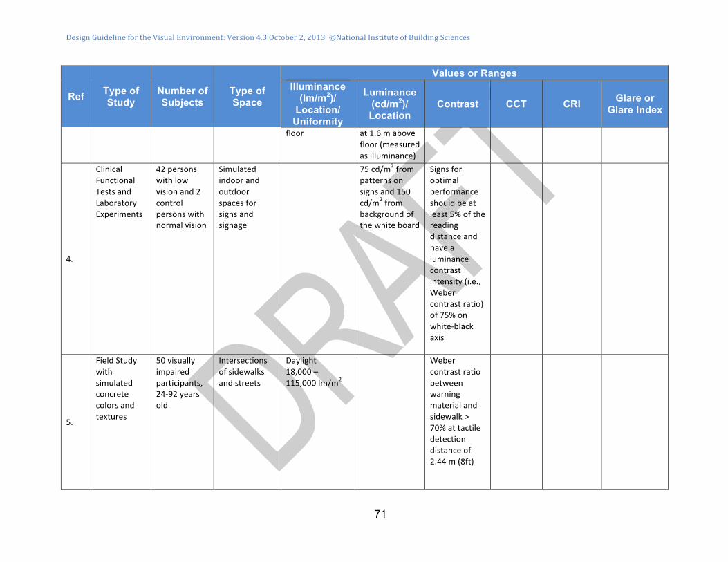
Design Guideline for the Visual Environment: Version 4.3 October 2, 2013 ©National Institute of Building Sciences
71
Ref Type of Study
Number of Subjects
Type of Space
Values or Ranges Illuminance
(lm/m2)/ Location/
Uniformity
Luminance (cd/m2)/ Location
Contrast CCT CRI Glare or Glare Index
floor at 1.6 m above floor (measured as illuminance)
4.
Clinical Functional Tests and Laboratory Experiments
42 persons with low vision and 2 control persons with normal vision
Simulated indoor and outdoor spaces for signs and signage
75 cd/m2 from patterns on signs and 150 cd/m2 from background of the white board
Signs for optimal performance should be at least 5% of the reading distance and have a luminance contrast intensity (i.e., Weber contrast ratio) of 75% on white-‐black axis
5.
Field Study with simulated concrete colors and textures
50 visually impaired participants, 24-‐92 years old
Intersections of sidewalks and streets
Daylight 18,000 – 115,000 lm/m2
Weber contrast ratio between warning material and sidewalk > 70% at tactile detection distance of 2.44 m (8ft)

Design Guideline for the Visual Environment: Version 4.3 October 2, 2013 ©National Institute of Building Sciences
72
Ref Type of Study
Number of Subjects
Type of Space
Values or Ranges Illuminance
(lm/m2)/ Location/
Uniformity
Luminance (cd/m2)/ Location
Contrast CCT CRI Glare or Glare Index
6.
General Reference Table 34.2
NA Clear sky in summer –northern temperate zones
150,000 on horizontal surface
2,900 from grass
Overcast sky in summer – northern temperate zones
16,000 on horizontal surface
300 from grass
Textile inspection
1,500 on horizontal surface
140 from light gray cloth
Office work 500 on horizontal surface
120 from white paper
Heavy engineering
300 on horizontal surface
20 from steel surface
Good street lighting
10 on horizontal surface
1.0 from concrete road surface
Moonlight 0.5 on horizontal surface
0.01 from asphalt road surface
Laboratory 50 normal vision – 20-‐30 years
Reading (task) areas
Median: 900 Range (10-‐90%): 329-‐2,072
White fluorescent lamps
Median: 1,000 Range (10-‐90%): 600-‐2,127
Warm-‐white fluorescent lamps

Design Guideline for the Visual Environment: Version 4.3 October 2, 2013 ©National Institute of Building Sciences
73
Ref Type of Study
Number of Subjects
Type of Space
Values or Ranges Illuminance
(lm/m2)/ Location/
Uniformity
Luminance (cd/m2)/ Location
Contrast CCT CRI Glare or Glare Index
6, 7.
Median 1,055 Range (10-‐90%): 75426-‐2,090
Daylight fluorescent lamps
50 normal vision – 40-‐79 years
Reading (task) areas
Median: 268 Range (10-‐90%): 75-‐817
White fluorescent lamps
Median: 260 Range (10-‐90%): 105-‐1,527
Warm-‐white fluorescent lamps
Median: 315 Range (10-‐90%): 162-‐1,753
Daylight fluorescent lamps
75 Cataract – preoperative – 40 – 80 years
Reading (task) areas
Median: 325 Range (10-‐90%): 98-‐1,800
White fluorescent lamps
Median: 300 Range (10-‐90%): 45-‐1,416
Warm-‐white fluorescent lamps
Median: 448 Range (10-‐90%): 52-‐1,460
Daylight fluorescent lamps
50 postoperative with intraocular lens
Reading (task) areas
Median: 121 Range (10-‐90%): 70-‐1,162
White fluorescent lamps
Median: 123 Range (10-‐90%): 50-‐939
Warm-‐white fluorescent lamps
Median: 140 Range (10-‐90%):
Daylight fluorescen
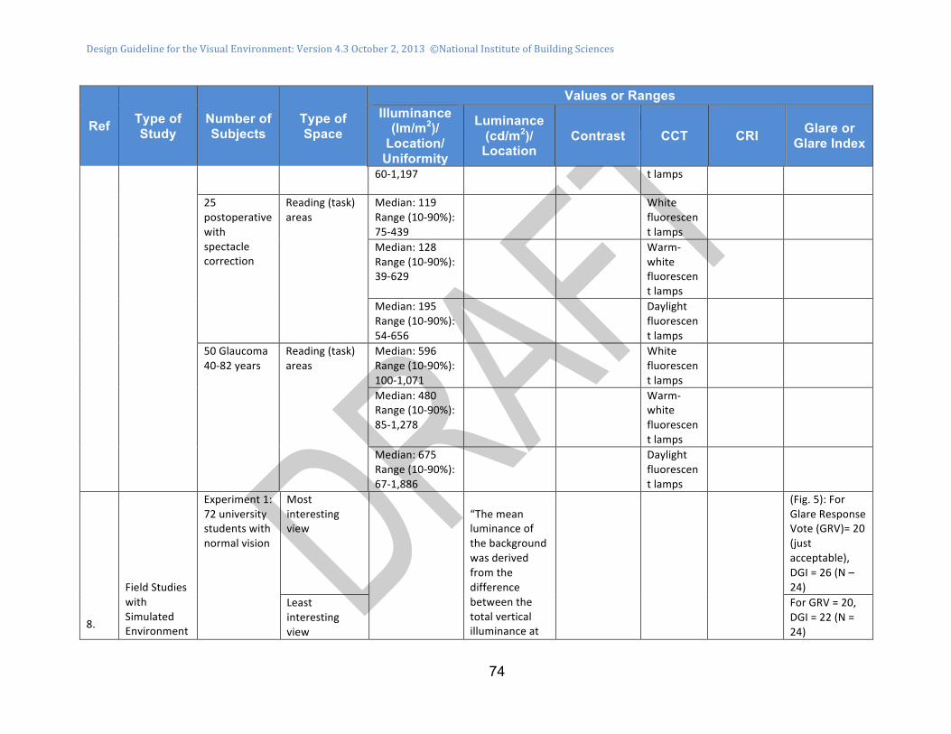
Design Guideline for the Visual Environment: Version 4.3 October 2, 2013 ©National Institute of Building Sciences
74
Ref Type of Study
Number of Subjects
Type of Space
Values or Ranges Illuminance
(lm/m2)/ Location/
Uniformity
Luminance (cd/m2)/ Location
Contrast CCT CRI Glare or Glare Index
60-‐1,197 t lamps
25 postoperative with spectacle correction
Reading (task) areas
Median: 119 Range (10-‐90%): 75-‐439
White fluorescent lamps
Median: 128 Range (10-‐90%): 39-‐629
Warm-‐white fluorescent lamps
Median: 195 Range (10-‐90%): 54-‐656
Daylight fluorescent lamps
50 Glaucoma 40-‐82 years
Reading (task) areas
Median: 596 Range (10-‐90%): 100-‐1,071
White fluorescent lamps
Median: 480 Range (10-‐90%): 85-‐1,278
Warm-‐white fluorescent lamps
Median: 675 Range (10-‐90%): 67-‐1,886
Daylight fluorescent lamps
8.
Field Studies with Simulated Environment
Experiment 1: 72 university students with normal vision
Most interesting view
“The mean luminance of the background was derived from the difference between the total vertical illuminance at
(Fig. 5): For Glare Response Vote (GRV)= 20 (just acceptable), DGI = 26 (N – 24)
Least interesting view
For GRV = 20, DGI = 22 (N = 24)

Design Guideline for the Visual Environment: Version 4.3 October 2, 2013 ©National Institute of Building Sciences
75
Ref Type of Study
Number of Subjects
Type of Space
Values or Ranges Illuminance
(lm/m2)/ Location/
Uniformity
Luminance (cd/m2)/ Location
Contrast CCT CRI Glare or Glare Index
s in 3m x 4m x 3m rooms in 20 story Arts Tower Building
No view the subjects’ eye and the illuminance from the masked cell” (i.e., measuring instrument).
For GRV = 20, DGI = 18 (N = 24) [may be appropriate for low vision persons]
9
Laboratory – color discrimination tests
12 with normal color vision and VA corrected to 20/20 or better
Experiment 1: Testing Lab At Warm (low)-‐CCTs
50
FM Score for Hue Tests: 55-‐70 [lower scores are better]
< 4000 K
CRI: 80-‐95
FM Score: 68-‐60
New Gamut Area Index (GAI): 70 60
500 [Better predictor of Hue]
FM Score: 30-‐40
CRI: 80-‐95
FM Score: 40-‐30
GAI: 55-‐95 [GAI is better predictor of Hue]
12 with normal color vision and VA corrected to 20/20 or better
Experiment 2: Testing Lab at Cool (high) CCTs
50
FM Score: 60-‐58
> > 6000 K
CRI: 72-‐95
FM Score: 70-‐50
GAI: 65-‐95
500 [Better predictor of Hue]
FM Score: 45-‐40
CRI: 70-‐94 [CRI is better predictor of
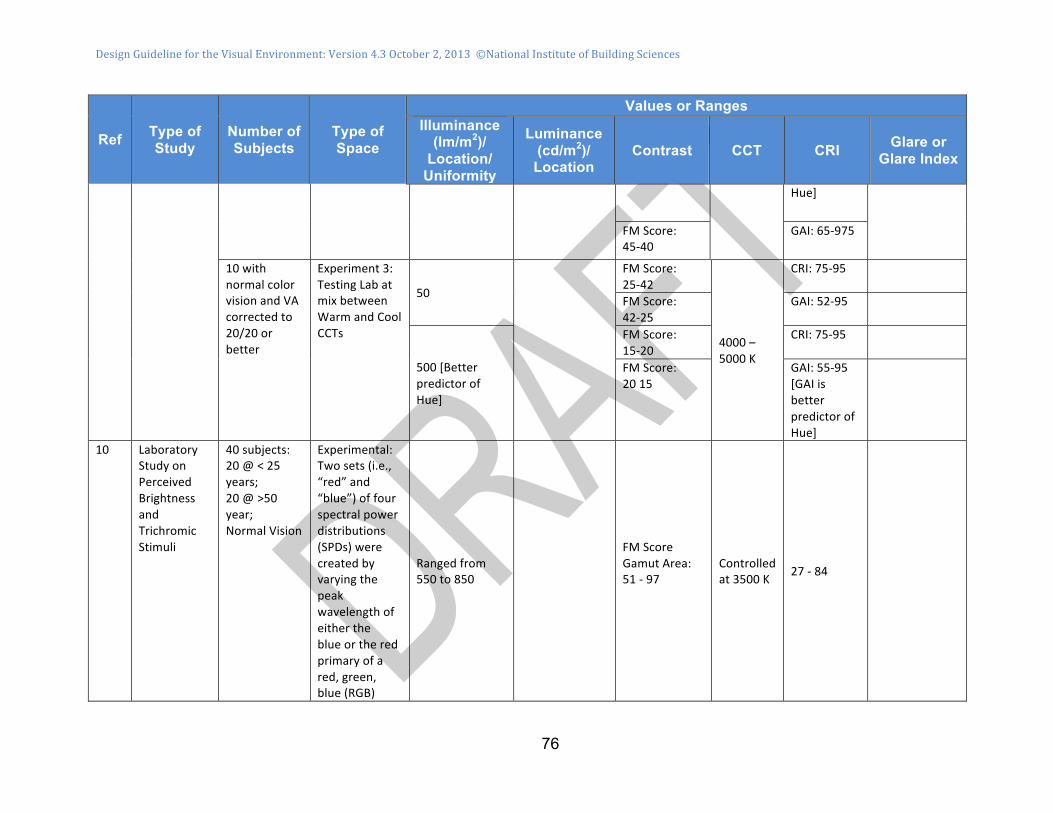
Design Guideline for the Visual Environment: Version 4.3 October 2, 2013 ©National Institute of Building Sciences
76
Ref Type of Study
Number of Subjects
Type of Space
Values or Ranges Illuminance
(lm/m2)/ Location/
Uniformity
Luminance (cd/m2)/ Location
Contrast CCT CRI Glare or Glare Index
Hue]
FM Score: 45-‐40
GAI: 65-‐975
10 with normal color vision and VA corrected to 20/20 or better
Experiment 3: Testing Lab at mix between Warm and Cool CCTs
50
FM Score: 25-‐42
4000 – 5000 K
CRI: 75-‐95
FM Score: 42-‐25
GAI: 52-‐95
500 [Better predictor of Hue]
FM Score: 15-‐20
CRI: 75-‐95
FM Score: 20 15
GAI: 55-‐95 [GAI is better predictor of Hue]
10 Laboratory Study on Perceived Brightness and Trichromic Stimuli
40 subjects: 20 @ < 25 years; 20 @ >50 year; Normal Vision
Experimental: Two sets (i.e., “red” and “blue”) of four spectral power distributions (SPDs) were created by varying the peak wavelength of either the blue or the red primary of a red, green, blue (RGB)
Ranged from 550 to 850
FM Score Gamut Area: 51 -‐ 97
Controlled at 3500 K 27 -‐ 84

Design Guideline for the Visual Environment: Version 4.3 October 2, 2013 ©National Institute of Building Sciences
77
Ref Type of Study
Number of Subjects
Type of Space
Values or Ranges Illuminance
(lm/m2)/ Location/
Uniformity
Luminance (cd/m2)/ Location
Contrast CCT CRI Glare or Glare Index
light-‐emitting diode (LED) source.
References 1. Bowers AR, Meek C, Stewart N. 2001. Illumination and reading performance in age-related macular degeneration. Clin Exp Optom, May 84(3): 139-147. 2. Miller D, Sarmiento JS, and Burns SK. 2009. Light Units, p 51. In: Opthamology, 3rd Edition; Yanoff M, Dunker J, and Augsburger J (editors), Mosby-Elsevier, Publisher. 3. Sinoo MM, van Hoof J, Kort HSM. 2010. Lighting conditions for older adults, a description of light assessment in nursing homes, pp 3-7. In: Symposium Proceedings Light & Care 2010, Ariadne Tenner, Toine Schoutens and Domien Beersma (editors), Light & Health Research Foundation, SOLG P.O. box 1082, 5602 BB Eindhoven, the Netherlands. 4. Lenoir M, et al. 2010. New Standard for the Visual Accessibility of Signs and Signage for People with Low Vision. Final Report, 15 March 2010, (ANEC-DFA-2008-G-044-Annex 6rev). ANEC, the European consumer voice in standardization, AISBL, Avenue de Tervueren 32, box 27, B-1040-Brussels, Belgium. 5. Jenness J and Singer J. 2006. Visual Detection of Detectable Warning Materials by Pedestrians with Visual Impairments. Final Report to Federal Highway Commission, Task Order 18 under Project DTFH61-01-C-00049, 24 May 2006, Westat Corp, Rockville MD. 6. Boyce PR and Sanford LJ. 2000. Chapter 34 - Lighting to Enhance Visual Capabilities, pp 617-636. In: Lighthouse Handbook on Vision Impairment (Vol I) and Vision Rehabilitation, 2nd Edition, Oxford Press. 7. Lindner H, Hubnert K, Schlote HW, and Rohl F. 1989. Subjective Lighting Needs of the Old and the Pathological Eyes. Lighting Research and Technology, 21: 1-10 (referenced in item 6, above). 8. Tuaycharoen N and Tregenze PR. 2007. View and Discomfort Glare from Windows. Lighting Research and Technology, Vol. 39, Issue 2, pages 185-201. 9. Rea MS and Freyssinier-Nova JP. 2008. Color Rendering: A Tale of Two Metrics. Col Res Appl, Vol 33: 192-202. 10. Royer MP and Houser KW. 2012. Spatial Brightness Perception of Trichromatic Stimuli. Leukos, Vol 9, No. 2: 80-108.

Design Guideline for the Visual Environment: Version 4.3 September 28, 201
78
5D. Index Index will be developed for final publication.

Design Guideline for the Visual Environment: Version 4.3 September 28, 201
79
5E. Background on this Guideline In September 2010, the National Institute of Building Sciences (NIBS) hosted a workshop in Washington, D.C., with participants from the fields of medicine (specialists in optometry and low vision), architecture, engineering, interior design, lighting design, professional associations, government, academia, advocacy, and research and development. A concept paper was developed based on the findings and recommendations from that Workshop: “Improving Building Design for Persons with Low Vision.” Proceedings of the Workshop, the concept paper, and related material, are available at the website: http://files.nibs.org/. The user name and password are both lowvision (one word, all lower case, not italicized). The participants of that interdisciplinary workshop expressed four major learning outcomes:
• Clinicians need a better understanding of lighting and accessibility exposures that “low vision” patients experience while in “built environments”
• Designers need a better understanding of the lighting and accessibility needs of “low vision” persons while in “built environments”
• A common vocabulary is needed for clinicians, design practitioners (e.g., architects, interior designers, lighting designers, engineers), building owners and managers, and policy makers for all built environments
• There is a need to balance federal and other mandates for reduced energy consumption against the needs of all building occupants, including people with low vision, to have adequate illumination.
The objective of the concept paper was to address these learning outcomes by: 1) analyzing the issues and knowledge gaps that were identified during the workshop; and 2) proposing the development of plans for addressing these issues and knowledge gaps through evidence-based improvements in designs and operational procedures for new and existing buildings. This guideline is a product of the workshop and concept paper, and will need further research to confirm and improve it. In 2012, the General Services Administration (GSA) undertook to revise its publication, P-100 Facilities Standards for the Public Buildings Service, with modifications to be performance-base, and to include recommendations for design for persons with low vision. This revision has not yet been published. However, recommendations from the drafts have been considered in this guideline. In 1995, the Royal National Institute for the Blind (RNIB) in Great Britain published: Building Sight, “a handbook of building and interior design solutions to include the needs of visually impaired people” (20). This document was not made mandatory by code or regulation, and remains a voluntary guideline. Many of the recommendations in the British publication are included in this guideline.

Design Guideline for the Visual Environment: Version 4.3 September 28, 201
80
In 2001, the British Standards Institute (BSI) first published and in 2009 updated BS 8300-: Design of buildings and their approaches to meet the needs of disabled people – Code of practice (24). Practices described in BS 8300-2009 and Evaluating access statements requirements in Part M of the building regulations and minor technical amendments to Part M of the building regulations – Impact Statement, 2012 have been considered in drafting this guideline. At this writing, the publication, ANSI/IES RP 28-2007 (2013): Recommended Practice for Lighting and the Visual Environment for Seniors and the Low Vision Population is undergoing major revisions, including its title, and will include provisions related to design for low vision (5). Recommendations in the drafts of RP 28-2013 have been considered in drafting this guideline. Also at this writing, the publication, FGI 2014: Guidelines for Design and Construction of Residential Health, Care, and Support Facilities is in development and will also include provisions for low vision in the building types it governs. Recommendations in the draft of FGI 2014 have been considered in drafting this guideline.

Design Guideline for the Visual Environment: Version 4.3 September 28, 201
81
5F. Low Vision Design Committee Members James E. Woods, PhD, PE, Chair Indoor Environmental Consultant [email protected] Stuart Knoop, FAIA, Vice Chair Principal Emeritus, OKKS Studios [email protected] Suleiman Alibhai, OD, FAAO Low Vision Services PLC [email protected] Nancy Clanton, PE, FIES, IALD, LC President Clanton & Associates, Inc. [email protected] Robert Dupuy, IALD, LC Associate Principal/Lighting Studio Leader Interface Engineering [email protected] Cheryl English VP Government and Industry Relations Acuity Brands Liaison, Jim H. McClung Lighting Research Foundation [email protected] Greg Guarnaccia, LC, LEED-AP, IES Principal Doubledge Design LLC [email protected] Vijay K. Gupta, PE, Fellow ASHRAE Chief Mechanical Engineer (ret.) US General Services Administration [email protected]
Earle Kennett Senior Vice President National Institute of Building Sciences [email protected] Fred Krimgold, PhD Director, Disaster Risk Reduction Program (DRR) Virginia Tech [email protected] Robert W. Massof, PhD Professor of Ophthalmology and Neuroscience Director, Lions Vision Research and Rehabilitation Center Wilmer Eye Institute Johns Hopkins University School of Medicine [email protected] Robert N. Mayer, PhD President Hulda B. and Maurice Rothschild Foundation [email protected] Marsha Mazz Director, Office of Technical and Information Services U.S. Architectural & Transportation Barriers Compliance Board [email protected] Barbara Milleville National Capital Citizens with Low Vision [email protected]

Design Guideline for the Visual Environment: Version 4.3 September 28, 201
82
Eunice Noell-Waggoner, LC President Center of Design for an Aging Society [email protected] Priscilla Rogers VisionAware Program Manager American Foundation for the Blind [email protected] Tom O. Sachs, AIA Principal, OKKS Studios [email protected] Erin Schambureck Design Studies, UW Madison DesignLab Consultant [email protected] Dennis Siemsen, OD Department of Ophthalmology Mayo Clinic [email protected]
Edd Soenke, AIA Design Partnership, Architects, NIBS Board Liaison [email protected] Stephanie Stubbs, Assoc. AIA, PMP Staff Program Director National Institute of Building Sciences [email protected] Gale Watson National Director Blind Rehabilitation Service Department of Veterans Affairs [email protected] Lam Vu, PE, CEM Facilities Standards Service Department of Veterans Affairs [email protected] Thomas Williams, AIA Senior Architect, Office of Facilities Management and Services Program US General Services Administration [email protected]

Design Guideline for the Visual Environment: Version 4.3 September 28, 201
83
6. TECHNICAL APPENDICES 6A. Health Effects Non-Visual Health Effects of Light Sources There are two ways that light sources impact health: 1) vitamin D synthesis is activated when ultraviolet-B light strikes the skin; 2) circadian rhythm is a process where light enters the eye and travels the same pathway until it reaches the retina where it activates intrinsically photo sensitive retinal ganglion cells (ipRGC), which send signals to the body clock (i.e., circadian pacemaker). Vitamin D is important for everyone and does not impact those with low vision differently than normally sighted individuals therefore control of Vitamin D is not addressed in this Guideline. However, a significant percentage of those with low vision retain light perception and exhibit normal circadian patterns. (25; 26), therefore, this guideline includes circadian rhythm. Circadian rhythm: The body clock controls the timing of most 24-hour behavioral and physiological elements, including the sleep-wake cycle, alertness and performance rhythms, hormone production, temperature regulation and metabolism.
• Light is the most powerful stimulus for entrainment of the body clock and keeping our bodies synchronized with the 24-hour light /dark cycle. The impact of light stimulus will depend on its intensity, timing, pattern of exposure, light history, and wavelength.
• The light-sensitive retinal ganglion cells (ipRGC) send signals via the optic nerve to the suprachiasmatic nucleus (SCN ),the “circadian pacemaker,” in the brain (17). Compared to the rods and cones, the ipRGC respond more slowly and signal the presence of light over the long term. Their functional roles are non-image-forming and fundamentally different from those of pattern vision; they provide a stable representation of ambient light intensity and wavelength content.
• Unlike the rods and cones, the ipRGC contains the photopigment, melanopsin, which is excited by light mainly in the blue portion of the visible spectrum (17) Those with low vision and many who are blind, including those with degenerated rod and cone photoreceptors, such as people with retinitis pigmentosa, still have functioning ipRGC as demonstrated by their circadian responses (27).
• The ipRGC respond to light is in the blue range of 460 – 480 nanometers (nm) (28), while the spectrum of visible light that stimulates rods and cones peaks at 550 nm. Light sources indoors should mimic the natural color rhythm of light outside. Exposure to cool light (like the blue sky) is important in the morning or during the day, but should be avoided in the evening and at night. Exposure to cool (blue-white) light at night suppresses melatonin during the time of its heaviest flow, thereby disrupting the circadian system.

Design Guideline for the Visual Environment: Version 4.3 September 28, 201
84
• Color vision-deficient individuals can maintain a normal circadian response to light as stimulation of rods and cones is not required (25; 26). If light can be seen by a low vision person, then the circadian system should still be functional.
The impact of the light stimulus will depend on its intensity, timing, pattern of exposure, light history (29), and wavelength.
• Circadian light, measure in luminance (amount of light entering the eye) needs to be significantly higher than light required for vision. Illuminance-Based Design does not predict the circadian response.
• Luminance-Based Design can be used to enhance circadian pattern control by selection of brightness and value contrast. For example, the response to blue light is more powerful than green light.
• Buildings are now being modeled to test their circadian efficacy. To maintain a healthy circadian rhythm, daylight should be used in interior spaces that are occupied by the same people for long periods of time. The color of electric light for spaces used in the evening and night should be warm in color, avoiding the cool light found during the day; nightlight use should be limited. Daytime lighting should be cooler, containing wavelengths in the 460-480 nm range (bluish-white – light from the blue sky) (28). Interaction of Lighting with Audio and other Sensory Systems While the subject of this guideline is design that accommodates low vision occupants, the role of the body’s other senses is important to keep in mind. When we respond to the environment, all our senses are employed to enrich and inform our comprehension of the space and our movement in it. Acoustic and kinesthetic changes are familiar experiences for everyone as contributors to our understanding of where we are. The loss of acuity in vision may heighten sensitivity in other senses and this may suggest the introduction of non-visual sensory cues to the design. For example, a change in lighting might be accompanied by a change in floor texture and sound absorption from one space to another. People with vision loss learn to use auditory and tactile cues to assist with wayfinding.

Design Guideline for the Visual Environment: Version 4.3 September 28, 201
85
6B. Basic Calculations and Measurements Illuminance-Based Design Illuminance is a measure of light flux (i.e., lumens5) impinging on a surface area at a specified distance from the light source or sources.6 Common terms for Illuminance are lux (i.e., lumens/m2 of surface area) and footcandles (i.e., lumens/ft2 of surface area). Illuminance from a single point-source to a horizontal surface (e.g., table or floor) is calculated as:
Ehi = [Iθ / D2] cos θ Eqn [1a] Where: Ehi = Illuminance perpendicular to horizontal surface i, (lux or footcandles), Θ = Angle of flux from vertical (degrees), Iθ = Light flux from source i in direction θ from vertical, (lumens), D = Distance from source i in direction θ to horizontal surface i, (m or ft); or Ehi = [Iθ / H2] cos3 θ Eqn [1b] Where: H = Vertical distance (height) from source i to horizontal surface i, (m or ft).
Illuminance from a single point-source to a vertical surface (e.g., wall) may be calculated as:
Evi = [Iθ / D2] cos (90 – θ) Eqn [2a] Where: Evi = Illuminance perpendicular to vertical surface i, (lux or footcandles), or Evi = [Iθ / d2] cos3 (90 – θ) Eqn [2b] Where: d = horizontal distance (depth) from source i to vertical surface i, (m or ft).
Illuminance from multiple sources, i, to a horizontal or vertical surface may be calculated as a vector summation:
Eh, sum = Σ Ehi or Eqn [3a]
Ev, sum = Σ Evi Eqn [3b]
For design, illuminance values may be calculated by the point-by-point method, the luminous area-by-point method, the utilization factor method, and other methods (7; 6). For commissioning and post-occupancy evaluations, Illuminance values should be measured with a calibrated light meter.

Design Guideline for the Visual Environment: Version 4.3 September 28, 201
86
Luminance Based Design Luminance is a quantitative measure of both direct and reflected light flux that enters the eye. Luminance from a surface area or a source in the field of view is expressed as Candela7 per square meter or square foot (Cd/m2 or Cd/ft2), or as lumens per steradian • square meter or square foot (lm/sr•m2 or lm/sr•ft2). Luminance may be calculated as the total light flux, LT, (lumens/sr•m2 or lumens/sr•ft2) from direct,8 LD, and indirect,9 LR, light sources that are transmitted through solid angles, Ω, within a field of view. Assuming the primary positions of the direct and indirect light sources are located in horizontal and vertical planes, the total luminance may be calculated as:
LD = Σ [ φ / Ω A cos θ]i + Σ [ φ / Ω A cos (90 – θ)]j Eqn [4]
Where: LD = sum of luminances (lumens/sr•m2 or lumens/sr•ft2) transmitted from direct sources with horizontal surfaces (e.g., light fixtures), i, and vertical surfaces (e.g., windows), j, Φ = average luminous flux from direct source, i and j, (lumens), A = surface area of the direct source, i, (m2 or ft2), Ω = solid angle (steradians) subtended by the eye to the direct source, i or j, which may be approximated as A/d2 (where d is the distance between the source and the eye).
LR = Σ [ E ρ / Ω cos θ]i + Σ [E ρ / Ω cos (90 – θ)]j Eqn [5]
Where: LR = sum of luminances (lumens/sr•m2 or lumens/sr•ft2) transmitted from indirect sources with horizontal surfaces, i (e.g., flooring, tables, ceiling), and vertical surfaces (e.g., walls, furniture), j, within the field of view, E = illuminance from surfaces area Ai, (lumens/m2 or lumens/ft2), see Eqns [4] and [5], ρ = reflectance values of surfaces area Ai, and LT = LD + LR Eqn [6]
The values of luminance calculated by this method are intended to be consistent with those measured clinically. Enhanced procedures for calculating luminance are available through computer programs, such as Radiance (15) For commissioning and post-occupancy evaluations, luminance values should be measured with a calibrated luminance meter. Some of these meters also incorporate outputs in terms of contrast and glare.
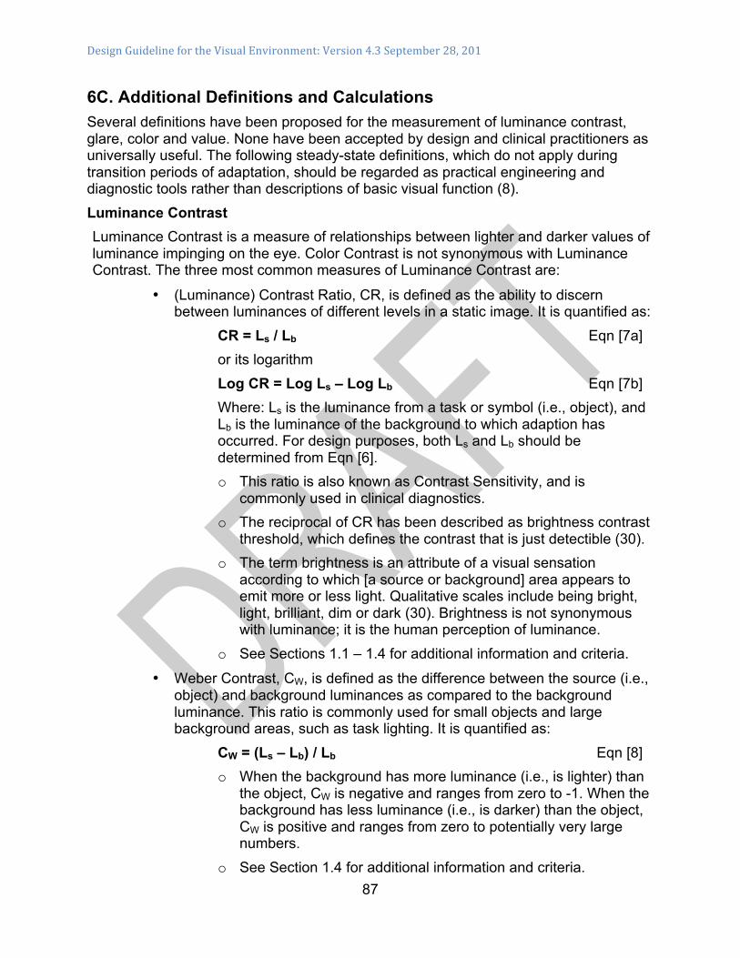
Design Guideline for the Visual Environment: Version 4.3 September 28, 201
87
6C. Additional Definitions and Calculations Several definitions have been proposed for the measurement of luminance contrast, glare, color and value. None have been accepted by design and clinical practitioners as universally useful. The following steady-state definitions, which do not apply during transition periods of adaptation, should be regarded as practical engineering and diagnostic tools rather than descriptions of basic visual function (8). Luminance Contrast Luminance Contrast is a measure of relationships between lighter and darker values of luminance impinging on the eye. Color Contrast is not synonymous with Luminance Contrast. The three most common measures of Luminance Contrast are:
• (Luminance) Contrast Ratio, CR, is defined as the ability to discern between luminances of different levels in a static image. It is quantified as:
CR = Ls / Lb Eqn [7a] or its logarithm Log CR = Log Ls – Log Lb Eqn [7b] Where: Ls is the luminance from a task or symbol (i.e., object), and Lb is the luminance of the background to which adaption has occurred. For design purposes, both Ls and Lb should be determined from Eqn [6]. o This ratio is also known as Contrast Sensitivity, and is
commonly used in clinical diagnostics. o The reciprocal of CR has been described as brightness contrast
threshold, which defines the contrast that is just detectible (30). o The term brightness is an attribute of a visual sensation
according to which [a source or background] area appears to emit more or less light. Qualitative scales include being bright, light, brilliant, dim or dark (30). Brightness is not synonymous with luminance; it is the human perception of luminance.
o See Sections 1.1 – 1.4 for additional information and criteria.
• Weber Contrast, CW, is defined as the difference between the source (i.e., object) and background luminances as compared to the background luminance. This ratio is commonly used for small objects and large background areas, such as task lighting. It is quantified as:
CW = (Ls – Lb) / Lb Eqn [8] o When the background has more luminance (i.e., is lighter) than
the object, CW is negative and ranges from zero to -1. When the background has less luminance (i.e., is darker) than the object, CW is positive and ranges from zero to potentially very large numbers.
o See Section 1.4 for additional information and criteria.
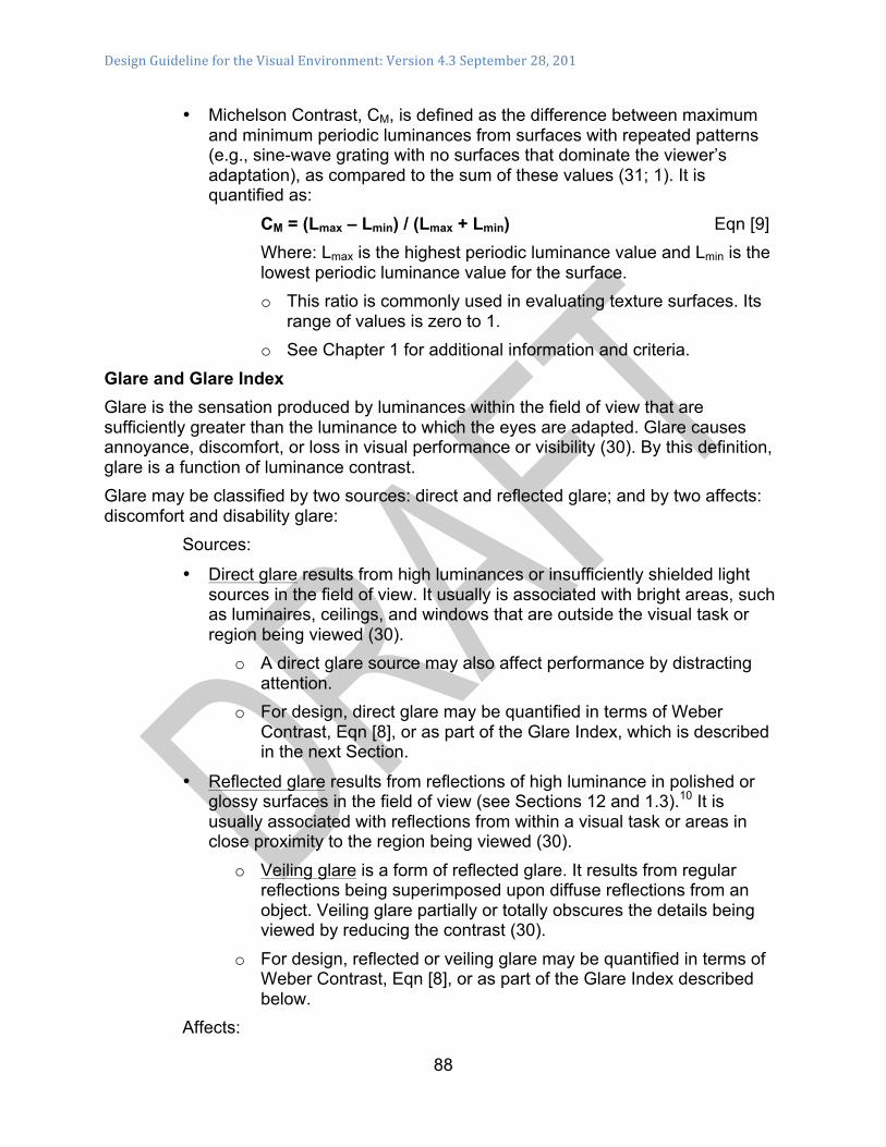
Design Guideline for the Visual Environment: Version 4.3 September 28, 201
88
• Michelson Contrast, CM, is defined as the difference between maximum and minimum periodic luminances from surfaces with repeated patterns (e.g., sine-wave grating with no surfaces that dominate the viewer’s adaptation), as compared to the sum of these values (31; 1). It is quantified as:
CM = (Lmax – Lmin) / (Lmax + Lmin) Eqn [9] Where: Lmax is the highest periodic luminance value and Lmin is the lowest periodic luminance value for the surface. o This ratio is commonly used in evaluating texture surfaces. Its
range of values is zero to 1. o See Chapter 1 for additional information and criteria.
Glare and Glare Index Glare is the sensation produced by luminances within the field of view that are sufficiently greater than the luminance to which the eyes are adapted. Glare causes annoyance, discomfort, or loss in visual performance or visibility (30). By this definition, glare is a function of luminance contrast. Glare may be classified by two sources: direct and reflected glare; and by two affects: discomfort and disability glare:
Sources:
• Direct glare results from high luminances or insufficiently shielded light sources in the field of view. It usually is associated with bright areas, such as luminaires, ceilings, and windows that are outside the visual task or region being viewed (30).
o A direct glare source may also affect performance by distracting attention.
o For design, direct glare may be quantified in terms of Weber Contrast, Eqn [8], or as part of the Glare Index, which is described in the next Section.
• Reflected glare results from reflections of high luminance in polished or glossy surfaces in the field of view (see Sections 12 and 1.3).10 It is usually associated with reflections from within a visual task or areas in close proximity to the region being viewed (30).
o Veiling glare is a form of reflected glare. It results from regular reflections being superimposed upon diffuse reflections from an object. Veiling glare partially or totally obscures the details being viewed by reducing the contrast (30).
o For design, reflected or veiling glare may be quantified in terms of Weber Contrast, Eqn [8], or as part of the Glare Index described below.
Affects:
Design Guideline for the Visual Environment: Version 4.3 September 28, 201
89
• Discomfort glare is a human response that results in sensations of irritation or pain from high luminances, either direct or reflected, in the field of view. It does not necessarily interfere with visual performance or visibility (12; 30).
o For design, it should be quantified in terms of the Daylight Glare Index described below, and listed in Table 1.
• Disability glare is a physiological effect that results in a reduction of visibility or visual performance caused by the scatter of light in the eye whereby the contrast of the retinal image is reduced (1; 12; 30).
o For design, it should be quantified in terms of the Daylight Glare Index and listed in Table 1.
A Glare Index, GI, is an empirically derived mathematical expression that is intended to relate direct and reflected luminances from various sources to human responses.
• The concept of GI, which has evolved from research during that last 50 years, has primarily focused on small sources, such as headlamps. 11
• The work begun by Hopkinson (32; 33) and his colleagues in the 1950s has resulted in an expression that includes large sources, such as windows. This work has resulted in what is known as the Hopkinson-Cornell Daylight Glare Index, DGI (34; 35). It is expressed as:
DGI = 10 log Σ {0.478 [Ls1.6 `Ω0.8] / [Lb + (0.07 ω0.5 Ls)]}
Eqn [10] Where Ls = Average luminance of a source (e.g., window) as seen from the reference point (lumens/sr•m2 or lumens/sr•ft2),
Lb = Average luminance of the background area surrounding the source, (lumens/sr•m2 or lumens/sr•ft2), `Ω = Solid angle subtended at the eye by the source, modified by a position index, P, (sr). `Ω can be estimated as the area of the source divided by the square of the distance from the source to the eye, A/D2, ω = Solid angle subtended at the eye by the source (sr).
• Statistically significant correlations between the Glare Sensation Vote (GSV) and calculated DGI results from measured values in Eqn [10] have been reported in the literature (35). A summary of results is shown in Table 6C-1:
Table 6C-1. Relationships between Perceived Glare and DGI.
Perceived Glare Glare Daylight Comments
Design Guideline for the Visual Environment: Version 4.3 September 28, 201
90
(Normal Vision) Sensation Vote (GSV)
Glare Index (Eqn [10]
Just Perceptible 0.0 16 Just Acceptable 1.0 20 Onset of Glare Just Uncomfortable 2.0 24 Threshold of
Discomfort Glare
Just Intolerable 3.0 28 Threshold of Disability Glare
• Limitations of the Perceived Glare, GSV, and DGI values in Table D-1
include: o Small sample size of 20 subjects who were university graduate
students with normal vision, o Small unfurnished offices in high-rise building with one window
size and different outside views, o Low vision occupants are likely to require lower values of DGI
for the same values of GSV due to sensitivities of this population.
• See Sections 1.2 – 1.4 for additional information and criteria. Color: Light Source Color and Object Color:
Light for Vision: The ability to see and differentiate between surfaces and objects in the visual environment is dependent on the various characteristics of the light source color, the object or material color and the combination of these characteristics. In addition, the light source color shining on a surface will affect the color perception of that material and the space. The color of objects or material in the space is addressed below and in Section 1.3 and Table 2.
Non-Visual aspects of Light:
• Circadian Patterns: The color of the light source will also impact circadian patterns. To maintain healthy circadian rhythms, the color temperature (wavelengths) of light must change to mimic the changing color of light in the sky from warm at dawn, cool like the blue sky at mid-day, back to warm at dusk, and darkness at night.
• Vitamin D3 synthesis: Ultraviolet-B (UVB) light that is needed for vitamin D synthesis is out of the visible range (range of 280 - 315 nm) (36). Vitamin D3 is required for bones and tissues to absorb calcium.
• Circadian Rhythms and Vitamin D Synthesis are addressed in greater detail in Appendix 6A.
Light Source Characteristics Color. The spectrum of the visible light is 380 – 760 nanometers (nm). However,
light below 340 nm may cause damage to the retinas of people over the age of 50 (37). Sources of visible light affect how humans perceive the colors that they see in the

Design Guideline for the Visual Environment: Version 4.3 September 28, 201
91
environment. There are two metrics to describe color quality used in architectural applications: correlated color temperature (CCT) and color rendering index (CRI) (38).
• A color temperature is expressed in degrees Kelvin (K), describing the light source and the light it emits. Lower number represent warm light (3000K or lower), i.e. dawn and dusk; mid-range is white light (3500K), i.e. one hour after sunrise; and higher numbers represent cool, bluish-white light (4000K or higher), i.e. two hours after sunrise and upward to the color of the blue sky. Warm light will enhance the warm colors and cool light will enhance cool colors. Cool light, like the blue sky, stimulates the circadian system during the day; warm light at night will not disrupt the circadian system. (See Appendix 6A for further information).
• Color rendering refers to how natural the color of an object appears with a given light source. According to IES nomenclature (30): o Color rendering is the “effect of an illuminant on the color appearance of
objects by conscious or subconscious comparison with their color appearance under a reference illuminant.”
o Color Rendering Index (CRI) is a “measure of the degree of color shift objects undergo when illuminated by the light source as compared with the color of the same objects when illuminated by a reference source of comparable color temperature.” The CRI is a scale of 1 to 100. Light sources with a high CRI make colors appear more colorful and natural. Three variations of CRI are defined by IES: § General: Measure of the average shift of eight standardized colors
chosen to be of intermediate saturation and spread throughout the range of hues (if the CRI is not qualified as to color samples used, the general CRI is assumed).
§ Special: Measure of color shift of various standardized special colors, including saturated colors, typical foliage, and Caucasian skin.
§ Color Preference Index: Measure appraising the light source for enhancing the appearance of an object or objects by making their colors tend toward people’s preferences.
• Color Intensity is a subset of luminance and provides information on the intensity of emitted light within a range of wavelength in a given direction.
• Uniformity refers to the even distribution of light within a space or across a plane. The plane may be horizontal, vertical or slanted. The uniformity is stated as a maximum-to-minimum ratio. o Older eyes adapt much more slowly to changes in light levels and function
better when lighting is even and consistent. o A 3:1 ratio is recommended for those with low vision to minimize the
fluctuation of light in a space or on a plane (5). Dark areas can obscure objects, steps and curbs.

Design Guideline for the Visual Environment: Version 4.3 September 28, 201
92
Surface Characteristics • Hue is the term used to describe how we perceive an object’s color, i.e. red,
green, blue. o Colors are sensed by the cones in the retina of the eye. Those who have
lost their central vision may not see color, only black and white. o Contrasting hues are not visible to those who are color blind. Contrasting
colors of the same value may not be visible to those with impaired vision. o The color of the light source will impact the hue of the material.
• Saturation (Intensity) refers to the brightness or dullness of the color. Saturation contrast may be too subtle for those with low vision to differentiate.
• Value (also see Eqn [5]) is the lightness or darkness of the surface color rated on a scale of 0 (black – total absorption) to 100 (white – total reflectance). The location of the surface material and interaction with the light source are important. For example, values in the higher range are recommended for ceilings and walls to distribute light throughout an interior space.
• Light Reflectance Value (LRV) is quantified numerically from 0–100 to indicate the percentage of light striking the surfaces that will be reflected back from the surface (39). The recommendations in Table 2 depend upon the location, exterior or interior, and vertical or horizontal surfaces. LRVs are used in lighting calculations and to determine value contrast. Lighting calculations for interior spaces factor in the LRV on ceilings, walls and floors to determine the illuminance (quantity of light) at a given point in a space. The LRVs in Table 2 represent a range to optimize light levels and allow for contrast in the visual environment. LRVs for materials are available from the material manufacturers. Or they can be estimated in the field using a paint fan deck under similar lighting conditions to find approximate color and sheen similar to the material (40). o The illuminance of the light source striking the surface is an important
factor. The strength of bright sunlight striking a light-value walking surface will be reflected into the eyes and may be sensed as glare.
o Outdoor walking paths and paved surfaces should be med-dark in value, below 35 LRV. Concrete darkens as it ages and will take years to reach 35 LRV without adding pigment to the mix or an acid-etch finish.
• Value Contrast, which is the ratio of between light to dark, enhances vision, especially for persons with low vision (24). Comparison of light reflectance values determines the amount of value contrast between adjacent surfaces or objects and their background to increase visibility. A minimum value difference of 30 points is required of critical elements. Steps and level changes require a greater difference of 50 points as an alert to the potential hazard. Contrast in percent is determined by: Contrast = [(B1 - B2)/B1] x 100.12 B1 = light reflectance value (LRV) of the lighter area and B2 = light reflectance value (LRV) of the darker area. Note that in any application both
Design Guideline for the Visual Environment: Version 4.3 September 28, 201
93
white and black are never absolute; thus, B1 never equals 100 and B2 is always greater than 0 (19). o Materials should have minimum differences in LRV for items (see Table
2): § LRV difference of 30 between objects and their background. § LRV difference of 30 between floors and walls or base molding to
define the space. § LRV difference of 30 between doors, door frames, and walls. § LRV difference of 50 as an alert to level changes and on stair nosing.
o Loss of contrast sensitivity is common among those with low vision. o Contrasting values should be used to define elements within a space, i.e.
an edge of a step, level change or an object in the pathway. o Value contrast is not light dependent and benefits everyone in low-light
conditions.
• Surface Sheen or Gloss: The sheen of a material is determined by shining a light on the surface at different testing angles. Black glass is used as the standard for high gloss. Material testing is conducted in a controlled laboratory condition measured by a glossmeter (41). The measurement results of a glossmeter are relative to the amount of reflected light from the black glass standard with a defined refractive index. The ratio of reflected to incident light for the specimen, compared to the ratio for the glass standard, is recorded as gloss units (GU). o Common terms to describe gloss include matte or flat (< 10 GU, measured
at 85 degree angle), medium gloss ( 10 – 70 GU, measured at 60 degree angle) and specular or high gloss (>70 GU measured at 20 degree angle.
o Light shining on a matte surface is diffusely scattered in all directions and the image forming qualities are diminished. High gloss surfaces reflect images distinctly. The incident light is directly reflected on the surface in the direction of reflection. The angle of incidence is equal to the angle of reflection, producing reflected glare.
o Matte finishes are recommended for interior floors or exterior walking surfaces to avoid reflected glare and optical illusions created by specular reflections. High gloss floors are reported to be very detrimental to safe navigation (42). The intensity of the sun striking large vertical surfaces with a specular finish will create similar reflections and glare.
o The combination of the gloss of the material, location, direction and intensity of the light source will determine the user’s sensation of luminance, contrast and glare.
o Recommended values are given in Table 2, in terms of Gloss Units (GU).

Design Guideline for the Visual Environment: Version 4.3 September 28, 201
94
o Recommended values are given in Section 1.4 Table 2, in terms of Gloss Units (GU).
• Texture: Table 2 does not recommend specific textures, but rather recommends where a change of texture provides sensory information that may be beneficial to persons who are visually impaired as a subtle cueing or a warning. o Patterns (also see Appendix 6C on Michelson Contrast): Table 2 indicates
where patterns on the walking surface should not be used. The uniformity of walking and transition surfaces is a safety issue. Stairways and walking surfaces are the most critical areas and should not have patterns.
o A uniform walking surface, free of visual clutter, allows the important visual information to be perceived, i.e. steps, curbs and objects. § The scale of the pattern and the value contrast of the pattern will
determine its impact. § Surfaces with large scale swirling or geometric patterns are confusing,
masking important visual cues, i.e. the edge of a step or objects in the pathway.
§ A pattern with a strong value contrast will be more problematic than one with a low value contrast.

Design Guideline for the Visual Environment: Version 4.3 September 28, 201
95
6D. Dimming and other Control Strategies Table 1 lists recommended illuminance and luminance ranges for ambient and task lighting. Dimming of the lighting to the minimum values of the range should be achieved by the appropriate type of control described below: 1. Occupancy Sensor Technology: Two technologies dominate, infrared and ultrasonic.
Infrared sensors detect temperature changes in a room and work well where the entire room is within the sensor’s field of view. Ultrasonic sensors use high frequency sound to detect motion (even around corners). Dual-technology sensors use both types of detection, increasing accuracy and flexibility.
• There are differences between each device’s sensitivity to minor motion (working at a desk) vs. major motion (walking or half-step activity). o Occupancy sensor placement is very important to successful implementation.
§ Sensors should be placed to activate as soon as a person enters the space so he or she is not forced to grope about for a switch or to avoid collisions. To avoid entrance into a completely dark room, such as public toilets with no spill light from adjacent spaces, a minimum illuminance should be provided that activates when the occupancy sensor deactivates.
§ Sensors must be located to ensure they will not detect movement outside the desired coverage area, for example, through an open doorway.
o Ultrasonic devices are sensitive to air movement and should not be placed near HVAC diffusers, or where air movement may cause false tripping.
2. For ease of identification, a minimum LRV difference of 20 should be provided between all switches, dimmers, button controls and covers and the mounted surface, and illuminated indicator light (pilot light) (See Table 2).
3. Descriptions of the various control options are listed below:
• Type C-1 Manual Dimming: Illuminated indicator light (pilot light), large button slide bar dimmer with on/off switch.
• Type C-2 Automated Shade Controls: Automated window shades and controls can be used for glare and contrast control by adjusting the daylight penetration into a space. o Shading is of particular importance in areas with east or west exposure, due
to the rising or setting sun. o Easily accessible controls and manual overrides with illuminated buttons
should be provided.
• Type C-3 Automatic-On, Automatic-Off Occupancy Sensor: Lights come on when motion is detected. Lights turn off when there is no movement in the room for a (programmable) pre-set time period. To avoid entrance into a completely dark room, such as public toilets with no spill light from adjacent spaces, a minimum

Design Guideline for the Visual Environment: Version 4.3 September 28, 201
96
illuminance should be provided that activates with the occupancy sensor deactivates, o Override switch for occupant control should be provided to turn lights off when
room is occupied. o In areas such as stairwells, occupancy sensors can be used to switch
between the minimum code required light levels during unoccupied periods and full light when occupied.
• Type C-4 Automatic-On to 50 percent, Manual-On to 100 percent, Automatic-Off Occupancy Sensor: Light comes on to 50 percent when motion is detected. o Override switch for occupant control turn lights up to 100 percent or off if
desired when room is occupied. Lights turn off when there is no movement in the room for a (programmable) pre-set time period. § Step dimming provides the ability to switch lighting to multiple levels, bi-
level or multi-level. It is most often used with step-dimming ballasts on fluorescent luminaires to give occupants more control over their environment and save energy.
§ Continuous dimming is preferred, but step dimming is a lower cost option.
• Type C-5 Programmable Scene Control: Allows various lighting circuits to be programmed in any combination and at any level (if dimmable) and saved for easy recall. o Often incorporates the ability to save multiple scenes. These can be single
room devices or part of a more sophisticated multi-room or whole building control system.
o Scheduling time should be verified.
• Type C-6 Astronomical Time Clock - Dimming/Step Dimming: Automatic dimming/step dimming at fixed hours of the day to increase light and/or decrease light at set times (e.g., dim all lights to maintain uniform lighting at night in corridors and common areas). o Scheduling should be verified with staff prior to commissioning; o A manual override may be required at supervisory areas, such as nursing
station.
• Type C-7 Astronomical Time Clock - Switching: Automatic switching at fixed hours of the day.
• Type C-8 Photocell: Photocells can measures the amount of illumination within or outside of a space to determine if lighting should be on, off, or dimmed.
• Type C-9 Emergency Egress Lighting Circuit: Should be connected to emergency egress lighting system.
• Type C-10 Wall Switch for Built-In Task Lights: Fixture mounted switches can be difficult to locate and operate, i.e. built-in under-cabinet lights in kitchen/coffee bar areas.

Design Guideline for the Visual Environment: Version 4.3 September 28, 201
97
o For ease of identification and operation, large button slide bar dimmer with on/off switch and occupancy sensor should be provided.
• Type C-11 Vacancy Sensor with Manual Dimming: This control option requires a switch to turn on lighting. Lights turn off when there is no movement in the room for a (programmable) pre-set time period. An override dimmer should be provided to allow occupant control over light levels.

Design Guideline for the Visual Environment: Version 4.3 September 28, 201
98
6E. Thermal Loads and Energy Impact Daylight that penetrates the glazing systems and light that is emitted from the fixtures and lamps will be absorbed into surfaces within the building, including the occupants, from where it will be re-radiated into indoor spaces and surfaces as infrared radiation (i.e., “sensible heat,” which is the component of heat that does not contain heat of water vaporization – “latent heat”). Heat Gains from Daylighting and Electric Lighting Heat gain from daylighting and electric lighting can partially off-set heat losses through the envelope when the outdoor temperature is lower than the indoor temperature and result in a reduction of the “sensible heating load” that must be balanced by the capacity and controllability of the HVAC system. Conversely, the heat gain from daylighting and electric lighting adds to the other elements of heat gain through the envelope when the outdoor temperature is higher than the indoor temperature and result in an increase of the “sensible cooling load” that must be balanced by the capacity and controllability of the HVAC system. Differences between heat losses and sensible heating loads, and between heat gains and sensible cooling loads, are determined by the thermal reflectances and capacitances of the surfaces being irradiated.
• Surfaces with lower reflectances and materials with higher capacitances will exhibit longer “lag periods” between the time of incident heat on the surface and the time the heat is re-radiated or convected from the surface (i.e., sensible heating or cooling “loads”).
Heating Loads from Daylighting and Electric Lighting Heating loads that are affected by daylighting include:
• Fixed and Operable windows. When windows are open and the outside dry-bulb and dew-point temperatures are lower than the indoor dry-bulb and dew-point temperatures, the sensible and latent heat losses in perimeter zones will increase.
• Transmission and Infiltration Heat Losses. o Thermal resistance values are typically lower for glazed surfaces than
for opaque walls or roof. o The sensible heat loss in perimeter zones will be proportional to the
percentage of glazing in a façade and the difference in resistance values.
o Infiltration heat losses in perimeter zones are related to the methods of framing and installing the glazing.
• Solar Heat Gains.

Design Guideline for the Visual Environment: Version 4.3 September 28, 201
99
o During daytime hours, the solar heat gain from direct and diffuse solar radiation may offset sensible heat losses through the façade.
o During night time hours, transmission heat loss through the glazing will increase, but can be mitigated by closing the internal blinds or shading.
Heating loads that are affected by electric lighting include:
• Occupancy schedules. When spaces are occupied, electric lighting will be required, which may reduce the heating load. During unoccupied periods or when certain types of dimming are employed, electric power can be reduced, which will reduce the corresponding sensible heat gain and may increase the heating load unless the space temperature is decreased.
• Electrical Heat Gains to maintain Lighting Requirements. o When daylighting is insufficient to provide for the criteria identified in
the OPR, supplemental electrical lighting will be required. o Heat gain from the electrical lighting may partially offset the heat loss
from the glazing during these periods. Cooling Loads from Daylighting and Electric Lighting Cooling loads that are affected by methods and means of daylighting include:
• Fixed and Operable windows. When the windows are open and the outside dry-bulb and dew-point temperatures are higher than the indoor dry-bulb and dew-point temperatures, the sensible and latent heat gains in perimeter zones will increase.
• Transmission and Infiltration Heat Gains. o Thermal resistance values are typically lower for glazed surfaces than
for opaque walls or roof. o The sensible heat gain in perimeter zones will be proportional to the
percentage of glazing in a façade and the difference in resistance values.
o Infiltration heat gains in perimeter zones are related to the methods of framing and installing the glazing.
• Solar Heat Gains. o During daytime hours, the solar heat gain from direct and diffuse solar
radiation will increase the sensible heat gains through the façade. § This heat gain within the perimeter zones can be mitigated by
closing the internal blinds or shading, but the block load (i.e., cooling load that must be dissipated by the HVAC system serving the zone) will not be affected.
o During night time hours, transmission heat gain through the glazing will decrease.
Cooling loads that are affected by methods and means of electric lighting include:

Design Guideline for the Visual Environment: Version 4.3 September 28, 201
100
• Occupancy schedules. When spaces are occupied, electric lighting will be required, which may increase the cooling load. During unoccupied periods or when certain types of dimming are employed, electric power can be reduced, which may reduce the corresponding sensible heat gain and may decrease the cooling load, even if the space temperature remains constant.
• Electrical Heat Gains to maintain Lighting Requirements. o When daylighting is insufficient to provide for the criteria identified in
the OPR, supplemental electrical lighting will be required. o Heat gain from the electrical lighting will increase the heat gain from
the glazing during these periods. Energy Impact Dissipation of sensible and latent heat from the occupied spaces eventually requires the consumption of fuel and electrical (i.e., energy) resources. Of particular concern is the intensive use of the energy resources for electrical lighting: 1) the direct electrical consumption to provide lighting in the occupied spaces (i.e., Lighting Power Densities – LPD, watt/ft2 floor area (9)); and 2) the indirect consumption of electricity and fuel to dissipate the heat from the electric lights and the heat from daylighting (9):
• Heat gain from daylighting and electric lighting. This heat gain can result in a reduction of the “sensible heating load” that must be balanced by the capacity and controllability of the HVAC system during heating seasons.
• Conversely, the heat gain from daylighting and electric lighting adds to the other elements of heat gain. This heat gain, which results in an increase of the “sensible cooling load” that must be balanced by the capacity and controllability of the HVAC system during cooling seasons.
Dynamic Affects Heating and cooling loads, and resultant energy consumption rates, are dynamically affected by daylighting and electric lighting:
• Occupancy and functional schedules. o When spaces are occupied, glare from daylighting should be controlled by
shading, which may then require the use of electric lighting to maintain the luminance, contrast, and glare criteria. These dynamics may reduce the heating load from daylighting and/or increase the cooling load from electric lighting.
o During unoccupied periods or when certain types of dimming control are employed, electric power can be reduced, which will reduce the corresponding sensible heat gain from lighting fixtures and may increase the heating load/ or decrease the cooling load to maintain the space temperature. Heat gain from the electrical lighting may partially offset the heat loss from the glazing during these periods.
• Climatic, Seasonal, and Circadian affects.

Design Guideline for the Visual Environment: Version 4.3 September 28, 201
101
o Seasonal changes in solar availability affect glare, duration of daylighting, and heat transfer from fenestrations. § During the winter season, low sun angles increase glare and radiant heat
gain from direct solar transmission, but for shorter daylight periods. Conversely, convective and conductive heal loss through glazing increases during this season, and electric lighting to maintain brightness, contrast and glare control is likely to be required for longer periods.
§ During the summer season, sun angles are higher during occupied periods, and glare and radiant heat from direct solar transmission are not as penetrating. Convective and conductive heat gain through glazing also increases during this season. Electric lighting may be required but for short periods during this season.
o Weather, including cloud cover, wet surfaces, and snow cover, significantly affects the quality and quantity of daylight, and its impact on brightness, contrast and glare in both indoor and outdoor spaces for normal and low vision populations. § The absence or presence of cloud cover causes the range of luminance
from daylight sources to range from very bright (e.g., > 30,000 cd/m2 – clear sky) to nearly darkness (e.g., <1 cd/m2).13 Electric lighting is needed to supplement daylighting to provide luminance, contrast and glare criteria throughout the year. Depending on the season, cloud cover will affect heat gain or loss through the fenestration, with variations on a daily basis.
§ Snow cover or wet surfaces on pathways may require heated surfaces for safety, especially for the low vision population. These heating systems are typically hydronic but may also be electric.
o Lighting in the range of 460 – 480 nanometers (nm) (e.g., daylighting) has been reported to affect circadian rhythms (28) (see Appendix 6A). Penetrations on the east side of the building may suppress melatonin production during morning hours and enhance control of circadian rhythms. Placement of fenestrations on the east side of the building may provide this enhancement, but will result in morning heat gains and greater potential for glare in these areas. Placement of fenestrations on the west side of the building will result in heat gains, but without the benefit of enhancement of circadian rhythms.

Design Guideline for the Visual Environment: Version 4.3 September 28, 201
102
6F. Building Systems and Controls Since every individual has unique vision capabilities and personal tolerances, flexibility in controlling environmental quality is very important, especially when trying to accommodate the spectrum of low vision disorders. Control of the visual environment for health, safety, and comfort can be achieved with passive and active methods. Both methods depend on defining a common set of criteria that is typically established by the owner’s project requirements. Passive methods depend primarily on the design and selection of materials, components and assemblies to meet the expected loads to be imposed throughout the building. Once the facility is occupied, the results of passive control are limited by the constraints of the design decisions. Passive systems may be the most appropriate for many smaller buildings. To achieve and maintain intended control during occupancy, active methods of control are also needed. This Section provides guidance in selecting active methods of control, but their need for maintenance and repair should be kept in perspective. Passive Controls Sections 1.3, 1.4 and 1.5 provide general guidance for providing methods of passive control of the visual environment. Chapters 2 and 3 provide additional specific guidance for this type of control. Active Controls Active methods of control should be integrated with the passive methods to assure that the intended control is being provided during various occupancies and functions. A summary of the performance criteria for outdoor and indoor visual environments is given in Table 1 and a summary of material surface characteristics is shown in Table 2. Characteristics of some dimming and other control strategies are summarized in Appendix 6D. Active methods require interventions during operations, which may be “controlled” by individuals (i.e., open-loop control) or by automated processes that involve sensors (i.e., closed-loop control). To achieve closed-loop control, three elements are required: a sensor, a controller, and a controlled device. These function together as a system to regulate the visual environment within the specified ranges of criteria.
• Sensors of the visual conditions within indoor or outdoor spaces may be characterized as: o “Indirect sensors” (e.g., infra-red or ultrasonic occupancy sensors, daylight
sensors, clocks) are not sensitive to specific luminous wavelengths. These are not intended to produce signals proportional to the quality or quantity of luminous flux. Examples are described as C-1 through C-11, except C-8, in Appendix 6D.
o “Direct sensors” (e.g., photosensors) are sensitive to specific spectral distributions and capable of producing signals proportional to the quality and quantity of luminous flux. Direct sensors are required in closed-loop control to produce signals that enable the control of luminance, CRI, contrast, and glare

Design Guideline for the Visual Environment: Version 4.3 September 28, 201
103
under variable forcing functions from sources such as curtain walls or light fixtures. An example is described as C-8 in Appendix 6D.
o Sensors may be used to provide signals for monitoring (i.e., without controlling) or for controlling the visual environment. For monitoring, sensors provide signals to indicate the visual conditions; for controlling, sensors provide signals to controllers that affect or change the visual conditions.
• A controller receives a signal from a sensor and, depending on its complexity, acts as a simple switch (i.e., manually operated open-loop controller) or may transmit a signal that has been influenced by set-points, feedback signals from sensors, or from other programs (e.g., software). The transmitted signal may actuate a controlled device and/or inform a centralized building automation system.
• A controlled device receives a signal from a controller and typically translates it into a physical motion or electronic output (e.g., modulates the lumens in the fixture, adjusts an internal or external shade, or changes the spectral distribution of the lamps).
• Any element requiring occupants (other than maintenance personnel) to be able to read it and use it (such as a thermostat or light switch) must be located so it can be easily found and used at all times, including in the dark. This may require some internal illumination.
Building Automated Control Systems Active control systems are typically integrated into Building Automated Control Systems, which include central monitoring and control capability in larger buildings. Lighting control systems should also be interfaced with the emergency control systems, and energy management systems. Designs of fully integrated building automated control systems require close coordination of design and operational professionals and should have input from health care professionals, especially for systems that are occupied by persons with low vision and other visual impairment.

Design Guideline for the Visual Environment: Version 4.3 September 28, 201
104

Design Guideline for the Visual Environment: Version 4.3 September 28, 201
105
Endnotes 1 Field of view for a normally sighted person extends approximately 50-60o nasally and
70-80o temporally from the vertical meridian and approximately 60o above and 75o below the horizontal meridian of the eyes.
2 Field of view for a normally sighted person extends approximately 50-60o nasally and 70-80o temporally from the vertical meridian and approximately 60o above and 75o below the horizontal meridian of the eyes.
3 See references 3, 6, 7 and 9 in Table 5C-1 in Appendix 5C. 4 Further guidance for wayfinding and other services for persons with low vision can be
found at an ADA website: http://www.ada.gov/lodblind.htm. Requirements for Braille, however, do not help persons with low vision – most of whom are not trained in Braille reading.
5 A “lumen” is a measure of visible light emitted by a source: one lumen is historically the amount of light emitted by a “standardized” candle (i.e., candela) through one steradian solid angle. 6 Illuminance on a horizontal surface follows Lambert’s Cosine Law and the Inverse Square Law: Illuminance is inversely proportional to the square of the distance from the light source to the surface. 7 A Candela is the luminous intensity, in a given direction, of a source that emits
monochromatic radiation of frequency 540×1012 hertz and that has a radiant intensity in that direction of 1⁄683 watt per steradian.
8 Direct sources include lighting fixtures and fenestrations within the field of view. 9 Indirect sources include reflected light from surfaces such as wall, floors, ceilings within the field of view. 10 Field of view for a normally sighted person extends approximately 50-60o nasally and
70-80o temporally from the vertical meridian and approximately 60o above and 75o below the horizontal meridian of the eyes.
11 Cite references. 12 This is a form of the equation for Weber Contrast in Appendix D, but the denominator
is more limited in this equation. 13 Boyce PR and Sanford LJ. 2000. Chapter 34 - Lighting to Enhance Visual
Capabilities, pp 617-636. In: Lighthouse Handbook on Vision Impairment (Vol I) and Vision Rehabilitation, 2nd Edition, Oxford Press.