in-situ visualization of pedaling forces on cycling...
TRANSCRIPT

In-Situ Visualization of Pedaling Forceson Cycling Training Videos
Oral Kaplan∗, Goshiro Yamamoto†, Yasuhide Yoshitake‡,Takafumi Taketomi∗, Christian Sandor∗ and Hirokazu Kato∗
∗Nara Institute of Science and Technology, Japan Email: {oral.kaplan.nv4, takafumi-t, sandor, kato}@is.naist.jp†Kyoto University Hospital, Japan Email: [email protected]
‡National Institute of Fitness and Sports in Kanoya, Japan Email: [email protected]
Abstract—Over the last decades, visual representations of datahas been a commonly used medium to bolster human cognitionin performance evaluation of professional athletes. However, thecurrent approaches to these visualizations still build upon thepaper based principles of initial designs with solid backgrounds.Due to this situation, same visualizations usually fail to provideexplicit information about the physical characteristics of thescenario that the data was captured, such as the form of athletes.
In this work, we present a data visualization method whichcombines visual representations of cyclist’s pedaling with corre-lated frames of indoor training videos. We designed a prototypesystem which allows us to superimpose various pedaling visual-izations onto simultaneously captured training videos of cyclists(Figure 1). The results of user studies we conducted with twelveprofessional cyclists confirmed their interest in new possibilitiesemerging from intuitive data visualizations. We also receivedvaluable feedback about the feasible benefits of our approachover traditional approaches, such as reduced cognitive overloadin understanding visualizations. We conclude by discussing thefuture implementations and application areas of our approachand further need of adjusting it to distinct training scenarios.
I. INTRODUCTION
Visual representations of data employ numerous abstractshapes to utilize distinct properties of our visual system[1][2].These visualizations can frequently be seen all around us; onnewspapers, TV news or simply internet. A line chart showingthe change in inflation over the years, a bar chart displaying theelection results or a pie chart representing the answers givento a survey are all a part of these visualizations. Althoughthe current popularity level of these methods can mostly beassociated with the works of Bertin[3], Tukey[4] and Tufte[5],in fact, the same visualizations were developed a long timeago. In 18th century, Playfair invented line, area, and bar chartsto represent changes happening in economical data throughtime[6]. In 1801, he also invented the pie chart and circle graphto emphasize part-whole relationships, such as the proportionsof land that the Turkish Empire had in Asia, Africa and Europebefore 1789[6].
It has been more than two centuries and we are still utilizingthe same visualization style defined by Playfair. The immensepower of his approach can be understood by just looking atthis fact alone. Yet, we believe a few aspects of it still canbe improved with the help of current level of technology.Computer systems started to move away from imitating textual
paper documents with Sutherland’s Sketchpad[7] in 1963,but when it comes to visual representations of data, they arestill revolving around paper based approaches. Sports trainingis also an area where the same visualization approach is beingused extensively.
Athletic performance depends on a great number of vari-ables. Evaluating the data related to all these variables playsa significant role in every professional athlete’s training. Onthe other hand, the vast amount of data captured in textualor numerical formats make information comprehension sub-stantially difficult. Due to this situation, professional sportscommunities became dependent on information visualizationtechniques over the past years[8].
Professional cycling is also a sport where a vast amountof sensors are used for capturing various types of data aboutcyclist’s training. Among all, the data about cyclist’s pedalingstill remains to be the most important factor in determiningperformance[9][10][11]. Captured data is most commonly vi-sualized in the form of time series, histograms or scatter plots(Figure 2). Although these visualizations give a nice overviewabout one’s pedaling performance over a long period of time,they usually fail to promote spatial reasoning and provideexplicit information on physical characteristics of cyclist’straining.
In this work, we introduce a multivariate visualizationapproach to be used for cycling training. We combine differentvisualizations with video support to promote causality betweenone’s form and pedaling by utilizing meaningful backgroundimages. In order to realize this, we developed a prototypesystem which allows us to superimpose numerous pedalingvisualizations onto simultaneously captured training videosof cyclists. In this paper, we describe our vision and theproperties of the visualizations we superimpose onto cyclingtraining videos. We also explain the studies we did withtwelve professional cyclists by using our system. The resultsof interviews showed possible benefits in reducing cognitiveoverload in understanding the visualizations. Additionally,couple of additional design principles that have to be takeninto consideration apart from common visualization methodswere also identified. We conclude this paper by discussing thefuture of our approach and the new possibilities it might bringwhen compared to traditional visualization methods.
978-1-5090-1897-0/16/$31.00 c©2016 IEEE

(a) No background (b) RGB video frames (c) Monochromatic video frames
Fig. 1: A vector based data visualization to represent pedaling forces that employs a solid background (a) and the samevisualization superimposed onto RGB (b) & monochromatic (c) frames taken from an indoor cycling training video.
II. RELATED WORK
A. Situated Visualizations
The idea of having a visualization with a meaningful back-ground is not a new approach from information visualizationpoint of view, but to our knowledge it has never been applied tocycling or cycling training. White introduced the term SituatedVisualization for referring to a visualization which is related toits environment[12]. SiteLens is a system that visualizes virtualdata in the context of its physical site to support site visitsof professional urban planners, designers and architects[13].With SiteLens White et al. aimed to support professionalsin sense making, pattern finding and insight discovery abouta physical site and its characteristics through emphasizing adata visualization’s relationship to its environment. ClayVisionis an urban navigation system developed by Takeuchi andPerlin which addresses the problems arising from the infor-mation bubble trend in vision based Augmented Reality(AR)applications[14]. This visualization scheme attracts a signifi-cant amount of user’s attention which eventually reduces theattention given to other details related to the physical world.Instead of pasting information bubbles, they employ free-formtransformations on real world elements to convey related in-formation. Kalkofen et al. introduced interactive visualizationsto emphasize existing spatial relationships between virtual andreal objects in AR applications[15]. They explored the effectsof focus and context on user’s perception when informationis presented in its real environment where the scene’s clutterdensity is usually high. Zollmann et al. designed an interfacewhich augments user’s view with relevant information tosupport flight management of micro aerial vehicles[16]. Withtheir approach, they aimed to provide spatial information aboutthe environment and support the cognitive abilities of users.
B. Pre-attentive Features
When we visualize data with charts, we simply employmeaningful abstract representations. Depending on the contextof data, these abstractions might include lines for representingchange over time, bars with a common baseline for valuecomparisons or dots for representing the distribution. The
effectiveness of these visualizations is mostly dependent ona set of rules defined as preattentive features. Healey definespreattentive processing as a limited set of low-level visualproperties that are detected very rapidly and accurately byour visual system system[17]. Generally, a preattentive targetcan usually be detected in less than 250 milliseconds. In ourvisualizations, we mainly try to make use of length, size andhue to convey information as fast as possible to cyclist’s abouttheir pedaling performance.
C. Pedaling in Cycling
Although pedaling might seem like a straightforward circu-lar action, it is not a simple movement as one might think.Complex structure and the lack of a ground truth in pedalingusually causes unexpected problems and produces unwantedoutcomes when it comes to cycling specific visualizations.Designing a visualization specific to cycling training unmistak-ably requires a deep understanding about pedaling dynamics.
Dorel and Hug gave an overview of pedaling technique incycling by using electromyography(EMG)[11]. They mainlydescribed the patterns of the lower limb muscle activation andthe constraints that effect these patterns such as power output,pedaling rate, body position and fatigue. Results showed sig-nificant amount of differences in muscle recruitment patternsand pedaling techniques of professional road cyclists.
Dorel et al. investigated the contribution of each func-tional sector of pedaling on the total force produced overa complete pedaling cycle, including down-stroke, up-strokeand transition phases[10]. A large positive contribution tototal force production during the down-stroke phase and aslight negative contribution during the upstroke phase werecommonly observed between participants. Total and effectiveforces produced during a complete pedal revolution weremeasured at different pedaling rates and difference betweenwere the greatest especially at high pedaling rates.
III. SYSTEM DESIGN
A. Scenario
Training in professional cycling commonly includes bothindoor and outdoor training. As the name implies, outdoor

(a) Line chart
(b) Histogram (c) Scatter plot
Fig. 2: Commonly used visualizations in sports training forassessing and evaluating athletic performance
training includes the training done by riding outside with acertain training schedule or goal. Whereas, indoor trainingin cycling might be understood in two different ways; oneis the muscle training that can be done without any cyclingequipment and other one is the indoor cycling training donewith rollers or bicycle resistance trainers.
While designing the system the main scenario that wefocused covered an indoor cycling training with a bicycleresistance trainer. These trainers allow cyclists to train byusing their own bicycles while it remains stationary. Simply,they convert a normal bicycle into a cycling ergo-meter thatexemplary ones can mostly be found in gyms. Main purpose ofuse includes warming up before a race, training indoors duringbad weather conditions or simply strength training. Trainingsessions with these type of trainers can also be used to evaluatethe effects of current form on pedaling forces.
During the experiments, we expect cyclists to undergo acertain training session with a specific goal in mind. In moredetail, cyclists are expected to see the changes happening intheir form throughout the training session and evaluate theeffects of these changes on their pedaling forces.
B. Components
The experimental setup we used included a power meterequipped bicycle mounted to a bicycle resistance trainer. Thepower meter we have chosen for this research was PioneerPedaling Monitor System. This system allows us to extracttangential and radial force components in every 30◦ of onefull crank rotation. The pedaling monitor system was installedon a Dura Ace 9000 FC-9000 with 52-36T combination and172.5 mm crank arm length. The rear cassette was a Dura AceCS-7900 with 11-28T combination. The resistance trainer weused was a Tacx Booster T2500.
Fig. 3: Triangles representing the amount of torque generation
The training videos were captured by using a Logicool HDPro Webcam C920r. An Optitrack Trio V120 were used totrack the passive reflective marker attached pedal in videoframes and to extract data about pedaling trajectory andmeasurement points. Both cameras were calibrated prior tousage by using a calibration board with a 7x10 chessboardpattern and three passive reflective markers.
C. Force Visualizations
While designing the visualizations used with trainingvideos, we focused on three different aspects of pedaling.These were resultant force vectors, torque generation and thedirectional deviation between torque and force vectors.
We implemented a vector based visualization based onthe one used by the power meter system itself to representdirection and magnitude of resultant forces. This visualizationallows cyclists to interpret the information about the forcesmeasured at twelve measurement points through length andorientation. Hue was used to explicitly provide informationabout produced force’s effect on crank rotation. Such as, a bluevector means positive contribution to rotation whereas a redvector means negative contribution. A white vector representsforce with no contribution at all.
For visualizing the torque generation, we employed a vectorand a triangle based approach (Figure 3). Similar to vectorvisualization, color was again used to explicitly provide infor-mation about produced force’s effect on crank rotation.
Finally, for visualizing the directional deviation betweentorque and force vectors, we again used two methods includinga vector and a triangle based approach. We used blue torepresent torque and yellow to represent force with positivecontribution to rotation. In terms of negative contribution torotation, we only visualized forces while omitting the torqueinformation for increased visual simplicity.
IV. USER STUDY
A. Experiments with Professionals
We evaluated our approach with a user study where ten maleand two female professional cyclists participated. Participantswere chosen from various cycling disciplines including eightroad cyclists, three track cyclists and one time trialist. Averageage was 20 with a minimum of 19 and a maximum of 23 yearsold. Their professional cycling experience was an average of6 (Min 1, Max 10) years. The professional backgrounds ofcyclists included first place in All-Japan Inter-College 3 kmCycling Championship, first place in All-Japan Inter-CollegeTeam Sprint, victory in All- Japan Road Race ChampionshipUnder 23 and several victories in both national and interna-tional time trial events.
The test environment were the same between all participantsexcept for the saddle height. We modified saddle height ac-cording to each participant’s preferred height or inseam length.The test procedure we followed employed three differentintervals. During the first interval, male cyclists were expectedto generate power equal to seven times of their body weights inwatts for one minute. During the second interval, participantswere expected generate power equal to ten times of their bodyweights in watts for thirty seconds. The final part employeda maximal effort for a total of ten seconds. Multipliers weremodified for female participants as six and eight times of theirbody weight. The maximal effort interval remained the samefor female cyclists. All participants took an active recoverybreak of five minutes between each interval by slowly pedalingwith a low gear low resistance combination. We encouragedparticipants to keep a steady cadence of 90 rpm during the firstand second intervals. Since final interval was a maximal effort,we did not specify any cadence value. We used a metronometo aid participants in keeping a steady cadence value. Duringeach trial, we kept the front gear constant; chain was on outerchain ring. We started the timer for each interval after thecyclist reached the desired cadence of 90 rpm. The rear gearand trainer’s resistance level was controlled and determinedaccording to the values represented in Table I.
B. Interviews with Professionals
Following each experiment, we had a short interview in theform of free talks with the participant for about 15 minutes. Werecorded the personal data of participant during the first part ofthe interview. Such data included age, weight, gender, profes-sion, specialization, experience and professional background.During the second part, we asked specific questions preparedto collect information about pedaling technique and videousage in cycling training. Finally, we allowed participants toexpress their objective thoughts, comments and suggestionsabout the concept of our research.
The biggest part that we find useful in the interviewswas unmistakably the comments that we received from eachparticipant. Almost all participants had experience with usingvideos or mirrors to assist their training needs. The mostcommon purpose of using these two mediums was to check
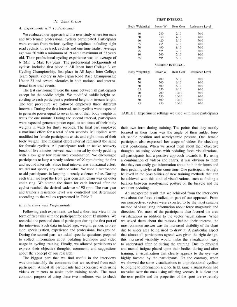
FIRST INTERVAL
Body Weight(kg) Power(W) Rear Gear Resistance Level
40 280 2/10 7/1050 350 4/10 7/1060 420 5/10 7/1065 455 7/10 7/1070 490 8/10 7/1075 525 7/10 8/1080 560 7/10 8/1085 595 8/10 8/10
SECOND INTERVAL
Body Weight(kg) Power(W) Rear Gear Resistance Level
40 400 6/10 8/1050 500 6/10 8/1060 600 8/10 8/1065 650 9/10 8/1070 700 10/10 8/1075 750 10/10 8/1080 800 10/10 8/1085 850 10/10 8/10
TABLE I: Experiment settings we used with male participants
their own form during training. The points that they mostlyfocused in their form was the angle of their ankle, fore-aft saddle position and aerodynamic posture. One femaleparticipant also expressed her usage of videos for checkingcleat positioning. When we asked them about their objectivethoughts on using videos with pedaling force visualizations,all participants had a positive approach towards it. By usinga combination of videos and charts, it was obvious to themthat they can easily get information about both their forms andtheir pedaling styles at the same time. One participant stronglybelieved in the possibilities of new training methods that canbe achieved with this kind of visualizations, such as finding abalance between aerodynamic posture on the bicycle and theresultant pedaling.
An unexpected result that we achieved from the interviewswas about the force visualization part of our approach. Fromour perspective, vectors were expected to be the most suitablemethod of visualizing information about force magnitude anddirection. Yet, most of the participants also favored the areavisualizations in addition to the vector visualizations. Whenwe asked them about the reasons behind their interest, themost common answer was the increased visibility of the chartdue to wider area being used to draw it. A particular aspectthat almost all participants agreed was given the right design,this increased visibility would make the visualization easyto understand after or during the training. Due to physicaland mental fatigue placed upon their bodies during and aftertraining, a visualization that clearly appears to the eye washighly favored by the participants. On the contrary, whenwe showed the same visualizations to unprofessional cyclistsbelonging to information science field, same visualizations hadno value over the ones using utilizing vectors. It is clear thatthe user profile and the properties of the sport are extremely
important factors that need to be taken into account whiledesigning sport specific visualizations.
All participants were positive about comparing their currentperformance with their past performances. By doing so, theywere expecting to see the increase or decrease in their pedalingperformance with respect to their physical form on the bicycle.A point mentioned by the most of participants was to useour approach to compare their pedaling styles while theirform is relatively bad and good to see if any significantdifferences exist in their pedaling performance. The answersto the question about comparing one’s own performance withsomebody else were mostly negative. Main reason behind thisresult was mostly due to the certain differences in body struc-ture and muscle recruitment patterns between each individual.Although two participants were positive about this kind ofcomparison, they only wanted to make it with people whosebody structures are close to theirs. Yet, they did not fullybelieved in this approach and its potential since most of themalready had a clear understanding about their own pedalingstyle and believed it would be substantially difficult to modifyaccording to another cyclist’s style.
Finally, a common suggestion from participants was towardsthe making of a real-time application where our approach canbe used during outdoor training. Their main desire was to beable compare their performance in a scenario which is thesame or as close as to real world scenarios such as races. Forexample, since the bicycle and the resistance trainer were fixedin place, using one’s own body weight was not an option.Participants expected to see significant differences in theirpedaling performances between indoor and outdoor trainingscenarios. Although, five participants also mentioned that theydo not explicitly place their focus nor on their pedaling neitheron their forms during outdoor training. This was mostly due tothe possible dangers it might pose if they are not fully awareof their surroundings. Participants also believed in the valueof an indoor training scenario which can replicate the outsideconditions, which remains to be an important milestone in ourfuture work calendar.
V. DISCUSSION
User studies with professionals clearly revealed that thevideos are not the most commonly used medium in cyclingdue to the limitation of scenarios where they can be trulyuseful. Although all participants had an experience with videousage to capture and evaluate their form, some of them usedvideos as infrequently as twice a year. When presented withour approach, all participants were positive about using it fortheir personal training, but only if provided in a way whichis easy to setup and use. We believe the main reason behindthat interest was the direct relationship that can be formedeffortlessly between cyclist’s form and its effects on pedal-ing. As mentioned before, current approaches to performanceevaluation in cycling mainly focus on the results rather thancauses. There is no denial that the current methods are highlyuseful. The point that we are interested in as researchers isto overcome the strict boundaries defined to separate those
(a) Track cyclist force vectors
(b) Track cyclist torque triangles
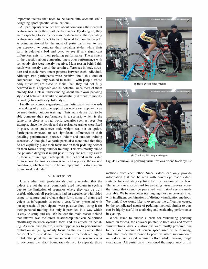
Fig. 4: Occlusion in pedaling visualizations of one track cyclist
methods from each other. Since videos can only provideinformation that can be seen with naked eye made videossuitable for evaluating cyclist’s form or position on the bike.The same can also be said for pedaling visualizations wherethe things that cannot be perceived with naked eye are madeavailable. We believe better training regimes can be establishedwith intelligent combinations of distinct visualization methods.We think if we would like to overcome the difficulties causedby the complicated nature of pedaling, methods similar to ourscan be highly useful in analyzing and evaluating performancein cycling.
When asked to choose a chart for visualizing pedalingforces on videos, the answers pointed to both area and vectorvisualizations. Area visualizations were mostly preferred dueto increased amount of screen space used while drawing.This also made them easier to perceive when superimposedon videos and eased required effort while making roughevaluations. All participants mentioned the importance of this
property since physical and mental stress placed upon theirbodies due to training also effected their cognitive abilities.Participants expressed that the comprehension of informationmight require less effort with area visualizations. However,visualizing more than one data as areas was also definedas impractical since it might simultaneously increase thecomplexity. Vector visualizations were mostly seen useful dueto participants familiarity with the method. We believe theeffects of this phenomenon named as mere-exposure principlerequires a better understanding
Vectors showed great qualities in extracting directionalinformation about cyclist’s pedaling. Yet, the reduced infor-mation integrity and visual simplicity also made it difficult forcyclists to extract a general pattern out of these visualizations.In this context, area visualizations representing torque gener-ation received more attention. Participant’s torque generationpattern was roughly identified during each interval. However,this visualization had occlusion problems when used withprofessional cyclists (Figure 4).
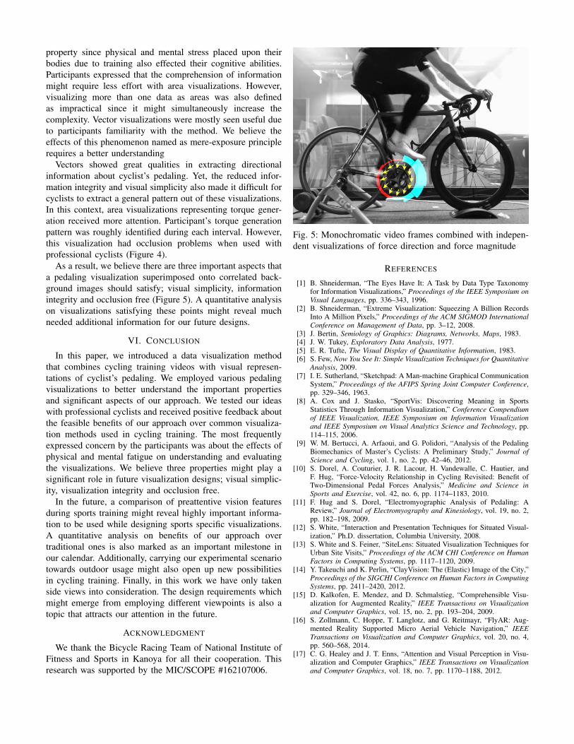
As a result, we believe there are three important aspects thata pedaling visualization superimposed onto correlated back-ground images should satisfy; visual simplicity, informationintegrity and occlusion free (Figure 5). A quantitative analysison visualizations satisfying these points might reveal muchneeded additional information for our future designs.
VI. CONCLUSION
In this paper, we introduced a data visualization methodthat combines cycling training videos with visual represen-tations of cyclist’s pedaling. We employed various pedalingvisualizations to better understand the important propertiesand significant aspects of our approach. We tested our ideaswith professional cyclists and received positive feedback aboutthe feasible benefits of our approach over common visualiza-tion methods used in cycling training. The most frequentlyexpressed concern by the participants was about the effects ofphysical and mental fatigue on understanding and evaluatingthe visualizations. We believe three properties might play asignificant role in future visualization designs; visual simplic-ity, visualization integrity and occlusion free.
In the future, a comparison of preattentive vision featuresduring sports training might reveal highly important informa-tion to be used while designing sports specific visualizations.A quantitative analysis on benefits of our approach overtraditional ones is also marked as an important milestone inour calendar. Additionally, carrying our experimental scenariotowards outdoor usage might also open up new possibilitiesin cycling training. Finally, in this work we have only takenside views into consideration. The design requirements whichmight emerge from employing different viewpoints is also atopic that attracts our attention in the future.
ACKNOWLEDGMENT
We thank the Bicycle Racing Team of National Institute ofFitness and Sports in Kanoya for all their cooperation. Thisresearch was supported by the MIC/SCOPE #162107006.
Fig. 5: Monochromatic video frames combined with indepen-dent visualizations of force direction and force magnitude
REFERENCES
[1] B. Shneiderman, “The Eyes Have It: A Task by Data Type Taxonomyfor Information Visualizations,” Proceedings of the IEEE Symposium onVisual Languages, pp. 336–343, 1996.
[2] B. Shneiderman, “Extreme Visualization: Squeezing A Billion RecordsInto A Million Pixels,” Proceedings of the ACM SIGMOD InternationalConference on Management of Data, pp. 3–12, 2008.
[3] J. Bertin, Semiology of Graphics: Diagrams, Networks, Maps, 1983.[4] J. W. Tukey, Exploratory Data Analysis, 1977.[5] E. R. Tufte, The Visual Display of Quantitative Information, 1983.[6] S. Few, Now You See It: Simple Visualization Techniques for Quantitative
Analysis, 2009.[7] I. E. Sutherland, “Sketchpad: A Man-machine Graphical Communication
System,” Proceedings of the AFIPS Spring Joint Computer Conference,pp. 329–346, 1963.
[8] A. Cox and J. Stasko, “SportVis: Discovering Meaning in SportsStatistics Through Information Visualization,” Conference Compendiumof IEEE Visualization, IEEE Symposium on Information Visualizationand IEEE Symposium on Visual Analytics Science and Technology, pp.114–115, 2006.
[9] W. M. Bertucci, A. Arfaoui, and G. Polidori, “Analysis of the PedalingBiomechanics of Master’s Cyclists: A Preliminary Study,” Journal ofScience and Cycling, vol. 1, no. 2, pp. 42–46, 2012.
[10] S. Dorel, A. Couturier, J. R. Lacour, H. Vandewalle, C. Hautier, andF. Hug, “Force-Velocity Relationship in Cycling Revisited: Benefit ofTwo-Dimensional Pedal Forces Analysis,” Medicine and Science inSports and Exercise, vol. 42, no. 6, pp. 1174–1183, 2010.
[11] F. Hug and S. Dorel, “Electromyographic Analysis of Pedaling: AReview,” Journal of Electromyography and Kinesiology, vol. 19, no. 2,pp. 182–198, 2009.
[12] S. White, “Interaction and Presentation Techniques for Situated Visual-ization,” Ph.D. dissertation, Columbia University, 2008.
[13] S. White and S. Feiner, “SiteLens: Situated Visualization Techniques forUrban Site Visits,” Proceedings of the ACM CHI Conference on HumanFactors in Computing Systems, pp. 1117–1120, 2009.
[14] Y. Takeuchi and K. Perlin, “ClayVision: The (Elastic) Image of the City,”Proceedings of the SIGCHI Conference on Human Factors in ComputingSystems, pp. 2411–2420, 2012.
[15] D. Kalkofen, E. Mendez, and D. Schmalstieg, “Comprehensible Visu-alization for Augmented Reality,” IEEE Transactions on Visualizationand Computer Graphics, vol. 15, no. 2, pp. 193–204, 2009.
[16] S. Zollmann, C. Hoppe, T. Langlotz, and G. Reitmayr, “FlyAR: Aug-mented Reality Supported Micro Aerial Vehicle Navigation,” IEEETransactions on Visualization and Computer Graphics, vol. 20, no. 4,pp. 560–568, 2014.
[17] C. G. Healey and J. T. Enns, “Attention and Visual Perception in Visu-alization and Computer Graphics,” IEEE Transactions on Visualizationand Computer Graphics, vol. 18, no. 7, pp. 1170–1188, 2012.