two type dept. studio™ pro technical type specimen ... filettd studio™ pro type specimen...
TRANSCRIPT
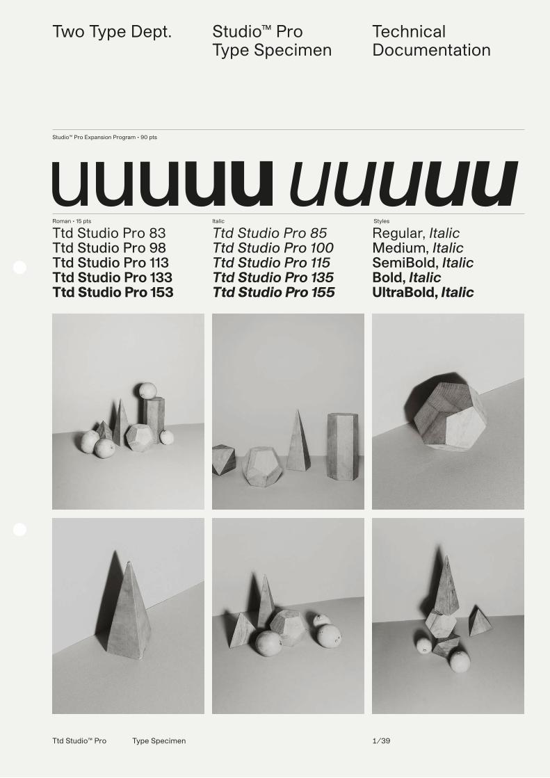
Roman • 15 pts
Ttd Studio Pro 83Ttd Studio Pro 98Ttd Studio Pro 113Ttd Studio Pro 133Ttd Studio Pro 153
Italic
Ttd Studio Pro 85Ttd Studio Pro 100Ttd Studio Pro 115Ttd Studio Pro 135Ttd Studio Pro 155
Styles
Regular, ItalicMedium, ItalicSemiBold, ItalicBold, ItalicUltraBold, Italic
Studio™ Pro Expansion Program • 90 pts
uuuuu uuuuu
Two Type Dept. Studio™ ProType Specimen
Technical Documentation
Ttd Studio™ Pro Type Specimen 1/39
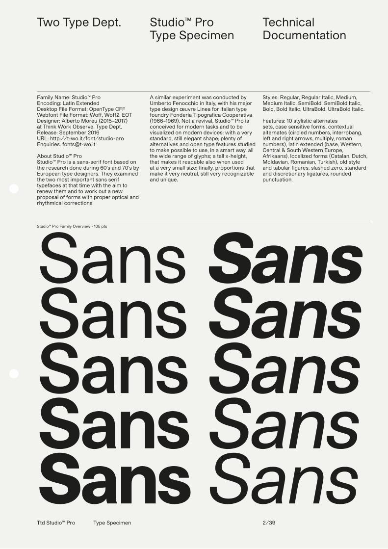
Studio™ Pro Family Overview • 105 pts
SansSansSansSansSans
SansSansSansSansSans
Two Type Dept. Studio™ ProType Specimen
Technical Documentation
Family Name: Studio™ ProEncoding: Latin ExtendedDesktop File Format: OpenType CFF Webfont File Format: Woff, Woff2, EOTDesigner: Alberto Moreu (2015–2017)at Think Work Observe, Type Dept. Release: September 2016URL: http://t-wo.it/font/studio-proEnquiries: [email protected]
About Studio™ Pro Studio™ Pro is a sans-serif font based on the research done during 60’s and 70’s by European type designers. They examined the two most important sans serif typefaces at that time with the aim to renew them and to work out a new proposal of forms with proper optical and rhythmical corrections.
A similar experiment was conducted by Umberto Fenocchio in Italy, with his major type design œuvre Linea for Italian type foundry Fonderia Tipografica Cooperativa (1966–1969). Not a revival, Studio™ Pro is conceived for modern tasks and to be visualized on modern devices: with a very standard, still elegant shape; plenty of alternatives and open type features studied to make possible to use, in a smart way, all the wide range of glyphs; a tall x-height, that makes it readable also when used at a very small size; finally, proportions that make it very neutral, still very recognizable and unique.
Styles: Regular, Regular Italic, Medium, Medium Italic, SemiBold, SemiBold Italic, Bold, Bold Italic, UltraBold, UltraBold Italic.
Features: 10 stylistic alternates sets, case sensitive forms, contextual alternates (circled numbers, interrobang, left and right arrows, multiply, roman numbers), latin extended (base, Western, Central & South Western Europe, Afrikaans), localized forms (Catalan, Dutch, Moldavian, Romanian, Turkish), old style and tabular figures, slashed zero, standard and discretionary ligatures, rounded punctuation.
Ttd Studio™ Pro Type Specimen 2/39
Ttd Studio™ Pro Type Specimen 3/39
Two Type Dept. Studio™ ProType Specimen
Characters SetOpenType Features
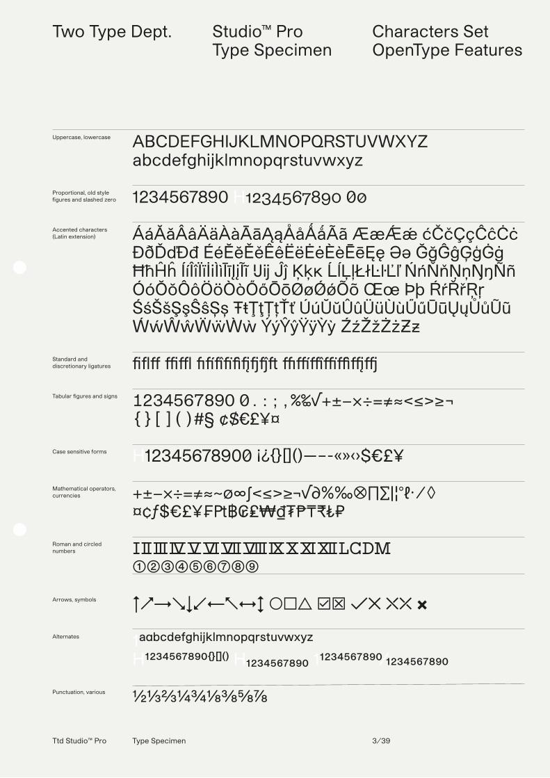
Uppercase, lowercase
Proportional, old style figures and slashed zero
Accented characters (Latin extension)
Standard and discretionary ligatures
Tabular figures and signs
Case sensitive forms
Mathematical operators, currencies
Roman and circled numbers
Arrows, symbols
Alternates
Punctuation, various
ABCDEFGHIJKLMNOPQRSTUVWXYZabcdefghijklmnopqrstuvwxyz
1234567890 H1234567890 00
ÁáĂăÂâÄäÀàĀāĄąÅåǺǻÃã ÆæǼǽ ćČčÇçĈĉĊċ ÐðĎďĐđ ÉéĔĕĚěÊêËëĖėÈèĒēĘę Əə ĞğĜĝĢģĠġ ĦħĤĥ ÍíÎîÏïİiÌìĪīĮįĨĩ IJij Ĵĵ Ķķĸ ĹĺĻļŁłĿŀĽľ ŃńŇňŅņŊŋÑñ ÓóŎŏÔôÖöÒòŐőŌōØøǾǿÕõ Œœ Þþ ŔŕŘřŖŗ ŚśŠšŞşŜŝȘș ŦŧŢţȚțŤť ÚúŬŭÛûÜüÙùŰűŪūŲųŮůŨũ ẂẃŴŵẄẅẀẁ ÝýŶŷŸÿỲỳ ŹźŽžŻżƵƶ
��� �� ������� �������
1234567890 0.:;,%‰√+±−×÷=≠≈<≤>≥¬{}[]()#§ ¢$€£¥¤
H12345678900 ¡¿{}[]()—–-«»‹›$€£¥
+±−×÷=≠≈~∅∞∫<≤>≥¬√∂%‰⦻∏∑|¦°ℓ⋅ ⁄ ◊¤¢ƒ$€£¥₣₧฿₢₤₩₫₮₱₸₹₺₽
ⅠⅡⅢⅣⅤⅥⅦⅧⅨⅩⅪⅫⅬⅭⅮⅯ➀➁➂➃➄➅➆➇➈
↑↗→↘↓↙←↖↔↕ ◯□△ ☑╳ ✓✕ ⤬⤫ ✖
1ªªbcdefghijklmnopqrstuvwxyz H¹²³⁴⁵⁶⁷⁸⁹⁰{}[]() H₁₂₃₄₅₆₇₈₉₀ 11234567890⁄1234567890
½⅓⅔¼¾⅛⅜⅝⅞
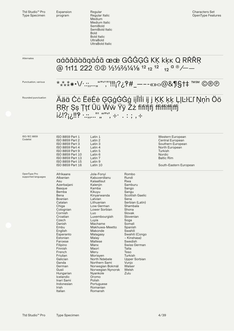
Alternates
Punctuation, various
Rounded punctuation
aáăâäàāąåǻã æǽ GĞĜĢĠ KĶ kķĸ Q RŔŘŖ@ 1111 222 ➀➁ ½⅓⅔¼⅛ 12⁄12 ¹²H₁₂ ª ® ⁄——
*⁂⁑⁕•\/·.:;,…„“”‘’‚"'!‼¡?¿‽#_—–-«»‹›@&¶§†‡ ™℠ ©®Ⓟ
Äää Ċċ ËëĖė ĢĢģĠĠġ iįÏïİi ij j ĶĶ ķķ ĻļĿŀĽľ Ņņʼn Öö ŖŖŗ Șș Țțť Üü Ẅẅ Ÿÿ Żż ABCD EFGH¡¿!?¡¿‼‽ ·.:;,…"'„“”‘’‚ ÷⋅ .:;,÷
ISO/IEC 8859 Codelist
ISO 8859 Part 1 ISO 8859 Part 2ISO 8859 Part 3ISO 8859 Part 4ISO 8859 Part 9ISO 8859 Part 10ISO 8859 Part 13ISO 8859 Part 15ISO 8859 Part 16
Latin 1Latin 2Latin 3 Latin 4Latin 5Latin 6Latin 7Latin 9Latin 10
Western EuropeanCentral EuropeanSouthern EuropeanNorth EuropeanTurkishNordicBaltic Rim
South-Eastern European
OpenType Prosupported languages
AfrikaansAlbanianAsuAzerbaijaniBasqueBembaBenaBosnianCatalanChigaColognianCornishCroatianCzechDanishEmbuEnglishEsperantoEstonianFaroeseFilipinoFinnishFrenchFriulianGalicianGandaGermanGusiiHungarianIcelandicInari Sami IndonesianIrishItalian
Jola-FonyiKabuverdianuKalaallisutKalenjinKambaKikuyuKinyarwandaLatvianLithuanianLow GermanLower SorbianLuoLuxembourgishLuyiaMachameMakhuwa-Meetto MakondeMalagasyMalayMalteseManxMaoriMeruMorisyenNorth NdebeleNorthern SamiNorwegian BokmålNorwegian NynorskNyankoleOromoPolishPortugueseRomanianRomansh
RomboRundiRwaSamburuSangoSanguScottish GaelicSenaSerbian (Latin)ShambalaShonaSlovakSlovenianSogaSomaliSpanishSwahiliSwahili (Congo – Kinshasa)SwedishSwiss GermanTaitaTesoTurkishUpper SorbianVunjoWalserWelshZulu
Ttd Studio™ ProType Specimen
Expansion program
RegularRegular ItalicMediumMedium ItalicSemiBoldSemiBold ItalicBoldBold ItalicUltraBoldUltraBold Italic
Characters SetOpenType Features
Ttd Studio™ Pro Type Specimen 4/39
Ttd Studio™ Pro Type Specimen 5/39
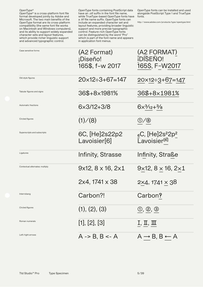
Case sensitive forms
Old style �gures
Tabular �gures and signs
Automatic fractions
Circled �gures
Superscripts and subscripts
Ligatures
Contextual alternates: multiply
Interrobang
Circled �gures
Roman numerals
Left/right arrows
(A2 Format)¡Diseño! 165$, f–w 2017
20×12÷3+67=147
36$+8×1981%
6×3/12+3/8
(1)/(8)
6C, [He]2s22p2Lavoisier[6]
Infinity, Strasse
9x12, 8 x 16, 2x1
2x4, 1741 x 38
Carbon?!
(1), (2), (3)
[1], [2], [3]
A -> B, B <- A
(A2 FORMAT)¡DISEÑO!165$, F–W2017
20×12÷3+67=147
36$+8×1981%
6×3⁄12+3⁄8
➀/➇
₆C, [He]2s²2p²Lavoisier[⁶]
In�nity, Straße
9×12, 8 × 16, 2×1
2×4, 1741 × 38
Carbon‽
➀, ➁, ➂
Ⅰ, Ⅱ, Ⅲ
A → B, B ← A
OpenType®OpenType® is a cross-platform font file format developed jointly by Adobe and Microsoft. The two main benefits of the OpenType format are its cross-platform compatibility (the same font file works on Macintosh and Windows computers), and its ability to support widely expanded character sets and layout features, which provide richer linguistic support and advanced typographic control.
OpenType fonts containing PostScript data have an .otf suffix in the font file name, while TrueType-based OpenType fonts have a .ttf file name suffix. OpenType fonts can include an expanded character set and layout features, providing broader linguistic support and more precise typographic control. Feature-rich OpenType fonts can be distinguished by the word “Pro” which is part of the font name and appears in application font menus.
OpenType fonts can be installed and used alongside PostScript Type 1 and TrueType fonts.
http://www.adobe.com/products/type/opentype.html

Ttd Studio™ Pro Type Specimen 6/39
OpenType Features: Automatic Fractions, Case Sensitive Forms, Circled Figures, Ligatures, Old Style Figures, Tabular Figures and Signs, Superscripts and Subscripts.
Contextual Alternates: Ballot Box with Check, Ballot Box with X, Circled Figures, Interrobang, Left/Right Arrows, Multiply, Numero Sign, Roman Numerals.
Localized Forms: Catalan, Dutch, Moldavian, Romanian, Turkish.Stylistic Sets: ss01, ss02, ss03, ss04, ss05, ss06, ss06, ss07, ss08, ss09, ss10.
Numero Sign
Ballot Box with CheckBallot Box with X
Localized Forms: Catalan, Dutch, Moldavian, Romanian, Turkish
Stylistic Sets:ss01
ss02
ss03
ss04
ss05
ss06
ss07
ss08
ss09
ss10
No.1
[v] [x]
Paral·lel, CRUIJFF,Timişoara, Spaţiu,DIYARBAKIR
Alvar Aalto
BACKGROUND
Knapsack
RUBBER
Quadricromia
12×21+1⁄2
PE—1/1
@rietveld
Studio®
“Tipogra�ca”
№1
☑ ╳
Paraŀlel, CRUIJFF,Timișoara, Spațiu,DİYARBAKIR
Alvar Aalto
BACKGROUND
Knapsack
RUBBER
Quadricromia
12×21+1⁄2
PE—1/1
@rietveld
Studio®
“TipograAca”
Ttd Studio™ Pro Type Specimen 7/39
Two Type Dept. Studio™ ProType Specimen
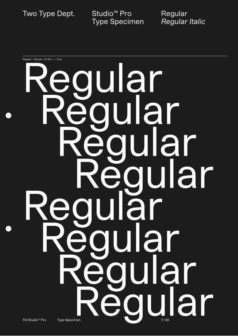
RegularRegular Italic
Regular • 100 pts + S/Alt ↔ − 15 pt
Regular Regular Regular RegularRegular Regular Regular Regular
Two Type Dept. Studio™ ProType Specimen
RegularRegular Italic
Ttd Studio™ Pro Type Specimen 8/39
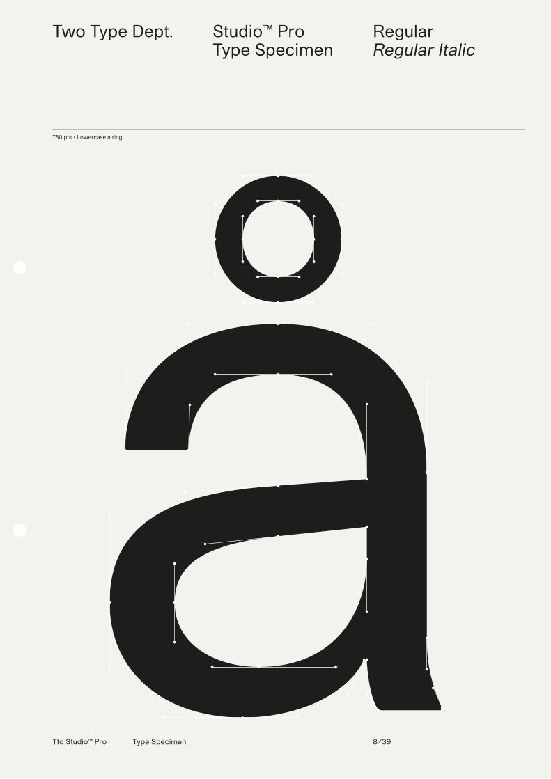
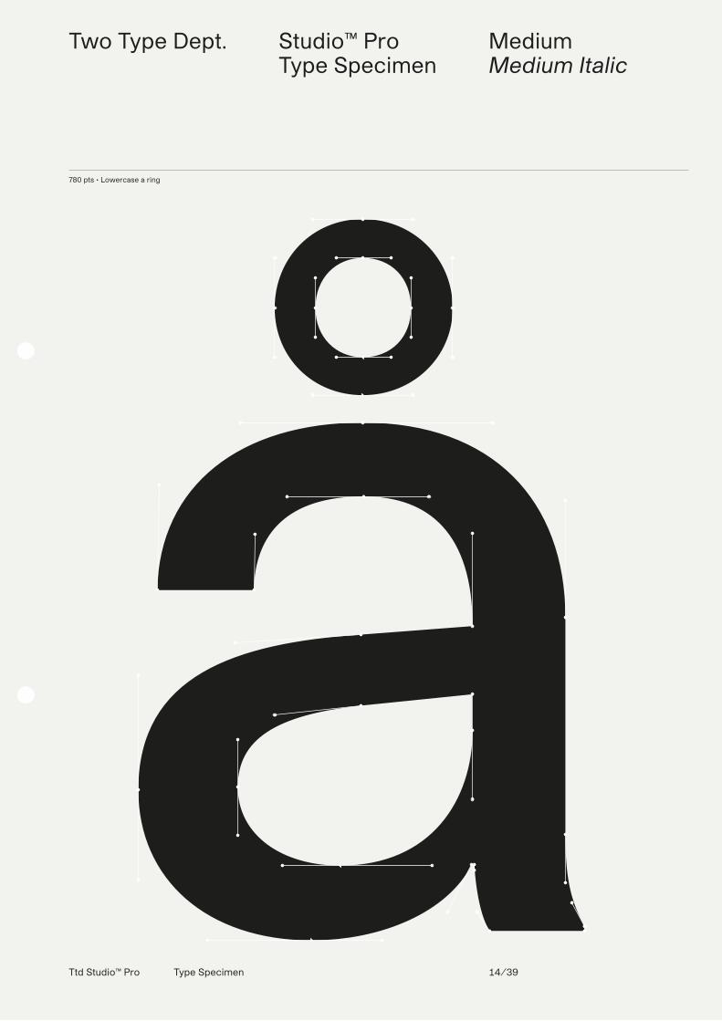
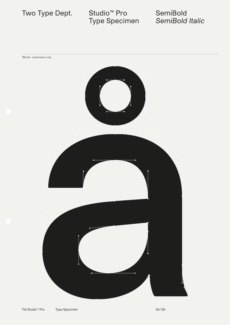
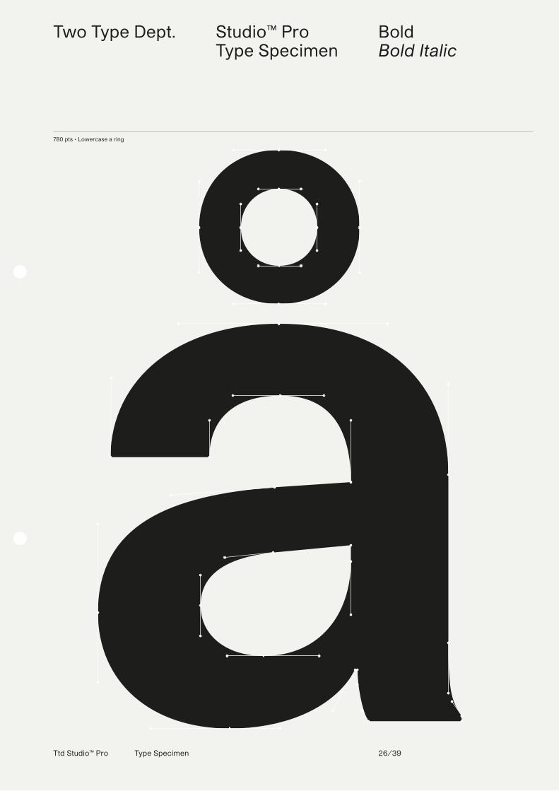
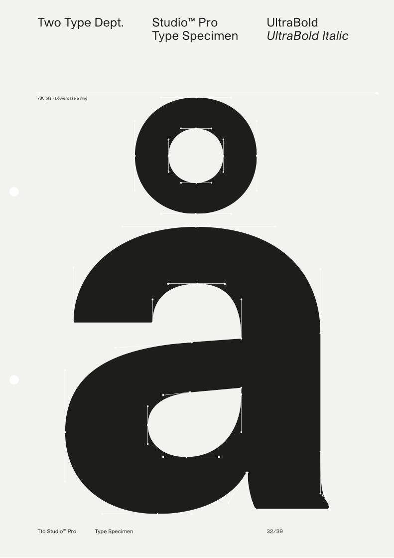
780 pts • Lowercase a ring
Emil Ruder (1914–1970), typographe suisse et graphiste, qui avec Armin Hofmann participa à la fondation de la Schule für Gestaltung Basel (en français : école de design de Bâle) et du style graphique connu comme le style suisse. Ruder était un contributeur et un éditeur du Typografische Monatsblätter. Il est le créateur des couvertures pour tous les numéros édités en 1961, puis occasionnellement jusqu'en 1967. Ruder publia une grammaire basique de la typographie intitulée Emil Ruder :
Typography. Le texte fut publié en allemand, anglais et français, par l'éditeur suisse Arthur Niggli en 1967. Le livre popularisa et propagea le style suisse, et devient un texte de base pour les programmes de graphisme et de typographie en Europe et en Amérique du Nord. En 1962 il participa à la fondation du International Center for the Typographic Arts (ICTA) (en français : centre international pour les arts typogra-phique) à New York. Le style suisse fut défini par l'utilisation de polices d'écriture
sans-serif, et l'emploi d'une grille pour structure, produisant une mise en page asymétrique. Ruder commença à l'ensei-gner en premier en 1942 à la Allgemeine Gewerbeschule de la ville suisse de Bâle. En 1948 Ruder rencontra l'artiste-peintre Armin Hofmann. Ruder et Hoffman commencèrent une longue période de collaboration. Leur enseignement atteignit une réputation internationale au milieu des années 1950. Au milieu des années 1960, leurs cours durent maintenir une longue
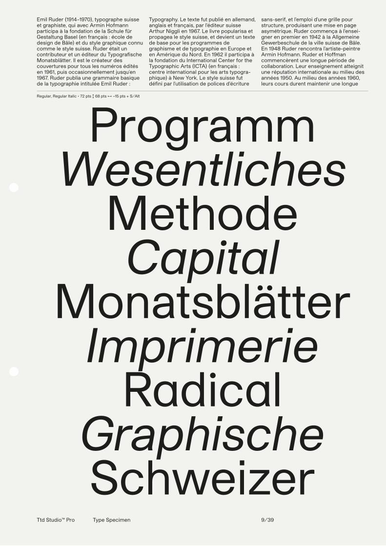
Regular, Regular Italic • 72 pts ↕ 68 pts ↔ −15 pts + S/Alt
ProgrammWesentliches
MethodeCapital
MonatsblätterImprimerie
RadicalGraphischeSchweizer
Ttd Studio™ Pro Type Specimen 9/39
Ttd Studio™ Pro Type Specimen 10/39
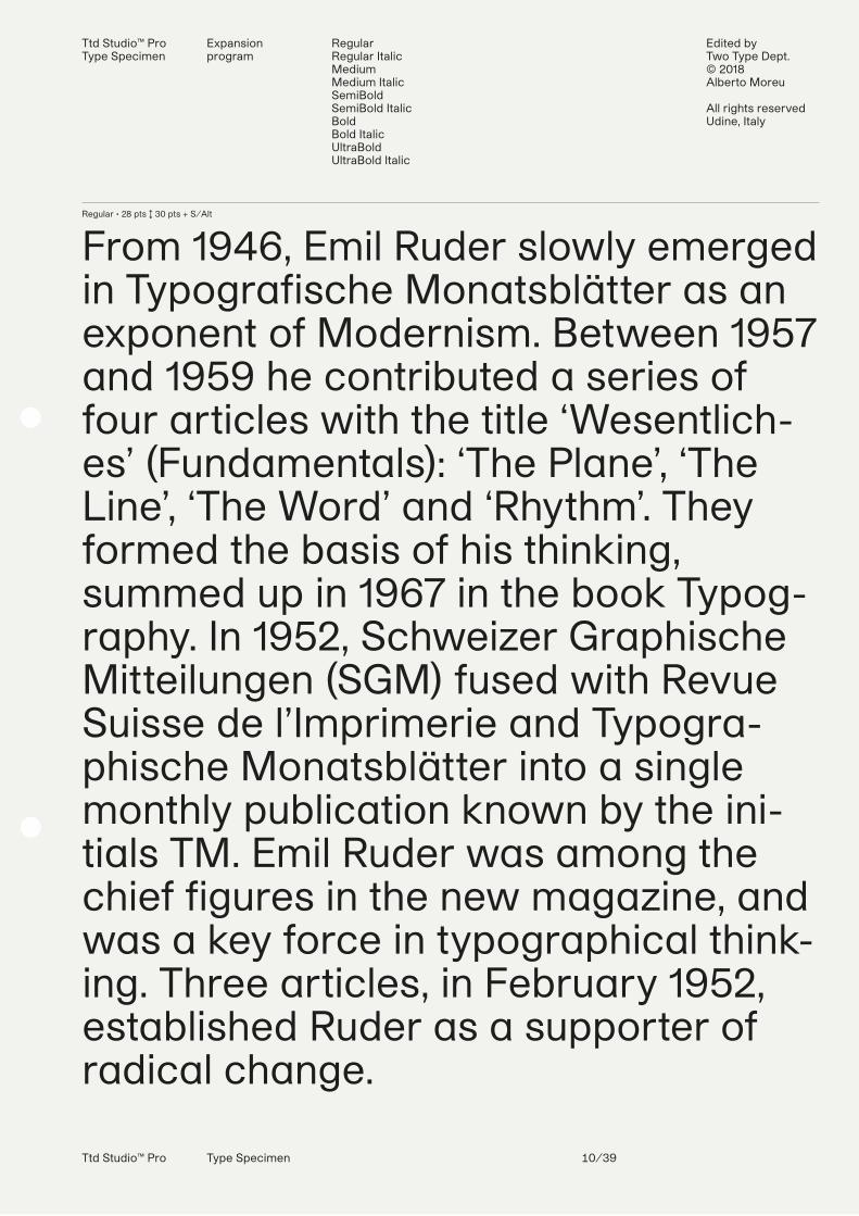
Regular • 28 pts ↕ 30 pts + S/Alt
From 1946, Emil Ruder slowly emerged in Typografische Monatsblätter as an exponent of Modernism. Between 1957 and 1959 he contributed a series of four articles with the title ‘Wesentlich-es’ (Fundamentals): ‘The Plane’, ‘The Line’, ‘The Word’ and ‘Rhythm’. They formed the basis of his thinking, summed up in 1967 in the book Typog-raphy. In 1952, Schweizer Graphische Mitteilungen (SGM) fused with Revue Suisse de l’Imprimerie and Typogra-phische Monatsblätter into a single monthly publication known by the ini-tials TM. Emil Ruder was among the chief figures in the new magazine, and was a key force in typographical think-ing. Three articles, in February 1952, established Ruder as a supporter of radical change.
Ttd Studio™ ProType Specimen
Expansion program
RegularRegular ItalicMediumMedium ItalicSemiBoldSemiBold ItalicBoldBold ItalicUltraBoldUltraBold Italic
Edited by Two Type Dept.© 2018Alberto Moreu
All rights reservedUdine, Italy
Ttd Studio™ Pro Type Specimen 11/39
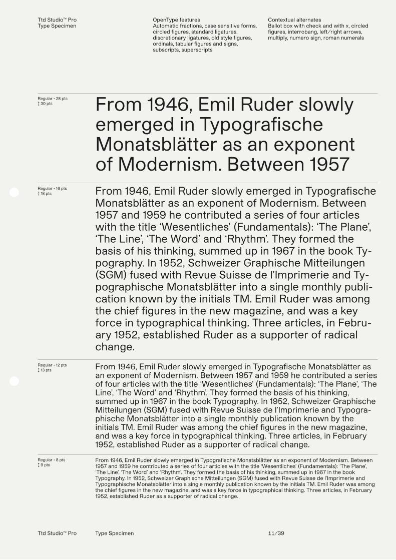
Regular • 28 pts↕ 30 pts
Regular • 16 pts↕ 18 pts
Regular • 12 pts↕ 13 pts
Regular • 8 pts↕ 9 pts
From 1946, Emil Ruder slowly emerged in Typografische Monatsblätter as an exponent of Modernism. Between 1957From 1946, Emil Ruder slowly emerged in Typografische Monatsblätter as an exponent of Modernism. Between 1957 and 1959 he contributed a series of four articles with the title ‘Wesentliches’ (Fundamentals): ‘The Plane’, ‘The Line’, ‘The Word’ and ‘Rhythm’. They formed the basis of his thinking, summed up in 1967 in the book Ty-pography. In 1952, Schweizer Graphische Mitteilungen (SGM) fused with Revue Suisse de l’Imprimerie and Ty-pographische Monatsblätter into a single monthly publi-cation known by the initials TM. Emil Ruder was among the chief figures in the new magazine, and was a key force in typographical thinking. Three articles, in Febru-ary 1952, established Ruder as a supporter of radical change.
From 1946, Emil Ruder slowly emerged in Typografische Monatsblätter as an exponent of Modernism. Between 1957 and 1959 he contributed a series of four articles with the title ‘Wesentliches’ (Fundamentals): ‘The Plane’, ‘The Line’, ‘The Word’ and ‘Rhythm’. They formed the basis of his thinking, summed up in 1967 in the book Typography. In 1952, Schweizer Graphische Mitteilungen (SGM) fused with Revue Suisse de l’Imprimerie and Typogra-phische Monatsblätter into a single monthly publication known by the initials TM. Emil Ruder was among the chief figures in the new magazine, and was a key force in typographical thinking. Three articles, in February 1952, established Ruder as a supporter of radical change.
From 1946, Emil Ruder slowly emerged in Typografische Monatsblätter as an exponent of Modernism. Between 1957 and 1959 he contributed a series of four articles with the title ‘Wesentliches’ (Fundamentals): ‘The Plane’, ‘The Line’, ‘The Word’ and ‘Rhythm’. They formed the basis of his thinking, summed up in 1967 in the book Typography. In 1952, Schweizer Graphische Mitteilungen (SGM) fused with Revue Suisse de l’Imprimerie and Typographische Monatsblätter into a single monthly publication known by the initials TM. Emil Ruder was among the chief figures in the new magazine, and was a key force in typographical thinking. Three articles, in February 1952, established Ruder as a supporter of radical change.
Ttd Studio™ ProType Specimen
OpenType features Automatic fractions, case sensitive forms, circled figures, standard ligatures, discretionary ligatures, old style figures, ordinals, tabular figures and signs, subscripts, superscripts
Contextual alternatesBallot box with check and with x, circled figures, interrobang, left/right arrows, multiply, numero sign, roman numerals
Ttd Studio™ Pro Type Specimen 12/39
Ttd Studio™ ProType Specimen
Localized forms CatalanDutchMoldavianRomanianTurkish
Stylistic sets ss01ss02ss03ss04ss05ss06ss06ss07ss08ss09ss10
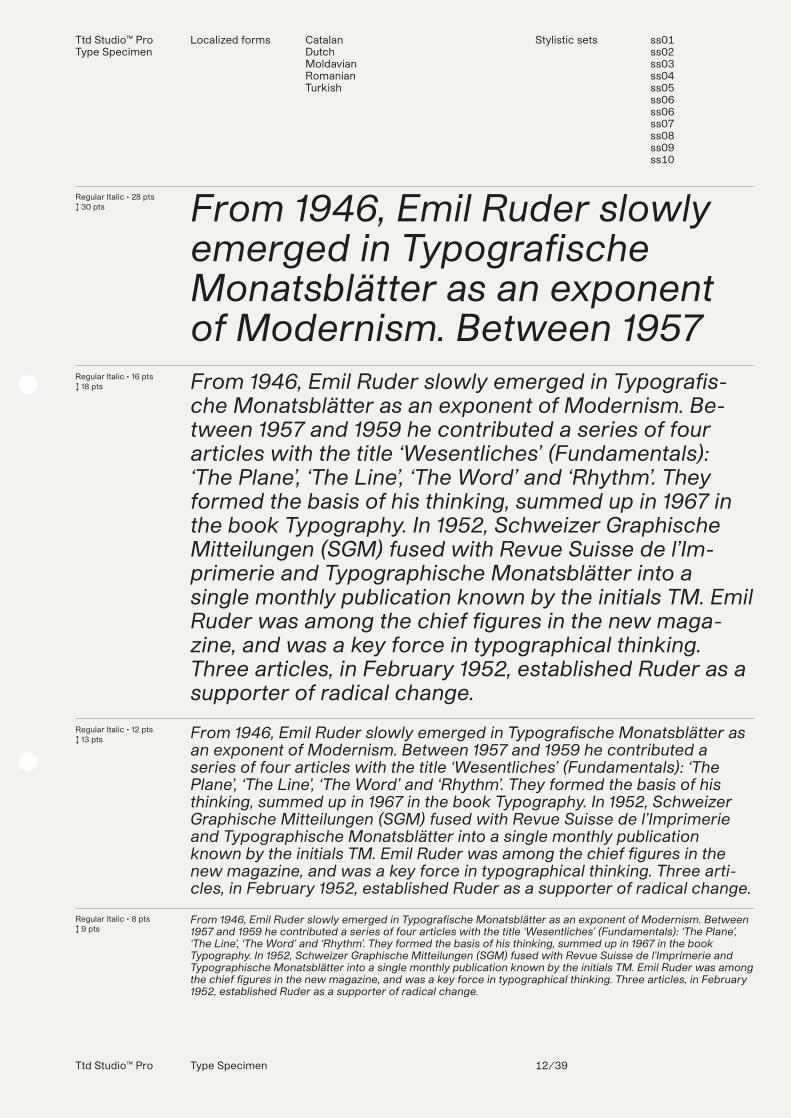
Regular Italic • 28 pts↕ 30 pts
Regular Italic • 16 pts↕ 18 pts
Regular Italic • 12 pts↕ 13 pts
Regular Italic • 8 pts↕ 9 pts
From 1946, Emil Ruder slowly emerged in Typografische Monatsblätter as an exponent of Modernism. Between 1957From 1946, Emil Ruder slowly emerged in Typografis-che Monatsblätter as an exponent of Modernism. Be-tween 1957 and 1959 he contributed a series of four articles with the title ‘Wesentliches’ (Fundamentals): ‘The Plane’, ‘The Line’, ‘The Word’ and ‘Rhythm’. They formed the basis of his thinking, summed up in 1967 in the book Typography. In 1952, Schweizer Graphische Mitteilungen (SGM) fused with Revue Suisse de l’Im-primerie and Typographische Monatsblätter into a single monthly publication known by the initials TM. Emil Ruder was among the chief figures in the new maga-zine, and was a key force in typographical thinking. Three articles, in February 1952, established Ruder as a supporter of radical change.
From 1946, Emil Ruder slowly emerged in Typografische Monatsblätter as an exponent of Modernism. Between 1957 and 1959 he contributed a series of four articles with the title ‘Wesentliches’ (Fundamentals): ‘The Plane’, ‘The Line’, ‘The Word’ and ‘Rhythm’. They formed the basis of his thinking, summed up in 1967 in the book Typography. In 1952, Schweizer Graphische Mitteilungen (SGM) fused with Revue Suisse de l’Imprimerie and Typographische Monatsblätter into a single monthly publication known by the initials TM. Emil Ruder was among the chief figures in the new magazine, and was a key force in typographical thinking. Three arti-cles, in February 1952, established Ruder as a supporter of radical change.
From 1946, Emil Ruder slowly emerged in Typografische Monatsblätter as an exponent of Modernism. Between 1957 and 1959 he contributed a series of four articles with the title ‘Wesentliches’ (Fundamentals): ‘The Plane’, ‘The Line’, ‘The Word’ and ‘Rhythm’. They formed the basis of his thinking, summed up in 1967 in the book Typography. In 1952, Schweizer Graphische Mitteilungen (SGM) fused with Revue Suisse de l’Imprimerie and Typographische Monatsblätter into a single monthly publication known by the initials TM. Emil Ruder was among the chief figures in the new magazine, and was a key force in typographical thinking. Three articles, in February 1952, established Ruder as a supporter of radical change.
Ttd Studio™ Pro Type Specimen 13/39
Two Type Dept. Studio™ ProType Specimen
MediumMedium Italic
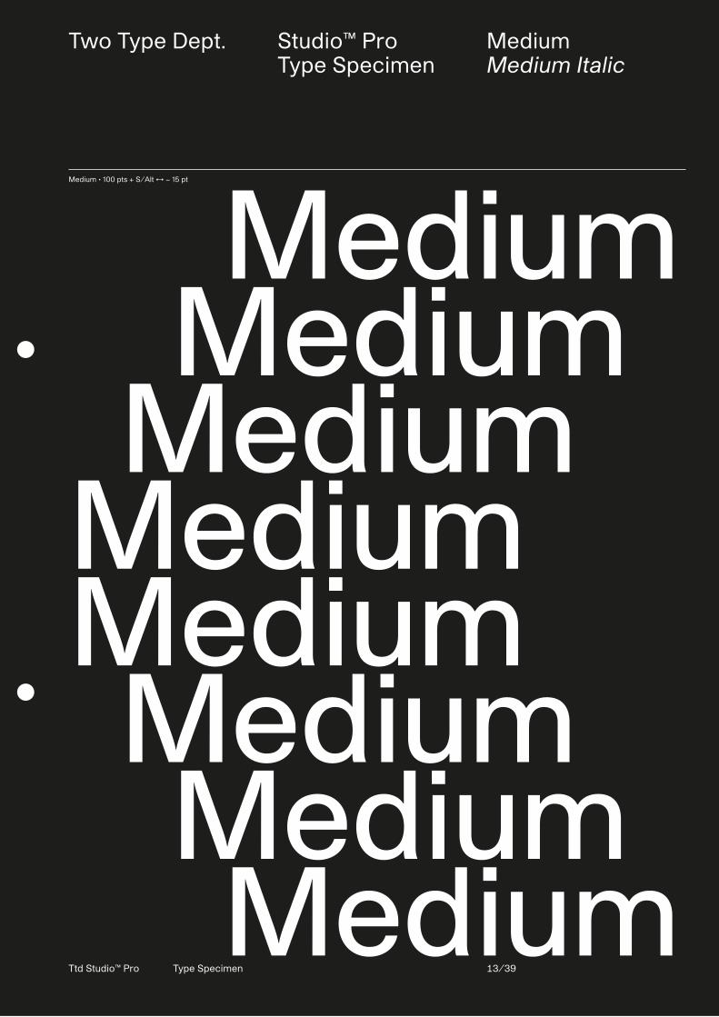
Medium • 100 pts + S/Alt ↔ − 15 pt
Medium Medium MediumMediumMedium Medium Medium Medium
Two Type Dept. Studio™ ProType Specimen
MediumMedium Italic
Ttd Studio™ Pro Type Specimen 14/39
780 pts • Lowercase a ring
In 1963, he was one of the founders of the design studio Total Design (currently named Total Identity). From 1964 onwards, Crouwel was responsible for the design of the posters, catalogues and exhibitions of the Stedelijk Museum in Amsterdam. In 1967 he designed the typeface New Alphabet, a design that embraces the limitations of the cathode ray tube technol-ogy used by early data display screens and phototypesetting equipment, thus only containing horizontal and vertical strokes.
Other typefaces from his hand are Fodor and Gridnik. In 1970 he designed the Dutch pavilion for Expo ’70 (Osaka, Japan). Later, Crouwel designed the Number Postage Stamps for the Dutch PTT, well known in the Netherlands during its circulation from 1976-2002. In the years Crouwel worked for Total Design, he designed many geometric wordmarks, one of which is the wordmark for the Dutch Rabobank, designed in 1973. The lettershapes have been influenced by the fact that the
wordmark had to be used as a 3D light box. After the 3D application was finalized, the 2D design for print was adapted. According to Wim Crouwel, New Alphabet was ‘over-the-top and never meant to be really used’. However, as unreadable as it was, it made a comeback in 1988 when designer Brett Wickens used a version of the font on the sleeve of Substance by Joy Division. In addition to his work as a graphic designer, he was also active in the educational field. In the 1950s he worked as
Medium, Medium Italic • 72 pts ↕ 68 pts ↔ −15 pts + S/Alt
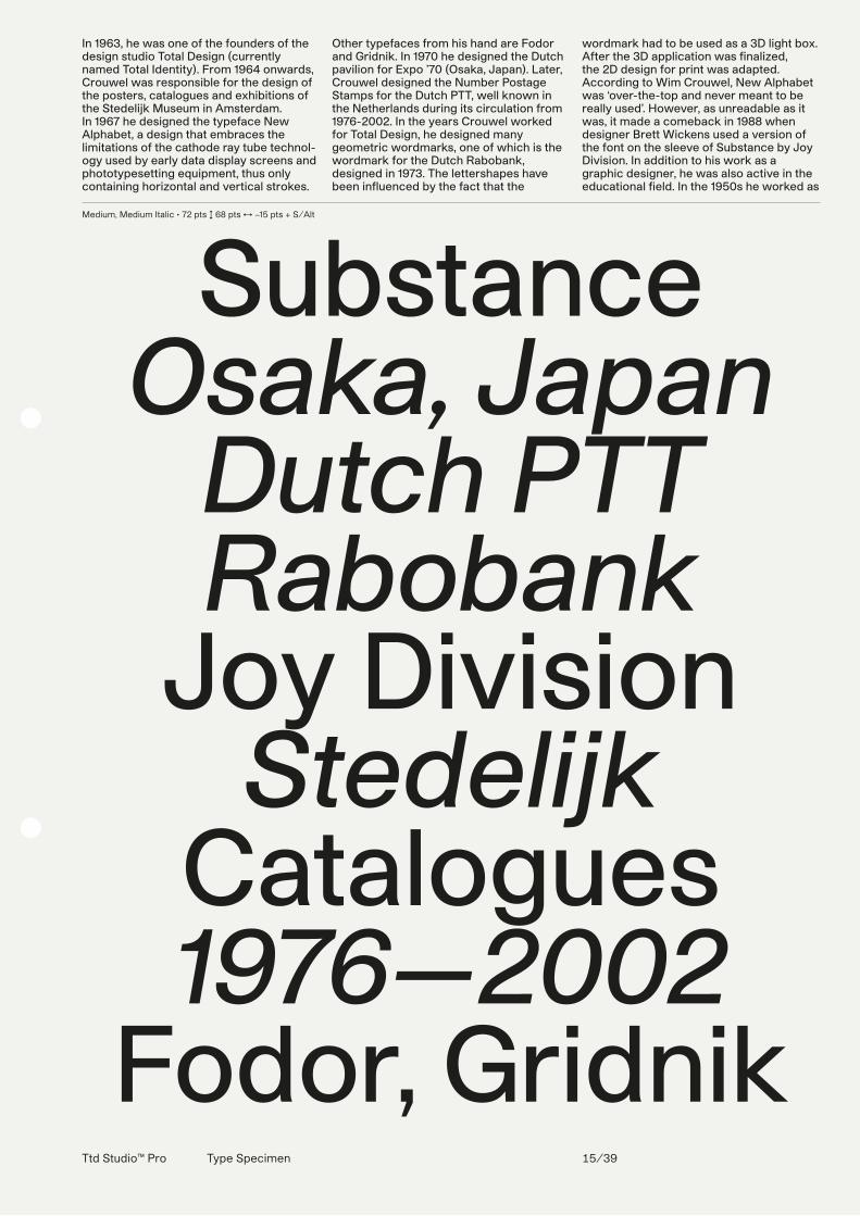
SubstanceOsaka, Japan
Dutch PTTRabobank
Joy DivisionStedelijk
Catalogues1976—2002
Fodor, GridnikTtd Studio™ Pro Type Specimen 15/39
Ttd Studio™ Pro Type Specimen 16/39
Medium • 28 pts ↕ 30 pts + S/Alt
In 1963 was hij mede-oprichter van het ontwerpbureau Total Design (tegenwoordig Total Identity). Hij blijft een lange tijd bij het bedrijf betrokken als directeur. Vanaf 1964 was Crouwel verantwoordelijk voor het ontwerp van de affiches, catalogi en tentoon-stellingen van het Stedelijk Museum in Amsterdam. Het lettertype New Al-phabet, ontworpen door Crouwel in 1967. In 1967 ontwierp hij het lettertype New Alphabet, een letter die de bep-erkingen van de kathodestraalbuis omarmt en zodoende bestaat uit alleen maar horizontalen en verti-calen. Andere letterontwerpen van zijn hand zijn Fodor en Gridnik. Crouwel was mede-ontwerper van het Neder-landse paviljoen op de wereldtentoon-stelling van 1970 in Osaka, Japan.
Ttd Studio™ ProType Specimen
Expansion program
RegularRegular ItalicMediumMedium ItalicSemiBoldSemiBold ItalicBoldBold ItalicUltraBoldUltraBold Italic
Edited by Two Type Dept.© 2018Alberto Moreu
All rights reservedUdine, Italy
Ttd Studio™ Pro Type Specimen 17/33
Ttd Studio™ ProType Specimen
OpenType features Automatic fractions, case sensitive forms, circled figures, standard ligatures, discretionary ligatures, old style figures, ordinals, tabular figures and signs, subscripts, superscripts
Contextual alternatesBallot box with check and with x, circled figures, interrobang, left/right arrows, multiply, numero sign, roman numerals
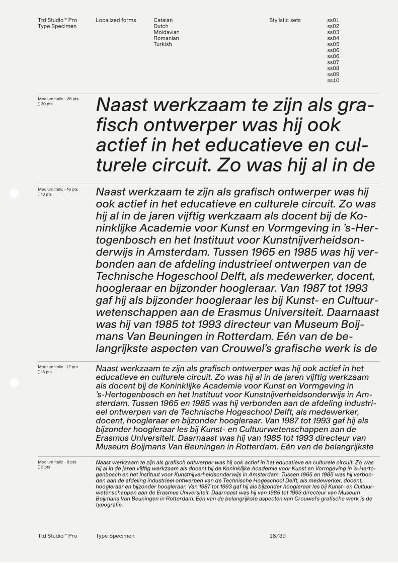
Medium • 28 pts↕ 30 pts
Medium • 16 pts↕ 18 pts
Medium • 12 pts↕ 13 pts
Medium • 8 pts↕ 9 pts
Naast werkzaam te zijn als gra-fisch ontwerper was hij ook actief in het educatieve en cul-turele circuit. Zo was hij al in de Naast werkzaam te zijn als grafisch ontwerper was hij ook actief in het educatieve en culturele circuit. Zo was hij al in de jaren vijftig werkzaam als docent bij de Ko-ninklijke Academie voor Kunst en Vormgeving in ’s-Her-togenbosch en het Instituut voor Kunstnijverheidson-derwijs in Amsterdam. Tussen 1965 en 1985 was hij ver-bonden aan de afdeling industrieel ontwerpen van de Technische Hogeschool Delft, als medewerker, docent, hoogleraar en bijzonder hoogleraar. Van 1987 tot 1993 gaf hij als bijzonder hoogleraar les bij Kunst- en Cultuur-wetenschappen aan de Erasmus Universiteit. Daarnaast was hij van 1985 tot 1993 directeur van Museum Boij-mans Van Beuningen in Rotterdam. Eén van de be-langrijkste aspecten van Crouwel’s grafische werk is de
Naast werkzaam te zijn als grafisch ontwerper was hij ook actief in het educatieve en culturele circuit. Zo was hij al in de jaren vijftig werkzaam als docent bij de Koninklijke Academie voor Kunst en Vormgeving in ’s-Hertogenbosch en het Instituut voor Kunstnijverheidsonderwijs in Am-sterdam. Tussen 1965 en 1985 was hij verbonden aan de afdeling industri-eel ontwerpen van de Technische Hogeschool Delft, als medewerker, docent, hoogleraar en bijzonder hoogleraar. Van 1987 tot 1993 gaf hij als bijzonder hoogleraar les bij Kunst- en Cultuurwetenschappen aan de Eras-mus Universiteit. Daarnaast was hij van 1985 tot 1993 directeur van Museum Boijmans Van Beuningen in Rotterdam. Eén van de belangrijkste
Naast werkzaam te zijn als grafisch ontwerper was hij ook actief in het educatieve en culturele circuit. Zo was hij al in de jaren vijftig werkzaam als docent bij de Koninklijke Academie voor Kunst en Vormgeving in ’s-Hertogen-bosch en het Instituut voor Kunstnijverheidsonderwijs in Amsterdam. Tussen 1965 en 1985 was hij verbonden aan de afdeling industrieel ontwerpen van de Technische Hogeschool Delft, als medewerker, docent, hoogleraar en bijzonder hoogleraar. Van 1987 tot 1993 gaf hij als bijzonder hoogleraar les bij Kunst- en Cultuurwetenschap-pen aan de Erasmus Universiteit. Daarnaast was hij van 1985 tot 1993 directeur van Museum Boijmans Van Beuningen in Rotterdam. Eén van de belangrijkste aspecten van Crouwel’s grafische werk is de typografie.
Ttd Studio™ Pro Type Specimen 18/39
Medium Italic • 28 pts↕ 30 pts
Medium Italic • 16 pts↕ 18 pts
Medium Italic • 12 pts↕ 13 pts
Medium Italic • 8 pts↕ 9 pts
Naast werkzaam te zijn als gra-fisch ontwerper was hij ook actief in het educatieve en cul-turele circuit. Zo was hij al in de Naast werkzaam te zijn als grafisch ontwerper was hij ook actief in het educatieve en culturele circuit. Zo was hij al in de jaren vijftig werkzaam als docent bij de Ko-ninklijke Academie voor Kunst en Vormgeving in ’s-Her-togenbosch en het Instituut voor Kunstnijverheidson-derwijs in Amsterdam. Tussen 1965 en 1985 was hij ver-bonden aan de afdeling industrieel ontwerpen van de Technische Hogeschool Delft, als medewerker, docent, hoogleraar en bijzonder hoogleraar. Van 1987 tot 1993 gaf hij als bijzonder hoogleraar les bij Kunst- en Cultuur-wetenschappen aan de Erasmus Universiteit. Daarnaast was hij van 1985 tot 1993 directeur van Museum Boij-mans Van Beuningen in Rotterdam. Eén van de be-langrijkste aspecten van Crouwel’s grafische werk is de
Naast werkzaam te zijn als grafisch ontwerper was hij ook actief in het educatieve en culturele circuit. Zo was hij al in de jaren vijftig werkzaam als docent bij de Koninklijke Academie voor Kunst en Vormgeving in ’s-Hertogenbosch en het Instituut voor Kunstnijverheidsonderwijs in Am-sterdam. Tussen 1965 en 1985 was hij verbonden aan de afdeling industri-eel ontwerpen van de Technische Hogeschool Delft, als medewerker, docent, hoogleraar en bijzonder hoogleraar. Van 1987 tot 1993 gaf hij als bijzonder hoogleraar les bij Kunst- en Cultuurwetenschappen aan de Erasmus Universiteit. Daarnaast was hij van 1985 tot 1993 directeur van Museum Boijmans Van Beuningen in Rotterdam. Eén van de belangrijkste
Naast werkzaam te zijn als grafisch ontwerper was hij ook actief in het educatieve en culturele circuit. Zo was hij al in de jaren vijftig werkzaam als docent bij de Koninklijke Academie voor Kunst en Vormgeving in ’s-Herto-genbosch en het Instituut voor Kunstnijverheidsonderwijs in Amsterdam. Tussen 1965 en 1985 was hij verbon-den aan de afdeling industrieel ontwerpen van de Technische Hogeschool Delft, als medewerker, docent, hoogleraar en bijzonder hoogleraar. Van 1987 tot 1993 gaf hij als bijzonder hoogleraar les bij Kunst- en Cultuur-wetenschappen aan de Erasmus Universiteit. Daarnaast was hij van 1985 tot 1993 directeur van Museum Boijmans Van Beuningen in Rotterdam. Eén van de belangrijkste aspecten van Crouwel’s grafische werk is de typografie.
Ttd Studio™ ProType Specimen
Localized forms CatalanDutchMoldavianRomanianTurkish
Stylistic sets ss01ss02ss03ss04ss05ss06ss06ss07ss08ss09ss10
Ttd Studio™ Pro Type Specimen 19/39
Two Type Dept. Studio™ ProType Specimen
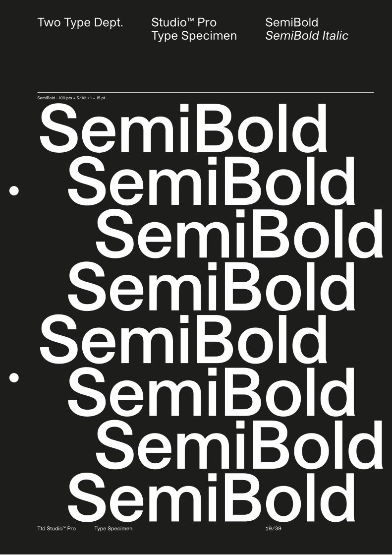
SemiBoldSemiBold Italic
SemiBold • 100 pts + S/Alt ↔ − 15 pt
SemiBold SemiBold SemiBold SemiBoldSemiBold SemiBold SemiBold SemiBold
Two Type Dept. Studio™ ProType Specimen
SemiBoldSemiBold Italic
Ttd Studio™ Pro Type Specimen 20/39
780 pts • Lowercase a ringSemiBold • 100 pts + S/Alt ↔ − 15 pt
SemiBold SemiBold SemiBold SemiBoldSemiBold SemiBold SemiBold SemiBold
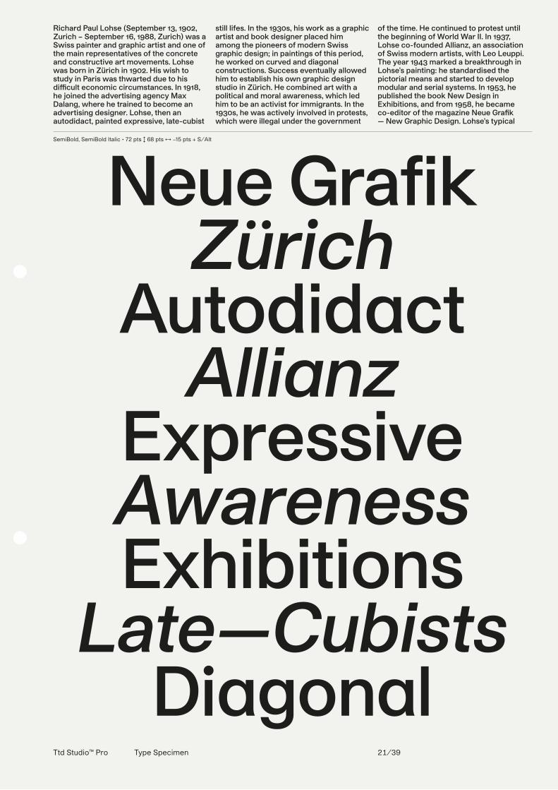
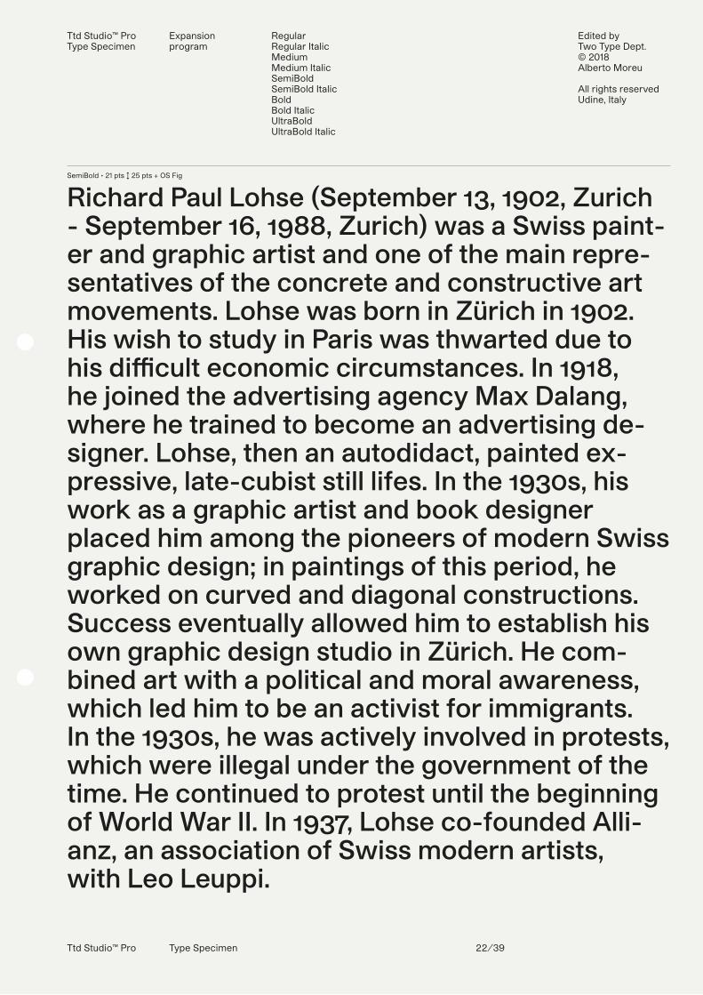
Richard Paul Lohse (September 13, 1902, Zurich – September 16, 1988, Zurich) was a Swiss painter and graphic artist and one of the main representatives of the concrete and constructive art movements. Lohse was born in Zürich in 1902. His wish to study in Paris was thwarted due to his di�cult economic circumstances. In 1918, he joined the advertising agency Max Dalang, where he trained to become an advertising designer. Lohse, then an autodidact, painted expressive, late-cubist
still lifes. In the 1930s, his work as a graphic artist and book designer placed him among the pioneers of modern Swiss graphic design; in paintings of this period, he worked on curved and diagonal constructions. Success eventually allowed him to establish his own graphic design studio in Zürich. He combined art with a political and moral awareness, which led him to be an activist for immigrants. In the 1930s, he was actively involved in protests, which were illegal under the government
of the time. He continued to protest until the beginning of World War II. In 1937, Lohse co-founded Allianz, an association of Swiss modern artists, with Leo Leuppi.The year 1943 marked a breakthrough in Lohse’s painting: he standardised the pictorial means and started to develop modular and serial systems. In 1953, he published the book New Design in Exhibitions, and from 1958, he became co-editor of the magazine Neue Gra�k — New Graphic Design. Lohse’s typical
SemiBold, SemiBold Italic • 72 pts ↕ 68 pts ↔ −15 pts + S/Alt
Neue GrafikZürich
AutodidactAllianz
ExpressiveAwarenessExhibitions
Late—CubistsDiagonal
Ttd Studio™ Pro Type Specimen 21/39
Ttd Studio™ Pro Type Specimen 22/39
SemiBold • 21 pts ↕ 25 pts + OS Fig
Richard Paul Lohse (September 13, 1902, Zurich - September 16, 1988, Zurich) was a Swiss paint-er and graphic artist and one of the main repre-sentatives of the concrete and constructive art movements. Lohse was born in Zürich in 1902. His wish to study in Paris was thwarted due to his di�cult economic circumstances. In 1918, he joined the advertising agency Max Dalang, where he trained to become an advertising de-signer. Lohse, then an autodidact, painted ex-pressive, late-cubist still lifes. In the 1930s, his work as a graphic artist and book designer placed him among the pioneers of modern Swiss graphic design; in paintings of this period, he worked on curved and diagonal constructions. Success eventually allowed him to establish his own graphic design studio in Zürich. He com-bined art with a political and moral awareness, which led him to be an activist for immigrants. In the 1930s, he was actively involved in protests, which were illegal under the government of the time. He continued to protest until the beginning of World War II. In 1937, Lohse co-founded Alli-anz, an association of Swiss modern artists, with Leo Leuppi.
Ttd Studio™ ProType Specimen
Expansion program
RegularRegular ItalicMediumMedium ItalicSemiBoldSemiBold ItalicBoldBold ItalicUltraBoldUltraBold Italic
Edited by Two Type Dept.© 2018Alberto Moreu
All rights reservedUdine, Italy
Ttd Studio™ Pro Type Specimen 23/39
Ttd Studio™ ProType Specimen
OpenType features Automatic fractions, case sensitive forms, circled figures, standard ligatures, discretionary ligatures, old style figures, ordinals, tabular figures and signs, subscripts, superscripts
Contextual alternatesBallot box with check and with x, circled figures, interrobang, left/right arrows, multiply, numero sign, roman numerals
SemiBold • 28 pts↕ 30 pts
SemiBold • 16 pts↕ 18 pts
SemiBold • 12 pts↕ 13 pts
SemiBold • 8 pts↕ 9 pts
Hartung utvecklade tidigt en uppskattning av Rembrandt och tyska konstnärer som Lovis Corith och expressionisterna Hartung utvecklade tidigt en uppskattning av Rembran-dt och tyska konstnärer som Lovis Corith och expressi-onisterna Oskar Kokoschka och Emil Nolde. År 1924 skrev han in sig vid universitetet i Leipzig, där han stu-derade filosofi och konsthistoria. Därefter studerade han vid Konstakademin i Dresden, där han kopierade målningar av de stora mästarna. Alltifrån 1920-talet var han en av den nonfigurativa konstens främsta europeis-ka företrädare. Mot en monokrom eller en färgrik bak-grund målade han upp ett stort och kraftfullt skrivteck-en, som påminner om österländsk kaligrafi. Hartungs hämningslösa abstrakta målningar utövade starkt infly-tande på många yngre amerikanska målare under 1960-talet, vilket gjorde honom till en viktig föregångare
Hartung utvecklade tidigt en uppskattning av Rembrandt och tyska konst-närer som Lovis Corith och expressionisterna Oskar Kokoschka och Emil Nolde. År 1924 skrev han in sig vid universitetet i Leipzig, där han studera-de filosofi och konsthistoria. Därefter studerade han vid Konstakademin i Dresden, där han kopierade målningar av de stora mästarna. Alltifrån 1920-talet var han en av den nonfigurativa konstens främsta europeiska företrädare. Mot en monokrom eller en färgrik bakgrund målade han upp ett stort och kraftfullt skrivtecken, som påminner om österländsk kaligrafi. Hartungs hämningslösa abstrakta målningar utövade starkt inflytande på många yngre amerikanska målare under 1960-talet, vilket gjorde honom
Hartung utvecklade tidigt en uppskattning av Rembrandt och tyska konstnärer som Lovis Corith och expressio-nisterna Oskar Kokoschka och Emil Nolde. År 1924 skrev han in sig vid universitetet i Leipzig, där han studerade filosofi och konsthistoria. Därefter studerade han vid Konstakademin i Dresden, där han kopierade målningar av de stora mästarna. Alltifrån 1920-talet var han en av den nonfigurativa konstens främsta europeiska företrädare. Mot en monokrom eller en färgrik bakgrund målade han upp ett stort och kraftfullt skrivtecken, som påminner om österländsk kaligrafi. Hartungs hämningslösa abstrakta målningar utövade starkt inflytande på många yngre amerikanska målare under 1960-talet, vilket gjorde honom till en viktig föregångare till den amerikanska lyriska abstraktionen av 1960 och 1970.
Ttd Studio™ Pro Type Specimen 24/39
SemiBold Italic • 28 pts↕ 30 pts
SemiBold Italic • 16 pts↕ 18 pts
SemiBold Italic • 12 pts↕ 13 pts
SemiBold Italic • 8 pts↕ 9 pts
Hartung utvecklade tidigt en uppskattning av Rembrandt och tyska konstnärer som Lovis Corith och expressionisternaHartung utvecklade tidigt en uppskattning av Rembran-dt och tyska konstnärer som Lovis Corith och expressi-onisterna Oskar Kokoschka och Emil Nolde. År 1924 skrev han in sig vid universitetet i Leipzig, där han stu-derade filosofi och konsthistoria. Därefter studerade han vid Konstakademin i Dresden, där han kopierade målningar av de stora mästarna. Alltifrån 1920-talet var han en av den nonfigurativa konstens främsta europe-iska företrädare. Mot en monokrom eller en färgrik bakgrund målade han upp ett stort och kraftfullt skriv-tecken, som påminner om österländsk kaligrafi. Har-tungs hämningslösa abstrakta målningar utövade starkt inflytande på många yngre amerikanska målare under 1960-talet, vilket gjorde honom till en viktig föregångare
Hartung utvecklade tidigt en uppskattning av Rembrandt och tyska konst-närer som Lovis Corith och expressionisterna Oskar Kokoschka och Emil Nolde. År 1924 skrev han in sig vid universitetet i Leipzig, där han studera-de filosofi och konsthistoria. Därefter studerade han vid Konstakademin i Dresden, där han kopierade målningar av de stora mästarna. Alltifrån 1920-talet var han en av den nonfigurativa konstens främsta europeiska företrädare. Mot en monokrom eller en färgrik bakgrund målade han upp ett stort och kraftfullt skrivtecken, som påminner om österländsk kaligrafi. Hartungs hämningslösa abstrakta målningar utövade starkt inflytande på många yngre amerikanska målare under 1960-talet, vilket gjorde honom
Hartung utvecklade tidigt en uppskattning av Rembrandt och tyska konstnärer som Lovis Corith och expressi-onisterna Oskar Kokoschka och Emil Nolde. År 1924 skrev han in sig vid universitetet i Leipzig, där han studerade filosofi och konsthistoria. Därefter studerade han vid Konstakademin i Dresden, där han kopierade målningar av de stora mästarna. Alltifrån 1920-talet var han en av den nonfigurativa konstens främsta europeis-ka företrädare. Mot en monokrom eller en färgrik bakgrund målade han upp ett stort och kraftfullt skrivtecken, som påminner om österländsk kaligrafi. Hartungs hämningslösa abstrakta målningar utövade starkt inflytande på många yngre amerikanska målare under 1960-talet, vilket gjorde honom till en viktig föregångare till den amerikanska lyriska abstraktionen av 1960 och 1970.
Ttd Studio™ ProType Specimen
Localized forms CatalanDutchMoldavianRomanianTurkish
Stylistic sets ss01ss02ss03ss04ss05ss06ss06ss07ss08ss09ss10
Ttd Studio™ Pro Type Specimen 25/39
Two Type Dept. Studio™ ProType Specimen
BoldBold Italic
Bold • 100 pts + S/Alt ↔ − 15 pt
Bold Bold BoldBold Bold Bold BoldBold
Two Type Dept. Studio™ ProType Specimen
BoldBold Italic
Ttd Studio™ Pro Type Specimen 26/39
780 pts • Lowercase a ring
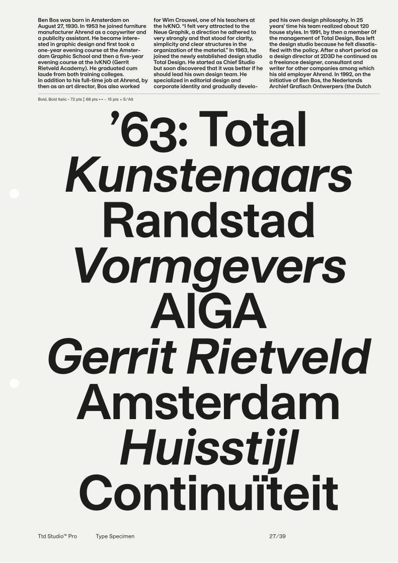
Ben Bos was born in Amsterdam on August 27, 1930. In 1953 he joined furniture manufacturer Ahrend as a copywriter and a publicity assistant. He became intere-sted in graphic design and first took a one-year evening course at the Amster-dam Graphic School and then a five-year evening course at the IvKNO (Gerrit Rietveld Academy). He graduated cum laude from both training colleges.In addition to his full-time job at Ahrend, by then as an art director, Bos also worked
for Wim Crouwel, one of his teachers at the IvKNO. “I felt very attracted to the Neue Graphik, a direction he adhered to very strongly and that stood for clarity, simplicity and clear structures in the organization of the material.” In 1963, he joined the newly established design studio Total Design. He started as Chief Studio but soon discovered that it was better if he should lead his own design team. He specialized in editorial design and corporate identity and gradually develo-
ped his own design philosophy. In 25 years’ time his team realized about 120 house styles. In 1991, by then a member 0f the management of Total Design, Bos left the design studio because he felt dissatis-fied with the policy. After a short period as a design director at 2D3D he continued as a freelance designer, consultant and writer for other companies among which his old employer Ahrend. In 1992, on the initiative of Ben Bos, the Nederlands Archief Grafisch Ontwerpers (the Dutch
Bold, Bold Italic • 72 pts ↕ 68 pts ↔ − 15 pts + S/Alt
’63: TotalKunstenaars
RandstadVormgevers
AIGAGerrit Rietveld
AmsterdamHuisstijl
ContinuïteitTtd Studio™ Pro Type Specimen 27/39
Ttd Studio™ Pro Type Specimen 28/39
Bold • 28 pts ↕ 30 pts + S/Alt + OS/Fig
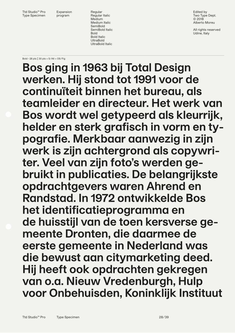
Bos ging in 1963 bij Total Design werken. Hij stond tot 1991 voor de continuïteit binnen het bureau, als teamleider en directeur. Het werk van Bos wordt wel getypeerd als kleurrijk, helder en sterk grafisch in vorm en ty-pografie. Merkbaar aanwezig in zijn werk is zijn achtergrond als copywri-ter. Veel van zijn foto’s werden ge-bruikt in publicaties. De belangrijkste opdrachtgevers waren Ahrend en Randstad. In 1972 ontwikkelde Bos het identificatieprogramma en de huisstijl van de toen kersverse ge-meente Dronten, die daarmee de eerste gemeente in Nederland was die bewust aan citymarketing deed. Hij heeft ook opdrachten gekregen van o.a. Nieuw Vredenburgh, Hulp voor Onbehuisden, Koninklijk Instituut
Ttd Studio™ ProType Specimen
Expansion program
RegularRegular ItalicMediumMedium ItalicSemiBoldSemiBold ItalicBoldBold ItalicUltraBoldUltraBold Italic
Edited by Two Type Dept.© 2018Alberto Moreu
All rights reservedUdine, Italy
Ttd Studio™ Pro Type Specimen 29/39
Ttd Studio™ ProType Specimen
OpenType features Automatic fractions, case sensitive forms, circled figures, standard ligatures, discretionary ligatures, old style figures, ordinals, tabular figures and signs, subscripts, superscripts
Contextual alternatesBallot box with check and with x, circled figures, interrobang, left/right arrows, multiply, numero sign, roman numerals
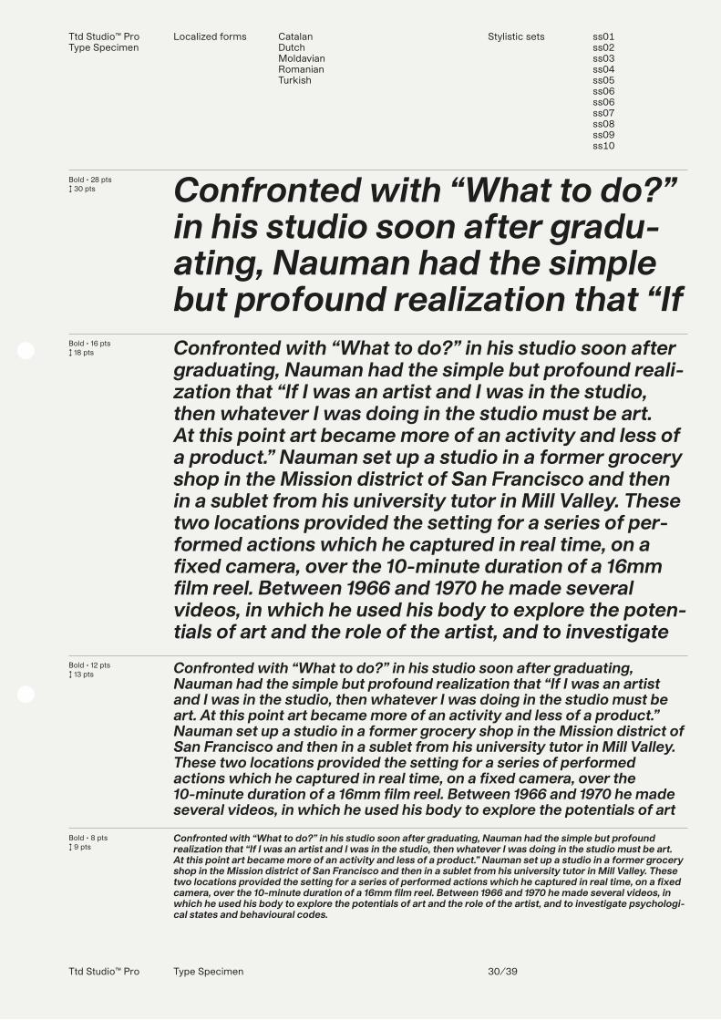
Bold • 28 pts↕ 30 pts
Bold • 16 pts↕ 18 pts
Bold • 12 pts↕ 13 pts
Bold • 8 pts↕ 9 pts
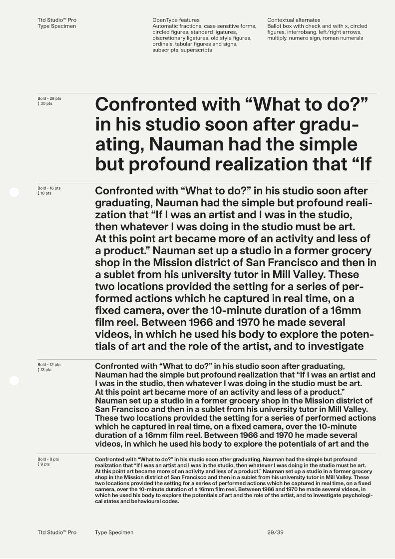
Confronted with “What to do?” in his studio soon after gradu-ating, Nauman had the simple but profound realization that “If Confronted with “What to do?” in his studio soon after graduating, Nauman had the simple but profound reali-zation that “If I was an artist and I was in the studio, then whatever I was doing in the studio must be art. At this point art became more of an activity and less of a product.” Nauman set up a studio in a former grocery shop in the Mission district of San Francisco and then in a sublet from his university tutor in Mill Valley. These two locations provided the setting for a series of per-formed actions which he captured in real time, on a fixed camera, over the 10-minute duration of a 16mm film reel. Between 1966 and 1970 he made several videos, in which he used his body to explore the poten-tials of art and the role of the artist, and to investigate
Confronted with “What to do?” in his studio soon after graduating, Nauman had the simple but profound realization that “If I was an artist and I was in the studio, then whatever I was doing in the studio must be art. At this point art became more of an activity and less of a product.” Nauman set up a studio in a former grocery shop in the Mission district of San Francisco and then in a sublet from his university tutor in Mill Valley. These two locations provided the setting for a series of performed actions which he captured in real time, on a fixed camera, over the 10-minute duration of a 16mm film reel. Between 1966 and 1970 he made several videos, in which he used his body to explore the potentials of art and the
Confronted with “What to do?” in his studio soon after graduating, Nauman had the simple but profound realization that “If I was an artist and I was in the studio, then whatever I was doing in the studio must be art. At this point art became more of an activity and less of a product.” Nauman set up a studio in a former grocery shop in the Mission district of San Francisco and then in a sublet from his university tutor in Mill Valley. These two locations provided the setting for a series of performed actions which he captured in real time, on a fixed camera, over the 10-minute duration of a 16mm film reel. Between 1966 and 1970 he made several videos, in which he used his body to explore the potentials of art and the role of the artist, and to investigate psychologi-cal states and behavioural codes.
Ttd Studio™ Pro Type Specimen 30/39
Ttd Studio™ ProType Specimen
Localized forms CatalanDutchMoldavianRomanianTurkish
Stylistic sets ss01ss02ss03ss04ss05ss06ss06ss07ss08ss09ss10
Bold • 28 pts↕ 30 pts
Bold • 16 pts↕ 18 pts
Bold • 12 pts↕ 13 pts
Bold • 8 pts↕ 9 pts
Confronted with “What to do?” in his studio soon after gradu-ating, Nauman had the simple but profound realization that “If Confronted with “What to do?” in his studio soon after graduating, Nauman had the simple but profound reali-zation that “If I was an artist and I was in the studio, then whatever I was doing in the studio must be art. At this point art became more of an activity and less of a product.” Nauman set up a studio in a former grocery shop in the Mission district of San Francisco and then in a sublet from his university tutor in Mill Valley. These two locations provided the setting for a series of per-formed actions which he captured in real time, on a fixed camera, over the 10-minute duration of a 16mm film reel. Between 1966 and 1970 he made several videos, in which he used his body to explore the poten-tials of art and the role of the artist, and to investigate
Confronted with “What to do?” in his studio soon after graduating, Nauman had the simple but profound realization that “If I was an artist and I was in the studio, then whatever I was doing in the studio must be art. At this point art became more of an activity and less of a product.” Nauman set up a studio in a former grocery shop in the Mission district of San Francisco and then in a sublet from his university tutor in Mill Valley. These two locations provided the setting for a series of performed actions which he captured in real time, on a fixed camera, over the 10-minute duration of a 16mm film reel. Between 1966 and 1970 he made several videos, in which he used his body to explore the potentials of art
Confronted with “What to do?” in his studio soon after graduating, Nauman had the simple but profound realization that “If I was an artist and I was in the studio, then whatever I was doing in the studio must be art. At this point art became more of an activity and less of a product.” Nauman set up a studio in a former grocery shop in the Mission district of San Francisco and then in a sublet from his university tutor in Mill Valley. These two locations provided the setting for a series of performed actions which he captured in real time, on a fixed camera, over the 10-minute duration of a 16mm film reel. Between 1966 and 1970 he made several videos, in which he used his body to explore the potentials of art and the role of the artist, and to investigate psychologi-cal states and behavioural codes.
Ttd Studio™ Pro Type Specimen 31/39
Two Type Dept. Studio™ ProType Specimen
UltraBoldUltraBold Italic
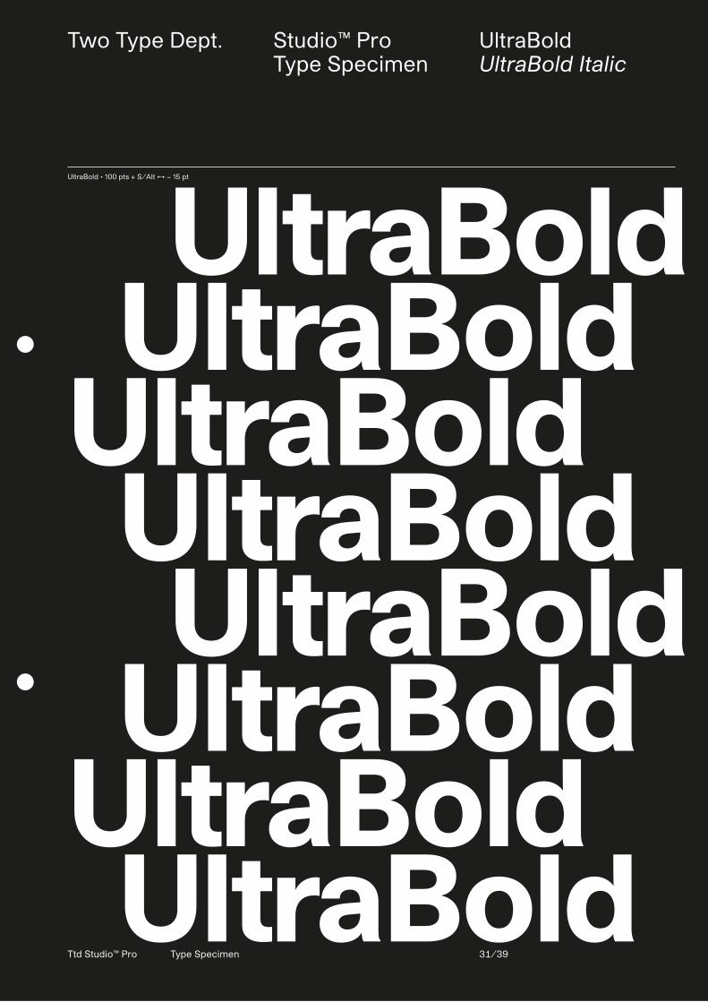
UltraBold • 100 pts + S/Alt ↔ − 15 pt
UltraBold UltraBoldUltraBold UltraBold UltraBold UltraBoldUltraBold UltraBold
Two Type Dept. Studio™ ProType Specimen
UltraBoldUltraBold Italic
Ttd Studio™ Pro Type Specimen 32/39
780 pts • Lowercase a ringUltraBold • 100 pts + S/Alt ↔ − 15 pt
UltraBold UltraBoldUltraBold UltraBold UltraBold UltraBoldUltraBold UltraBold
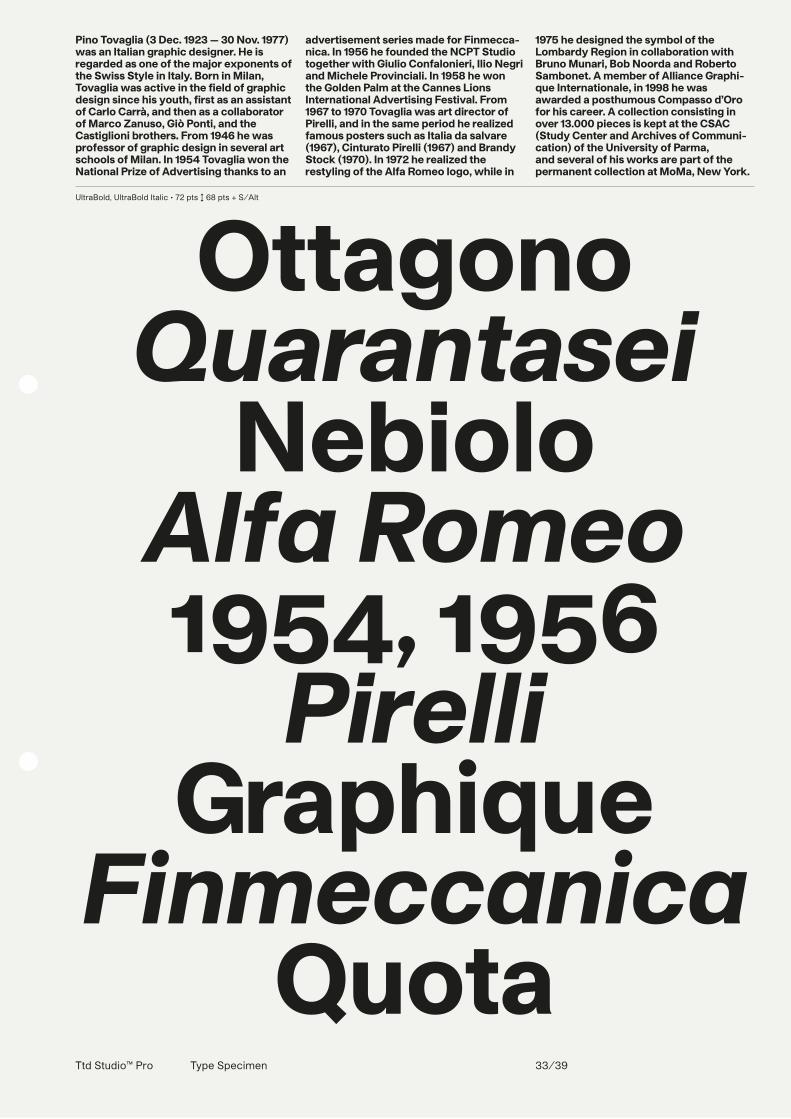
Pino Tovaglia (3 Dec. 1923 — 30 Nov. 1977) was an Italian graphic designer. He is regarded as one of the major exponents of the Swiss Style in Italy. Born in Milan, Tovaglia was active in the field of graphic design since his youth, first as an assistant of Carlo Carrà, and then as a collaborator of Marco Zanuso, Giò Ponti, and the Castiglioni brothers. From 1946 he was professor of graphic design in several art schools of Milan. In 1954 Tovaglia won the National Prize of Advertising thanks to an
advertisement series made for Finmecca-nica. In 1956 he founded the NCPT Studio together with Giulio Confalonieri, Ilio Negri and Michele Provinciali. In 1958 he won the Golden Palm at the Cannes Lions International Advertising Festival. From 1967 to 1970 Tovaglia was art director of Pirelli, and in the same period he realized famous posters such as Italia da salvare (1967), Cinturato Pirelli (1967) and Brandy Stock (1970). In 1972 he realized the restyling of the Alfa Romeo logo, while in
1975 he designed the symbol of the Lombardy Region in collaboration with Bruno Munari, Bob Noorda and Roberto Sambonet. A member of Alliance Graphi-que Internationale, in 1998 he was awarded a posthumous Compasso d’Oro for his career. A collection consisting in over 13.000 pieces is kept at the CSAC (Study Center and Archives of Communi-cation) of the University of Parma, and several of his works are part of the permanent collection at MoMa, New York.
Ttd Studio™ Pro Type Specimen 33/39
UltraBold, UltraBold Italic • 72 pts ↕ 68 pts + S/Alt
OttagonoQuarantasei
NebioloAlfa Romeo1954, 1956
PirelliGraphique
FinmeccanicaQuota
Ttd Studio™ Pro Type Specimen 34/39
UltraBold • 28 pts ↕ 30 pts
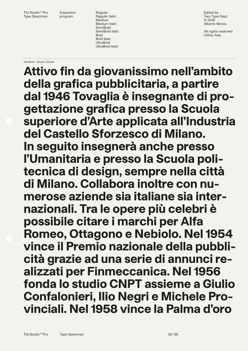
Attivo fin da giovanissimo nell’ambito della grafica pubblicitaria, a partire dal 1946 Tovaglia è insegnante di pro-gettazione grafica presso la Scuola superiore d’Arte applicata all’Industria del Castello Sforzesco di Milano. In seguito insegnerà anche presso l’Umanitaria e presso la Scuola poli-tecnica di design, sempre nella città di Milano. Collabora inoltre con nu-merose aziende sia italiane sia inter-nazionali. Tra le opere più celebri è possibile citare i marchi per Alfa Romeo, Ottagono e Nebiolo. Nel 1954 vince il Premio nazionale della pubbli-cità grazie ad una serie di annunci re-alizzati per Finmeccanica. Nel 1956 fonda lo studio CNPT assieme a Giulio Confalonieri, Ilio Negri e Michele Pro-vinciali. Nel 1958 vince la Palma d’oro
Ttd Studio™ ProType Specimen
Expansion program
RegularRegular ItalicMediumMedium ItalicSemiBoldSemiBold ItalicBoldBold ItalicUltraBoldUltraBold Italic
Edited by Two Type Dept.© 2018Alberto Moreu
All rights reservedUdine, Italy
Ttd Studio™ Pro Type Specimen 35/39
Ttd Studio™ ProType Specimen
OpenType features Automatic fractions, case sensitive forms, circled figures, standard ligatures, discretionary ligatures, old style figures, ordinals, tabular figures and signs, subscripts, superscripts
Contextual alternatesBallot box with check and with x, circled figures, interrobang, left/right arrows, multiply, numero sign, roman numerals
UltraBold • 28 pts↕ 30 pts
UltraBold • 16 pts↕ 18 pts
UltraBold • 12 pts↕ 13 pts
UltraBold • 8 pts↕ 9 pts
L’Alliance graphique internatio-nale (AGI) est née en 1950 de la rencontre amicale de trois gra-phistes français Jean Picart L’Alliance graphique internationale (AGI) est née en 1950 de la rencontre amicale de trois graphistes fran-çais Jean Picart Le Doux (qui sera le premier pré-sident), Paul Colin et Jacques Nathan-Garamond, et de deux graphistes suisses, Fritz Bühler et Donald Brun, à l’occasion d’une exposition de leurs travaux à Bâle. Les liens ont été maintenus et étendus et l’AGI est fondée o�ciellement le 22 novembre 1952. Le but de ce “club” international est : 1. De créer des liens d’amitié entre des artistes graphiques de di�érents pays que rap-prochent des a�nités esthétiques et dont la notoriété s’est a�rmée dans le domaine de la publicité, du livre ou de l’art mural. 2. De faire connaître au public par des expositions et des manifestations diverses les
L’Alliance graphique internationale (AGI) est née en 1950 de la rencontre amicale de trois graphistes français Jean Picart Le Doux (qui sera le pre-mier président), Paul Colin et Jacques Nathan-Garamond, et de deux graphistes suisses, Fritz Bühler et Donald Brun, à l’occasion d’une exposi-tion de leurs travaux à Bâle. Les liens ont été maintenus et étendus et l’AGI est fondée o�ciellement le 22 novembre 1952. Le but de ce “club” inter-national est : 1. De créer des liens d’amitié entre des artistes graphiques de di�érents pays que rapprochent des a�nités esthétiques et dont la notoriété s’est a�rmée dans le domaine de la publicité, du livre ou de l’art mural. 2. De faire connaître au public par des expositions et des
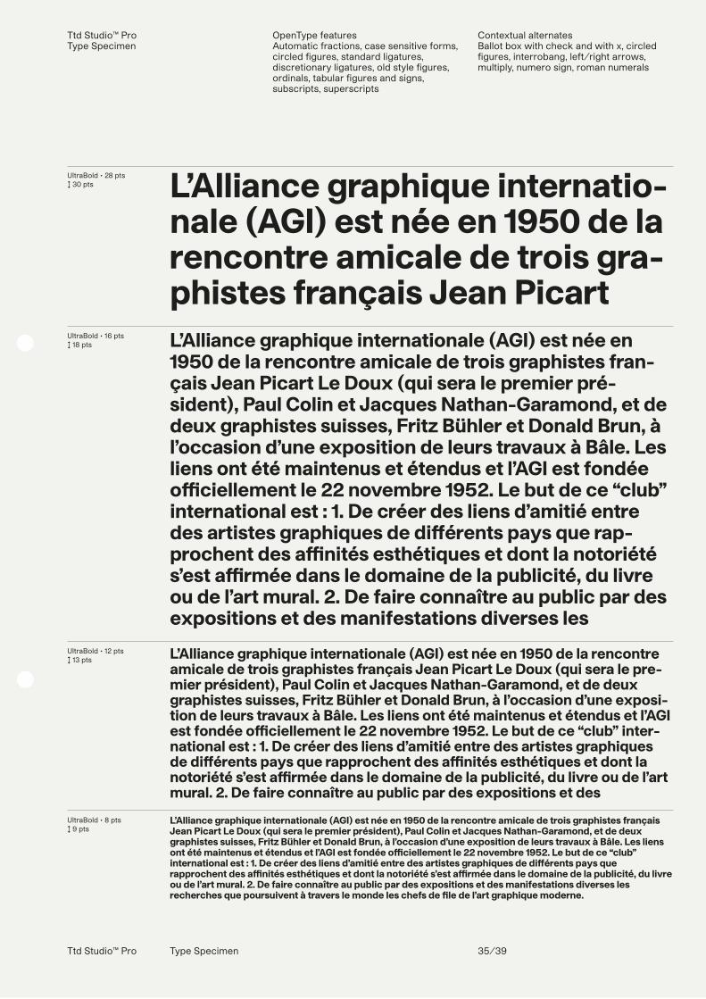
L’Alliance graphique internationale (AGI) est née en 1950 de la rencontre amicale de trois graphistes français Jean Picart Le Doux (qui sera le premier président), Paul Colin et Jacques Nathan-Garamond, et de deux graphistes suisses, Fritz Bühler et Donald Brun, à l’occasion d’une exposition de leurs travaux à Bâle. Les liens ont été maintenus et étendus et l’AGI est fondée o�ciellement le 22 novembre 1952. Le but de ce “club” international est : 1. De créer des liens d’amitié entre des artistes graphiques de di�érents pays que rapprochent des a�nités esthétiques et dont la notoriété s’est a�rmée dans le domaine de la publicité, du livre ou de l’art mural. 2. De faire connaître au public par des expositions et des manifestations diverses les recherches que poursuivent à travers le monde les chefs de �le de l’art graphique moderne.
Ttd Studio™ ProType Specimen
Localized forms CatalanDutchMoldavianRomanianTurkish
Stylistic sets ss01ss02ss03ss04ss05ss06ss06ss07ss08ss09ss10
Ttd Studio™ Pro Type Specimen 36/39
UltraBold Italic • 28 pts↕ 30 pts
UltraBold Italic • 16 pts↕ 18 pts
UltraBold Italic • 12 pts↕ 13 pts
UltraBold Italic • 8 pts↕ 9 pts
L’Alliance graphique internatio-nale (AGI) est née en 1950 de la rencontre amicale de trois gra-phistes français Jean Picart L’Alliance graphique internationale (AGI) est née en 1950 de la rencontre amicale de trois graphistes fran-çais Jean Picart Le Doux (qui sera le premier pré-sident), Paul Colin et Jacques Nathan-Garamond, et de deux graphistes suisses, Fritz Bühler et Donald Brun, à l’occasion d’une exposition de leurs travaux à Bâle. Les liens ont été maintenus et étendus et l’AGI est fondée o�ciellement le 22 novembre 1952. Le but de ce “club” international est : 1. De créer des liens d’amitié entre des artistes graphiques de di�érents pays que rap-prochent des a�nités esthétiques et dont la notoriété s’est a�rmée dans le domaine de la publicité, du livre ou de l’art mural. 2. De faire connaître au public par des expositions et des manifestations diverses les
L’Alliance graphique internationale (AGI) est née en 1950 de la rencontre amicale de trois graphistes français Jean Picart Le Doux (qui sera le premier président), Paul Colin et Jacques Nathan-Garamond, et de deux graphistes suisses, Fritz Bühler et Donald Brun, à l’occasion d’une exposi-tion de leurs travaux à Bâle. Les liens ont été maintenus et étendus et l’AGI est fondée o�ciellement le 22 novembre 1952. Le but de ce “club” international est : 1. De créer des liens d’amitié entre des artistes gra-phiques de di�érents pays que rapprochent des a�nités esthétiques et dont la notoriété s’est a�rmée dans le domaine de la publicité, du livre ou de l’art mural. 2. De faire connaître au public par des expositions et des
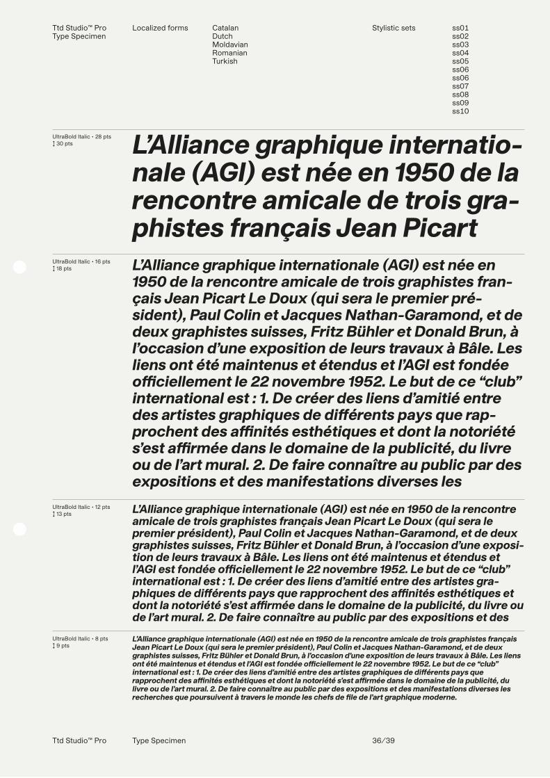
L’Alliance graphique internationale (AGI) est née en 1950 de la rencontre amicale de trois graphistes français Jean Picart Le Doux (qui sera le premier président), Paul Colin et Jacques Nathan-Garamond, et de deux graphistes suisses, Fritz Bühler et Donald Brun, à l’occasion d’une exposition de leurs travaux à Bâle. Les liens ont été maintenus et étendus et l’AGI est fondée o�ciellement le 22 novembre 1952. Le but de ce “club” international est : 1. De créer des liens d’amitié entre des artistes graphiques de di�érents pays que rapprochent des a�nités esthétiques et dont la notoriété s’est a�rmée dans le domaine de la publicité, du livre ou de l’art mural. 2. De faire connaître au public par des expositions et des manifestations diverses les recherches que poursuivent à travers le monde les chefs de �le de l’art graphique moderne.
120 pts ↕ 120 pts ↔ − 30 pts + ss10
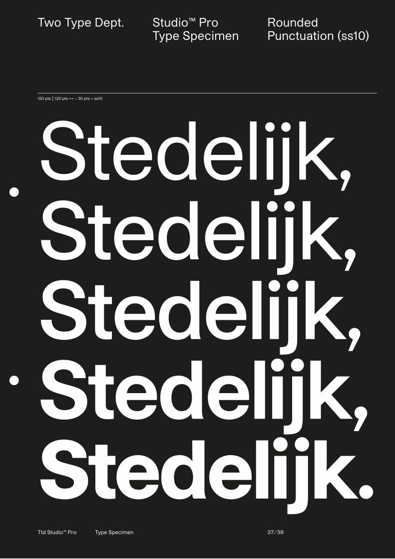
Stedelijk,Stedelijk,Stedelijk,Stedelijk,Stedelijk.Ttd Studio™ Pro Type Specimen 37/39
Two Type Dept. Studio™ ProType Specimen
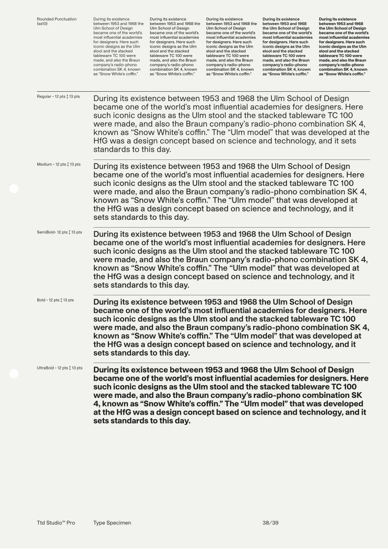
Rounded Punctuation (ss10)
Rounded Punctuation(ss10)
During its existence between 1953 and 1968 the Ulm School of Design became one of the world’s most in�uential academies for designers. Here such iconic designs as the Ulm stool and the stacked tableware TC 100 were made, and also the Braun company’s radio-phono combination SK 4, known as “Snow White’s coEn.”
During its existence between 1953 and 1968 the Ulm School of Design became one of the world’s most in�uential academies for designers. Here such iconic designs as the Ulm stool and the stacked tableware TC 100 were made, and also the Braun company’s radio-phono combination SK 4, known as “Snow White’s co�n.”
During its existence between 1953 and 1968 the Ulm School of Design became one of the world’s most in�uential academies for designers. Here such iconic designs as the Ulm stool and the stacked tableware TC 100 were made, and also the Braun company’s radio-phono combination SK 4, known as “Snow White’s con.”
During its existence between 1953 and 1968 the Ulm School of Design became one of the world’s most in�uential academies for designers. Here such iconic designs as the Ulm stool and the stacked tableware TC 100 were made, and also the Braun company’s radio-phono combination SK 4, known as “Snow White’s co n.”
During its existence between 1953 and 1968 the Ulm School of Design became one of the world’s most in�uential academies for designers. Here such iconic designs as the Ulm stool and the stacked tableware TC 100 were made, and also the Braun company’s radio-phono combination SK 4, known as “Snow White’s co�n.”
Ttd Studio™ Pro Type Specimen 38/39
120 pts ↕ 120 pts ↔ − 30 pts + ss10
Stedelijk,Stedelijk,Stedelijk,Stedelijk,Stedelijk.
Regular • 12 pts ↕ 13 pts
Medium • 12 pts ↕ 13 pts
SemiBold• 12 pts ↕ 13 pts
Bold • 12 pts ↕ 13 pts
UltraBold • 12 pts ↕ 13 pts
During its existence between 1953 and 1968 the Ulm School of Design became one of the world’s most in�uential academies for designers. Here such iconic designs as the Ulm stool and the stacked tableware TC 100 were made, and also the Braun company’s radio-phono combination SK 4, known as “Snow White’s coEn.” The “Ulm model” that was developed at the HfG was a design concept based on science and technology, and it sets standards to this day.
During its existence between 1953 and 1968 the Ulm School of Design became one of the world’s most in�uential academies for designers. Here such iconic designs as the Ulm stool and the stacked tableware TC 100 were made, and also the Braun company’s radio-phono combination SK 4, known as “Snow White’s co�n.” The “Ulm model” that was developed at the HfG was a design concept based on science and technology, and it sets standards to this day.
During its existence between 1953 and 1968 the Ulm School of Design became one of the world’s most in�uential academies for designers. Here such iconic designs as the Ulm stool and the stacked tableware TC 100 were made, and also the Braun company’s radio-phono combination SK 4, known as “Snow White’s con.” The “Ulm model” that was developed at the HfG was a design concept based on science and technology, and it sets standards to this day.
During its existence between 1953 and 1968 the Ulm School of Design became one of the world’s most in�uential academies for designers. Here such iconic designs as the Ulm stool and the stacked tableware TC 100 were made, and also the Braun company’s radio-phono combination SK 4, known as “Snow White’s co n.” The “Ulm model” that was developed at the HfG was a design concept based on science and technology, and it sets standards to this day.
During its existence between 1953 and 1968 the Ulm School of Design became one of the world’s most in�uential academies for designers. Here such iconic designs as the Ulm stool and the stacked tableware TC 100 were made, and also the Braun company’s radio-phono combination SK 4, known as “Snow White’s co�n.” The “Ulm model” that was developed at the HfG was a design concept based on science and technology, and it sets standards to this day.
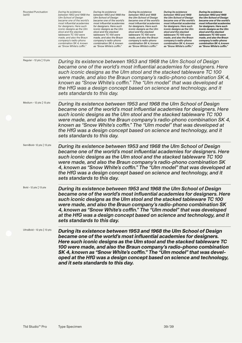
Rounded Punctuation(ss10)
During its existence between 1953 and 1968 the Ulm School of Design became one of the world’s most in�uential academies for designers. Here such iconic designs as the Ulm stool and the stacked tableware TC 100 were made, and also the Braun company’s radio-phono combination SK 4, known as “Snow White’s co�n.”
During its existence between 1953 and 1968 the Ulm School of Design became one of the world’s most in�uential academies for designers. Here such iconic designs as the Ulm stool and the stacked tableware TC 100 were made, and also the Braun company’s radio-phono combination SK 4, known as “Snow White’s co�n.”
During its existence between 1953 and 1968 the Ulm School of Design became one of the world’s most in�uential academies for designers. Here such iconic designs as the Ulm stool and the stacked tableware TC 100 were made, and also the Braun company’s radio-phono combination SK 4, known as “Snow White’s co�n.”
During its existence between 1953 and 1968 the Ulm School of Design became one of the world’s most in�uential academies for designers. Here such iconic designs as the Ulm stool and the stacked tableware TC 100 were made, and also the Braun company’s radio-phono combination SK 4, known as “Snow White’s co�n.”
During its existence between 1953 and 1968 the Ulm School of Design became one of the world’s most in�uential academies for designers. Here such iconic designs as the Ulm stool and the stacked tableware TC 100 were made, and also the Braun company’s radio-phono combination SK 4, known as “Snow White’s co�n.”
Ttd Studio™ Pro Type Specimen 39/39
Regular • 12 pts ↕ 13 pts
Medium • 12 pts ↕ 13 pts
SemiBold• 12 pts ↕ 13 pts
Bold • 12 pts ↕ 13 pts
UltraBold • 12 pts ↕ 13 pts
During its existence between 1953 and 1968 the Ulm School of Design became one of the world’s most in�uential academies for designers. Here such iconic designs as the Ulm stool and the stacked tableware TC 100 were made, and also the Braun company’s radio-phono combination SK 4, known as “Snow White’s co�n.” The “Ulm model” that was developed at the HfG was a design concept based on science and technology, and it sets standards to this day.
During its existence between 1953 and 1968 the Ulm School of Design became one of the world’s most in�uential academies for designers. Here such iconic designs as the Ulm stool and the stacked tableware TC 100 were made, and also the Braun company’s radio-phono combination SK 4, known as “Snow White’s co�n.” The “Ulm model” that was developed at the HfG was a design concept based on science and technology, and it sets standards to this day.
During its existence between 1953 and 1968 the Ulm School of Design became one of the world’s most in�uential academies for designers. Here such iconic designs as the Ulm stool and the stacked tableware TC 100 were made, and also the Braun company’s radio-phono combination SK 4, known as “Snow White’s co�n.” The “Ulm model” that was developed at the HfG was a design concept based on science and technology, and it sets standards to this day.
During its existence between 1953 and 1968 the Ulm School of Design became one of the world’s most in�uential academies for designers. Here such iconic designs as the Ulm stool and the stacked tableware TC 100 were made, and also the Braun company’s radio-phono combination SK 4, known as “Snow White’s co�n.” The “Ulm model” that was developed at the HfG was a design concept based on science and technology, and it sets standards to this day.
During its existence between 1953 and 1968 the Ulm School of Design became one of the world’s most in�uential academies for designers. Here such iconic designs as the Ulm stool and the stacked tableware TC 100 were made, and also the Braun company’s radio-phono combination SK 4, known as “Snow White’s co�n.” The “Ulm model” that was devel-oped at the HfG was a design concept based on science and technology, and it sets standards to this day.