international specification for orienteering maps
TRANSCRIPT
International Specificationfor Orienteering Maps
INTERNATIONAL ORIENTEERING FEDERATION 2000
Radiokatu 20, FI-00093 SLU, Finland – http://www.orienteering.org
MAP COMMITTEE
MAP COMMITTEE:Björn Persson (chairman), Andreas Dresen, Søren Nielsen, Christopher Shaw, László Zentai
ISOM2000 Project Team and Reference Group:Jorma Ake, Pat Dunlavey, Lennart Karlsson, Flemming Nørgaard, Hans Steinegger,Knut-Olav Sunde, Alex Tarr, Håvard Tveite.
Editor:László Zentai
Colour copiers, printers and other digital printing equipment are not yet suitable for printing orienteering maps forhigh level competitions. It is very difficult to achieve the line quality, legibility and colour appearance of traditionalspot colour printed maps using this kind of equipment.
It is expected that the continuing development of computer technology will lead to the possibility of usingalternative printing methods with quality suitable for large competitions.
Most printing devices use a 4-color technique (CMYK). For such devices the same colour settings as recom-mended for 4-color offset printing may be suitable, but the colour appearance will vary slightly from one device toanother and from one paper quality to another.
Extensive experimentation with different colour and halftone settings, different paper qualities and othervariables will be necessary to achieve a quality as close to offset printing as possible. Such experimentation hasto be done for a whole range of devices. This specification can therefore not give any general recommendationsfor the use of such alternative printing methods.
3.5.3 Alternative printing methods
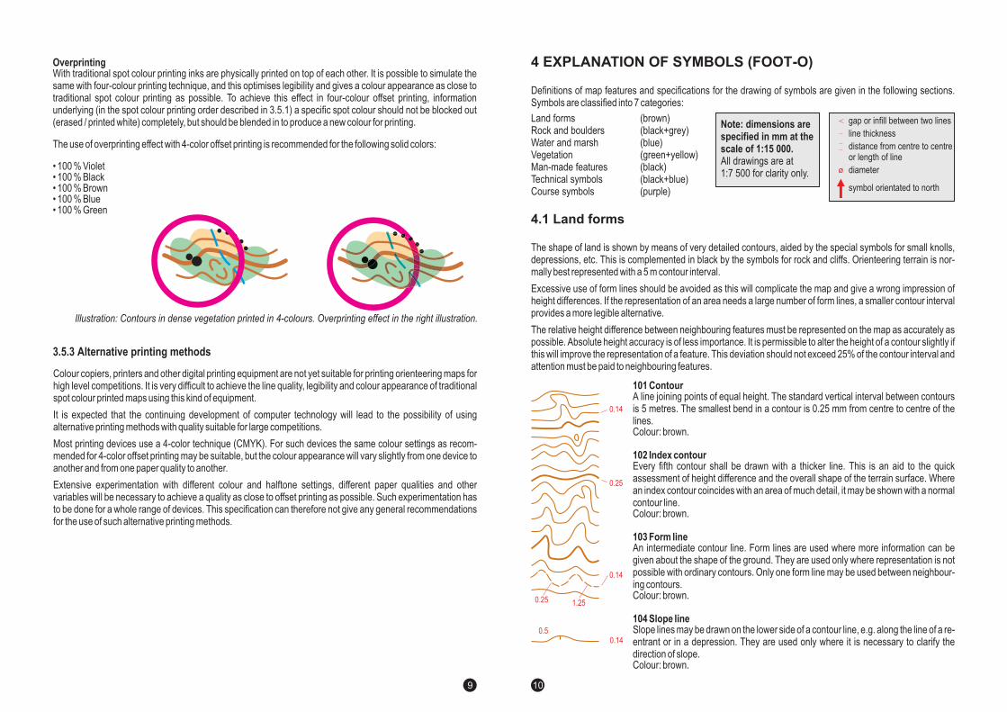
OverprintingWith traditional spot colour printing inks are physically printed on top of each other. It is possible to simulate thesame with four-colour printing technique, and this optimises legibility and gives a colour appearance as close totraditional spot colour printing as possible. To achieve this effect in four-colour offset printing, informationunderlying (in the spot colour printing order described in 3.5.1) a specific spot colour should not be blocked out(erased / printed white) completely, but should be blended in to produce a new colour for printing.
The use of overprinting effect with 4-color offset printing is recommended for the following solid colors:
• 100 % Violet• 100 % Black• 100 % Brown• 100 % Blue• 100 % Green
Illustration: Contours in dense vegetation printed in 4-colours. Overprinting effect in the right illustration.
7
Definitions of map features and specifications for the drawing of symbols are given in the following sections.Symbols are classified into 7 categories:
(brown)(black+grey)(blue)(green+yellow)(black)(black+blue)(purple)
Land formsRock and bouldersWater and marshVegetationMan-made featuresTechnical symbolsCourse symbols
The shape of land is shown by means of very detailed contours, aided by the special symbols for small knolls,depressions, etc. This is complemented in black by the symbols for rock and cliffs. Orienteering terrain is nor-mally best represented with a 5 m contour interval.
Excessive use of form lines should be avoided as this will complicate the map and give a wrong impression ofheight differences. If the representation of an area needs a large number of form lines, a smaller contour intervalprovides a more legible alternative.
The relative height difference between neighbouring features must be represented on the map as accurately aspossible. Absolute height accuracy is of less importance. It is permissible to alter the height of a contour slightly ifthis will improve the representation of a feature. This deviation should not exceed 25% of the contour interval andattention must be paid to neighbouring features.
101 Contour
102 Index contour
103 Form line
104 Slope line
A line joining points of equal height. The standard vertical interval between contoursis 5 metres. The smallest bend in a contour is 0.25 mm from centre to centre of thelines.Colour: brown.
Every fifth contour shall be drawn with a thicker line. This is an aid to the quickassessment of height difference and the overall shape of the terrain surface. Wherean index contour coincides with an area of much detail, it may be shown with a normalcontour line.Colour: brown.
An intermediate contour line. Form lines are used where more information can begiven about the shape of the ground. They are used only where representation is notpossible with ordinary contours. Only one form line may be used between neighbour-ing contours.Colour: brown.
Slope lines may be drawn on the lower side of a contour line, e.g. along the line of a re-entrant or in a depression. They are used only where it is necessary to clarify thedirection of slope.Colour: brown.
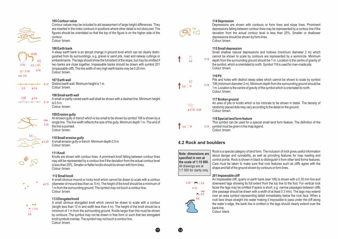
Note: dimensions arespecified in mm at thescale of 1:15 000.All drawings are at1:7 500 for clarity only.
gap or infill between two lines
line thickness
distance from centre to centreor length of line
diameter
symbol orientated to north
4 EXPLANATION OF SYMBOLS (FOOT-O)
4.1 Land forms
0.14
0.14
1.250.25
0.25
0.140.5
8
105 Contour value
106 Earth bank
107 Earth wall
108 Small earth wall
109 Erosion gully
Contour values may be included to aid assessment of large height differences. Theyare inserted in the index contours in positions where other detail is not obscured. Thefigures should be orientated so that the top of the figure is on the higher side of thecontour.Colour: brown.
A steep earth bank is an abrupt change in ground level which can be clearly distin-guished from its surroundings, e.g. gravel or sand pits, road and railway cuttings orembankments. The tags should show the full extent of the slope, but may be omitted iftwo banks are close together. Impassable banks should be drawn with symbol 201(impassable cliff). The line width of 0.25 mm.Colour: brown.
Distinct earth wall. Minimum height is 1 m.Colour: brown.
Colour: brown.
An erosion gully or trench which is too small to be shown by symbol 106 is shown by asingle line. The line width reflects the size of the gully. Minimum depth 1 m. The end ofthe line is pointed.
very high earth banks may be
A small or partly ruined earth wall shall be shown with a dashed line. Minimum heightis 0.5 m.
Colour: brown.
A small erosion gully or trench. Minimum depth 0.5 m.Colour: brown.
Knolls are shown with contour lines. A prominent knoll falling between contour linesmay still be represented by a contour line if the deviation from the actual contour levelis less than 25%. Smaller or flatter knolls should be shown with form lines.Colour: brown.
A small obvious mound or rocky knoll which cannot be drawn to scale with a contour(diameter of mound less than ca. 5 m). The height of the knoll should be a minimum of1 m from the surrounding ground. The symbol may not touch a contour line.Colour: brown.
A small obvious elongated knoll which cannot be drawn to scale with a contour(length less than 12 m and width less than 4 m). The height of the knoll should be aminimum of 1 m from the surrounding ground. Knolls larger than this must be shownby contours. The symbol may not be drawn in free form or such that two elongatedknoll symbols overlap. The symbol may not touch a contour line.Colour: brown.
110 Small erosion gully
111 Knoll
112 Small knoll
113 Elongated knoll
ø 0.25
ø 0.5
0.5
0.14
0.14
0.14
max.
0.25
0.5
0.5
2.5
0.25
ø 0.4
ø 0.4
0.8
0.4
0.18
(0.25)
225
0.18
min. 0.6
1.5
9
114 Depression
115 Small depression
116 Pit
117 Broken ground
118 Special land form feature
Depressions are shown with contours or form lines and slope lines. Prominentdepressions falling between contour lines may be represented by a contour line if thedeviation from the actual contour level is less than 25%. Smaller or shallowerdepressions should be shown by form lines.Colour: brown.
Small shallow natural depressions and hollows (minimum diameter 2 m) whichcannot be shown to scale by contours are represented by a semicircle. Minimumdepth from the surrounding ground should be 1 m. Location is the centre of gravity ofthe symbol, which is orientated to north. Symbol 116 is used for man-made pits.Colour: brown.
Pits and holes with distinct steep sides which cannot be shown to scale by symbol106 (minimum diameter 2 m). Minimum depth from the surrounding ground should be1 m. Location is the centre of gravity of the symbol which is orientated to north.Colour: brown.
An area of pits or knolls which is too intricate to be shown in detail. The density ofdots may vary according to the detail on the ground.
Colour: brown.
This symbol can be used for a special small land form feature. The definition of thesymbol must be given in the map legend.Colour: brown.
randomly placed
Rock is a special category of land form. The inclusion of rock gives useful informationabout danger and runnability, as well as providing features for map reading andcontrol points. Rock is shown in black to distinguish it from other land forms features.Care must be taken to make sure that rock features such as cliffs agree with theshape and fall of the ground shown by contours or form lines.
An impassable cliff, quarry or earth bank (see 106) is shown with a 0.35 mm line anddownward tags showing its full extent from the top line to the foot. For vertical rockfaces the tags may be omitted if space is short, e.g. narrow passages between cliffs(the passage should be drawn with a width of at least 0.3 mm). The tags may extendover an area symbol representing detail immediately below the rock face. When arock face drops straight into water making it impossible to pass under the cliff alongthe water’s edge, the bank line is omitted or the tags should clearly extend over thebank line.Colour: black.
201 Impassable cliff
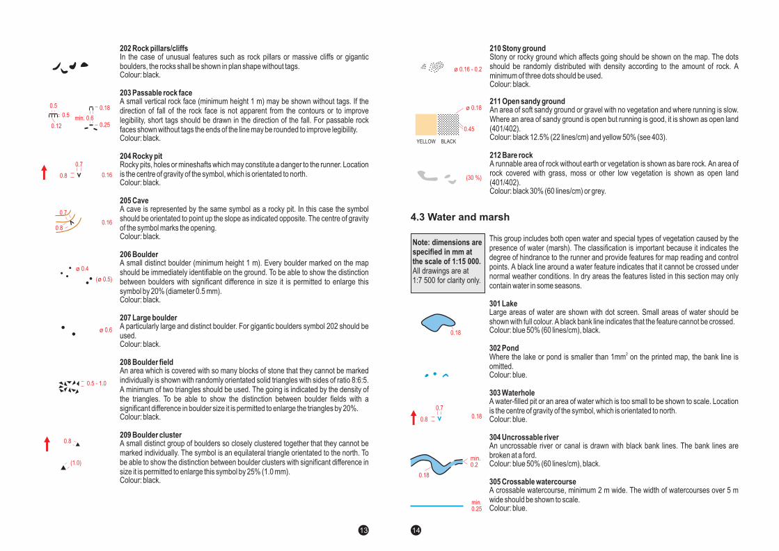
Note: dimensions arespecified in mm atthe scale of 1:15 000.All drawings are at1:7 500 for clarity only.
4.2 Rock and boulders
ø 0.18 - 0.25
0.18
0.18
0.8
0.7
0.8
0.8
0.18
min.0.5
0.50.35
0.6
0.12
10
202 Rock pillars/cliffs
203 Passable rock face
204 Rocky pit
205 Cave
206 Boulder
207 Large boulder
208 Boulder field
209 Boulder cluster
In the case of unusual features such as rock pillars or massive cliffs or giganticboulders, the rocks shall be shown in plan shape without tags.Colour: black.
A small vertical rock face (minimum height 1 m) may be shown without tags. If thedirection of fall of the rock face is not apparent from the contours or to improvelegibility, short tags should be drawn in the direction of the fall. For passable rockfaces shown without tags the ends of the line may be rounded to improve legibility.Colour: black.
Rocky pits, holes or mineshafts which may constitute a danger to the runner. Locationis the centre of gravity of the symbol, which is orientated to north.Colour: black.
A cave is represented by the same symbol as a rocky pit. In this case the symbolshould be orientated to point up the slope as indicated opposite. The centre of gravityof the symbol marks the opening.Colour: black.
A small distinct boulder (minimum height 1 m). Every boulder marked on the mapshould be immediately identifiable on the ground. To be able to show the distinctionbetween boulders with significant difference in size it is permitted to enlarge thissymbol by 20% (diameter 0.5 mm).Colour: black.
A particularly large and distinct boulder. For gigantic boulders symbol 202 should beused.Colour: black.
An area which is covered with so many blocks of stone that they cannot be markedindividually is shown with randomly orientated solid triangles with sides of ratio 8:6:5.A minimum of two triangles should be used. The going is indicated by the density ofthe triangles. To be able to show the distinction between boulder fields with asignificant difference in boulder size it is permitted to enlarge the triangles by 20%.Colour: black.
A small distinct group of boulders so closely clustered together that they cannot bemarked individually. The symbol is an equilateral triangle orientated to the north. Tobe able to show the distinction between boulder clusters with significant difference insize it is permitted to enlarge this symbol by 25% (1.0 mm).Colour: black.
ø 0.6
ø 0.4
( 0.5)ø
0.25
0.18
0.16
0.16
min. 0.60.5
0.5
0.12
0.7
0.7
0.8
0.8
0.5 - 1.0
0.8
(1.0)
11
210 Stony ground
211 Open sandy ground
212 Bare rock
Stony or rocky ground which affects going should be shown on the map. The dotsshould be randomly distributed with density according to the amount of rock. Aminimum of three dots should be used.Colour: black.
An area of soft sandy ground or gravel with no vegetation and where running is slow.Where an area of sandy ground is open but running is good, it is shown as open land(401/402).Colour: black 12.5% (22 lines/cm) and yellow 50% (see 403).
A runnable area of rock without earth or vegetation is shown as bare rock. An area ofrock covered with grass, moss or other low vegetation is shown as open land(401/402).Colour: black 30% (60 lines/cm) or grey.
This group includes both open water and special types of vegetation caused by thepresence of water (marsh). The classification is important because it indicates thedegree of hindrance to the runner and provide features for map reading and controlpoints. A black line around a water feature indicates that it cannot be crossed undernormal weather conditions. In dry areas the features listed in this section may onlycontain water in some seasons.
Large areas of water are shown with dot screen. Small areas of water should beshown with full colour. A black bank line indicates that the feature cannot be crossed.Colour: blue 50% (60 lines/cm), black.
Where the lake or pond is smaller than 1mm on the printed map, the bank line isomitted.Colour: blue.
A water-filled pit or an area of water which is too small to be shown to scale. Locationis the centre of gravity of the symbol, which is orientated to north.Colour: blue.
An uncrossable river or canal is drawn with black bank lines. The bank lines arebroken at a ford.Colour: blue 50% (60 lines/cm), black.
A crossable watercourse, minimum 2 m wide. The width of watercourses over 5 mwide should be shown to scale.Colour: blue.
301 Lake
302 Pond
303 Waterhole
304 Uncrossable river
305 Crossable watercourse
2
Note: dimensions arespecified in mm atthe scale of 1:15 000.All drawings are at1:7 500 for clarity only.
4.3 Water and marsh
0.45
YELLOW BLACK
ø 0.18
(30 %)
ø 0.16 - 0.2
0.18
0.18
0.7
0.8
0.18
min.0.2
min.0.25
12
306 Crossable small watercourse
307 Minor water channel
308 Narrow marsh
309 Uncrossable marsh
310 Marsh
311 Indistinct marsh
312 Well
313 Spring
314 Special water feature
A crossable watercourse (including a major drainage ditch) less than 2 m wide. Forbetter legibility a ditch in a marsh should be drawn as a crossable watercourse (305).Colour: blue.
A natural or man-made minor water channel which may contain water only intermit-tently.Colour: blue.
A marsh or trickle of water which is too narrow to be shown with symbol 310 (less thanca. 5 m wide).Colour: blue.
A marsh which is uncrossable or dangerous for the runner. A black line surrounds thesymbol.Colour: blue, black.
A crossable marsh, usually with a distinct edge.Where a small marsh area
should be combined with either 403/404 it is permitted to use 401/402 to improvelegibility.Colour: blue.
Colour: blue.
Wells and captive springs, which are clearly visible on the ground.Colour: blue.
The source of a stream with a distinct outflow. The symbol is orientated to opendownstream.Colour: blue.
A special small water feature. The definition of the symbol must always be given in themap legend.Colour: blue.
The symbol should be combined withvegetation symbols to show runnability and openness.
An indistinct or seasonal marsh or area of gradual transition from marsh to firmground, which is crossable. The edge is generally indistinct and the vegetation similarto that of the surrounding ground. The symbol should be combined with vegetationsymbols to show runnability and openness.
ø 0.25
0.18
0.1
0.3
0.1
0.9
0.25
0.5
0.3
0.25
0.2
0.25
0.14
1.25
0.5
0.25
0.18
0.18
0.8
0.8
0.180.8
min. 0.5
min.
0.14
13
The representation of vegetation is important to the orienteer because it affects runnability and visibility and italso provides features for map reading.
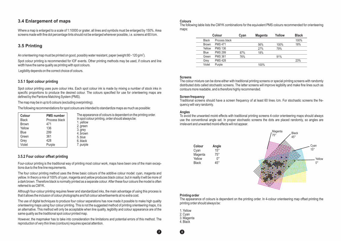
COLOURThe basic principle is as follows:- represents runnable forest,- represents open areas divided into several categories,-
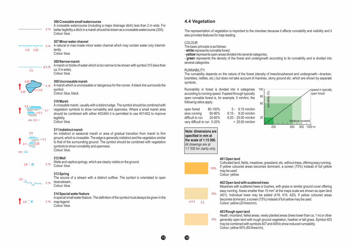
RUNNABILITY.The runnability depends on the nature of the forest (density of trees/brushwood and undergrowth—bracken,brambles, nettles, etc.) but does not take account of marshes, stony ground etc. which are shown by separatesymbols.
whiteyellowgreen represents the density of the forest and undergrowth according to its runnability and is divided into
several categories.
Runnability in forest is divided into 4 categoriesaccording to running speed. If speed through typicallyopen runnable forest is, for example, 5 min/km, thefollowing ratios apply:
open forestslow runningdifficult to runvery difficult to run
80-100%60-80%20-60%0-20%
6:15 min/km8:20 min/km
25:00 min/km25:00 min/km
5 -6:15 -8:20 -
>
401 Open land
402 Open land with scattered trees
403 Rough open land
Cultivated land, fields, meadows, grassland, etc. without trees, offering easy running.If yellow coloured areas becomes dominant, a screen (75%) instead of full yellowmay be used.Colour: yellow.
Colour: yellow (20 lines/cm).
Heath, moorland, felled areas, newly planted areas (trees lower than ca. 1 m) or othergenerally open land with rough ground vegetation, heather or tall grass. Symbol 403may be combined with symbols 407 and 409 to show reduced runnability.Colour: yellow 50% (60 lines/cm).
Meadows with scattered trees or bushes, with grass or similar ground cover offeringeasy running. Areas smaller than 10 mm at the maps scale are shown as open land(401). Individual trees may be added (418, 419, 420). If yellow coloured areasbecomes dominant, a screen (75%) instead of full yellow may be used.
2
4.4 Vegetation
Note: dimensions arespecified in mm atthe scale of 1:15 000.All drawings are at1:7 500 for clarity only.
speed in typicallyopen forest
20
200 600 800 1000 m
60
80
100
100%
50%
0.5ø 0.4
50%
runn
abilt
y(%
)
distance covered
14
5.6.2 Discipline-specific symbols
The following symbols are introduced for ski orienteering maps.
The track network is indicated by green symbols for track width. When a track follows a path, the green issuperimposed on the path. The symbols are drawn with a compact and clearly visible shade of green (PMS 354is recommended). Opened skiable dirt roads are shown only with black. (Roads that are cleared from snow butstill skiable are only shown with black.)
Track overprint
If a road printed in black is not open, but has tracks on it, a track must be printed ingreen beside the road.A route or road which is out-of-bounds is shown by the general symbol 711 Forbiddenroute, printed in purple.All junctions and crossings must be drawn solid in order to clarify the exact position ofthe junction or crossing. This is valid also for dotted tracks.
Note: dimensions arespecified in mm atthe scale of 1:15 000.All drawings are at1:7 500 for clarity only.
801 Track >2 m
802 Track 1-2 m
803 Track 0.8-1 m
804 Road covered with snow
805 Sanded or snowless road
806 Prepared areas
Track wider than 2.0 m.Colour: green.The thinner line can be used in areas with very dense track network.
Track 1-2 m wide.Colour: green.
Narrow, soft, winding track with 0.8-1 m width. The symbols is also used for difficultslopes.Colour: green.The smaller dots can be used in areas with very dense track network.
A road on the map covered with snow during the competition. The symbol is a crossline across the road. The symbol can also be used on green track symbols to showthat the track is not opened.Colour: green.
A road on the map which is sanded or snowless during the competition is shown by achain of V-symbols across the road.Colour: green.
Prepared slalom slopes and similar areas.Colour: green.
The thinner line can be used in areas with very dense track network.
ø 0.5
0.5
4.0
0.5
0.9
0.5(0.35)
0.5
3.0
0.5
0.5
0.5(0.35)
0.5(0.35)
5.060°
0.18
2.0
25
Maps for mountain bike orienteering are based on the specifications for foot-orienteering maps. However inorder to meet the specific requirements put on the map by the nature of mountain bike orienteering, certaindeviations and additions to the foot-orienteering map specification are needed. These special rules and symbolsare described in this chapter.
Mountain bike orienteering is a sport in which the bike-orienteer uses the map to navigate a track and pathnetwork in order to visit a number of control points. The competitor must always stay on the track and paths andis not allowed to cycle freely in the terrain. This rule is important for the requirements of the map.
Mountain bike orienteering takes place on the track and path network and involves as a basic element complexroute choice problems, including the estimating of height differences. It is obvious that the map must concentrateon clearly depicting these features. The map must also be legible when cycling at high speed. This means thatthe map should omit a large number of details in "free" terrain in order to exaggerate the track and path networkand to simplify the presentation of the shape of the ground. Only details that impact a) route choice and b)navigation and positioning, need be shown on the map.
In order to accomplish fairness in route choice, additional symbols need to be introduced. These symbolsdescribe the quality and width of the tracks and paths.
The scale for mountain bike orienteering maps range from 1:10 000 to 1:30 000. Maps at 1:10 000 may beproduced for the shorter distances while 1:30 000 is suitable for the long distances. The size of the map sheetmust not exceed 300 mm by 300 mm.
Independent of scale, maps should be drawn with lines, line screens and symbol sizes as specified for the 1:15000 maps. This is especially important since the line widths for tracks and paths present information about theclassification.
The contour interval for mountain bike orienteering maps is 5 m. In very hilly terrain an interval of 10 m may beused. Note: The same interval must be used all over the map!
Even though new printing methods, like digital offset, colour copying etc. is developing rapidly, traditional offsetis still superior in quality when printing detailed maps. For IOF events such as World Championships and WorldCup this is the recommended method. However, if alternative methods produces maps with the same quality astraditional spot colour offset printing, they will be accepted.
6 MAP SPECIFICATION FOR MOUNTAIN BIKE ORIENTEERING
6.1 General
6.2 Content
6.3 Scale and map size
6.4 Contour interval
6.5 Printing and reproduction
26
For smaller competitions, maps are likely to be reproduced in relatively small quantities and for this the new andcheaper printing methods are well suited.
Please refer also to section 3.4 Printing, in this publication.
The following symbols from the foot-orienteering map specification are recommended for the mountain bikeorienteering map.
The shape of land is shown by means of contours. In order to maintain legibility of the map with scales down to1:30 000, when cycling at high speed the contour lines may be more generalised in comparison to foot-o maps.Form lines shall be omitted.101 Contour, 102 Index contour, 104 Slope line, 105 Contour value, 106 Earth bank, 109 Erosion gully, 111 Knoll,114 Depression.
Rocks and boulders are not likely to affect route choice, but where prominent they can serve as valuable featuresfor navigation and positioning. The map may show these features when they are visible to the competitor.201 Impassable cliff, 202 Rock pillars/cliffs, 207 Large boulder, 208 Boulder field, 209 Boulder cluster, 211 Opensandy ground, 212 Bare rock.
Besides navigation and positioning, this group is important to the competitor as it facilitates the interpretation ofheight (what is "up" and what is "down") in maps with complex contouring.301 Lake, 304 Uncrossable river, 305 Crossable watercourse, 306 Crossable small watercourse, 307 Minorwater channel, 309 Uncrossable marsh, 310 Marsh, 314 Special water feature.
The representation of vegetation is of importance to the competitor only for navigational purposes, not for routechoices. If for example the forest is dense on one side of the path and sparse on the other, this presents naviga-tion and positioning information. It is not necessary to grade the forest for "speed" purposes unlike maps for foot-orienteering, only for visibility. In order to meet the demands for highest possible legibility, the 30% green colourused for 406 Forest slow running has been judged optimal.It should also be noted that the symbols 414 and 416 (cultivation boundaries) should be omitted since they maycause confusion with some of the symbols used for tracks and paths.401 Open land, 402 Open land with scattered trees, 403 Rough open land, 404 Rough open land with scatteredtrees, 405 Open forest, 406 Forest: slow running, 412 Orchard, 413 Vineyard, 415 Cultivated land, 418, 419,420Special vegetation features.
As stated above, the track and path network provides information fundamental to the competitor. Since a new setof symbols for detailed classification of this network is introduced, the corresponding symbols used in foot-orienteering maps are omitted.501 Motorway, 502 Major road, 503 Minor road, 515 Railway, 516 Power line, 517 Major power line, 518 Tunnel,521 High stone wall, 524 High fence, 525 Crossing point, 526 Building, 527 Settlement, 529 Paved area, 531Firing range, 534 Uncrossable pipeline, 536 High tower, 540,541 Special man-made features.
Land forms
Rock and boulders
Water and marsh
Open land and vegetation
Man-made features
6.6.1 Use of foot-o symbols
6.6 Recommended symbols
27
The following symbols are introduced for mountain bike orienteering maps.
Mountain bike orienteering requires two classifications for tracks and paths: a. speed (or "riding") and b. width.Three classes of speed and two classes of width, given in all six combinations, is optimal.
Road and track classification
"Riding" classification
Width classification
Three levels of classification is proposed: EASY, SLOW, DIFFICULT.
Two levels of width is proposed:MORE THAN 1.5 m WIDE (termed "TRACK")
vehicle trackcan be used by four wheeled vehicles, cars, tractors, forestryalways possible to pass or cross other bikers
LESS THAN 1.5 m WIDE (termed "PATH")too narrow for a four wheeled vehiclehiking path
811 Track: easy riding
812 Path: easy riding
813 Track: slow riding
814 Path: slow riding
815 Track: difficult to ride
816 Path: difficult to ride
A track with stabilised surface at least 1.5 m wide. Forest road or well maintainedtrack with no obstacles.Colour: black.
Well maintained path narrower than 1.5 m. Smooth, clean path with no erosion orobstacles.Colour: black.
A track at least 1.5 m wide. Infrequently used, with ruts, grassy, wet, muddy or sandy.Possibility of rocky surfaces. Pedalling is more difficult, riding is slowed.Colour: black.
Path narrower than 1.5 m, through difficult terrain, with rocky or banked surface.Other characteristics as in 813.Colour: black.
Rarely used track at least 1.5 m wide, with obstacles such as roots or rocky steps.Many obstacles, stones, rocks, erosion, mud, lad slides or sand. Very slow orimpossible riding. Could necessitate to carry bike.Colour: black.
Path narrower than 1.5 m, through very difficult terrain. Mountain paths with manyobstacles. Other characteristics as in 815.Colour: black.
Note: dimensions arespecified in mm atthe scale of 1:15 000.All drawings are at1:7 500 for clarity only.
6.6.2 Discipline-specific symbols
0.6
0.35
0.5 3.0
0.6
0.5
0.35
0.5 1.5
0.6
3.0
0.5 1.5
0.35
28
Maps for international trail orienteering are based on foot orienteering mapping specifications and are usuallyamended versions of sections of foot orienteering maps. Although important, the number and extent of theamendments are generally not large.
Trail orienteering requires map and terrain interpretation by competitors on tracks, paths and marked routes(referred to as 'trails'). Competitors are not permitted to enter the terrain off the trails and this has a number ofconsequences for trail-O mapping.
The competition area is that adjacent to the trails, generally within 50 m. Concentrating on this greatly reducedarea, compared with foot orienteering, leads to a more detailed terrain representation and an enlarged mapscale.
The map must fairly represent the terrain as seen from the trails. Features which cannot be seen may be omitted,particularly if their inclusion would distort the representation of visible features.
The concept of runnability cannot apply to trail orienteering. Those symbols and descriptions in foot orienteeringwhich refer to passability and runnability of terrain features off the trails are amended to refer to appearance andvisibility.
Trail orienteering provides competition for disabled entrants. There is a need to represent on the map steppedsections of the trails which present difficulties to competitors with impaired mobility. Special symbols areintroduced for this purpose.
The map committee wishes to thank Brian Parker, GBR for his valuable comments and cooperation in compilingthis section of the ISOM.
With the exception of the variations given in the following paragraphs, the specification for international trailorienteering maps is that for foot orienteering maps.
The scale for an international trail orienteering map is 1:5 000.
The dimensions of symbols, lines and line screens are 100% greater than those used for 1:15 000 foot orienteer-ing maps.
The contour interval for trail orienteering maps follows the same rules as for foot-orienteering maps.
7 MAP SPECIFICATION FOR TRAIL ORIENTEERING
7.1 General
7.2 Content
7.3 Scale
7.4 Contour interval
29
Maps for trail-orienteering are likely to be reproduced in relatively small quantities. Since trail-o maps usessymbols enlarged by 100%, the new and cheaper 4-colour printing methods, such as digital colour printing,colour copying and digital offset are well suited.
Please refer also to section 3.4 Printing, in this publication.
The symbols for 1:15 000 foot orienteering maps, scaled to 1:5 000 and enlarged by 100% apply, with thefollowing amendments.
Symbols 406 and 407 are deleted, symbols 405 and 408-410 are re-described:
Typically open forest with good visibility of terrain features from the trails.
Areas with denser trees giving significantly reduced visibility and preventing more distant terrain features frombeing used as control sites.
Areas with denser and taller undergrowth giving significantly reduced visibility and preventing lower terrainfeatures from being used as control sites.
Areas of very dense trees or undergrowth giving severely reduced visibility.
The following are re-described foot orienteering map symbols indicating appearance and not runnability:
Major amendments
405 Forest: good visibility
408 Forest: reduced visibility
409 Undergrowth: reduced visibility
410 Vegetation: severely reduced visibility
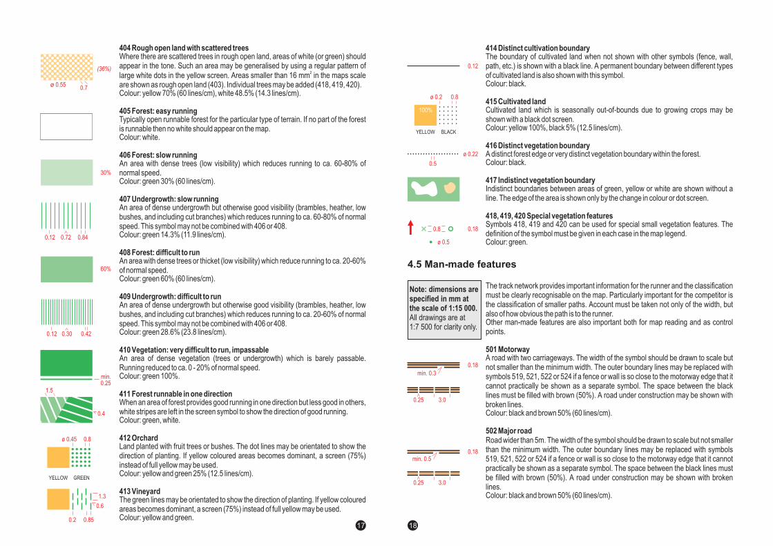
Minor amendments
201 Major cliff
203 Minor rock face
208 Distinct boulderfield
210 Distinct stony ground
212 Distinct bare rock
7.5 Printing and reproduction
7.6 Recommended symbols
7.6.1 Use of foot-o symbols
30
304 River
305 Watercourse
306 Small watercourse
309 Prominent marsh
310 Marsh
401 Distinct open land
402 Distinct open land with scattered trees
403 Distinct rough open land
404 Distinct rough open land with scattered trees
Area of very distinct marsh identifiable by vegetation and free water (or bare ground in dry conditions). The blacksurrounding line may be omitted.
Area of distinct marsh identified by vegetation.
Two new symbols are introduced to indicate passability of the trails for disabled competitors.
831 Passable step
832 Impassable step
A natural or man-made step or difficult section of trail that is passable by disabledcompetitors with care and assistance. The symbol is a cross line across the trail.
Colour: black.
A step or section of trail that is unlikely to be passable by disabled competitors, evenwith assistance. The symbol is a cross line across the trail.
Colour: black.
7.6.2 Discipline-specific symbols
0.3
0.18
0.3
0.35
31
The park orienteering discipline is still under strong development. This makes it difficult to create a fixed stan-dard, since doing this could harm the further development. Therefore the word "guidelines" has been chosen,meaning it is not to be considered as an enforcing standard, simply because map making in town and parkenvironments often needs improvisation and compromising. The "guideline" indicates a least common denomi-nator, making sure that certain basic cartographic rules and language is maintained.
8.2 Content
Maps for park orienteering are based on the foot-orienteering map specification.
As in traditional orienteering map making, features which are most essential for the runner in competition speedmust be selected and presented on the map. It is important to understand that the larger scale should not betaken as an excuse to "over detail" the map. The running speed is normally so high that the competitor does notobserve small details anyway.
8.3 Scale
The recommended scale is 1:5 000.
8.4 Contour interval
The recommended contour interval is 2, 2.5 or 5 m. It must be the same all over the map. Parks and towns areoften relatively flat, and the map maker should avoid "chasing" contour details. If a city base map (or similar)which often has 1 m interval, is used as base material, every second contour should be taken out in order tocreate a 2 m vertical interval.
8.5 Printing and reproduction
These types of maps, often produced in smaller amounts of copies, are well suited for four-colour printing andcolour copying. The results are particularly good when the symbols are enlarged by 150%.Please refer also to section 3.4 Printing, in this publication.
8.6 Recommended symbols
All symbols from the basic orienteering map specification is applicable for the park orienteering map.
The larger scale of park and town maps, easily invites to additional "large scale" symbols, such as light poles,benches etc. This could be of interest for educational maps such as school maps, and as mentioned initially themap maker has to have a certain degree of freedom in this respect. However for competition maps they are of
Special detail features
8 MAPPING GUIDELINES FOR PARK ORIENTEERING
8.1 General
8.6.1 Use of foot-o symbols
32
33
851 Building
852 Building pass-through
853 Building outline
A building is shown with its ground plan so far as the scale permits. Buildings smallerthan 1 mm on the map should be drawn with 100% black.Colour: black 50%, min 0.5 x 0.5 mm
A building pass-through means that it is possible to run through a building or under aroof or similar, without having to open doors or gates. It is shown with its ground planso far as the scale permits.Colour: black 30%, min 0.5 x 0.5 mm
A black line surrounds the outline of a building or a pass-through. It may also be usedto show characteristic structures or apparent height differences of a building.Colour: black.
2
very limited interest. As a matter of fact, the symbols defined for traditional foot-o maps covers most of the needs.If the "special features" (the "x" and "o" symbols) are used, they must always be described in the map legend.
In parks and cities, one can expect to find several areas that are permanently out of bounds for orienteering.Examples are planted flower beds etc that often serves as barriers (e.g. along a road) and could affect a routechoice if they cannot be crossed. It can be argued that the map user should know from common sense not topass these areas. However, for the sake of good will it is of importance to mark them on the map. The symbol 527– settlement – should be used (yellow 100% / green 50%).
Park and city maps has a lot of black and therefore black north lines should be avoided.Colour: blue. Line width 0.25 mm.
Maps for park orienteering should be drawn with lines, line screens and symbol dimensions 50% greater thanthose used for 1:15 000 foot-orienteering maps.
Permanent out of bounds
North lines
Dimensions of map symbols
This section describes additions to and deviations from the foot-orienteering map specification. The deviationsare of two types namely deviations in cartography (symbols) and deviations in feature definitions.
Very essential features in park and town maps are buildings. Normal o-maps use 100% black to depict these, butfor maps with a lot of buildings, this makes black the dominant colour, which gives a very "dull" map. A lightertone is recommended for the buildings. Further, it is very important to get information about "pass through"possibilities in buildings. This is accomplished by an even lighter shade of grey. This creates also a possibility todepict features "under the roof".
Building symbols and "pass through"
Note: all drawings areat the double of theprinting scales forclarity only.
8.6.2 Discipline-specific symbols
min.0.5 x 0.5
0.12
Roads and stairways
Potential legibility problems exists around roads and tracks, having to do with the amount of other types of blacklinear symbols in these type of maps. In order to avoid this, the minimum width of the symbol (minor road) ischanged to 2 m so that it can be used for all types of roads". For roads and vehicle tracks less than 2 m symbol505 (vehicle track) should be used. Symbol 504 (road) should not be used for park and town maps.
It is of interest to distinguish roads where car traffic is allowed or disallowed, since it could have importance forroute choices. For roads with car traffic the symbols 501-503 should be used.
Roads should be drawn to exact width. If the edge of the road is so steep that it is impassable (e.g. a high wall orsimilar) the symbol 201 (impassable cliff) should be used as the road boundary. Omit the tags if they are pointinginto the road.
Stairways are road features that also serves as important orienteering tools.
"
861 Road without car traffic
862 Stairways
Road where car traffic is not allowed, for example "walking streets" or similar. Thespace between the black lines must be filled with brown 30%. A road under construc-tion may be shown with broken lines.It is possible to use 50% black/0.25 mm for the edge to better distinguish it from blackman-made objects adjacent to the road.Colour: black 100% (50%) and brown 30%.
Stairways are road or track features. There should be at least two or more steps inconnection and the symbol must be generalised to show at least two lines on the map.Large stairs should be drawn to exact width.Colour: black.
0.18
0.25 3.0
min. 0.5
0.5
0.1
0.25
3634