metro real-time visualization - forsiden projects... · metro real-time visualization. ... 9.1.1...
TRANSCRIPT
Metro real-time Visualization Midterm report
Thomas Bekkeheien ([email protected])
Ann Christin Kern ([email protected]) Magnus Lange ([email protected])
1/39
Contents: 1. Introduction
1.1 Presentation of the project
1.2 Why we wanted to do this project
2. Interaction design model
3. Problem space
4 Users
4.1 Understanding the users
4.2 Different user groups
5 Assumptions
6 Conceptual model
7 Data gathering
7.1 Methods
7.1.1 Interview
7.1.2 Questionnaire/survey
7.1.3 Combining techniques
7.2 The methods we used in our project
8 Prototypes
8.1 The low fidelity prototypes
8.1.1 Overview mode
8.1.2 Information mode
8.1.3 Placements of components at Blindern station
8.1.4 Panel
9 Analysis of data gathering
9.1 Analysis of quantitative interviews
9.1.1 Prototype of the panel
9.1.2 Prototype of overview mode
9.1.3 Prototype of placement
9.2 Analysis of qualititative interviews
9.2.1 How the interviewees imagined a real‐time system
2/39
9.2.1.1 Overview mode
9.2.1.2 Placement
9.2.1.3 Panel
9.2.1.4 Conclusion of how interviewees imagined the system
9.2.2 What the interviewees thought of our ideas
9.2.2.1 Prototype of overview mode
9.2.2.2 Prototype of information mode
9.2.2.3 Prototype of placement
9.2.2.4 Prototype of panel
9.2.2.5 General conclusion
9.2.3 Analysis of observation
9.2.4 How we will improve our prototypes according to all gathered data
9.2.4.1 Prototype of overview mode
9.2.4.2 Prototype of information mode
9.2.4.3 Prototype of placement
9.2.4.4 Prototype of panel
10. Evaluation
10.1 Heuristic evaluation
10.2 Our evaluation
11. Future work
12. References
Appendix A – interviews
Appendix B ‐ Observations
Appendix C ‐ Similar systems
Appendix D ‐ Prototypes
3/39
1. Introduction
1.1 Presentation of the project
Our main idea concerns a project for the Blindern metro station. The purpose is to provide a real‐time visualization of where trains are located on every metro tracks in real‐time. A kind of similar real‐time installation is already presented in some of Oslo's train‐stations, but the only information available at the moment is a simple text based estimated arrival. Additionally, the existing system has proven to be quite misleading; trains often arrive after they were supposed to, and the real‐time information displayed tends to lack updates. We will improve this system by using the very same data stream that is already in use in this installation(Jørgenrud, M. 2008), but hopefully with more accuracy. At the same time, we wish to take one step further, and display all metro traffic in an interesting 2D graphical interface on screens at the Blindern station. The design will be informative and most likely also exciting and entertaining for users waiting for their train to arrive.
1.2 Why we wanted to do this project
We wanted to design a visualization of the realtime metro system thats around on some of the main metro stations in Oslo. For many reasons for our choice of idea we wished to provide a product that some of the people waiting around blindern station for the metro would find entertaining and useful. Why we like to think this particular idea is a bit special is that this system will show the users not only when the metro arrives, but also a visualization of the metro moving towards blindern station showing speed, time to arrival and the distance approaching the station. The already existing realtime system is only shown in numbers of how many minutes there until the metro arrives at the metro station. Often the number of minutes to arrival can variate and change from 2 minutes to 3 or 4 minutes of arrival. If theres only 2 minutes until arrival at one particularly station it could suddenly be 3 minutes to arrival. We have often found it very frustrating as users ourselves waiting on the metro to come and the metro suddenly somethimes are slowing down or using more time approaching the metrostation. For the users to actually be able to see exactly where the train is and know the speed and distance to the station would be satisfying. Before we got started designing our idea we did some research talking to friends and family to hear their thoughts of this system. The feedback was amazingly good. Friends and family had only positive things to say about such a system we had in mind designing. Some of them even said "Dette er et produkt som allerede burde vært installert på de fleste t‐banestasjoner" ‐ translated: "This is a product that should already have been installed on most of the metrostation". The meaning of this project is that the system on blindern metro station should be informative and give the users the opportunity to be entertained while waiting on a train and actually see exactly when the metro arrives blindern station. As users of the metro and students of the University of Oslo ourselves we personally think this will help all people on blindern station as well as every metrostation.
4/39
2. Interaction Design Model We have chosen to stick with a quite simple version of a lifecycle model for our interaction design. The process we cycle through can be described like this: 1 ‐ Identifying needs and establishing requirements 2 ‐ Describing possible solutions 3 ‐ Designing prototypes 4 ‐ Evaluate, with proper data gathering techniques, to investigate different user’s response to our solutions and prototypes. 5 ‐ Analyzing gathered data, and evaluating the result (Sharp et.al. 2007, p. 448) The reason why we have chosen such a lifecycle model is to ensure that we maintain a consistent focus of what the users actually want and need. It is very important to realize what benefits the users most when designing a system like this.
3. Problem space The main focus for the project is to present a map over the railway system of Oslo, with a simple and informative design. The idea is to let people know exactly when their train is arriving at the Blindern station, and to give them the opportunity to find out whether other trains are delayed. We hope people at the station will be excited from getting access to a panel with buttons, where they can easily select any train on the railway system to get more detailed information about that particular train. Our product is useful for people in many ways; for example if a person are planning to switch trains within the next few stations, he could see the whereabouts of both his trains in real‐time on the screen, and thereby find out whether he could manage to get a quick switch, or if he has time enough to get a cup of coffee before the switch. It will also be easier for people to calculate an estimated arrival at their destination, which might be important for busy people. The new system will hopefully attract the traveler’s attention, and turn boring waiting into a pleasant little stay. The existing product can generally not be trusted, and is quite boring to stare at. It is designed as a rather small display with digits, and the only thing it is telling its audience is how many minutes there might be left before the next train approaches. But even with this little information available, this display is often the main attraction while waiting.
4. Users
4.1 Understanding the users
This part of the project is about how we understand the users. To have a system not drawing attention to the users we believe is pointless. Why would anybody go and look on a boring or perhaps messy display nobody understood? So one of the most important things we had to come up with was a attractive design that draw attention and let the users get curious about it. It was not only important to draw attention from users but to draw the right type of attention. Not all types of
5/39
attention is good attentions. We didn't want for example the users to get confused or scared and not want to use the system for its purpouse. Loud noises draws attention but not that kind of attention that attract people to the place the loud noise come from. A messy and confusing system do not help the users and does not draw the right type of attention when the same users want to use the system next time. The 6 buttons have one color each, totally 5 different colors (two of the tracklines, line 4 and 6 have the same color) to match the trackline colors. On each button there is one number, one up to six, also to match the tracklinenumbers. The buttons will draw attention from the users as well because of the different colors. The users will have positive relations with a system thats easy to use and understand and at the same time invites them to use it again and again. The already existing realtime system for the metroes in Oslo consists of only numbers and not pictures. There exists proof that humans remember images better than text only. So if users can interact and use a visualization of a realtime system theres a big chance that they will remember better wich metro going where in Oslo as well. As we came to an understanding of some of the users we asked in our project they use the metro often, but didn't remember all the 6 tracks and the different places and direction the metroes are going. The assumption is that the system is easy to use and simple understandable design. It isn't important for the users to remember all of the tracklines in Oslo, but if they do, they have taken the metro very often and for several years. The need for our system will also attract experienced users of the metro because they can't possible remember the timetables for all the 6 tracklines. They can never know or remember if the metro is delayed or on wich other metrostation their metro could be in the moment. As a part of our idea the users will recall, recognize and feel familiar with our system in the same way they are familiar with the metro model of all metrolines in Oslo. Then the users don't need to spend so much time understanding the system. The users of blindern metrostation are in different ages and target groups such as students, teachers, workers at UIO and people who have no connection to the UIO. The users consist also of older people like retired workers and tourists. For meeting most of the users, our system is easy to use so few of the users will have problems during use of the system. Older people are usually less updated on technology than others and few have a computer or know how to use one. Since our system doesn't have anything else than 6 buttons to push on a board theres no difference from pushing some buttons for a metro tickett. Old people usually have few or no problems bying a tickett. There should not be any problems for tourists to use our system either. Our system have not yet any other language than norwegian to give information about the speed, distance and time to arrival blindern station. But since the information only consists of speed, distance and time to arrival, where speed is shown in km/h, distance in kilometer or meters and time to arrival in minutes and second, the tourists will be able to understand the information shown on the display while pushing on of the 6 trackline buttons. For people in a hurry our system would not be the first thing they would spend time on when they arrives the station. There are two ways to arrive blindern station or any other metrostation: arrival with a metro to the station, or simply walk or run to the station for meeting people or use the metro for going somewhere. People in a hurry that arrives with a metro have most likely not any interests in using our system since they already have reach their destination. But for people in a hurry that are going somewhere with the metro, the system can quickly be used to give the right information. The users in a hurry will get information about their train as their pushing the button for the train they want to travel with. If the metro is arriving the station and a users only have time to jump inside the train, the system will have no effect. This will happen often especially for students on the run. Those kind of users knows the tracks and the metrosystem very well and have no need to use our system if they are lucky and arrives the station right on time to travel with a specific train. For users who have more time while waiting on a train to arrive the station, our system would be an entertaining and useful resource for the users.
6/39
Most of the users are regular people. Our system consists of a display and a set of buttons. For the regular people as users they have no problem use the system with pushing a specified button and watch the screen for observation of the trains thats moving around on the map. The screen is in height with a regular persons head. Wheelchair users and midgets isn't that tall as a grown up person but will not have any kind of problem with using the system because of their handicaps. The buttons are in a comfortable height for every user. Regular adults can easily push the buttons that are in the height of their stomach. For wheelchair users and migdet this means that they have to lift their arm for pushing one of the button just a bit higher than a regular person. We dont see this as any type of problem. One other problem could appear if the users in wheelchair or midgets have bad sight. Then they need to be very close to the screen for watching the trains move. But if the users only want to see when one specific train is approaching the metrostations it would be enough to just push the selected button for the specific trackline. Then the screen will zoom in on the information about speed, distance and time to arrival. The information is in such big fonts that there shouldn't be any problem for a user with less sight than regular users. The users in wheelchair and midgets can easily roll or step a bit back after pushed a button to see more clearly and get a perfect overview of the screen and the information thats coming up on the screen after pushing a button. Blind people is users of the metro as much as regular people. Our system have not yet maked a difference (tatt hensyn) for blind people. We have made up some thoughts of how to make the system work for a blind person as well as a person able to see the visualization of a map with trains moving on it. There have to be a speaker nearby. The blind person have to know that there is buttons to push so the he or she can hear how long there is until a specific metro arrives the station, the speed and distance as well. Regulary people would perhaps be annoyed of a speaker that talks all the time, and there probarbly no need for a speaker for a person who is able to see the information on a screen instead. So our thougths further on this kind of a situation is that the speaker only speaks every five or ten minutes perhaps and only give a short information about a system with buttons to push to the left or right of the speaker. Then a blind person who has been waiting more then five or perhaps ten minutes can be able to locate the sound and move towards the sound. Blind persons have really sharp other senses so they can feel with their hand or a (stokk) where things are. The buttons is of course in the same color as one of the 6 lines the metro in Oslo contains, and have numbers outlined on each button so a blind person can feel a number and then push. The same applies to colorblind people. The number are in white Before the blind can hear anything he or she must push a speaker button first so they enable the speaker as well. This because the thought of hearing a voice every time someone pushes one of the buttons that not are blind would perhaps be annoyed of a voice telling them when their able to see the information for themselves. The blind should get information about enabling the speaker button at the same time as the speaker speak every five or ten minutes.
4.2 Different user groups
The main group of users will obviously be people that use the metro railway at Blindern as a resource of transportation. Regular users, primarily students, employees and residents at Blindern, will hopefully find the information provided by the system very useful, especially when trains are delayed. For these users, waiting for the train to arrive should be far more entertaining and pleasant, compared to the current situation.
7/39
Another important group of users will be the tourists, and others who have rather little knowledge of the metro system and its different tracks. This group of users will probably benefit most, since they are often searching for precise and good information that is easy to understand. Busy people will also benefit from the system. Given a calculated, more accurate estimated time of arrival, these users should have a much better opportunity to coordinate their travelling when making appointments and other plans. We assume the system will be quite helpful for children and elderly people, making it easier to figure out which tracks are going where, and when their train will be approaching the station.
5. Assumptions To make our idea as user friendly as possible we need to look from and understand the user’s perspective. We will put up some assumptions to investigate whether our product is useful, user friendly, safe to use and how we can make the user's experience as pleasing as possible.
Anyone waiting at a metro station wants precise, easy accessible, relevant and understandable information about when the subway arrives at the station. It's might be easier for some users to understand visual information rather than text‐based information, and an interactive design makes sure the user gets full utility of our system. Information based on a subway‐map and time tables may be harder to understand, especially for children or people new to Oslo. In addition, not all information is possible to acquire at the station. Such as exactly where the metro is right now and when it's expected to arrive, especially when there are delays and eventual problems with the railway system. A user may also feel more welcome if the information system is welcoming and easy to use. Screens showing a map with moving elements representing the trains would probably be easier to use and find, rather than posters with time tables hung up on a wall somewhere at the station. Our system will also be easier to use, efficient, effective, and easy to remember how to use.
In general, people dislike waiting for the metro to arrive and are easily bored while waiting. By offering an interactive solution with relevant information, the user may be distracted from their passive condition.
A kind of similar real‐time system does exist and is under test runs for Oslo's public transport system. But the system is rather inadequate. Trafikanten offers text‐based real‐time information which currently only can be acquired by internet/wap or by text messages (sms). This is not very user friendly seeing that not many have access to internet on a metro station. Not many users are willing to pay for text messages to the system either. The users also have little or no knowledge of the existence of this system or how to use it. Trafikanten's real‐time system is based on electronic boards placed on a handful public
8/39
Our product's priorities are to be user friendly and easily understandable and accessible. It may contribute to make public transport easier, more comfortable and more attractive.
6. Conceptual model Some relatively big screens, standing on each side of the platform at Blindern, will be the main elements in this installation. The screens will be placed where it's easy to discover them. It is also important that many users are able to watch the screen at the same time. The system will include two modes, the overview mode and the information mode: Overview mode contains a graphical presentation covering the entire screen with these elements: A map over Oslo's metro railways. An overview of all active trains in real‐time, moving on the map. Clearly displayed information of both directions and line numbers for each train. The map in the overview mode will be the exact same map that is already being displayed on the metro stations and inside the trains. In addition to the standard mode presentation, the users will get access to more functions through a standing panel in an immediate area below the screen on each platform. The panel will contain six buttons, numbered from one to six, and will use the same color code as the metro‐system already have for their different tracks. When a user push a button, the system will select the closest train for the chosen line number, and the screen will switch to a more detailed information mode. The buttons may be pushed several times to circulate between the all active subway trains for the particular track number. The circulation will start at the closest train, and iterate to the last train. We assume that clicking through the whole cycle of trains will require approximately 4 – 6 clicks, depending on how many trains are in movement on the specified line number. The users will also get access to a home button, representing the initial screen (the overview mode). The information mode will contain the following elements:
An animated picture of the train with correct track number and track name.
The train's position; either the station the train is on right now, or the station the train is approaching.
The train's speed. The following information will only be available if the line number chosen passes through Blindern station:
An accurately estimated time of arrival to Blindern station based on various factors. The following information will only occur if the line number chosen doesn’t pass by Blindern:
An accurately estimated time of arrival to the nearest station in connection with any of the various tracks passing by Blindern.
How many meters away the train is from this particular station
9/39
Only one user may interact with each installation of the system simultaneously. If the user interface (the panel of buttons) has been inactive for 8 seconds or so, the system will automatically return to overview mode, presenting the main graphical overview‐map. It is essential to develop the system to appear as innovative and obvious as possible. The intent is to let users quickly understand that the graphics on the screen is representing the positions to all active trains in Oslo. The UI will be fairly simple; the ultimate goal is to let the user’s know what to do by themselves, without even having seen the installation before. All necessary data needed to let the information system get real‐time updates, are already accessible on the internet, distributed by Trafikanten (Jørgenrud, M. 2008). The data has been encoded into a XML stream, making it fairly easy to implement in the application. This means that the only thing that remains to be done to make this application to function, is to program the graphics and somehow connect it with the XML stream.
7. Data gathering The purpose of data gathering is to collect data; response, reactions and opinions from users relevant to the project. By performing a well planned and executed data gathering and evaluating the result data, we get valuable insight in how we can improve our project design further to better fit the user's needs. In the context of data gathering there are two kinds of data; qualitative and quantitative data. Quantitative data are more concerned about receiving a large amount of data, than the quality of the responds, and are often in form of numbers or easily translated into numbers. Qualitative data are more concerned about the quality of the result data, often giving a broader insight into the user's view. As opposed to quantitative data, qualitative data are more difficult to measure or count, thus making it hard to analyze and present in an understandable way.
7.1 Methods
There are several techniques for data gathering, three of them well known; interviews, questionnaires/surveys and observation. We are using interviews and observations in our project. Interviews result in some quantitative, but mostly qualitative data. Questionnaires can result in both qualitative and quantitative data, but normally mostly quantitative data.
7.1.1 Interview:
An interview consists of one (or more) interviewer(s) asking one or several interviewees a set of questions; normally performed, but don't have to be, face‐to‐face. The interview questions depend on the purpose and goal of the interview and may be structured, semi‐structured, unstructured or focused at group interviews (Fontana and Frey, 1994); unstructured is commonly recognized as open‐ended.
10/39
Unstructured/open‐ended interview:
Unstructured interviews are where the questions posed by the interviewer are open, meaning there are no predetermined set of alternatives for the interviewee to choose between. There are no expectations or demands of their answers, the interviewee is free to say (almost) what she or he desires about the topic.
Structured interviews:
The interviewer asks the interviewee questions, whereas the interviewee has a predetermined set of alternatives to choose between. Most commonly are the options Yes/No or some type of scale (e.g. from 1 to 5, or Not true/Very true) where the interviewee are required to choose one (or several) already given options.
Semi‐structured interviews:
Semi‐structured interviews combine features of structured and unstructured interviews, and use both open and closed questions. The interview may ask the interviewee to provide further information on questions, even on closed ones.
Advantages with interviews: The benefit with interviews may be that they generate rich data, giving results with a deeper and broader understanding of the user's view and opinions on the interview topics. As opposed to a questionnaire, the interviewer may guide the interviewee, if necessary, leading her or she in the desired direction of the interview goals. In addition, interviewees may mention issues, ideas or other things that the interviewer had not thought of. Disadvantages with interviews: Interviews are normally conducted face‐to‐face, or are very time‐consuming, making it hard to reach a large group of people. The result data is more difficult to analyze than e.g. questionnaires, because the questions are not standardized. Interviews are more like conversations, where the interviewee answers may be (almost) anything.
7.1.2 Questionnaire/Survey:
A survey or questionnaire is a well‐known technique for collecting data and opinions. Like an interview, a questionnaire may have open or closed questions or, commonly, a combination of these. A questionnaire does not require an interviewer meeting the interviewees face‐to‐face, even if it is possible, and are often published on‐line to reach a large and varieted group of people. Advantages with questionnaires:
A questionnaire is excellent for conducting data gathering from a large group of people, and often over a large geographical area. Another advantage is that the result data are easy to analyze, since the questions are standardized. Using questionnaires also often result in specific answers to your questions.
Disadvantages with questionnaires:
Because questionnaires often are spread over a wide network of people, the response rate may be low. In addition, effort and skill are needed to plan and phrase the questions carefully, so that there will be no misunderstandings or difficult to analyze the result data.
11/39
7.1.3 Combining techniques
It is wise to combine methods of data gathering in order to triangulate findings. There are no "right way" to combine techniques, it all depends on a variety of factors such as goals and focus of the data gathering, the participants involved and the resources available.
7.2 The methods we used in our project
Why, how, where, who, which and what, were something we had to determine. To collect data from users we had to figure out which methods would be suitable for our project. We had to find out where we could get people’s attention for at least 5 minutes, and probably up to 20 minutes. The first thing that crossed our minds was to ask people at the Blindern station. But we know by our own experience that we usually don't have time for even short interviews from strangers on a metro station when we are waiting for a metro. The metros are arriving pretty rapidly, making it difficult to get users attention long enough for an interview. Thus, we realized that to ask users at the station would be difficult for us. When gathering data from users, the first thing we had to do was to explain properly what our project was all about. This is important because users need to understand the concept of what they are going to be interviewed about. Our first interview revealed that we actually failed at this, as the person being interviewed didn’t understand the concept until the very end of the interview. So in order to get a successful interview with the users, we had to ask people that didn’t seem to be too busy. Based on this conclusion, we decided not to interview people at the Blindern station. To find non‐busy users of the Blindern metro station, we found it appropriate to ask students and employees at the Blindern University. At the university, we got in touch with several users at the open outdoor square called Frederikkeplassen, as well as users at our own faculty, the Institute of Informatics. Additionally, we thought it would be interesting to interview a couple of tourists, which is what one of our group members did during a visit home in Stavanger. After doing several interviews, both qualitative and quantitative, we found that the users had pretty similar opinions of how the system should be. In the quantitative interviews, we found a few smaller disagreements of design details. However, the results from the qualitative interviews gave us a pretty good indication of how the users wanted the system to be. So we decided to stop this iteration of data gathering, and started evaluating the prototypes based on the data results. Several of the prototypes were improved, a couple of new were developed, including a high fidelity prototype, while others were discarded. The plan was to go through a second round of data gathering, while presenting our renewed assortment of prototypes, but unfortunately we didn’t get that far. By using both qualitative and quantitative methods of collecting data about users, we were able to obtain valuable information about the users expectations of the system, as well as interesting opinions on how the prototypes could be further developed. We varied the use of these methods depending on who we were interviewing. We thought it was reasonable not to steal too much time from users we didn’t personally know, and therefore we focused on interviewing these users with the quantitative method. We asked them six questions that led to short and concrete answers. The three first questions were asked prior to presenting any prototypes, and the remaining three questions afterwards. Only the most preferred prototypes from the qualitative interviews were presented, to keep these sessions as less time‐consuming as possible. The qualitative interviews were carried out on users we already personally knew, like family, friends and classmates. The qualitative interviews proved to last from 20 – 40 minutes, generally depending on the length of the
12/39

user’s response. We asked them eleven questions in total, which led to a deeper discussion of personal opinions of how the system should be. The setup of this interview was slightly different from the quantitative. First we asked a few question to get impressions of how these users would imagine a system that presented the metro traffic of Oslo in real‐time, without putting any ideas into their heads. Afterwards, we explained in detail how the group imagined the system to be. All of our prototypes were presented at this point, and the users got the opportunity to respond to each prototype. Finally, the users were allowed to express themselves regarding how their imagined system differs and/or equals to our idea, as well as pointing out any interventions or suggestions they might have. By doing the qualitative interview this way, we hoped to get the users real personal opinion of how the system should look like. The qualitative interviews were initiated by a pilot study, to check whether our questions were appropriate. What we learned from this pilot study was that we needed to be more careful not to provoke users to think differently about our prototypes. We considered asking elderly people and children as well in this iteration of data gathering, but after we learned how challenging it was for teenagers and adults to understand the concept of metro real‐time visualization, we decided to put these users on hold until the next iteration of data gathering emerged. The reason is that at we in the next iteration will have a more concrete prototype and a more secure idea how the system would look, and be used. We think it might be more appropriate to interview elderly people and children at the next stage of the data gathering, to be able to adjust the system more to this user group. Alternative methods to use in a project like this could be to just observe people at the metro stations. At this point, it will be impossible to actually observe how users would react to the system, considering that we don't yet have any functional high fidelity prototyped installation to provide the station. However, we decided to observe how users behave while waiting at the station, and thereby we made some assumptions about why they behave like they do. Another method we could have used is focus groups. We could have presented our idea with screenshots and small prototypes for maybe 10 people in a room. Then all the people could discuss what their thoughts were on this system. This is more like a debate and would be a very good method for collection data. The reason for not using this idea is that we thought it would be hard to get so many users attention simultaneously, at least with the amount of time needed to get a meaningful discussion. This type of method could demand at least one hour of discussion. This method would probably have been one of the best to use to collect data for this type of a project so it's a bit unfortunate that it didn't get used.
9 Analysis of data gathering
9.1 Analysis of quantitative interviews
Our subjects' age ranged from 20 to 40 and everyone were either a student or employed at the University of Oslo. We met and interviewed them at Fredrikkeplassen, which is the main university square. We tried not to exceed 5 minutes with every interviewee. Everyone we asked, with the exception of one, used the metro every day or almost every day and knew the lines fairly well – they did not have to check the subway map to find out which one they could take. When we presented our idea, all interview subjects were very positive. Most of them
13/39

concluded that our idea of presenting subways in motion in real‐time would function much better than the existing system of Trafikanten. Almost all interviewees were curious whether this project would be realized and when they could use it. Additionally, we learned that one student had seen a similar system at the u‐bahn and/or s‐bahn in Berlin, Germany. The interviewee was very satisfied with this system and hoped it would come to Norway as well.
9.1.1 Prototype of the panel
In the quantitative data gathering, most of the interviewees were also positive to the panel for communicating with the system, especially those who weren't very familiar with the metro in Oslo. Everybody we asked were positive that this system would be useful, both for themselves and others.
9.1.2 Prototype of overview mode
When we presented the two prototypes (see Appendix D) of metro maps, half of our interviewees preferred one, and half preferred the other. We understood that the default subway map (fig. D.1.1.1) was easier to understand and recognisable, while the geographical map (fig. D.1.1.2) were more exciting and geographically informative. Everybody stressed that it was important to include all station names at the map.
9.1.3 Prototype of placement
The same result goes for the placement of components, half of our interviewees preferred hanging screens at the bridge (fig D.1.3.2) and half preferred screens placed at the stations (fig D.1.3.1).
9.2 Analysis of qualitative interviews
As expected, we learned more about user's needs and preferences in our qualitative interviews. Our interviewees' ages ranged from 18 to 46 and everyone except 1 interviewee who only used the metro once, used the metro system almost every day in periods of their lives. Their experience with subways ranged from 8 years back until just some months ago. Some of the interviewees were unfamiliar with the metro map, but almost everybody knew the different metro lines that they used or use.
9.2.1 How the interviewees imagined a real-time system
We did not present our illustrations nor explained how we would make such a system before the interviewees told us how they imagined or wished the system would be like. This way we could learn more what the users wished or needed without us putting ideas in their heads first. It seemed like all interviewees were enthusiastic about the idea of a visualized realtime metro‐map. As one user expressed himself: "A visual representation of the metro would be
14/39
awesome! Almost like shown on Sesam Stasjon!" (Sesam Stasjon is a norwegian childrens television show).
9.2.1.1 Overview mode
Every one of our interviewee imagined a screen displaing a map. To represent subways in motion several suggestion were presented; icons, thick lines, arrows, tiny illustrations of a metro, or simply a flashing light. Accompanied with colors or line numbers these indications would be enough to make the system understandable. One interviewee suggested to present only the metros in close proximity to Blindern, so the map wouldn't be overflowed with flashing or disturbing elements. The map itself had to be understandable and simple, not too much colors and details. Most of our subjects had the traditional subway map in mind, because they thought it would take time to understand another kind of map they were not used to already.
9.2.1.2 Placement
Our interviewees suggested both large screens hanging over people's heads, either one or two, for both directions, or screens at the level of people's eyes on either side of the station, just as we had come up with. But most of our interviewees preferred having screens at eye's level, because it would be simpler to read and look closer.They also mentioned issues with vandalism and problems having screens high up with sun reflecting making it impossible to read.
9.2.1.3 Panel
We then asked whether they wanted a passive or interactive system, and almost everyone wanted a passive system. They thought it shouldn't be necessary to actually manually go and do something to receive the information they wanted. By having a screen displaying all metros moving in real‐time was enough. Having more components would also increase the chance of vandalism. Otherwise half of our interviewees would love to press buttons and make things happen if they were there. Most of our subjects would only interact with the system if there were abnormalities, such as delays. Other ideas for an interactive system were the possibility to contact the metro central if they needed it, or some imagined aspects such as entertainment, such as displaying the metro's current speed, year the metro was made, how many metres away it was and so on.
9.2.1.4 Conclusion of how interviewees imagined the system
Generally, we got the impression that most of the interviewees imagined the system to be pretty similar to how we were planning to make it, except that they didn't want to have the opportunity to interact with the system.
9.2.2 What the interviewees thought of our ideas
When we presented our prototypes, the idea was that the interviewees could come with input and tell us which ones they liked and why they did. In addition they could compare our ideas with what they imagined earlier in the interview.
15/39
9.2.2.1 Prototype of overview mode
When we presented the different prototypes of the metro‐map, it was a clear majority who preferred the default metro‐map that is used today (Fig. D.1.1.1). They liked that one best because it was simple, understandable, recognizable, easy to read the station names and to see how many stations there were between stops. We got several suggestions for modifications; several of our interviewees mentioned adding small details, no strong colors, to the map to make it more interesting. The illustrations had to be very weak and simple not to interrupt the map; e.g. drawing the royal castle, city hall, the parliament building, Oslofjorden, Holmenkollen and so on. Other minor suggestions such as making the lines thinner, so the metros would be easier to see also came up. The rest liked the more geographical correct map (fig D.1.1.2). But all of them stressed the importance of having all station names written on the map, even though it could make it harder to read than the default map. They preferred this one because it was more interesting, new and unknown, and far more informative in geographical locations.
9.2.2.2 Prototype of information mode
Almost all feedback for these prototypes revealed that the users preferred the red animated train as the information mode (fig D.1.2.2). The reasons were described as "It is a good effect to animate the train like this, because I get the feeling that the train is moving towards me in a hurry to pick me up. It also seems like it's talking to me, providing me all the information it has available. I think it will be hard to misinterpret this information." and "The other picture was kind of boring compared to this one (fig D.1.2.1), this was more alive (fig D.1.2.2)." Generally, people liked both prototypes, but clearly they preferred the one with the red train.
9.2.2.3 Prototype of placement
About half of our interviewees preferred the placement of two screens at the Blindern bridge (fig. D.1.3.2), and the other half preferred screens on each platform (fig. D.1.3.1). But they mentioned some advantages and disadvantages by both options we did not think of. Some of the interviewees felt they could get "performance anxiety" if they pressed buttons and interrupted the information screen for everyone else at the station if the screens were hanging at the Blindern bridge. In that case, they would not dare communicate with the system! One important point most of our interviewees mentioned was that a smaller screen at eye level would make it easier to ensure that everyone could see the information clearly. They could move closer to get a better look, which is not easy with large screens hanging high over people's heads. The advantage by having the screens hanging up high for everyone to see, what that it's visible for everyone at the station, obviously, whereas smaller screens would require you walking up to them. In addition, if several people wanted to use the system, e.g. when a delay occurs, they would eventually have to wait in a queue.
9.2.2.4 Prototype of panel
We didn't get much feedback on the panel (fig D.1.4.1), other than that it was simple and user‐friendly. All our interviewees said that they would know immediately which button they would press. There were no proposals for changes. Some of the users were very skeptic about having a panel for interaction with the system, but after we explained our idea of interaction, and presented them this prototype, most of them changed their minds. One user, who would recommend the system to be non‐interactive, responded like this when we explained our idea of interaction: "Oh. Actually, I think it would be smart to have a panel which provides the opportunity to obtain such information. This is exactly what I would like to have at my disposal when I'm standing at the station wondering when my train will arrive".
16/39
9.2.2.5 General conclusion
To conclude, our interviewees felt that a passive system would be more appropriate when hanging two screens for everyone to see, and an interactive system would be better with smaller screens at either side of the station. When we asked whether our ideas would be useful and if they would actually use it, we got a majority of agreement. Our interviewees especially though this system would be useful for people new to Oslo or the metro system. Elder people could be frightened by the unfamiliar technology, and children would probably not understand it. Many of them expressed annoyance with Trafikanten's current real‐time solution and agreed that our idea would be far more informative and correct.
9.2.3 Analysis of observations
An analysis of observations can be found in Appendix B.
9.2.4 How we will improve our prototypes according to all gathered data
We need to point out details of what seems to be what people generally want from a system such as this. These details will give us a better understanding of how the final product may be designed to fulfill most of the user’s needs.
9.2.4.1 Prototype of overview mode
We encountered several opinions of how this feature should be designed. When doing the qualitative interviews, the users did visualize the overview screen more or less the same way as we do. The simple map that is being used at the metro already was clearly the most attractive alternative. However, there were slightly different ideas of more detailed design, like how to represent subways in motion. For example, we got suggestions of both making the lines thicker and thinner. We have taken these suggestions into consideration, but we concluded that it was better to just leave the lines with their present thickness. We think the map would become messier if we thickened the lines, and that they would be harder to see if we would make them thinner. We got another very interesting suggestion which we would like to quote: "The arrows could perhaps have been bigger, and they should have the exact same colors as the lines to increase the feeling of good overview." This is a suggestion we find very appropriate, in fact we liked it so much that we decided to apply this proposal to our high fidelity prototype. One user said that it would be better to just present a map of the area nearby Blindern, so that the map didn't get too much input and got too messy. We have considered this a potential problem ourselves as well, but when looking at the prototypes, we think that it works pretty well to display all stations in Oslo on the map. Additionally, there were no other users presenting this as a problem after looking at the prototypes. Several users, actually including the user pointing out that too much input could be messy, said that the map had a surprisingly good feeling of overview. From the quantitative interviews, we learned that half of the interviewees preferred the simple map, while the other half preferred the geographical map. Based on the combined data gathered from both quantitative and qualitative interviews, we find that the majority of the users preferred the simple map, and therefore we have decided to implement this map in our high fidelity prototype.
9.2.4.2 Prototype of information mode
Clearly, the prototype involving the red train was most appreciated by the users (fig D.1.2.2). Therefore, this is the prototype we have used as a base for our future work on the information mode. We have, however, changed it a bit when designing the high fidelity prototype. One of the
17/39
users we interviewed came up with an interesting idea: "I really like the faded background of the map in this picture. Maybe the traffic in the background should be updated in real‐time in this mode as well?". And that is exactly what we did when making the high fidelity prototype. Additionally, we have changed the text presentation when making the high fidelity prototype, placing the information text in a "speech‐bubble" to make it look even more like the train is speaking to the user.
9.2.4.3 Prototype of placement
Generally, people had very different opinions on where the information displays should be placed. From the various opinions, we concluded that the users found it more appropriate to place big screens hanging in connection with the bridge if the system were non‐interactive, and screens on the platforms at eye‐level if the system were to be interactive. Based on this conclusion, we decided to make a new low fidelity prototype, where the screens are presented on the platforms (fig D.1.3.3). Having the screens at eye‐level could become inappropriate concerning users of wheelchairs, children and small people. This is something that should be discussed further in the project.
9.2.4.4 Prototype of panel
The data gathered show that no users have been critic about the design of the panel (fig D.1.4.1). In fact, they seemed to be pretty satisfied with its simple design and obvious buttons. However, after discussing the design of the panel within the group, we have decided to integrate the panel with the screens. The prototype of the standalone panel was originally designed to accompany screens hanging in connection with the bridge. Integrating the panel with the screen will be more natural and appropriate considering that we decided to place the screens alongside the platforms. We have made a new low fidelity prototype of the installation, combining the screen with the panel (fig D.1.4.2).
10. Evaluation Reviewing the different evaluation methods we concluded that an analytical approach would fit to our project. All the other methods involve users interacting with the system, and since we don't have a high‐fidelity prototype the users can use, we found analytical methods necessary. By using ourselves as expert users we will take advance of the heuristic evaluation to properly inspect whether our design meets the users' needs.
10.1 Heuristic evaluation
Heurestic evaluation is a usability inspection technique developed by Jakob Nielsen and co. (Nielsen and Mohlich, 1990; Nielsen, 1994). In this method the expert users, that is us, will evaluate the design guided by a set of usability preferences, called heuristics. We chose to follow the revised version of the heuristics listed in Interaction Design: beyond human‐computer interaction (Sharp, Roogers and Preece, 2007, p. 686‐687):
Visibility of system status. How well the users are kept informed about what is going on, including feedback within reasonable time.
Match between system and the real world. By speaking the users' language, naturally and in logical order, using familiar concepts rather than system‐oriented terms.
User control and freedom. How the system are responding to the users if they perform actions by mistake.
18/39
Consistency and standards. Users should not have to wonder whether different words or phrases mean the same things.
Error prevention. Error messages and presenting users with a confirmation option before they commit to "serious" actions.
Recognition rather than recall. Minimize the users' memory load by making actions and options visible, thus the user don't need to remember anything.
Flexibility and efficiency of use. The system should respond to both inexperienced and experienced users, and allow users to tailor frequent actions.
Aesthetic and minimalist design. Interaction should not contain information that is irrelevant or rarely needed.
Help users recognize, diagnose, and recover from errors. Error messages should be expressed in plain and natural language, precisely indicating the problem and suggest a solution.
Help and documentation. Even though it is better if the system can be used without documentation, it may be necessary to provide help and documentation.
10.2 Our evaluation
Visibility of system status Our system have the main map of all the metrotracks shown on the display 24‐7. The users are aware of all the tracks and all the trains in move at the same time. When a user push one of the six buttons with a number form one to six on, the map stays in the background and a information bubble comes up. It shows the nearest train moving towards blindern station on the trackline with the number the same as the number on the button pushed. For blind people a speaker button must be pushed first for enabling speaking. Match between system and the real world The map in our system is an exact copy of the metromap that is around at all the metrostations in Oslo. This is something the users feel familiar with and draws their attention towards our system. The map in itself is easy to read and understand. The numbered buttons have the same number and the same color as the tracklines on the metromap. So every user that understands the regular metromap, understands our system. User control and freedom If the user pushes a button that the user didn't meant to push, the user can easily push a "Home" button to get back to the default map. If the user want to see a specific train that's not the first train in the specific trackline to arrive the blindern station, he or she can push the button several times for finding the specific train. A problem that comes with this function is that the user can unfortunally push the button once too much and miss the specific train the user wanted to see information about. The "Home" button helps the user back to default again. This is so the user don't have to push the button so many times to get back to the specific train without watching all other trains moving on the same tracklines before the specific train comes up again. Consistency and standards To maintain consistency in our design, we have used the exact same map for representation of metro traffic as the map already in use on the stations and inside the trains. Additionally, the color code used on the buttons in our installation corresponds directly to the color code developed by “Sporveien AS” for the various metro tracks. The information mode in our system uses an image of a train that is similar to some of the trains in use today. We have had a lot of focus on using images, objects and codes that the users are already familiar with. As far as we can see, the product will
19/39

appear as highly consistent in context of the metro railway system. Recognition rather than recall The map simple colors and numbers helps the user to remember and sort out the different tracklines from each others. Since we use the original model of the metrotracklines in our system the users will recognize the model quickly and remember most of the tracks. The original model is something that daily users of the metro cannot avoid to see when they are taking a train. The metro model is on every metrostation and every train. With only 8 big coloured buttons to push there is no difficulty to recognize which button to push for a specific trackline. For example the green button represents the trackline number 3, wich also is also coloured green, destination from Mortensrud ‐ Sognsvann. Aesthetic and minimalist design It has been very important for us to make the design as simple and minimalistic as possible. We have only included core functions, like displaying the metro traffic in real‐time and letting the users choose a specific line number to obtain more information. The system could easily be expanded to include a lot of more functions, but this could also compromise the simplicity of using the system. The functions implemented were suggested and .. by the users themselves. The users clearly pointed out that they wanted the system to be as simple as possible. By implementing few functions in the system, we were able to minimize the amount of buttons to 8, where each button is mapped to exactly one action. The most important function of the system is accessible without pressing any buttons, it will run as the default screen. We have also tried to make the design as aesthetic as possible, without compromising the feeling of overview. Help and documentation Generally there should not be any problem to understand this system and use it as it supposed. Any kind of documentation would be redundant. There will not be necessary to explain to the user how to use this system. As many of the users we interviewed said: "If there are buttons to push, I push them" (In norwegian we quote what some of the users exactly said in the interview: "Hvis det er knapper å trykke på, så kommer jeg til å trykke på dem"). With this we mean that the users want to find out for themselves how the system works. There isn't to much to find out how the system works since the system is quite simple. Many of the users also love to play and plunder with technology and are often restless while waiting for a train to arrive the metrostation. This is therefore a great opportunity to make the time passing by while waiting.
11 Future work In this section, we will discuss what we could have done further in this project.
Develop our high fidelity prototype further, by giving the buttons functionality and therefore making the installation interactive.
Connect the high fidelity prototype with the actual data stream from Trafikanten.
Extend the high fidelity prototype by designing a physical cabinet that would represent how the final installation could possibly look like.
Take a new round of data gathering, presenting our new low fidelity prototypes and the high fidelity prototype.
Establish a focus group.
Find out more of what children and elderly users want and need from such a system. Possibly by interviewing them, while demonstrating our high fidelity prototype.
20/39
12 References
"BVG". Available at http://www.bvg.de/index.php/en/Bvg/Start. [20.11.2008] "google transit". Google Transit available at http://www.google.com/transit [20.11.2008]. Google Transit Feed available at http://code.google.com/transit/spec/transit_feed_specification.html [20.11.2008] Jørgenrud, M. 2008. "Alle 'kan' hente ut Trafikantens trafikkdata" ("Everybody can get Trafikanten's traffic data"). In digi.no, posted Aug 27. Available at http://www.digi.no/php/art.php?id=784010. [27.08.2008] Nielsen, J. 1994. Heuristic evaluation. In J. Nielsen and R.L.Mack (eds.), Usability Inspection Methods. John Wiley & Sons, New York. Nielsen, J. and Mohlich, R. 1990. Heuristic evaluation of user interfaces. In Proceedings of ACM CHI '90 Conference. "S‐Bahn". S‐Bahn in Berlin. From Wikipedia. Available at http://en.wikipedia.org/wiki/Berlin_S‐Bahn. [20.11.2008] Sharp, S. and Rogers, Y. and Preece, J. 2007. Interaction Design: beyond human‐computer interaction. 2nd ed. John Wiley & Sons Ltd, West Sussex, England. "U‐Bahn". U‐Bahn in Berlin. From Wikipedia. Available at http://en.wikipedia.org/wiki/Berlin_U‐Bahn. [20.11.2008] "VBB". Available at http://www.vbbonline.de/start.php?id_language=2. [20.11.2008] "VBB S+U Navigator". Available at http://www.vbbonline.de/index.php?cat=436&sCat=425&id_language=2. [20.11.2008]
21/39
Appendix A - Interviews
Quantitative interviews
Prototypes of maps that were shown: • Default map: The default metro map that are in use today, displayed at every station and inside metros. • Oslo map: A more "geographical correct" map showing only the metro lines. • Real map: A "true" detailed map of Oslo, where we drew the lines in. Placement of the components on the station: • Bridge screens: Two big screens hanging from the bridge, with a panel on each side of the station. • Station screens: Screens and panel on eye‐level on each side of the station. Questions: 1. Age/sex 2. How often do you take the metro? 3. How well do you know the metro's lines? We explain our idea of interactive train maps on the stations. We show the two different prototypes of map type, and ask which one she or he prefers. 4. What do you think of our suggestion? 5. How often do you think you will use the panel to get more information? 6. Do you think this system will be useful for you if it is realized? 7. Do you think it will be useful for other people? Interview 1 1. Male, unknown age. Location: Fredrikkeplassen. 2. Every day. 3. Well enough. 4. Very good. 5. Every time. 6. Would be useful 7. Yes Preferred map: Oslo map. Interview 2 1. Female, unknown age. Location: Fredrikkeplassen. 2. Every other day. 3. Very well. 4. Very well. 5. Every time. 6. Yes. 7. Yes. Preferred map: Oslo map. Interview 3 1. Male, 28 years old student. Location: Fredrikkeplassen
22/39
2. Never. Used the metro very much until 4 months ago. 3. I know those that are relevant to me just a little. 4. Good. Mentions that he dislikes the speakers used on the metro – not possible to understand anything that is said. 5. Yes 6. Yes and no. (He was being polite) 7. Yes Preferred map: Default map Location on the station: Both bridge and at eye‐level. Interview 4 1. Female, 40 years old student. Location: Fredrikkeplassen 2. Approximately 3 times a week. 3. I know some of the west‐bound lines. 4. Good 5. Every time. 6. Yes 7. Yes. Preferred map: Default map because it was clear Location on the station: Both locations Interview 5 1. Male, 20 years old student. Location: Fredrikkeplassen 2. Every other day. 3. Have to check the map every time. 4. Positive, good. 5. Not every day, maybe on metro lines that I am not familiar with. 6. Yes 7. Both yes and no. Preferred map: Oslo map Location on the station: Bridge screens, since this was more "exciting". Interview 6 1. Female, 26 years old student. Location: SIO‐centre 2. Every day. 3. Somewhat 4. Useful 5. Yes 6. Yes 7. Yes Preferred map: Default map. Location on the station: Station screens. Interview 7 1. Male, 32 years old student and employed by UiO. Location: Fredrikkeplassen. 2. Five days in the week 3. Yes, relatively. 4. Good, "when will this appear?" he asked us. 5. Yes, have to try it out. 6. Yes 7. Yes Preferred map: Both maps, both downsides and upsides by them both.
23/39
Location on the station: Station screens because it would be easier to look closer.
Qualitative interviews
Prototypes of maps that were shown: • Default map: The default metro map that are in use today, displayed at every station and inside metros. • Oslo map: A semi‐"geographical correct" map showing only the metro lines. • Real map: A "true" detailed map of Oslo, where we drew the lines in. Pictures of what happens when a user presses a button: • White metro with text inside a speach bubble. • Red metro drawed halfway opaque on top of the map. Placement of the components on the station: • Bridge screens: Two big screens hanging from the bridge, with a panel on each side of the station. • Station screens: Screens and panel on eye‐level on each side of the station. Questions: Questions before any pictures are shown: 1. Age/sex 2. How often do you use the metro? 3. How long have you used the metro as alternative transportation? 4. How well do you know the metro's lines? Do you know which metro you should take almost anywhere in Oslo, without checking the metro map beforehand? Imagine a information system placed on the station where all metros in Oslo are displayed and updated in real‐time. 5. How do you imagine such a system would look like? 6. Where on the metro station should the different components be placed? 7. Should this system be interactive or passive? 7b. (If interactive): What options should the system provide users for interaction? Our prototypes (pictures) are shown, and we explain our idea. 8. Which suggestion are most similar to the system you imagined? 9. Which suggestion do you think is interesting and reasonable? 10. How often do you think you will take advance of the panel to find more information about your metro? 11. Do you think this system will be useful for you if it is realized? 12. Do you think it will be useful for other people? Interview 1 1. Female, 18 years old. 2. Normally 5 days a week, sometimes in the weekends if I have to work at school. 3. Since august 2008. 4. No, I only know which metro to take to get home, to the school and downtown, not the rest. 5. Should be a screen that displays the metro lines, and trains as dots. Have to be some kind of map, for example those that are displayed inside the metro. 6. Two screens, one on each side of the station. The screens have to be large enough so several
24/39
people can view it at the same time without standing in a queue. The screens should be placed inside the sheds (at Blindern station) so the rain won't fall on them. If not, the screens could be placed high up, to everyone to see, on each side of the station. 7. Yes, you should be able to find out how many minutes there are to your metro arrives. 7b. I can't come up with anything. 8. and 9. The default map. I kind of liked the detailed map of Oslo, but I still prefer the default map. There you only see the different lines instead of all those details. I prefer the screens hanging on the bridge for overview, not screens at eye‐level because this would make people line up. I really like the faded background of the map in this picture (fig. D.1.2.2). Maybe the traffic in the background should be updated in real‐time in this mode as well? The other picture was kind of boring compared to this one (fig D.1.2.1), this was more alive(fig D.1.2.2). 10. I know when my metro is arriving, but maybe I would use the panel instead of checking the time table if I'm taking a line that I'm not used to taking. Maybe I would use the panel if I am at the station and the metro should have passed by, to check for delays. 11. Yes, it is nice to know the exact time, especially if the metro is delayed. I have often experienced that the messages over the radio is errenous. 12. Yes, to some extent. But perhaps especially if you are going to a station where only one line passes by, so you can let people who are waiting for you know when you are coming. Interview 2 1. Female, 23 years old. 2. I walk to school, but for three years ago when I lived at Kjelsås, I used it every day. Now I use it perhaps 1‐2 times a week, it varies. I use it if I'm going downtown. 3. Since I moved to Oslo a little over 3 years ago. Before that I rarely used the metro, only when I was visiting Oslo. 4. No, only if I have used it earlier. I have an overall view of the end stations, but not anything further than that. Unless I've been there. 5. I imagine it big, and the map also have to be big so that the metros won't run on top of each other. Would be nice if the metros had different colors, so they are easy to separate from one another. Should be displayed digitally, so you can see the trains moving. Possibly a line representing trains, in addition to the line number. I imagine only the closest trains in close proximity are displayed, not the ones further away. 6. A screen on either side of the station, one for each direction. It have to be placed somewhere you can get to fast and easily, but not blocking the way for people. Somewhere several people can see at the same time. 7. I'm not sure. I imagine something that runs passively. But would possibly be fun to implement extra information by pressing some buttons. But in this case the system has to return to the main map‐picture when the user has completed the interaction with the system. 7b. It is not necessary as long as you can see how long it is until the metro arrives at the main screen. But perhaps if you choose your line? Additional information such as when the train is produced and stuff like that? 8. The default map is the simplest and most similar to what I imagined. It is easy to find your metro here. Could perhaps add Oslofjorden in the background? Perhaps thinner lines, and larger symbols that move, so it would be easier to separate those. Maybe add familiar landmarks, such as Holmenkollen. As long as it doesn't get too messy or would conflict with the symbols on the map it would be a nice idea. The arrows (representing metros) should have the same color as the lines. But I like the Oslo map as well, because you can really see the geography of Oslo in addition to the lines. I preferred having screens on eye‐level, because you kind of get the screen to yourself. And I'd like to go closer and look at things. Having the screens hanging on the bridge would make it a bit scary to press the buttons because then everyone would see it. 9. Depends on what would happen when I press a button. The first time I would press just to see what happens, but I don't think I would use them on later occasions. In that case it would be because of entertainment, and to get more information.
25/39
10. Cool, and useful if you have to catch a metro. But it's not that often I use the metro, so I haven't been in such situations myself. For me it would be entertainment only, really. 11. Yes, I think so. Those going to e.g. Kringsjå would probably like to know when their metro is arriving, the same applies to those who are going downtown. And it would be fun to watch while waiting for the metro. Could also be useful for planning the journey, maybe you have enough time to drop by Narvesen and buy a hot dog before your metro arrives. Interview 3 1. Female, 21 years old student. Location: Institute of Informatics. 2. Very rarely. 3. I take the metro if the tram is not coming, that is, once every 4. month or so. 4. No, I have to check the map. 5. I imagine a map similar to the default map because it would be the most practical and understandable. 6. I would place it where the maps already are, next to the ticketing machines or something. 7. It should be passive. The system should display delays. 8. The default map. 9. The default map. 10. No, only if I am impatient, perhaps. 11. To some extent, but it depends on whether the metro is delayed or not. 12. It depends on how much time other people have. Could be useful but mostly entertaining for people who are waiting for the metro. Interview 4 1. Male, 23. 2. I don't take it anymore, but when i studied in Oslo, I used the metro about 6‐8 times a week. 3. I used the metro steadily through a period of 6 months. 4. No, perhaps only the lines that are relevant to me. If I were to go somewhere unknown, I'd check the map. 5. A visual representation of the metro would be awesome! Almost like shown on Sesam Stasjon! (TV‐show). A digital version of it hanging around, with icons representing the trains. The icons could be the line numbers on the trains. As simple as possible. 6. The components should be placed so that several travellers could see it. Perhaps hanging under the bridge, one for each direction. The bridge hopefully provides some shadow and prevents the sun from shining on the screen. 7. If it were to be interactive, that would be a huge demand. You would need a lot of screens? By principle I'm more a fan of having all relevant information available without having to press any buttons. 7b. Time tables in text format. Would be difficult to present visually a train arriving in no less than 3 hours. 8. The "real" map will definitively not work. It has to be as simple as possible listing only the names of the stations and the train positions. Geographical location doesn't matter. The default map was cool, almost like Sesam Stasjon. I was afraid it would be too much information, but this seems to work just fine. I would perhaps made the lines thicker and the arrows thinner, so it's easier to see the trains, especially downtown. Maybe separated the lines a bit. I haven't been on Blindern station before, so it's hard to say. But I'd prefer having the screens next to the ticket machines. But maybe hanging them under the bridge would prevent rain and vandalism. 9. Once because of pure curiousity, and to show it to other people. But never. I think the panel will destroy the system because of people pressing the buttons only to annoy others. 10. I would get better overview, yes. But I know the metro's coming every 15 min anyway. If the metro was delayed more than 5 minutes, then the radio would speak anyway. Can't say I've missed a better alternative, the time tables work just fine. But it would be cool with something modern.
26/39
11. Tourists and people who don't take the metro very often. And those who aren't familiar with the time tables. Interview 5 1. Female, 46 years old. 2. Rarely or never. I only use the metro when I visit my son in Oslo. I don't live in Oslo myself. 3. The last three years. 4. Very bad, I have to check the map every time. It's not hard to find out where the lines are going, but it was a bit tricky and scary my first time. 5. A quite big map, hanging high above my head, so noone can destroy it. Marked with colors and shape of a dot on the lines that is moving towards me. The system has to show where you are and perhaps light green when a train is closing, and another color when it's leaving. Something similar to the Oslo Central metro station, but in a smaller font and more advanced. If I was on Blindern station and could see the train coming in which direction and about 15 minutes including its end station, it would be easier to get an overview. 6. In close proximity to getting off and entering the train, somewhere next to the ticket machines. Anything else would be hard – if you have to look for the system. 7. No, it shouldn't be interactive. The more buttons, the more vandalism. 7b. It would have to be to figure out where on the map I am, and finding the line I want, which station I'm going to and whether I am on the right track. 8. The default map is the most sensible, and it reminded me of what I imagined. Arrows and a simple map makes it all more clearly arranged. I preferred having the screens on the bridge, because of vandalism. It would also provide a better overview for several users at the same time. It is a good effect to animate the train like this (fig D.1.2.2), because I get the feeling that the train is moving towards me in a hurry to pick me up. It also seems like it's talking to me, providing me all the information it has available. I think it will be hard to misinterpret this information. Oh. Actually, I think it would be smart to have a panel (fig. D.1.4.1) which provides the opportunity to obtain such information. This is exactly what I would like to have at my disposal when I'm standing at the station wondering when my train will arrive. 9. Oh yes definitively. I wouldn't bother that anyone else was seeing what happened when I press the buttons, as long as I have use for that particular information. I think this system should be installed at all metro stations already, I feel I get too little information standing on the metro station. 10. Yes, it sounds fantastic. I would feel safer if I could see my train moving closer to the station I'm standing on. Only that would provide much more information than what's available today. 11. I don't think it's useful for people already living in Oslo. They know the lines already and don't need this information. They could use it when the metro is delayed, or jsut to see where it is at the moment – that would be useful for many people. Interview 6 1. Male, 24 years old. 2. Every week, every day (almost), from Majorstua to Blindern or Forskningsparken. 3. Since I moved to Majorstua for about half a year ago. I lived at Sagene before that, so I didn't take metro at that time. Didn't use the metro very much before that either, just sometimes to Ullevål. 4. Mostly taking only one metro line now, so that one I know. Sometimes I take the metro to the Central station, but otherwise I don't know where the lines goes or when they arrive. 5. I miss something that gives information of which and when the metro arrives. I can see that such a system would be messy – too much information. I would probably use the regular map. I think it's best to plot the trains on that map, so you clearly see which trains are coming and so on. 6. I don't think that's important. I would have a big screen available for everyone. Would be nice to have a screen that you could walk closer to see better. I would placed the screen on the bridge, perhaps smaller screens on either side of the station. 7. For entertainment it would be fun to be able to do something with the system. But otherwise I don't really see the point. The useful presentation should be passive and have no need of someone
27/39
pressing buttons. We can't have something that disappears if people who are unfamiliar with the system presses buttons leading away from the main screen. 7b. Overview over each metro line, lights representing trains. The buttons could provide information that are not displayed on the map. Such as textual information about speed, estimated arrival, whether there has been problems, if it's a queue or something like that. If the train is delayed, the system should tell you what it is. 8. The "real" map of Oslo would work fine, but I'd prefer a simpler map, the same goes for the semi‐real map. The default map was closest to what I imagined myself, you can see all the station and clearly directions. It's easier to use this map to show how many stops left until the metro's arriving. The mood and aesthetics of the map doesn't matter to me – I want simple and clear information. I would prefer a screen on either side of the station, at eye‐level. This could cause problems with vandalism, though. The picture of the red metro was cool, but I'm not sure which one of the metro pictures I'd go for. To summarize: Need something that is apparent and clear, and the information should not be hard to obtain. 9. I'd probably tested it, but my frequency of using the metro – I wouldn't use the panel every time. But if I'm bored while waiting on the metro, and no line was in front of it, I'd probably go over. I wouldn't be afraid to use the system as long as there's no queue. If the system was installed with a big screen for everyone to see, I probably wouldn't use the panel, I feel that information is kind of private. I don't like to hold presentations for other people. 10 and 11. Yes, I think it would be useful. Interview 7 1. Male, 26 year old. 2. About 6 times a month. 3. I've only lived in Oslo for 8 years, so 8 years. 4. No, I have to check the map and timetable. 5. It would probably be something with flashing diodes, a big screen with some sort of overview map and flashing "icons" representing metros. 6. For example a large screen on the Blindern bridge – so you can see it from both sides of the station. 7. Passive. Otherwise it would be destroyed by people messing with it, including vandalism. 7b. If interactive? That would be an option to check whether the train is delayed or some kind of communication with the metro central. When it's passive it should display the metro moving in real‐time. 8. I prefered the semi‐geographical map, because it's a more correct display of the metro lines in Oslo. Besides, I never really liked the default map. I definitively prefer the two screens on the bridge – that provides more overview. And several people can see the system at the same time. If the screens were placed on the sides of the station, people would have to actually walk over to look at it. In addition, with big screens people on the other track can make up their mind and go over to the other side. The disadvantage is that if someone presses a button, this will interrupt the information system for everyone else at the station. 9. I would probably not used it, as long as the information I needed is displayed on the screen in its passive condition. 10. If it was placed on a station I actually use, then yes. 11. Yes. Perhaps it would be a bit scary to older people, but definitively useful for people who haven't been in Oslo before. Interview 8 1. Female, unknown age. 2. About 5‐6 times a week. 3. As long as I've been a student, in 2,5 years. Before that just a little sometimes. 4. I'm farily familiar with the map and I know which lines I can take. 5. That would be some kind of system that shows the information in real‐time. It should display when
28/39

the metro really is coming, not just following the time tables. I'm not sure whether the system should provide buttons for users to communicate. At least I want information about delays, where the metro is at that time etc. The map should be displayed where the metros are marked on it, if you know what I mean. But careful not to take too much information in it. 6. The screens should be placed at eye‐level, and they have to be large so everyone can see. Think about the weak‐sighted, blind people are ruled out I guess. If the system has touch screens they should be placed lower. 7. The easiest would be a passive system, how should a designer solve the problem of multiple user pressing several buttons at the same time. 7b. Touch screens are nice things. You could press on a metro line and receive information about that particular metro. 8. I imagined a combination of the semi‐realistic map and the default one. By using the colors and look from the default map onto the semi‐realistic map. I actually imagined a tiny red metro moving from or towards stations, with a tiny arrow behind or in front of it to show its direction. The arrows could perhaps have been bigger, and they should have the exact same colors as the lines to increase the feeling of good overview. But it shouldn't be too much, the arrows from the default map work just fine. I also imagined a combination of screens hanging on the bridge and on both sides of the station. So all travellers can look at the screen, and if they want additional info, they could go to the smaller screens. 9. I really hate the bad information available at the metro stations, so if there were buttons to press, I'd press them to find out when my metro is arriving. 10. Yes, if I get the information I need. And the system has to work too! 11. I see a lot of annoyed people on the metro, so yes, I'm sure there's a lot of people thinking like I do.
29/39

Appendix B – Observations
We have, at several occasions, observed users waiting for their train at the Blindern Station. The observations were conducted in sessions of approximately 5 – 30 minutes each, while standing at the station waiting for our own train. Below is a list of important observations made, and trivial assumptions based on these observations. The following observations was conducted from people being in a passive condition: Observation Assumtions
Most were often looking into the air or down at the ground.
There does not exist any elements attracting their attention.
They were often glancing along the railway trails, even though no trains were in sight. Mostly in the direction of where their train will appear, but also in the other direction.
They are possibly looking for something to draw their attention, to get some kind of entertainment. It may also mean that users are searching for information on when their train actually arrives.
Some did very often look at their watch, even as much as several times per minute.
This might construe that their train was delayed, or maybe that they were in a hurry and had problems waiting without keeping track of time. If the trains in these cases actually were delayed, this observation may indicate that the users are not provided with sufficient information about delays.
Almost all started staring at approaching trains, even though the train was going in the opposite direction. Many were staring even until the train left the station and became out of sight.
This may indicate even more that users search for elements to draw their attention.
A suprisingly small amount of users checked the timetable during their stay at the platform. Of those who did, a few cheched the timetable right away, while others actually waited until 5 – 15 minutes had past.
This observation can mean that the users in general have knowledge of their train’s normal time of departure, and that some only consult the timetable once they are uncertain if they remember the correct time of departure.
Several people wandered back and forth, seemingly without any concrete destination goals.
Some people might find wandering around more entertaining than standing still waiting.
A lot of people were taking sporadic, quick glimpses at the bridge.
This could be becouse of all the movement of people walking on the bridge. There are also some sentences and words tagged on the outside of the wall of the bridge. The bridge might therefor function as a element drawing attention.
Most people, if not all, were looking at other people on the platforms, especially those who were moving. People on bicycles seemed to be most interessting.
Once again, this might indicate a lack of entertainment.
There were also several users being in an active condition while being at the platform. By being in an active condition, we mean users that: Communicated with each other. Were talking in cellular phones. Interacting with mobile units, like a cellular phone, PDA, musicplayer etc.
30/39

Observations revealed that as long as these users maintained their active condition, they didn’t seem to be searching for alternative sources of entertainment or attention. We assume this is because they were sufficiently entertained at the moment. However, as soon as these users eventually situated themselves into a passive condition, they quickly adapted the characteristics of other users in a passive condition. Conclution: From our assumptions based on the observations, it is clearly that most users would benefit from provided entertainment at the station. Additionally, there might seem to be a relatively obvious need of complementary information of when trains will arrive at the station. Our idea will fulfill both these needs, as the fundamentals of our idea are based on making a product that is both informative and entertaining.
31/39
Appendix C – Similar systems
We have looked into other metro systems that can be similar with our metro realtime visualization system. There are metroes all over the world in large cities with systems that inform the users in different ways on when the metro is arriving a specific location or station. In cities like Paris and Berlin there are hughe complex metrosystems and tourists have often big problems with finding the right metro. In Paris for example, the metro have many different track and several floors under the ground. The users can use elevators between the floors for taking different lines. In so case it may be difficult to use our design of the metro realtime system since the metrosystem in Paris have more than one track in one direction and more than one floor on the most of the stations around the city. It exists realtime system in Paris and Berlin in the same way as it exists a realtime system in Oslo. (pictures of the realtime system in oslo and tram realtime system in berlin). In Berlin they have taken the technology a bit further and developed a realtime visualization system with a map of the tracks. The realtime system is ment for working on only smartphones and you can see the trains moving on the map in realtime. There are two main public transportation systems, the S‐Bahn and U‐Bahn. The S‐Bahn is a rapid transit system, a subsidiary of the Deutsche Bahn. It consists of 15 lines and is integrated with U‐Bahn. The underground railway U‐Bahn consists of 170 stations over 9 lines and is a bit similar to Norway's metro, only bigger and with more stations and tracks or lines. Trains run every two to five minutes during peak hours, and every seven to twelve minutes for the rest of the day. U‐Bahn's system is maintained and operated by BVG ("BVG") which offers a website providing information and a search function for fares. They also offer services similar to Trafikanten in Norway, a text‐messaging system and a WAP‐solution where the users can search for fare information. The "Verkehrsverbund Berlin‐Brandenburg" ("VBB") is another association that offers public transportation information in Berlin and Brandenburg. Their site offers search boxes for fares, as the others and a call number for checking whether the transport is on schedule. The VBB offers a fairly interesting mobile application, VBB S+U Navigator, free to download from their site, that features interactive information for both S‐ and U‐Bahn. ("VBB S+U") The programme only runs on smart phones with Windows Mobile, and provides an animated chart, showing you the best route to you destination. You receive information about the travel time and other lines stopping at the stations you pass. It seems like Oslo is a bit behind in comparism to other metroes in other big cities. Trafikanten have plans to start developing a metro‐realtime system for mobiles and smartphones while the metro system in Berlin already have a visualization for smartphones up and running for the users of the metro. As we was looking for systems that could be similar to ours, for learning and experiencing how other systems might work in real life and affect users, we could overcome the google transit system. Since we used google search engine the google transit quickly came up as a suggestion for similar system. It's not the same but the system have a overview over many of the other transportation systems in the world. If you are a tourist or a local theres no problem finding out when the next tram, bus or subway/metro is leaving or arriving. Google offers this as an extension to their Google Maps and its for public transportation information only. At this time they cover transit information for cities in the USA, Canada, Japan, Taiwan, Perth in Australia, Austria, France, Italy, Poland, Russia, Switzerland and the United Kingdom.
32/39
Their website ("Google transit") provides city maps by Google Maps and search boxes where the user can search for transportation, providing the options from, to, and when. The transit trip planning system they provide is called Google Transit Feed. ("Google Transit") Public agencies that oversees public transportation for a city can submit specially formatted textfiles containing information such as routes, stops, trips, stop‐times, fare information, transfer stations, and more. When Google accepts your submittion, your city and public transportation information will be added to their site for everyone to see and use. As far as we can see, Google only offers information for the users that visit their site, and there is no mention of implementing this information at stations or in mobile devices. We have yet to discover a metrosystem that is close to what we have designed.
33/39
Appendix D – Prototypes A prototype of an idea or project may range from illustrations, animation, a model or a small piece of software that present our idea for the users. Users commonly can't tell you what they want, but if you show them a prototype and they get to use it, they'll normally know what they don't want. By making several prototypes and iterating through several versions, the more we learn what the users need, like, dislike and thus improve our design. Prototypes early in the project may be useful to choose between alternatives and answer important questions. A low‐fidelity prototype does not look much like or is made of the same materials as the final result. If the final product is e.g. a software, low‐fidelity prototyping may consist of illustrations and screenshots. As opposed to high‐fidelity prototyping low‐fidelity prototypes are simple, cheap and used for exploration. High‐fidelity prototyping are very much like the final product, more expensive and take longer time to develop. Thus low‐fidelity prototypes are useful in the beginning of a project to explore limitations and possibilities before moving further into details.
D.1 The low fidelity prototypes
One of the first things we did in this project was to construct several low‐fidelity prototypes, consisting of various illustrations that suggest how our idea of the project is. In our data gathering we presented this variety of prototypes to potential users, so that they could explore which ones they preferred, and why. When analyzing gathered data, we discovered in some detail what the users want and need. These discoveries resulted in modifications of some of the prototypes, and we also ended up making some new ones.
D.1.1 Overview mode
We created several suggested screenshots for our project's "Information mode", where the entire subway‐map is displayed showing every metro's movement in Oslo. In the qualitative interviews the subjects were presented with all of our versions. The two prototypes shown below were the ones that were most appreciated. Because of this we discarded the rest of the prototypes. In our quantitative data gathering we presented only these two different illustrations shown below.
34/39
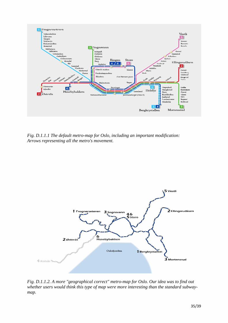
Fig. D.1.1.1 The default metro-map for Oslo, including an important modification: Arrows representing all the metro's movement.
Fig. D.1.1.2. A more "geographical correct" metro-map for Oslo. Our idea was to find out whether users would think this type of map were more interesting than the standard subway-map.
35/39
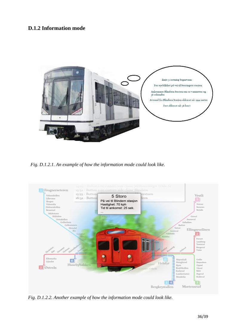
D.1.2 Information mode
Fig. D.1.2.1. An example of how the information mode could look like.
Fig. D.1.2.2. Another example of how the information mode could look like.
36/39

D.1.3 Placements of components at Blindern station
In both of our qualitative and quantitative data gatherings we presented two different ways of
placing the components at Blindern metro‐station.
Fig. D.1.3.1. Placing both screens and panels on both sides of the station (yellow outlining).
37/39
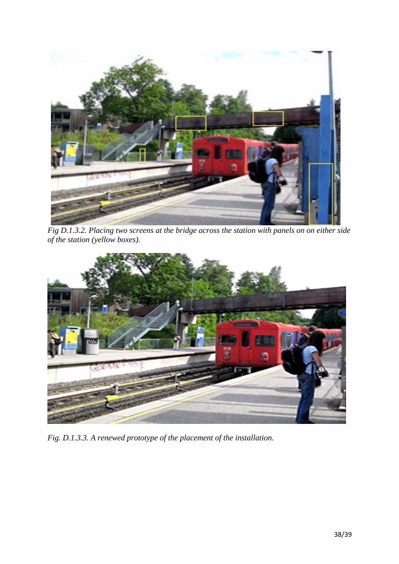
Fig D.1.3.2. Placing two screens at the bridge across the station with panels on on either side of the station (yellow boxes).
Fig. D.1.3.3. A renewed prototype of the placement of the installation.
38/39
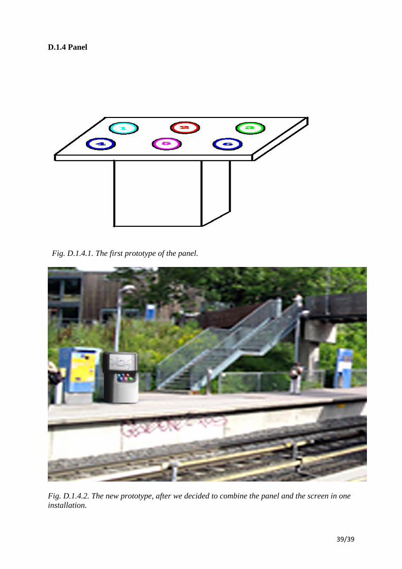
D.1.4 Panel
Fig. D.1.4.1. The first prototype of the panel.
Fig. D.1.4.2. The new prototype, after we decided to combine the panel and the screen in one installation.
39/39