《统计与数据分析》 - coe.pku.edu.cn ·...
TRANSCRIPT

§4 描述性统计学
Zhu Huaiqiu@Peking University
Zhu Huaiqiu@Peking University
《统计与数据分析》Statistics & Data Analysis《统计与数据分析》Statistics & Data Analysis
A picture says more than a thousand words!

描述性统计学(或统计描述)(Descriptive statistics, or Statistical description):研究如何取得反映客观现象的数据,从科学研究的原始数据出发,采用收集、整理、概括、描述等方法,通过图表形式对所收集的数据进行加工处理和显示,进而通过综合概括与分析给出总体或样本数据的概括性的、描述性的基本信息。
——Clear and understandable way
——统计学最基本的分支:解释性的一般统计方法;有别于推断性统计学(或统计推断)( Inferential statistics
or Statistical inference)
——广泛运用于生物医学、工程学、自然科学、社会科学等具体领域
§4.1 描述性统计学概述
What does the Descriptive Statistics do?
How to present your arguments or viewpoints?
Open-air preaching in James Street, Covent Garden, London. The preacher is using an unusual style, he has his main points written on laminated plastic cards and is sticking them on a board.

What does the Descriptive Statistics do?
——Describe and summarize the basic features of the data gathered from an experimental study in various ways;
——Form the basis of quantitative analysis of data together with simple graphics analysis;——Provide simple summaries about the sample and the measures;——Proceed to inferential statistics if there are enough data to draw a conclusion
It is necessary to be familiar with primary methods of describing data in order to understand phenomena and make intelligent decisions.
描述性统计学主要方法
(1) Graphical displays of the data in which graphs summarize the data or facilitate comparisons.
(2) Tabular description in which tables of numbers summarize the data.
(3) Summary statistics (single numbers) which summarize the data
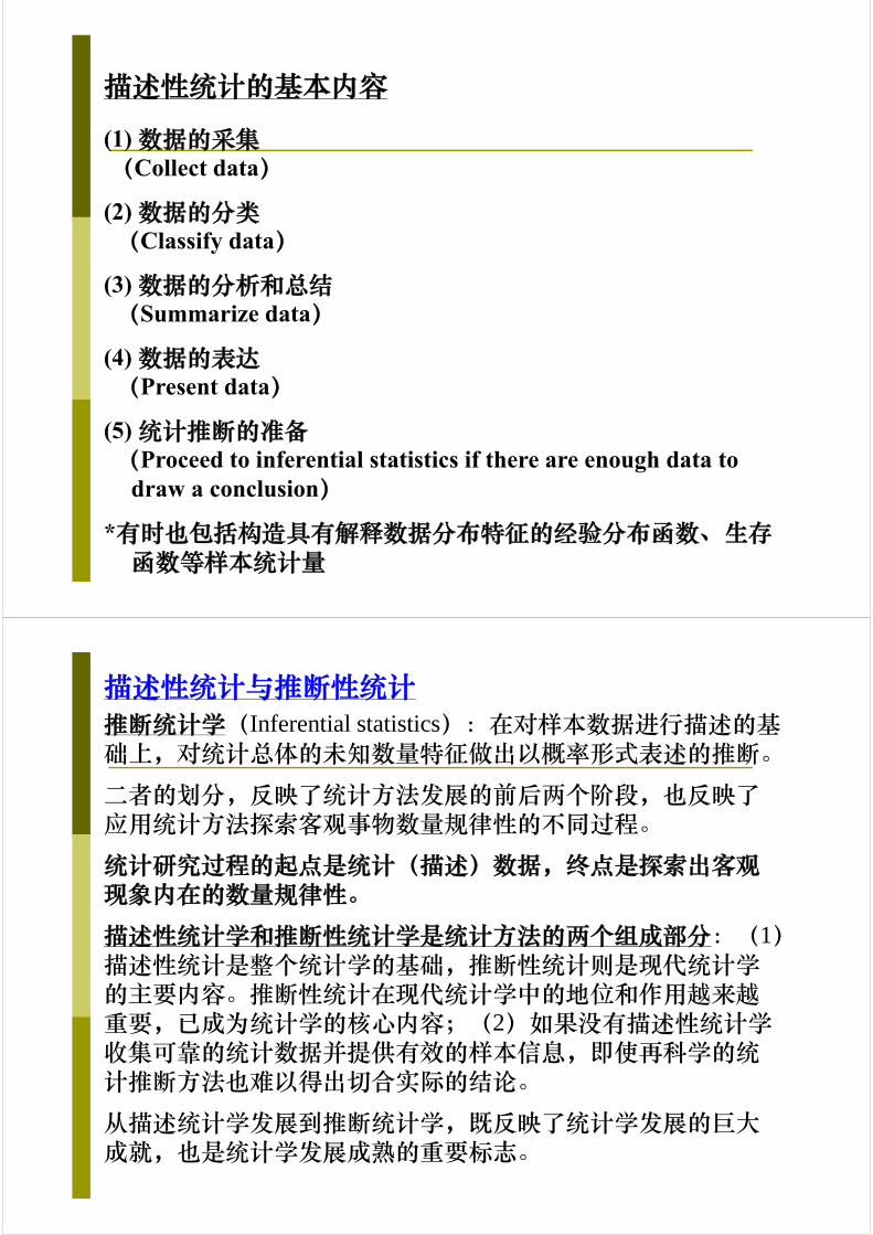
描述性统计的基本内容
(1) 数据的采集(Collect data)
(2) 数据的分类(Classify data)
(3) 数据的分析和总结(Summarize data)
(4) 数据的表达(Present data)
(5) 统计推断的准备(Proceed to inferential statistics if there are enough data to
draw a conclusion)
*有时也包括构造具有解释数据分布特征的经验分布函数、生存函数等样本统计量
描述性统计与推断性统计推断统计学(Inferential statistics):在对样本数据进行描述的基础上,对统计总体的未知数量特征做出以概率形式表述的推断。
二者的划分,反映了统计方法发展的前后两个阶段,也反映了应用统计方法探索客观事物数量规律性的不同过程。
统计研究过程的起点是统计(描述)数据,终点是探索出客观现象内在的数量规律性。
描述性统计学和推断性统计学是统计方法的两个组成部分:(1)描述性统计是整个统计学的基础,推断性统计则是现代统计学的主要内容。推断性统计在现代统计学中的地位和作用越来越重要,已成为统计学的核心内容;(2)如果没有描述性统计学收集可靠的统计数据并提供有效的样本信息,即使再科学的统计推断方法也难以得出切合实际的结论。
从描述统计学发展到推断统计学,既反映了统计学发展的巨大成就,也是统计学发展成熟的重要标志。
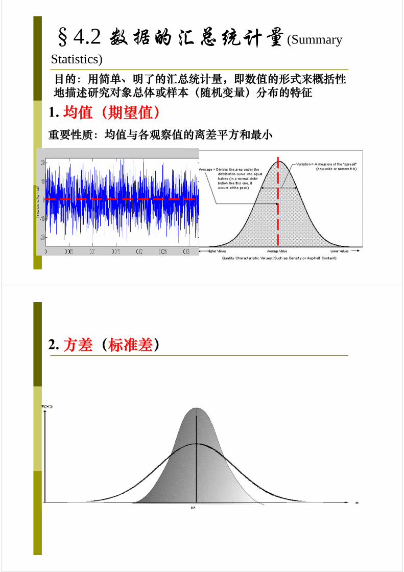
§4.2 数据的汇总统计量(Summary
Statistics)
目的:用简单、明了的汇总统计量,即数值的形式来概括性地描述研究对象总体或样本(随机变量)分布的特征
1. 均值(期望值)重要性质:均值与各观察值的离差平方和最小
2. 方差(标准差)
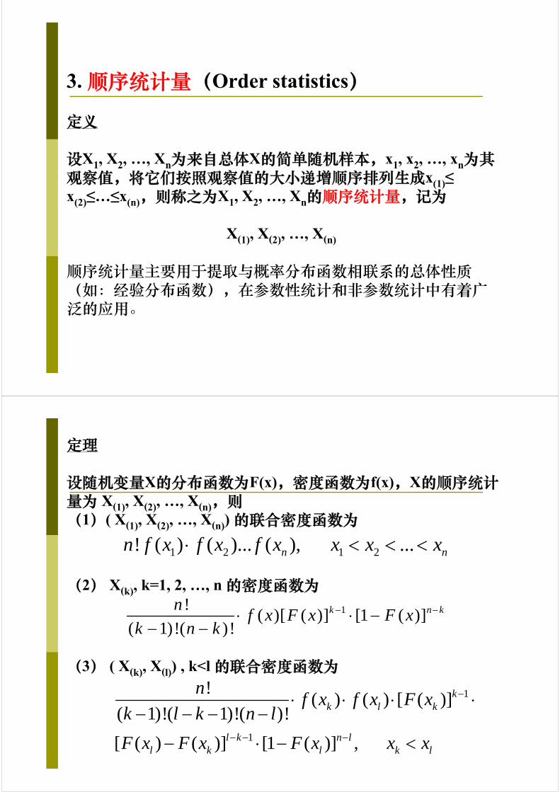
3. 顺序统计量(Order statistics)
定义
设X1, X2, …, Xn为来自总体X的简单随机样本,x1, x2, …, xn为其观察值,将它们按照观察值的大小递增顺序排列生成x(1)≤ x(2)≤…≤x(n),则称之为X1, X2, …, Xn的顺序统计量,记为
X(1), X(2), …, X(n)
顺序统计量主要用于提取与概率分布函数相联系的总体性质(如:经验分布函数),在参数性统计和非参数统计中有着广泛的应用。
定理
设随机变量X的分布函数为F(x),密度函数为f(x),X的顺序统计量为 X(1), X(2), …, X(n),则(1)( X(1), X(2), …, X(n)) 的联合密度函数为
(2) X(k), k=1, 2, …, n 的密度函数为
(3) ( X(k), X(l)) , k<l 的联合密度函数为
1 2 1 2! ( ) ( )... ( ), ...n nn f x f x f x x x x
1!( )[ ( )] [1 ( )]
( 1)!( )!k n kn
f x F x F xk n k
1
1
!( ) ( ) [ ( )]
( 1)!( 1)!( )!
[ ( ) ( )] [1 ( )] ,
kk l k
l k n ll k l k l
nf x f x F x
k l k n l
F x F x F x x x
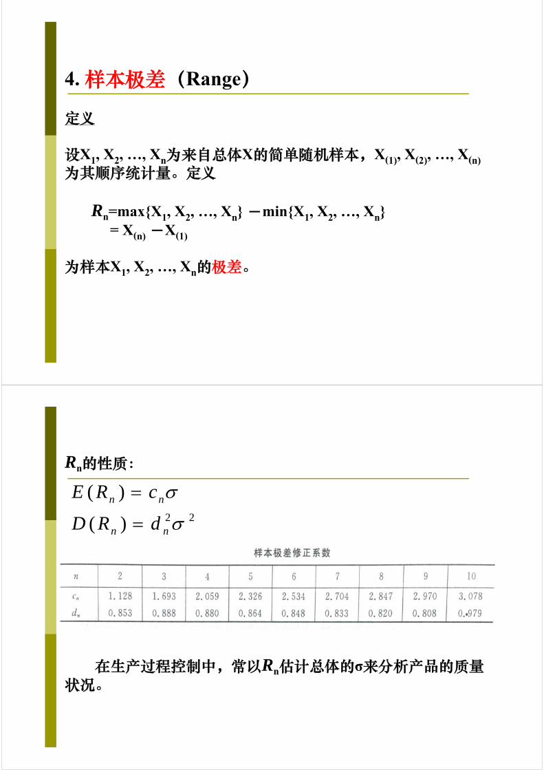
4. 样本极差(Range)
定义
设X1, X2, …, Xn为来自总体X的简单随机样本,X(1), X(2), …, X(n)为其顺序统计量。定义
Rn=max{X1, X2, …, Xn} -min{X1, X2, …, Xn}= X(n) -X(1)
为样本X1, X2, …, Xn的极差。
Rn的性质:
在生产过程控制中,常以Rn估计总体的σ来分析产品的质量状况。
2 2
( )
( )
n n
n n
E R c
D R d
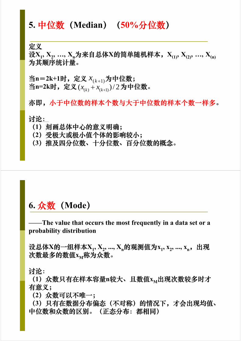
5. 中位数(Median)(50%分位数)
定义设X1, X2, …, Xn为来自总体X的简单随机样本,X(1), X(2), …, X(n)为其顺序统计量。
当n=2k+1时,定义 为中位数;当n=2k时,定义 为中位数。
亦即,小于中位数的样本个数与大于中位数的样本个数一样多。
讨论:(1)刻画总体中心的意义明确;(2)受极大或极小值个体的影响较小;(3)推及四分位数、十分位数、百分位数的概念。
( ) ( 1)( ) / 2k kx x ( 1)kx
6. 众数(Mode)
——The value that occurs the most frequently in a data set or a probability distribution
设总体X的一组样本X1, X2, ..., Xn的观测值为x1, x2, ..., xn,出现次数最多的数值xM称为众数。
讨论:(1)众数只有在样本容量n较大、且数值xM出现次数较多时才有意义;(2)众数可以不唯一;(3)只有在数据分布偏态(不对称)的情况下,才会出现均值、中位数和众数的区别。(正态分布:都相同)

Plant Growth (# of leaves/plant)
6
4
5
4
8
3
【Example 4.1】均值、中位数和众数的区别
7. 变异系数(相对标准差)
定义已知总体X的一组样本X1, X2, ..., Xn,其均值为
方差(标准差)为
则称
为X的变异系数(coefficient of variation)或相对标准差。
1
1 n
ii
X Xn
2 2
1
1( )
1
n
ii
S X Xn
v
SC
X

【Example 4.2】一位生物学家研究不同种类啮齿类动物的遗传变异,需要测量每只啮齿类动物的体重(单位:克)。他随机选取20只小白鼠,测得结果为:=25.8克,s=3.2克;又随机选取15只灰袋鼠,测得结果为:
=70850.0克,s=4264.0克。试比较这两种啮齿类动物体重的变异系数。X
X

8. Chebyshev’s theorem
定理
给定一组数据x1, x2, ..., xN,其数学期望和方差都存在,即均值为μ,标准差为σ > 0。则对于任意k>1,位于区间[μ−kσ, μ+kσ]内的数据所占比例大于或等于
k=2: 75.0%k=3: 88.9%k=4: 93.8%
2
11
k
随机变量X取值基本上集中在E(X)附近,进一步说明了方差的意义。
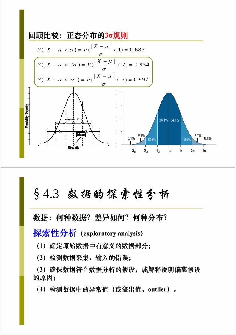
回顾比较:正态分布的3σ规则| |
(| | ) ( 1) 0 .683
| |(| | 2 ) ( 2) 0 .954
| |(| | 3 ) ( 3) 0 .997
XP X P
XP X P
XP X P
§4.3 数据的探索性分析
数据:何种数据?差异如何?何种分布?
探索性分析(exploratory analysis)
(1)确定原始数据中有意义的数据部分;
(2)检测数据采集、输入的错误;
(3)确保数据符合数据分析的假设,或解释说明偏离假设的原因;
(4)检测数据中的异常值(或溢出值,outlier)。
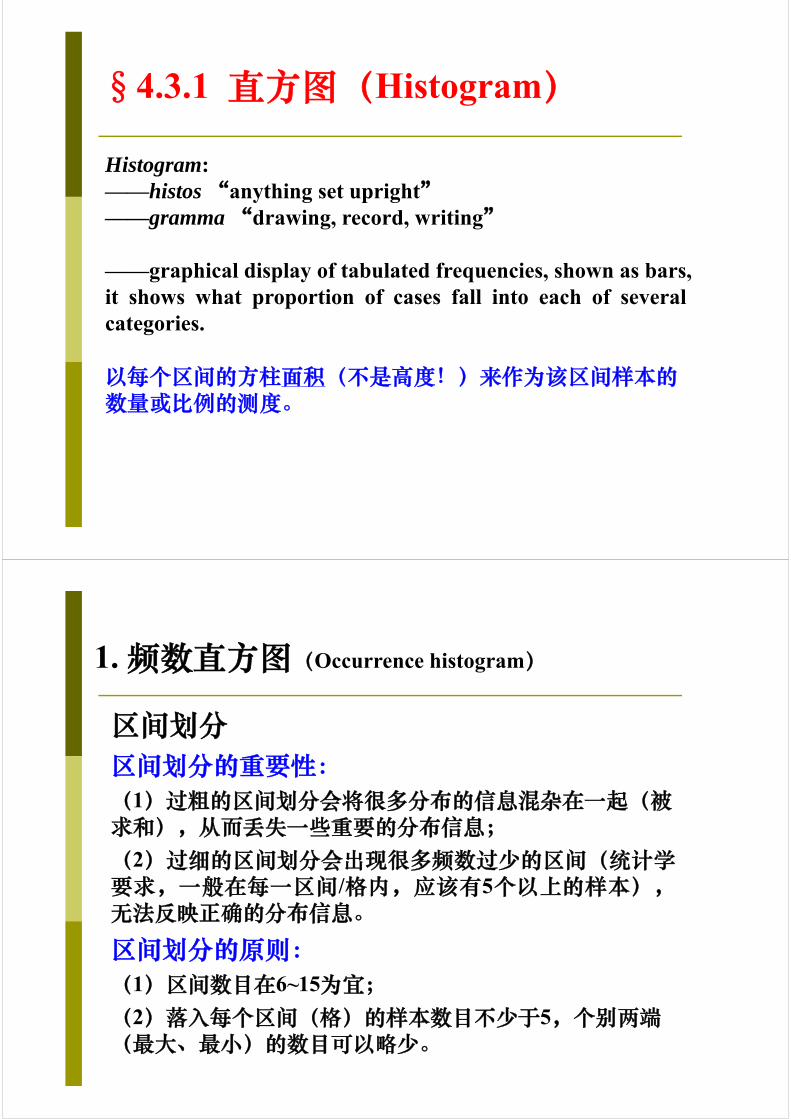
§4.3.1 直方图(Histogram)
Histogram:——histos “anything set upright”——gramma “drawing, record, writing”
——graphical display of tabulated frequencies, shown as bars,it shows what proportion of cases fall into each of severalcategories.
以每个区间的方柱面积(不是高度!)来作为该区间样本的数量或比例的测度。
区间划分区间划分的重要性:(1)过粗的区间划分会将很多分布的信息混杂在一起(被求和),从而丢失一些重要的分布信息;(2)过细的区间划分会出现很多频数过少的区间(统计学要求,一般在每一区间/格内,应该有5个以上的样本),无法反映正确的分布信息。
区间划分的原则:(1)区间数目在6~15为宜;(2)落入每个区间(格)的样本数目不少于5,个别两端(最大、最小)的数目可以略少。
1. 频数直方图(Occurrence histogram)
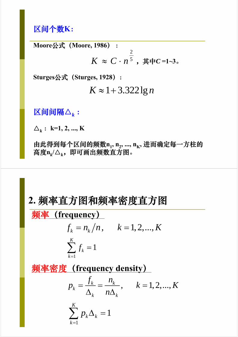
区间个数K:
Moore公式(Moore, 1986) :
,其中C =1~3。
Sturges公式(Sturges, 1928):
2
5K C n
1 3.322lgK n
区间间隔△k :
△k :k=1, 2, ..., K
由此得到每个区间的频数n1, n2, ..., nK, 进而确定每一方柱的高度nk/△k,即可画出频数直方图。
2. 频率直方图和频率密度直方图频率(frequency)
, 1, 2,...,k kf n n k K
1
1K
kk
f
频率密度(frequency density)
, 1, 2,...,k kk
k k
f np k K
n
1
1K
k kk
p
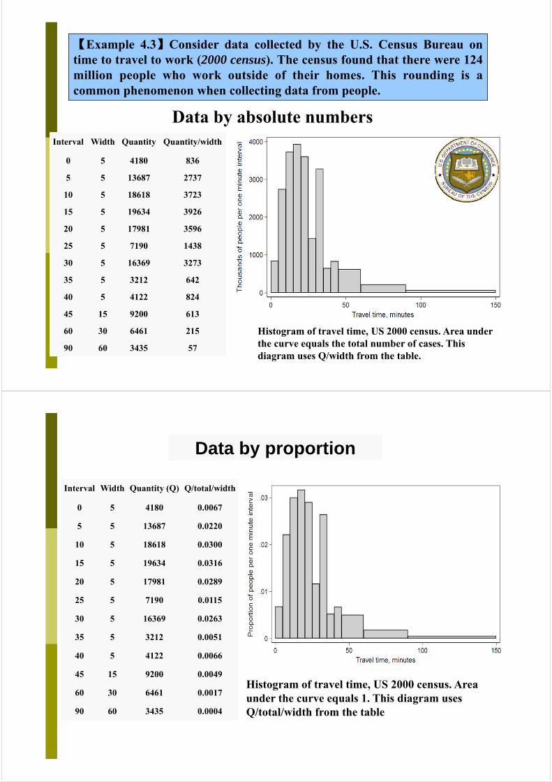
【Example 4.3】Consider data collected by the U.S. Census Bureau ontime to travel to work (2000 census). The census found that there were 124million people who work outside of their homes. This rounding is acommon phenomenon when collecting data from people.
Data by absolute numbersInterval Width Quantity Quantity/width
0 5 4180 836
5 5 13687 2737
10 5 18618 3723
15 5 19634 3926
20 5 17981 3596
25 5 7190 1438
30 5 16369 3273
35 5 3212 642
40 5 4122 824
45 15 9200 613
60 30 6461 215
90 60 3435 57
Histogram of travel time, US 2000 census. Area under the curve equals the total number of cases. This diagram uses Q/width from the table.
Data by proportion
Interval Width Quantity (Q) Q/total/width
0 5 4180 0.0067
5 5 13687 0.0220
10 5 18618 0.0300
15 5 19634 0.0316
20 5 17981 0.0289
25 5 7190 0.0115
30 5 16369 0.0263
35 5 3212 0.0051
40 5 4122 0.0066
45 15 9200 0.0049
60 30 6461 0.0017
90 60 3435 0.0004
Histogram of travel time, US 2000 census. Area under the curve equals 1. This diagram uses Q/total/width from the table
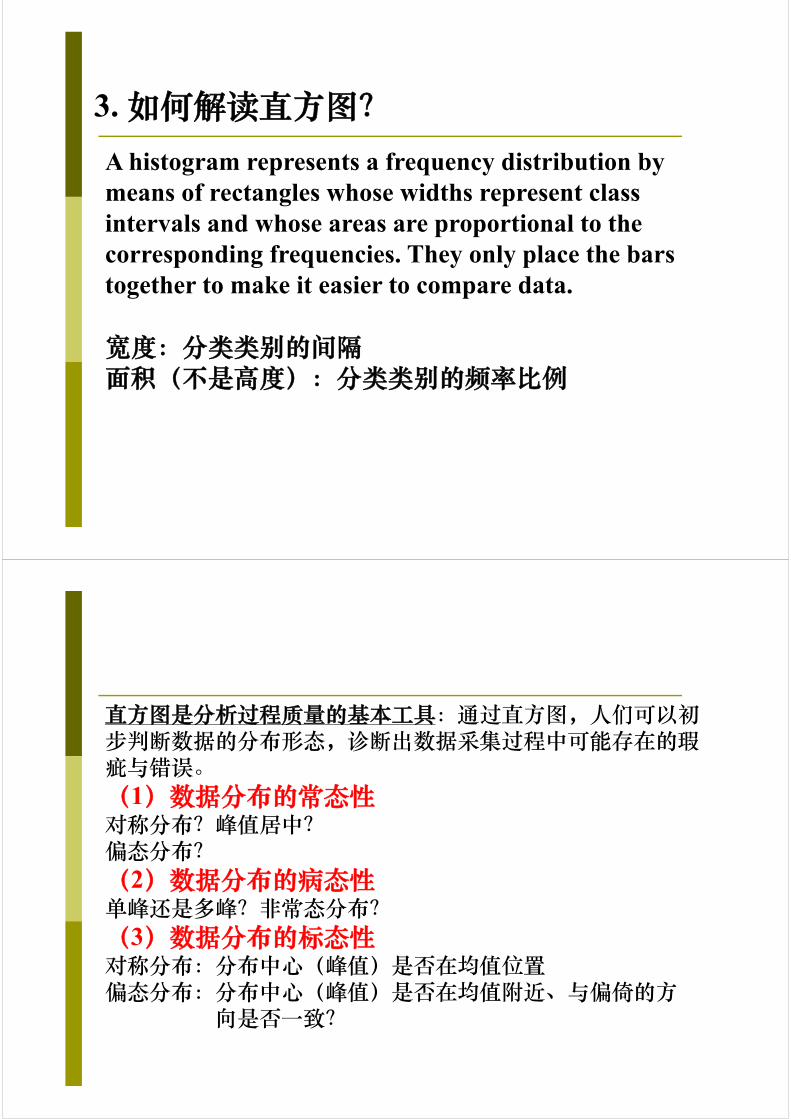
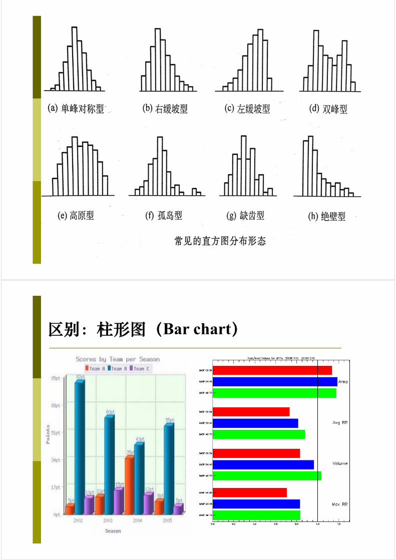
3. 如何解读直方图?A histogram represents a frequency distribution by means of rectangles whose widths represent class intervals and whose areas are proportional to the corresponding frequencies. They only place the bars together to make it easier to compare data.
宽度:分类类别的间隔面积(不是高度):分类类别的频率比例
直方图是分析过程质量的基本工具:通过直方图,人们可以初步判断数据的分布形态,诊断出数据采集过程中可能存在的瑕疵与错误。(1)数据分布的常态性对称分布?峰值居中?偏态分布?(2)数据分布的病态性单峰还是多峰?非常态分布?(3)数据分布的标态性对称分布:分布中心(峰值)是否在均值位置偏态分布:分布中心(峰值)是否在均值附近、与偏倚的方
向是否一致?
区别:柱形图(Bar chart)

4. Pareto图(Pareto chart)
Pareto定理:绝大多数缺陷能用分类的统计来考察,亦即绝大多数的问题或缺陷产生于相对有限的起因。就是常说的80/20定律,即20%的原因造成80%的问题。
V. Pareto(意大利经济学家)
A type of chart that contains both bars and a line graph, where individual values are represented in descending order by bars, and the cumulative total is represented by the line.
Pareto图(又称排列图)常用于质量控制研究,关注于对不同类型的缺陷、失效方式等的数据表示。
A Pareto chart showing the relative frequency of reasons for arriving late at work.
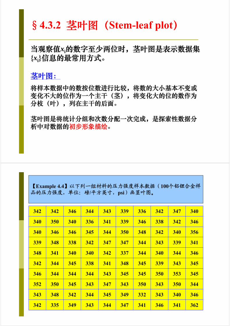
§4.3.2 茎叶图(Stem-leaf plot)
当观察值xi的数字至少两位时,茎叶图是表示数据集{xi}信息的最常用方式。
茎叶图:将样本数据中的数按位数进行比较,将数的大小基本不变或变化不大的位作为一个主干(茎),将变化大的位的数作为分枝(叶),列在主干的后面。
茎叶图是将统计分组和次数分配一次完成,是探索性数据分析中对数据的初步形象描绘。
342 342 346 344 343 339 336 342 347 340
340 350 340 336 341 339 346 338 342 346
340 346 346 345 344 350 348 342 340 356
339 348 338 342 347 347 344 343 339 341
348 341 340 340 342 337 344 340 344 346
342 344 345 338 341 348 345 339 343 345
346 344 344 344 343 345 345 350 353 345
352 350 345 343 347 343 350 343 350 344
343 348 342 344 345 349 332 343 340 346
342 335 349 343 344 347 341 346 341 362
【Example 4.4】以下列一组材料的压力强度样本数据(100个铝锂合金样品的压力强度,单位:磅/平方英寸,psi)画茎叶图。
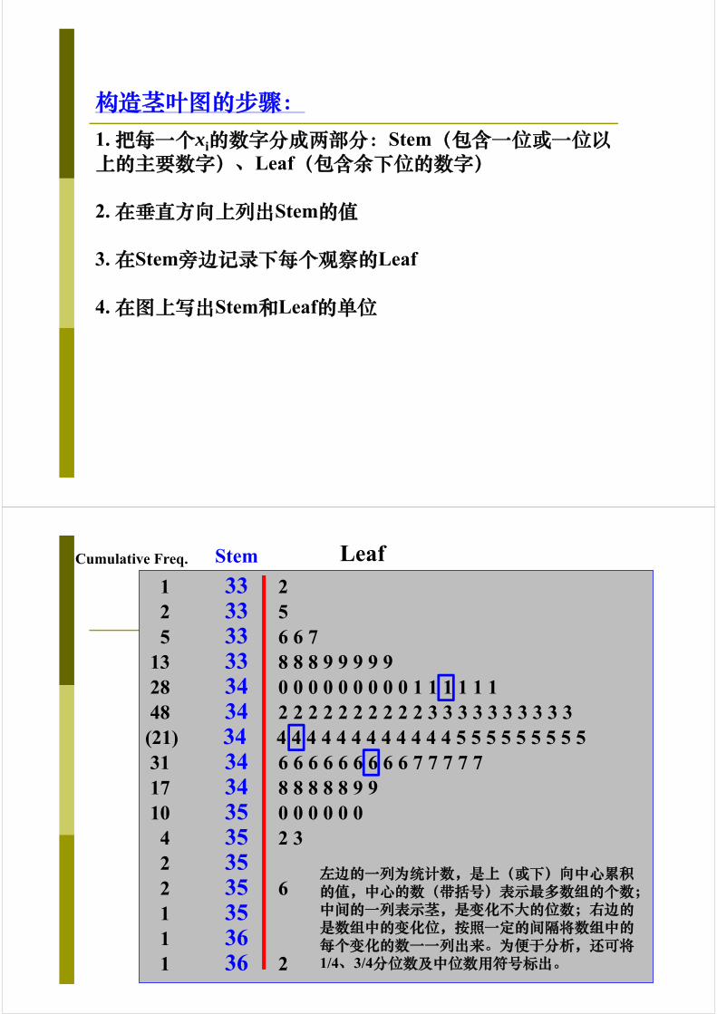
构造茎叶图的步骤:1. 把每一个xi的数字分成两部分:Stem(包含一位或一位以上的主要数字)、Leaf(包含余下位的数字)
2. 在垂直方向上列出Stem的值
3. 在Stem旁边记录下每个观察的Leaf
4. 在图上写出Stem和Leaf的单位
1 33 22 33 55 33 6 6 7
13 33 8 8 8 9 9 9 9 928 34 0 0 0 0 0 0 0 0 0 1 1 1 1 1 148 34 2 2 2 2 2 2 2 2 2 2 3 3 3 3 3 3 3 3 3 3(21) 34 4 4 4 4 4 4 4 4 4 4 4 4 5 5 5 5 5 5 5 5 531 34 6 6 6 6 6 6 6 6 6 7 7 7 7 717 34 8 8 8 8 8 9 910 35 0 0 0 0 0 04 35 2 32 352 35 61 351 361 36 2
左边的一列为统计数,是上(或下)向中心累积的值,中心的数(带括号)表示最多数组的个数;中间的一列表示茎,是变化不大的位数;右边的是数组中的变化位,按照一定的间隔将数组中的每个变化的数一一列出来。为便于分析,还可将1/4、3/4分位数及中位数用符号标出。
Cumulative Freq. Stem Leaf

用于比较两组样本数据的统计分布的茎叶图
Leaf Stem Leaf
茎叶图的优点:
(1)简单、直观,不需要数学运算。茎叶图中的数据可以随时记录,随时添加,方便记录与表示;
(2)没有原始数据信息的损失,所有数据信息都可以从茎叶图中得到。与直方图不同,直方图则失去原始数据信息。将茎叶图茎和叶逆时针方向旋转90度,实际上就是一个直方图;
(3)可以从中统计出次数,计算出各数据段的频率或百分比。均值、中位数和众数均可依原始数据准确方便地算出,从而可以看出分布是否与正态分布或单峰偏态分布逼近。

茎叶图的缺点:
适用于一些简单的情形,具有局限性,不如直方图通用。茎叶图只便于表示两位有效数字的数据,而且茎叶图只方便记录两组的数据,两个以上的数据虽然能够记录,但是没有表示两个记录那么直观、清晰。
§4.3.3 箱线图(Boxplot)
箱线图(Boxplot)概述:
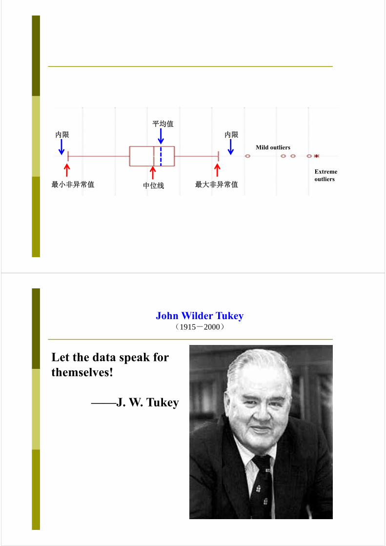
——也称箱须图(Box-whisker Plot),由统计学家John Tukey提出。
——利用数据中的五个统计量:最小值、第1/4分位数、中位数、第3/4分位数与最大值来描述数据,可以粗略地看出数据是否具有有对称性,分布的分散程度等信息,特别可以用于对多个样本的比较。
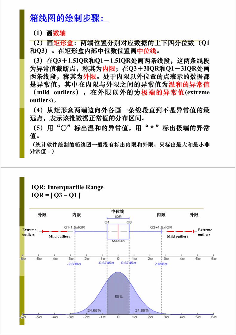
箱线图的绘制步骤:(1)画数轴(2)画矩形盒:两端位置分别对应数据的上下四分位数(Q1和Q3)。在矩形盒内部中位数位置画中位线。(3)在Q3+1.5IQR和Q1-1.5IQR处画两条线段,这两条线段为异常值截断点,称其为内限;在Q3+3IQR和Q1-3IQR处画两条线段,称其为外限。处于内限以外位置的点表示的数据都是异常值,其中在内限与外限之间的异常值为温和的异常值(mild outliers),在外限以外的为极端的异常值 (extremeoutliers)。(4)从矩形盒两端边向外各画一条线段直到不是异常值的最远点,表示该批数据正常值的分布区间。(5)用“〇”标出温和的异常值,用“*”标出极端的异常值。(统计软件绘制的箱线图一般没有标出内限和外限,只标出最大和最小非异常值。)
中位线内限 内限外限 外限
Mild outliers Mild outliers
Extreme outliers
Extreme outliers
IQR: Interquartile RangeIQR = | Q3 – Q1 |
中位线
内限 内限
Mild outliers
Extreme outliers
最小非异常值 最大非异常值
平均值
John Wilder Tukey(1915-2000)
Let the data speak for themselves!
——J. W. Tukey
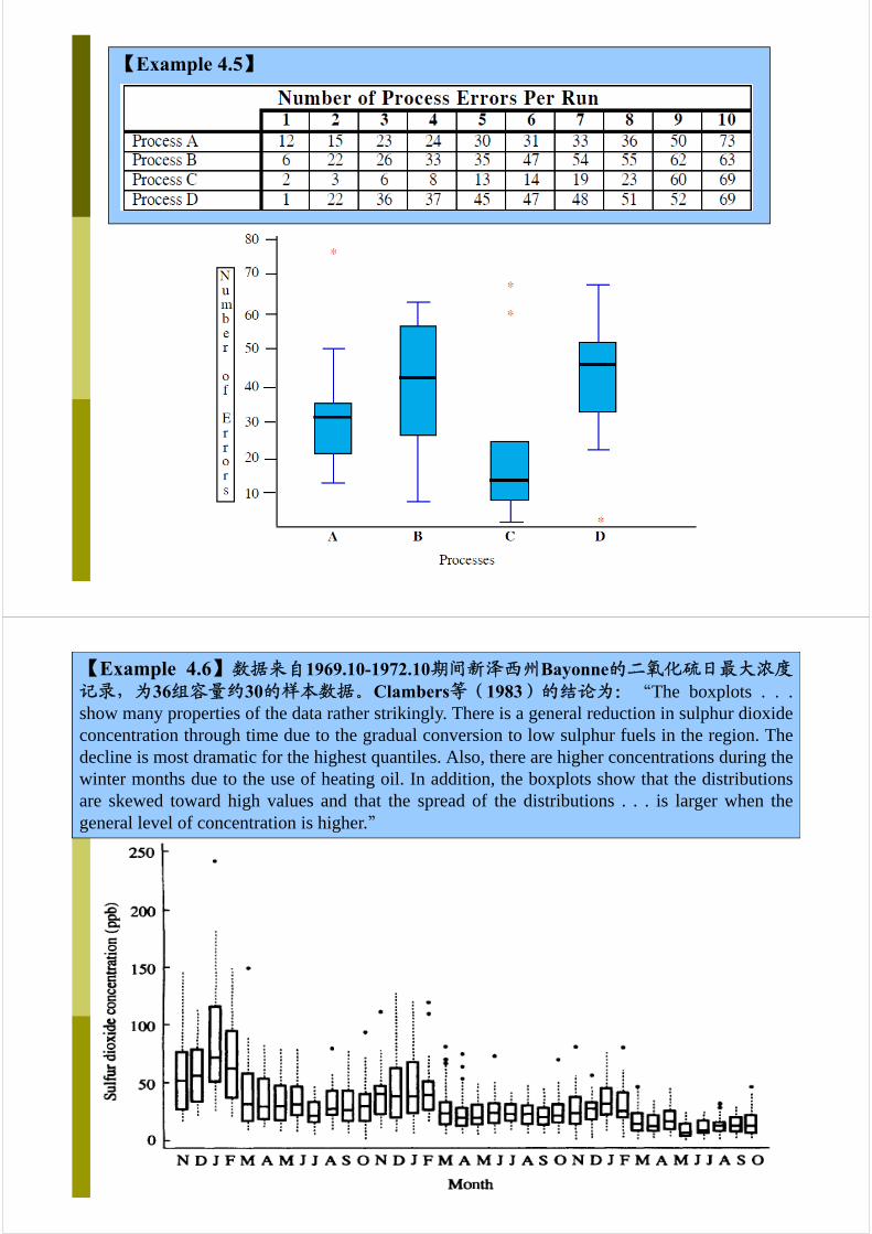
【Example 4.5】
【Example 4.6】数据来自1969.10-1972.10期间新泽西州Bayonne的二氧化硫日最大浓度记录,为36组容量约30的样本数据。Clambers等(1983)的结论为:“The boxplots . . .show many properties of the data rather strikingly. There is a general reduction in sulphur dioxideconcentration through time due to the gradual conversion to low sulphur fuels in the region. Thedecline is most dramatic for the highest quantiles. Also, there are higher concentrations during thewinter months due to the use of heating oil. In addition, the boxplots show that the distributionsare skewed toward high values and that the spread of the distributions . . . is larger when thegeneral level of concentration is higher.”

箱线图的意义:
(1)直观、明了、客观地识别数据批中的异常值(Outliers:正态分布情形、非正态分布情形)
(2)能判断数据的偏态和尾重
(3)能比较几批数据的形状
箱线图的局限:
(1)不能提供关于数据分布偏态和尾重程度的精确度量;
(2)对于批量较大的数据批,反映的形状信息更模糊;
(3)用中位数代表总体平均水平有一定的局限性
应用箱线图最好结合其它描述统计工具如均值、标准差、偏度、分布函数等来描述数据批的分布形状。
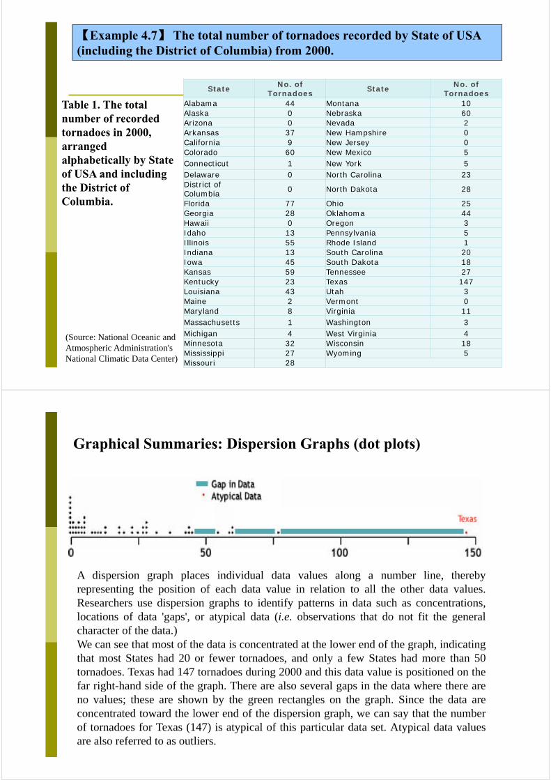
【Example 4.7】 The total number of tornadoes recorded by State of USA (including the District of Columbia) from 2000.
State No. of Tornadoes State No. of
Tornadoes Alabama 44 Montana 10Alaska 0 Nebraska 60Arizona 0 Nevada 2Arkansas 37 New Hampshire 0California 9 New Jersey 0Colorado 60 New Mexico 5Connecticut 1 New York 5Delaware 0 North Carolina 23District of Columbia 0 North Dakota 28
Florida 77 Ohio 25Georgia 28 Oklahoma 44Hawaii 0 Oregon 3Idaho 13 Pennsylvania 5Illinois 55 Rhode Island 1Indiana 13 South Carolina 20Iowa 45 South Dakota 18Kansas 59 Tennessee 27Kentucky 23 Texas 147Louisiana 43 Utah 3Maine 2 Vermont 0Maryland 8 Virginia 11Massachusetts 1 Washington 3Michigan 4 West Virginia 4Minnesota 32 Wisconsin 18Mississippi 27 Wyoming 5Missouri 28
Table 1. The total number of recorded tornadoes in 2000, arranged alphabetically by State of USA and including the District of Columbia.
(Source: National Oceanic and Atmospheric Administration's National Climatic Data Center)
Graphical Summaries: Dispersion Graphs (dot plots)
A dispersion graph places individual data values along a number line, therebyrepresenting the position of each data value in relation to all the other data values.Researchers use dispersion graphs to identify patterns in data such as concentrations,locations of data 'gaps', or atypical data (i.e. observations that do not fit the generalcharacter of the data.)We can see that most of the data is concentrated at the lower end of the graph, indicatingthat most States had 20 or fewer tornadoes, and only a few States had more than 50tornadoes. Texas had 147 tornadoes during 2000 and this data value is positioned on thefar right-hand side of the graph. There are also several gaps in the data where there areno values; these are shown by the green rectangles on the graph. Since the data areconcentrated toward the lower end of the dispersion graph, we can say that the numberof tornadoes for Texas (147) is atypical of this particular data set. Atypical data valuesare also referred to as outliers.
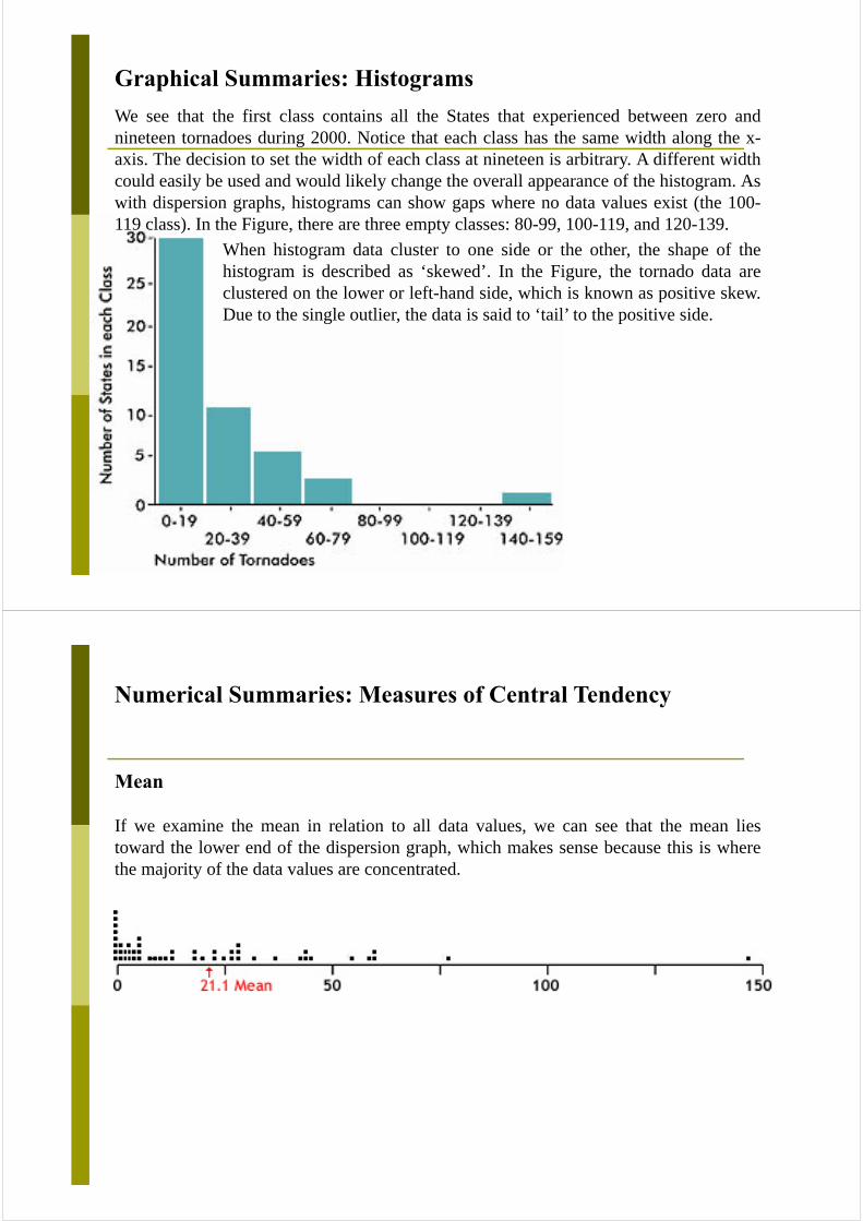
Graphical Summaries: Histograms
We see that the first class contains all the States that experienced between zero andnineteen tornadoes during 2000. Notice that each class has the same width along the x-axis. The decision to set the width of each class at nineteen is arbitrary. A different widthcould easily be used and would likely change the overall appearance of the histogram. Aswith dispersion graphs, histograms can show gaps where no data values exist (the 100-119 class). In the Figure, there are three empty classes: 80-99, 100-119, and 120-139.
When histogram data cluster to one side or the other, the shape of thehistogram is described as ‘skewed’. In the Figure, the tornado data areclustered on the lower or left-hand side, which is known as positive skew.Due to the single outlier, the data is said to ‘tail’ to the positive side.
Numerical Summaries: Measures of Central Tendency
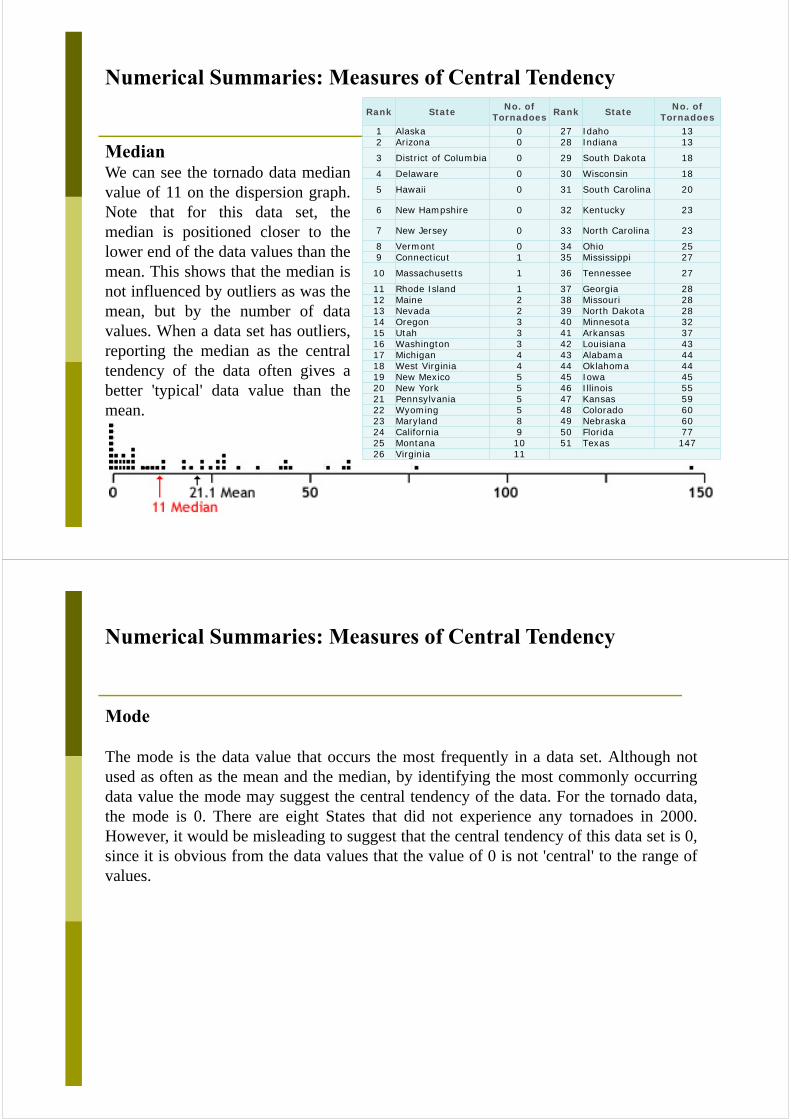
Mean
If we examine the mean in relation to all data values, we can see that the mean liestoward the lower end of the dispersion graph, which makes sense because this is wherethe majority of the data values are concentrated.
Numerical Summaries: Measures of Central Tendency
MedianWe can see the tornado data medianvalue of 11 on the dispersion graph.Note that for this data set, themedian is positioned closer to thelower end of the data values than themean. This shows that the median isnot influenced by outliers as was themean, but by the number of datavalues. When a data set has outliers,reporting the median as the centraltendency of the data often gives abetter 'typical' data value than themean.
Rank State No. of Tornadoes Rank State No. of
Tornadoes 1 Alaska 0 27 Idaho 132 Arizona 0 28 Indiana 13
3 District of Columbia 0 29 South Dakota 18
4 Delaware 0 30 Wisconsin 18
5 Hawaii 0 31 South Carolina 20
6 New Hampshire 0 32 Kentucky 23
7 New Jersey 0 33 North Carolina 23
8 Vermont 0 34 Ohio 259 Connecticut 1 35 Mississippi 27
10 Massachusetts 1 36 Tennessee 27
11 Rhode Island 1 37 Georgia 2812 Maine 2 38 Missouri 2813 Nevada 2 39 North Dakota 2814 Oregon 3 40 Minnesota 3215 Utah 3 41 Arkansas 3716 Washington 3 42 Louisiana 4317 Michigan 4 43 Alabama 4418 West Virginia 4 44 Oklahoma 4419 New Mexico 5 45 Iowa 4520 New York 5 46 Illinois 5521 Pennsylvania 5 47 Kansas 5922 Wyoming 5 48 Colorado 6023 Maryland 8 49 Nebraska 6024 California 9 50 Florida 7725 Montana 10 51 Texas 14726 Virginia 11
Numerical Summaries: Measures of Central Tendency
Mode
The mode is the data value that occurs the most frequently in a data set. Although notused as often as the mean and the median, by identifying the most commonly occurringdata value the mode may suggest the central tendency of the data. For the tornado data,the mode is 0. There are eight States that did not experience any tornadoes in 2000.However, it would be misleading to suggest that the central tendency of this data set is 0,since it is obvious from the data values that the value of 0 is not 'central' to the range ofvalues.
Numerical Summaries: Measures of Dispersions
VarianceState
No. of Tornad
oes
Deviation Scores
Squared Deviation
Scores
Alaska 0 -21.1 445.21Arizona 0 -21.1 445.21District of Columbia 0 -21.1 445.21
Delaware 0 -21.1 445.21Hawaii 0 -21.1 445.21
New Hampshire 0 -21.1 445.21
New Jersey 0 -21.1 445.21Vermont 0 -21.1 445.21Connecticut 1 -20.1 404.01
Massachusetts 1 -20.1 404.01
Rhode Island 1 -20.1 404.01Maine 2 -19.1 364.81Nevada 2 -19.1 364.81Oregon 3 -18.1 327.61Utah 3 -18.1 327.61Washington 3 -18.1 327.61Michigan 4 -17.1 292.41West Virginia 4 -17.1 292.41New Mexico 5 -16.1 259.21New York 5 -16.1 259.21Pennsylvania 5 -16.1 259.21Wyoming 5 -16.1 259.21Maryland 8 -13.1 171.61California 9 -12.1 146.41Montana 10 -11.1 123.21
Virginia 11 -10.1 102.01Idaho 13 -8.1 65.61Indiana 13 -8.1 65.61South Dakota 18 -3.1 9.61
Wisconsin 18 -3.1 9.61South Carolina 20 -1.1 1.21
Kentucky 23 1.9 3.61North Carolina 23 1.9 3.61
Ohio 25 3.9 15.21Mississippi 27 5.9 34.81Tennessee 27 5.9 34.81Georgia 28 6.9 47.61Missouri 28 6.9 47.61North Dakota 28 6.9 47.61
Minnesota 32 10.9 118.81Arkansas 37 15.9 252.81Louisiana 43 21.9 479.61Alabama 44 22.9 524.41Oklahoma 44 22.9 524.41Iowa 45 23.9 571.21Illinois 55 33.9 1149.21Kansas 59 37.9 1436.41Colorado 60 38.9 1513.21Nebraska 60 38.9 1513.21Florida 77 55.9 3124.81Texas 147 125.9 15850.81
Sum=0.0 Sum=36096.5
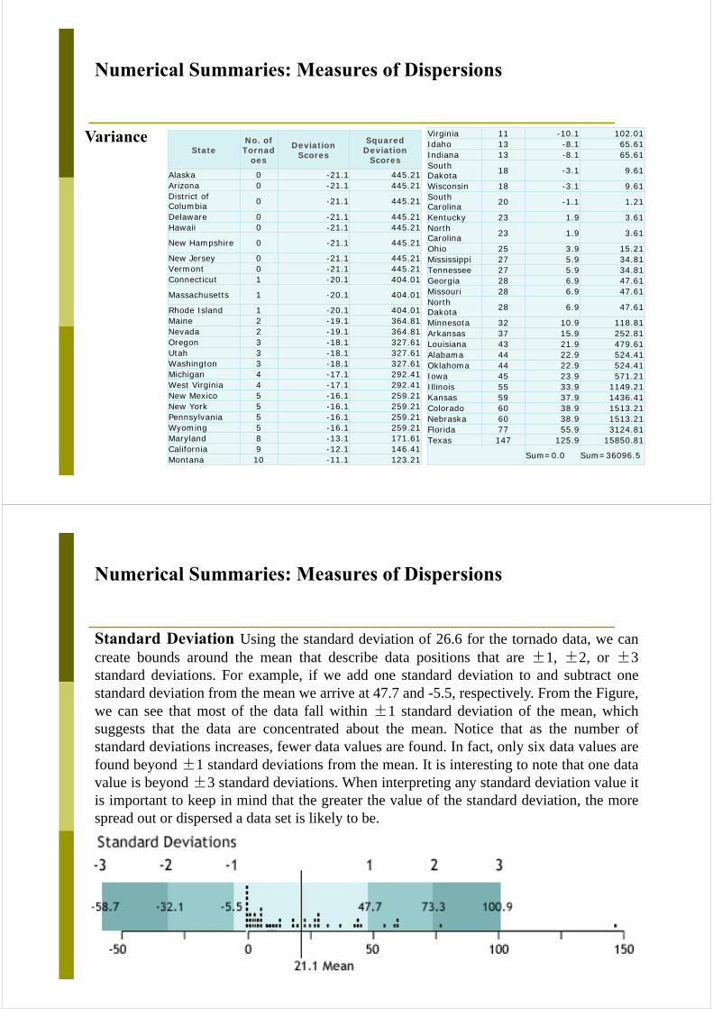
Numerical Summaries: Measures of Dispersions
Standard Deviation Using the standard deviation of 26.6 for the tornado data, we cancreate bounds around the mean that describe data positions that are ±1, ±2, or ±3standard deviations. For example, if we add one standard deviation to and subtract onestandard deviation from the mean we arrive at 47.7 and -5.5, respectively. From the Figure,we can see that most of the data fall within ±1 standard deviation of the mean, whichsuggests that the data are concentrated about the mean. Notice that as the number ofstandard deviations increases, fewer data values are found. In fact, only six data values arefound beyond ±1 standard deviations from the mean. It is interesting to note that one datavalue is beyond ±3 standard deviations. When interpreting any standard deviation value itis important to keep in mind that the greater the value of the standard deviation, the morespread out or dispersed a data set is likely to be.
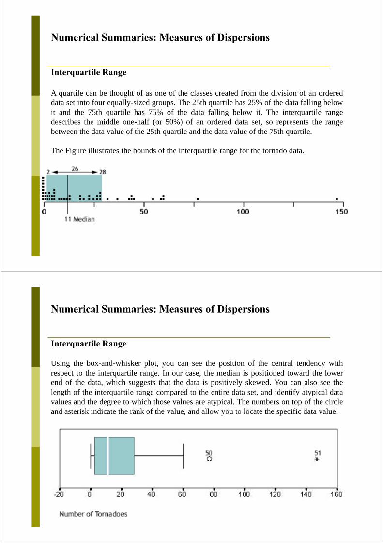
Numerical Summaries: Measures of Dispersions
Interquartile Range
A quartile can be thought of as one of the classes created from the division of an ordereddata set into four equally-sized groups. The 25th quartile has 25% of the data falling belowit and the 75th quartile has 75% of the data falling below it. The interquartile rangedescribes the middle one-half (or 50%) of an ordered data set, so represents the rangebetween the data value of the 25th quartile and the data value of the 75th quartile.
The Figure illustrates the bounds of the interquartile range for the tornado data.
Numerical Summaries: Measures of Dispersions
Interquartile Range
Using the box-and-whisker plot, you can see the position of the central tendency withrespect to the interquartile range. In our case, the median is positioned toward the lowerend of the data, which suggests that the data is positively skewed. You can also see thelength of the interquartile range compared to the entire data set, and identify atypical datavalues and the degree to which those values are atypical. The numbers on top of the circleand asterisk indicate the rank of the value, and allow you to locate the specific data value.
§4.3.4 其它统计图示方法
A distribution of tornadoes by month for area covered by the National Weather Forecast Office in Shreveport. This includes 48 counties and parishes in SW Arkansas, NW Louisiana, SE Oklahoma, and E Texas.
Bar chart
柱形图
Scatter plot(散点图)
A 3D scatter plot allows for the visualization of multivariate data of up to four dimensions. The Scatter plot takes multiple scalar variables and uses them for different axes in phase space. The different variables are combined to form coordinates in the phase space and they are displayed using glyphs and colored using another scalar variable.
轮廓图
雷达图
0
1.0
1.0
1.0
1.0
1.0

调和曲线图
...2cos2sincossin2
54321 txtxtxtx
xtfX
Descriptive Statistics——Classification & Arrangement——Summarizing——Presentation (figure, graph, table, …)
Inferential Statistics——Sampling——Parameter Estimation——Hypothesis Test
Statisticsfor Data Analysis
Conclusions
+Working Hypothesis
Data